Discover 20 budget decor hacks and DIY tips that make your home look expensive instantly. Learn how to achieve affordable luxury and elevate your space without breaking the bank.
HOW TO DECORATE AROUND A LARGE TV
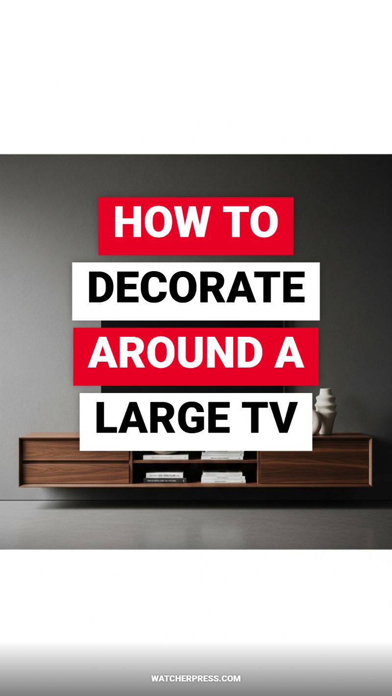
A large television, while necessary for modern entertainment, often dominates a room, looking utilitarian rather than stylish. The most effective, budget-friendly hack to instantly elevate this area is making the TV disappear when it’s off. Achieving this sleek, expensive look starts with the wall treatment. Instead of mounting the TV against a brightly painted wall, opt for a dark, matte finish—think deep charcoal, navy, or a rich olive green, similar to the moody grey backdrop in the image. Matte paint absorbs light, preventing glare and allowing the black screen to visually recede into the wall. This simple color change costs only the price of a can of paint but provides the sophisticated, seamless integration seen in high-end design. Crucially, ensure every single wire is concealed. Exposed cables are the quickest way to downgrade an otherwise polished setup, so invest time in cable channels or feed them through the wall behind the console for a truly custom, high-end appearance.
The choice of media console is paramount. To achieve the elevated aesthetic shown in the visual—a floating wooden unit—you don’t need expensive custom cabinetry. Look for budget-friendly floating shelves or mid-century style wall-mounted cabinets that offer clean lines and rich wood tones. Floating pieces create a sense of spaciousness and architectural interest that traditional floor-standing units lack, instantly giving the area a built-in, custom look. Once the TV is grounded by this horizontal element, focus on intentional, curated styling. The key is balance and texture. Use the rule of odds when placing objects: a stack of carefully chosen, coverless books (or books with neutral dust jackets) paired with one large, sculptural element, like the white vase pictured, adds visual weight and artistic flair. Avoid clutter; expensive decor looks sparse and purposeful. Choose items in contrasting textures (smooth ceramics, woven baskets, metallic accents) to ensure the decor feels layered and interesting, drawing the eye down and around the screen.
To complete the look and transition this area from functional to cinematic, incorporate strategic, inexpensive lighting. Bias lighting—placing LED strip lights behind the TV or along the back edge of the floating console—is a powerful budget hack. This soft, diffused light not only enhances the viewing experience by reducing eye strain but also provides a gorgeous ambient glow that frames the setup, making the entire vignette feel intentional and luxurious. When arranging the space, remember the principle of framing: the console should ideally be 25% wider than the TV itself to provide a substantial anchor, preventing the large screen from feeling visually overwhelming. By combining a dark, matte background, a streamlined floating console, concealed wiring, and subtle ambient lighting, you transform the TV wall from a necessary distraction into a cohesive, high-design focal point that instantly elevates your living space.
Create the Perfect Gallery Wall Layout
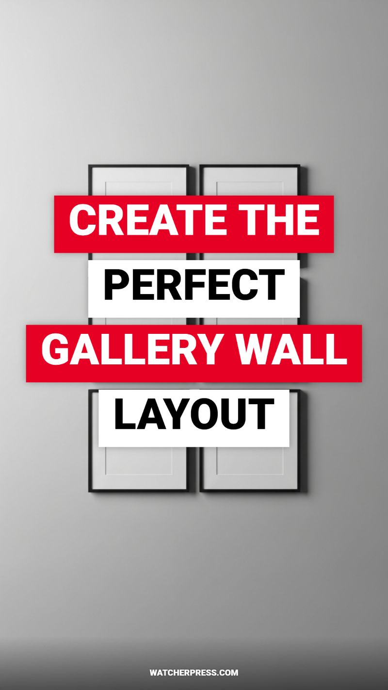
Gallery walls are a hallmark of expertly styled homes, instantly turning a blank expanse into a curated focal point. While a sprawling, asymmetrical arrangement of vintage finds can be beautiful, the most effective budget hack is to embrace the simplicity and sophistication of symmetry, as visually demonstrated here. A clean grid layout, utilizing identical frames and uniform spacing, is inherently modern and requires minimal planning while delivering maximum impact. The perceived effortlessness of a perfectly aligned grid suggests intentional design, which elevates simple, inexpensive frames to look remarkably sophisticated. To capitalize on this high-end feel, choose simple black or thin metallic frames and, crucially, always include a wide, crisp white mat; this provides necessary breathing room and instantly makes budget-friendly prints or even personal photographs feel like museum-quality art.
The key to a polished, professional gallery wall is precision, especially when utilizing a rigid symmetrical grid. Before placing the first nail, map out your arrangement using paper templates cut to the exact size of your frames. The most common mistake amateur decorators make is hanging frames too far apart. For a cohesive, high-impact look, limit the negative space between frames to a narrow, consistent measurement—ideally between 1.5 to 3 inches. This tight spacing forces the individual elements to read as a single, large installation rather than disparate pieces. When installing, measure the distance from the floor or surrounding furniture (like a console table) to the center point of the entire installation, ensuring the center is roughly eye-level (about 57 inches from the floor). Use a level obsessively during the installation process; even a slight deviation in alignment will completely undermine the symmetrical effect.
To maintain the expensive, minimalist aesthetic, be intentional about the content within the frames. If you are using photographs, opt for high-contrast black and white images. If you prefer abstract art, limit the color palette to coordinating neutrals or subtle tones that match the room’s dominant scheme. The simplicity of the visual arrangement—four frames of the same size, texture, and color on a plain gray wall—demonstrates how restraint is a powerful design tool. Avoid introducing clutter in the surrounding space. When executed with clean lines, consistent materials, and precise spacing, a simple gallery wall layout becomes a powerful visual anchor that instantly upgrades your decor, proving that smart planning, not hefty expenditure, is the secret to high-impact styling.
THE SECRET TO A MINIMALIST LIVING ROOM

The true secret to an expensive-looking minimalist living room, even on a budget, lies in maximizing negative space and committing fully to a light, neutral palette. As illustrated by the crisp, bright room pictured, a clean, white canvas is the ultimate foundation for luxury design. Start by painting the walls and ceiling a bright, consistent white; this instantly enlarges the area, reflecting natural light better than any complex color scheme ever could. Next, apply ruthless editing to your belongings. Minimalism is not just about what you buy, but what you choose to live without. Remove all decorative clutter, personal knick-knacks, and excess textiles. A room that is intentionally sparse immediately suggests high value and curation, making it seem less like a storage space and more like a gallery.
The furniture selection is critical, focusing on simple geometric forms and natural materials to add warmth and texture without busyness. Notice the slipcovered white sofa in the image. Slipcovers are often a budget-friendly alternative to custom upholstery and offer the immense benefit of being washable, which helps maintain that pristine, high-end look indefinitely. Contrast this soft texture with a single focal piece made from a solid, natural material, such as the blonde wood coffee table. This piece provides a grounding element while maintaining clean, strong lines. When choosing wood, select light, consistent tones; this prevents the room from feeling heavy or rustic and maintains the airy, modern aesthetic that is characteristic of expensive Scandinavian design. By focusing on foundational pieces that prioritize form and material integrity over trendy detailing, you create an environment that feels both sophisticated and timeless.
To ensure this clean aesthetic doesn’t feel cold, focus on texture within your neutrals. For instance, use the same shade of white for your pillows and sofa, but vary the material (linen, cotton duck, or a subtle knit) to provide visual depth. Symmetry is another free hack that instantly elevates the look; arrange pillows and select furniture that balances the space perfectly, creating a sense of calm order. Finally, remember that the budget hack here is efficiency: when there are few items, the quality of each item is magnified. By limiting the visible items, you force yourself to invest in the best quality pieces you can afford for those few selections, giving the entire space a higher perceived value than a room crammed with lesser quality finds.
The Best Plants for Every Room Layout
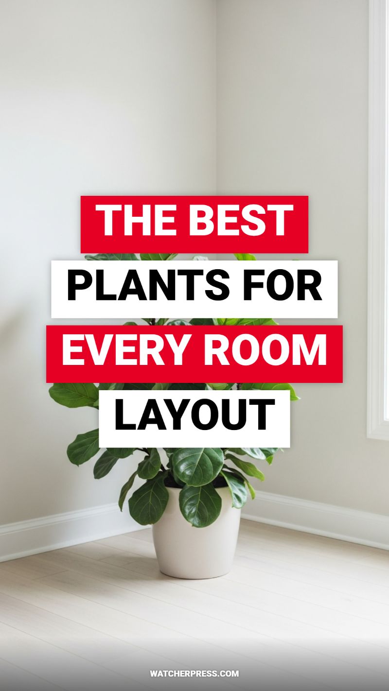
Incorporating living greenery is one of the quickest and most cost-effective ways to instantly elevate a space, making it feel layered, intentional, and expensive. The key to successfully utilizing plants as a high-end decor hack lies in maximizing scale and choosing the right architectural varieties. As seen in the visual, a single, large-leaf plant—such as a Fiddle Leaf Fig or a Rubber Tree—placed strategically in a forgotten corner instantly transforms bare architecture into a curated vignette. This strategy addresses the empty wall syndrome often found in budget decorating and makes the room feel warmer and more complex. To achieve this high-impact look without the high price tag, focus on acquiring robust, healthy plants and giving them room to breathe. Avoid cluttering surfaces with many small pots; instead, invest in one or two large statement pieces that draw the eye up and anchor the room.
Beyond the foliage itself, the vessel holding the plant is paramount to conveying a sense of luxury. A cheap plastic nursery pot, no matter how beautiful the plant, will immediately detract from the expensive aesthetic. Always transplant your statement greenery into heavy, matte ceramic pots, woven baskets, or simple white concrete planters, as these materials signal quality and texture. If your budget is tight, buy plain terra cotta pots and paint them a soft, uniform color (like the clean white shown here) or look for discounted oversized pots at flea markets. Furthermore, ensure the plant variety suits your specific room layout and lighting conditions. For instance, high ceilings demand tall, upright plants (like Bird of Paradise), while low-light areas benefit from architectural heroes like Snake Plants or ZZ Plants. If you must use faux plants for a specific layout, invest in high-quality varieties that lack the glossy sheen of cheaper versions, and crucially, remember to dust them regularly.
To perfect the designer look, always consider how the plant interacts with the vertical space and surrounding furniture. Using a simple plant stand or elevating the pot slightly (perhaps with a hidden stack of books or wood blocks) adds crucial height and dynamism, preventing the greenery from looking squat or lost on the floor. Pay close attention to plant health; drooping, brown, or yellowing leaves instantly break the illusion of an expensive, well-maintained home. If your room is minimalist, use the plant to soften harsh lines, placing it right into a corner to organically break up the 90-degree angle. This use of organic form against clean, modern lines is a hallmark of high-end design, effortlessly adding life and complexity without having to buy expensive art or furniture.
THE EASIEST WAY TO STYLE OPEN SHELVES
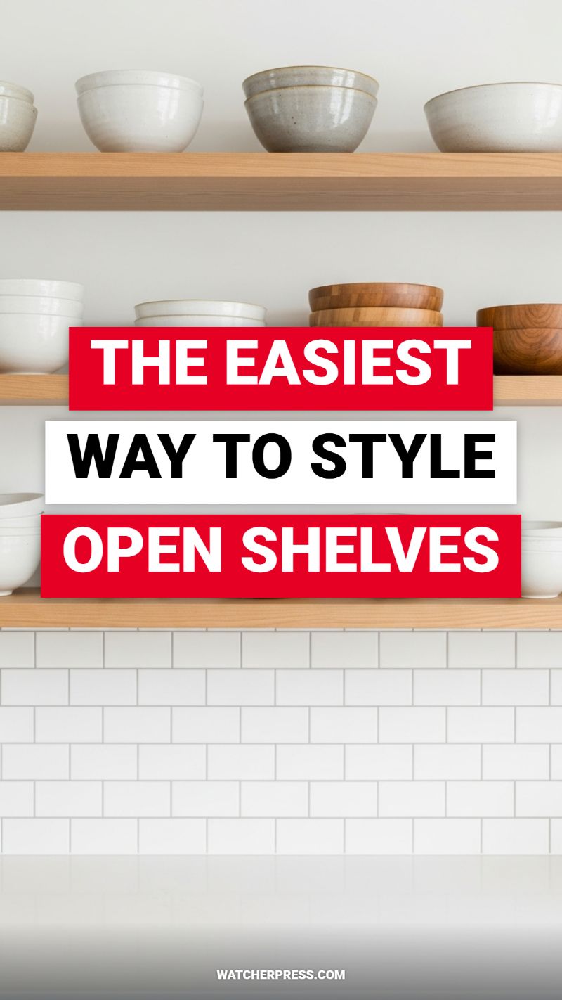
Open shelving instantly modernizes a kitchen or living area, but executing the look poorly can quickly shift the aesthetic from bespoke and curated to cluttered and chaotic. The secret to making basic, functional items look expensive is embracing a monochromatic or natural color palette and focusing heavily on texture and asymmetry. As seen in this example, the display relies on ceramics, matte white glazes, soft grays, and natural wood tones. By restricting your color choices, you force the eye to appreciate the subtle differences in material and shape, giving even budget-friendly items the appearance of being collected and carefully considered pieces of art. Always shop for duplicates of bowls and plates in the same neutral family; this uniformity is the foundation of the high-end open shelf display.
To apply this look practically, begin by mastering the art of grouping. Avoid placing single items in isolation; instead, display them in clusters of odd numbers (the designer-favorite Rule of Three or Five) or in neat stacks of two or more. Notice how the bowls are stacked high on the left but grouped loosely on the right, providing crucial visual variation and height. Intermix the materials: place a warm stack of wooden bowls next to a set of cool, rough-textured ceramic ones. This contrast prevents the display from looking flat or repetitive. Importantly, open shelving is a budget hack because it forces you to use the dishware you already own. Only display items you genuinely use regularly, which ensures the shelves remain functional and prevents them from becoming a graveyard for unnecessary knick-knacks.
Finally, remember that the backdrop is as important as the items themselves. A clean, tiled backsplash (like the timeless white subway tile shown here) or a freshly painted wall provides a crisp canvas that makes the displayed texture pop. If you are choosing shelving material, natural light wood or rich dark wood always looks inherently more expensive than heavily painted or laminate options. This style technique is affordable because it doesn’t require purchasing expensive art or artifacts; it utilizes simple, uniform organizational principles applied to everyday kitchen items, achieving an elevated look through mindful placement and material consistency.
WHY EVERYONE IS OBSESSED WITH JAPANDI STYLE

Japandi is the definitive fusion of Japanese rustic minimalism (Wabi-Sabi) and Scandinavian functionality and coziness (Hygge). This style is universally celebrated because it instantly creates a serene, sophisticated environment that manages to look incredibly expensive, yet fundamentally relies on simple, natural elements rather than elaborate, costly ornamentation. The core principle involves focusing on intentionality and natural, quality materials—like light-toned woods, neutral palettes (whites, creams, soft grays, and black accents), and clean, uncluttered spaces. By prioritizing utility and beauty in tandem, you achieve a balanced aesthetic that feels warm, organic, and effortlessly luxurious, making it the perfect foundational style to elevate your home décor quickly.
The Japandi philosophy is inherently budget-friendly because it embodies the powerful mantra of “less is more.” To execute this hack affordably, the very first step is a radical decluttering session, adopting the Japanese concept of *Ma*, which is the respectful appreciation of empty space. Removing superfluous items instantly saves money and allows your remaining, carefully chosen pieces to look more significant and curated. For structural elements, avoid expensive, heavily treated materials; instead, opt for light-toned, raw wood finishes, which can often be achieved by lightly sanding and oiling affordable furniture pieces or cleverly utilizing IKEA hacks. This focus on natural finishes gives the room a high-end, bespoke feel without the associated investment in custom-made pieces.
To bring the Japandi look to life, focus on grounding the space with visual weightlessness and organic textures, much like the light wood floors and neutral fabrics depicted in the image. Choose low-slung furniture with simple, architectural lines—a direct nod to traditional Japanese design which keeps the space feeling open and airy. Instead of expensive framed prints, use nature as your affordable decor: a simple ceramic vase holding a few sprigs of dried pampas grass or branches. Invest in a few high-impact, natural textiles to introduce the Scandinavian cozy factor (Hygge), such as a chunky knit throw or a linen duvet. Finally, ensure lighting is soft and diffused; affordable paper lanterns or minimalist, matte-black pendant lights work perfectly to enhance the tranquility of the space. By adhering to a strict neutral color scheme and prioritizing light, space, and functionality, you transform your home into a tranquil sanctuary that boasts high design appeal without the prohibitive price tag.
BEDROOM MAKEOVER ON A TINY BUDGET
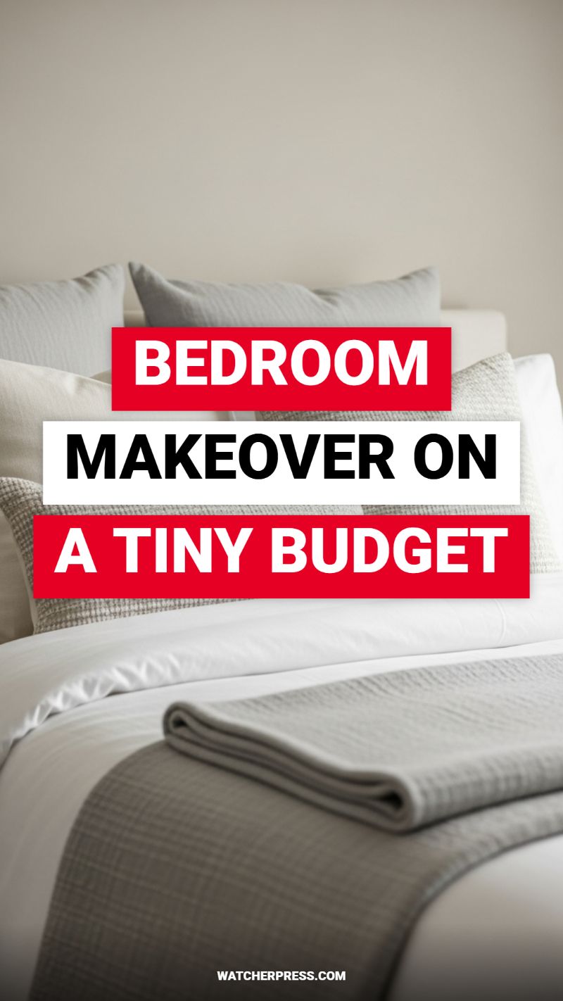
The secret to making a budget bedroom look like a high-end retreat lies in the sophisticated use of layered textiles and a strict monochromatic color palette, as showcased in this image. To replicate this look without spending a fortune, prioritize crisp white cotton duvet covers and sheets. White instantly elevates a space, reflecting light and giving the illusion of cleanliness and luxury—even if your current bedding is a sale rack find. Supplement the white foundation with accent pieces in varying shades of one neutral color, such as the taupe-gray seen here. Focus on texture (waffles, knits, or linen blends) rather than relying on expensive materials like silk or cashmere. A textural gray throw blanket, folded neatly across the foot of the bed, adds visual weight and complexity, mimicking the meticulous styling found in boutique hotels. Seek out inexpensive woven throws or blankets during seasonal clearances; their texture provides the depth and contrast necessary to make flat, solid colors visually engaging.
Achieving a high-end aesthetic is less about the cost of the items and more about the precision of their presentation. The core instructional hack here is structure. Start by ensuring your bedding is tailored; invest in a steam iron to give your duvet and pillowcases a sharp, starched finish, eliminating wrinkles that instantly signal a low-effort room. When layering pillows, utilize the rule of diminishing size and proportion to create visual height. Begin with two large Euro shams (often budget-friendly foam inserts work fine when covered in quality fabric) placed against the headboard, followed by your standard sleeping pillows, and topped off with one or two smaller decorative lumbar pillows in a contrasting texture. This structured arrangement disguises potentially less-attractive bed frames and creates a substantial, plush focal point. The final touch is the neatly folded throw blanket; this intentional folding technique requires minimal effort but broadcasts an immediate sense of luxurious attention to detail.
Finally, integrate the surrounding context—the walls and lighting—as part of your budget makeover strategy. Paint is arguably the most powerful budget hack available. Choose a soft, muted neutral (a greige, beige, or warm white) with a matte finish, which absorbs light beautifully and lends an architectural solidity often associated with expensive design, as opposed to cheaper, reflective glossy finishes. Avoid complex patterns on the wall or bedding, as simplicity maximizes the impact of the layered textiles. Simultaneously, commit to rigorous decluttering. Even the most perfectly styled bed will look diminished if surrounded by visible clutter, overflowing surfaces, or tangled cords. An uncluttered environment is the ultimate luxury, providing a restful sanctuary that suggests intentionality and refined taste, regardless of how much you spent on the actual components.
BEFORE YOU BUY FURNITURE, READ THIS
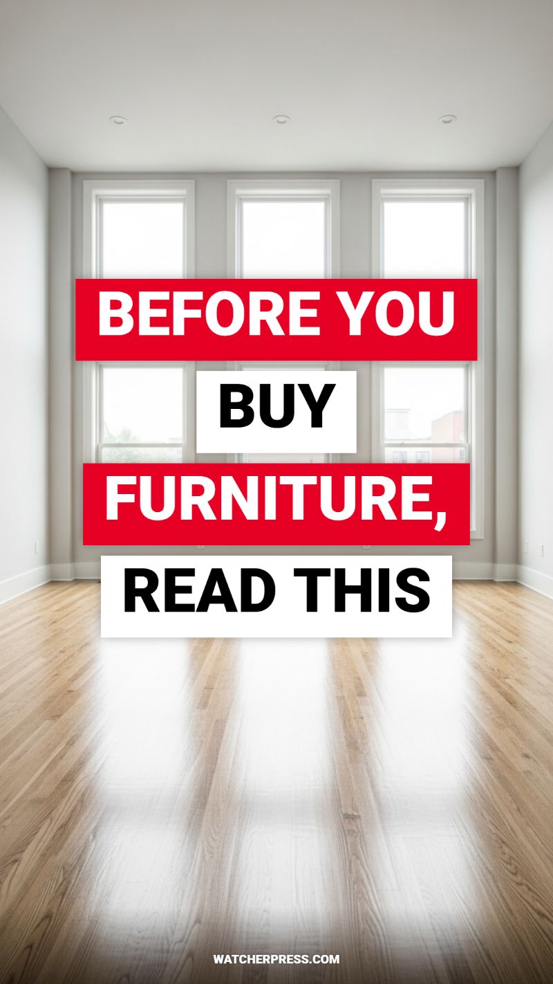
The single most effective budget hack for achieving an expensive aesthetic is rigorous planning before any purchase is made. Looking at this empty, sun-drenched space, the possibilities are endless, but without a clear strategy, it’s easy to fall prey to impulse buys that clash, overcrowd, or simply don’t fit your space, leading to costly returns or the need for expensive replacements later. Before browsing any showroom, grab a measuring tape and draw a detailed floor plan, ideally to scale. Pay close attention to wall lengths, window placements, and, crucially, the distance between outlets and doors. Understanding scale is paramount for an elevated look; a common mistake is purchasing pieces that are too small for large rooms or, conversely, oversized sectionals that swallow up compact living areas. By mapping out where anchor pieces (like sofas, dining tables, or beds) will sit and leaving appropriate negative space—the ‘breathing room’ required for flow and visual balance—you ensure that when furniture arrives, it looks intentional, bespoke, and perfectly proportioned, which are hallmarks of high-end design.
Once your floor plan is complete, shift your focus to defining your design vision through a detailed mood board. The costly look of luxury comes from cohesion, not price tags. This process involves selecting a cohesive color palette, defining your preferred textures (metals, woods, fabrics), and identifying the specific style you wish to achieve (e.g., Mid-Century Modern, Japandi, Minimalist). Crucially, this planning phase allows you to categorize your spending. Prioritize investing the majority of your budget in high-impact anchor pieces that require durability or comfort, such as a well-made sofa frame or a quality mattress, while utilizing budget-friendly alternatives for secondary items like side tables, decorative lighting, or storage solutions. By adhering strictly to the aesthetic parameters established in your mood board, you avoid wasting money on sale items or trends that don’t align with your overall vision, ensuring every purchase contributes meaningfully to the desired luxurious outcome.
Finally, take inspiration from the visual elements of this image, where light plays a central role. Notice how the three large windows and the reflective polished hardwood floor instantly make the space feel grand and airy—a sophisticated, expensive look achieved without purchasing any furniture. Your budget planning must extend beyond physical items and account for how natural and artificial light will interact with your space. Strategically incorporating reflective elements, such as large mirrors (which can be found affordably at thrift stores), polished metals, or glass surfaces, maximizes the light you have, making rooms feel larger and brighter. Furthermore, plan your lighting layers (ambient, task, and accent) early on, budgeting for fixtures that mimic high-end materials without the steep price. Simple, structural pendant lights or sleek floor lamps, positioned according to your pre-planned layout, can dramatically elevate the ambiance and functionality of the room, proving that smart design choices, made before opening your wallet, are the most effective path to affordable luxury.
3 THINGS THAT RUIN YOUR HOME’S FLOW

The open-concept layout depicted in this image achieves its high-end, airy aesthetic almost entirely through impeccable spatial flow. Flow is the invisible architecture of your home, and optimizing it is the single most effective, zero-cost budget hack available. When rooms flow seamlessly, they appear larger, brighter, and significantly more expensive than fragmented, cluttered spaces. The three primary culprits that destroy this critical element are: incorrect furniture scaling, obstructed pathways, and inconsistent visual cues. To begin your audit, walk through your space as if you were a guest seeing it for the first time, noting any point where you must detour, squeeze past a piece of furniture, or stop the eye due to visual clutter.
Achieving true flow requires you to prioritize clear traffic patterns above all else. Examine how people naturally move from one functional zone to the next—for instance, the transition from the kitchen island to the living room seating area. Any item that creates a bottleneck or blocks a clear sightline is a flow killer that instantly shrinks the room’s perceived value. Ensure primary thoroughfares maintain a minimum width of 36 to 48 inches. A common design flaw is pushing all furniture against the walls; while this can maximize floor space, it often ignores the need for clear egress and makes the room feel sterile. Instead, float sofas and chairs slightly away from the perimeter to define conversation zones, but always respect the necessary pathway behind them. Use large area rugs to subtly define zones in an open area, maintaining a neutral color palette across these rugs to foster visual continuity.
Beyond physical obstacles, visual inconsistency severely hinders flow. To successfully mimic the streamlined, sophisticated look of this image, focus on cohesive material application. In open-plan designs, inconsistent flooring is one of the quickest ways to visually fragment the space. If possible, use the same or highly similar flooring material throughout the interconnected areas (like the continuous light wood planks seen here) to ensure the eye travels smoothly. If replacing flooring is outside your budget, employ large, minimal area rugs that cover most of the floor within their respective zones. Furthermore, unify your lighting scheme. A mismatch of fixture styles, metal finishes, or temperature (warm vs. cool bulbs) can abruptly halt the visual rhythm. Opt for a unified aesthetic—for instance, sticking to black matte fixtures in both the dining area and the living space—to create a balanced, expensive look that guides the viewer through the entire home.
TRENDING OUTDOOR DECOR IDEAS FOR SUMMER
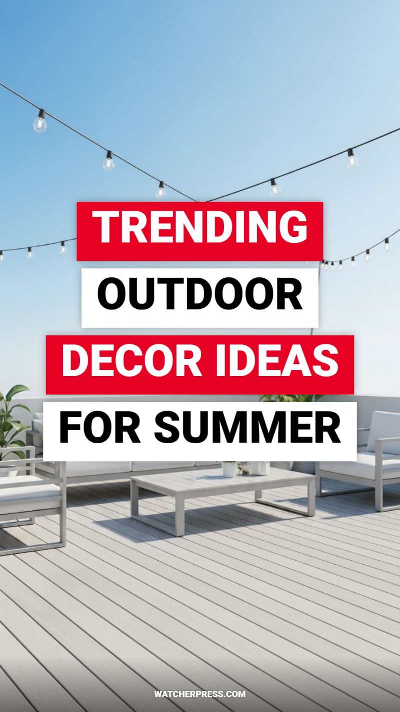
Achieving a luxurious outdoor living space, often associated with high-end resorts, doesn’t require a massive budget, but rather careful selection and strategic placement of elements. The foundation of this expensive look, as demonstrated in the image, is a strict commitment to a monochromatic, minimalist palette. To replicate this, select outdoor furniture with clean, modern lines—think square frames and flat surfaces. Opting for light neutrals (whites, creams, and pale grays) instantly elevates the perceived quality of the materials, making even budget-friendly aluminum or plastic composite pieces appear bespoke. The key hack here is uniformity: ensure all seating, cushions, and coffee tables share the same color family and a similar texture. If you are refurbishing existing wooden or metal furniture, sand and apply a high-quality exterior paint in a crisp white or pale dove gray to instantly unify the set and mask material inconsistencies, achieving a cohesive, curated aesthetic.
The most significant yet affordable architectural hack visible in high-end outdoor design is the implementation of strategic lighting, specifically large-scale bistro or cafe string lights. Instead of simply draping lights along a railing, treat them as an overhead canopy or
MAKE YOUR BATHROOM LOOK LIKE A SPA
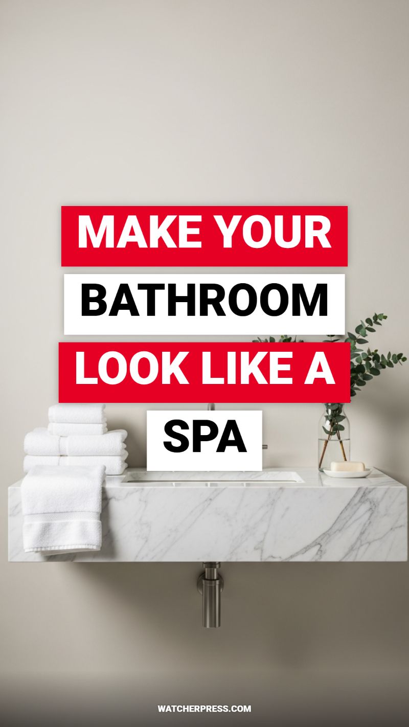
The secret to achieving an expensive, spa-like bathroom aesthetic on a budget lies in cultivating deliberate minimalism and focusing on premium textures. Start with a radical decluttering session, removing all non-essential items from your countertop to mimic the clean lines of luxury hotels. Embrace a serene, neutral color palette—think crisp whites, soft grays, and natural beige tones—which instantly reads as calming and high-end. To replicate the visual impact of the marble vanity seen in the photo without the hefty price tag, consider applying architectural contact paper or vinyl film designed with a realistic Carrara marble pattern to an existing flat countertop. This DIY hack is transformative and dramatically updates the material presence of your space. Finish the foundational layer by ensuring all surfaces are spotless and polished; cleanliness is the cheapest luxury upgrade available.
Next, elevate your textile game. The image clearly demonstrates the power of pristine, fluffy white towels. Invest in a dedicated set of matching, plush white towels (often available affordably in bulk at discount stores) and commit to stacking them neatly, perhaps on an open shelf or directly on the counter. This visual consistency is paramount to the spa illusion. Beyond linens, tackle organization to maintain the clean look. Decant everyday products like mouthwash, cotton balls, and hand soap into matching glass bottles or ceramic dispensers. Use woven baskets or small, elegant trays (look for inexpensive metallic or bamboo options) to group functional items, hiding visual chaos while adding textural warmth. Removing branded labels from sight is a tiny step that yields a huge aesthetic payoff in creating a bespoke environment.
Finally, appeal to the senses with organic touches and soothing scents—the hallmarks of an actual spa. Introduce natural greenery, such as a simple glass vase holding fresh eucalyptus branches, which is budget-friendly, visually striking, and offers a wonderful, therapeutic scent. Alternatively, place a small potted succulent or fern on the counter for a low-maintenance organic element. The lighting must also be addressed; swap out harsh, cool-toned bulbs for warm, soft white LED lighting (around 2700K) to cast a flattering, relaxing glow. Complete the transformation with an aromatherapy diffuser or a high-quality scented candle with notes like lavender, sandalwood, or marine air. By focusing on consistent colors, luxurious-looking organization, and sensory details, you turn your standard bathroom into a sanctuary that feels priceless.
ULTIMATE GUIDE TO CHOOSING THE RIGHT RUG
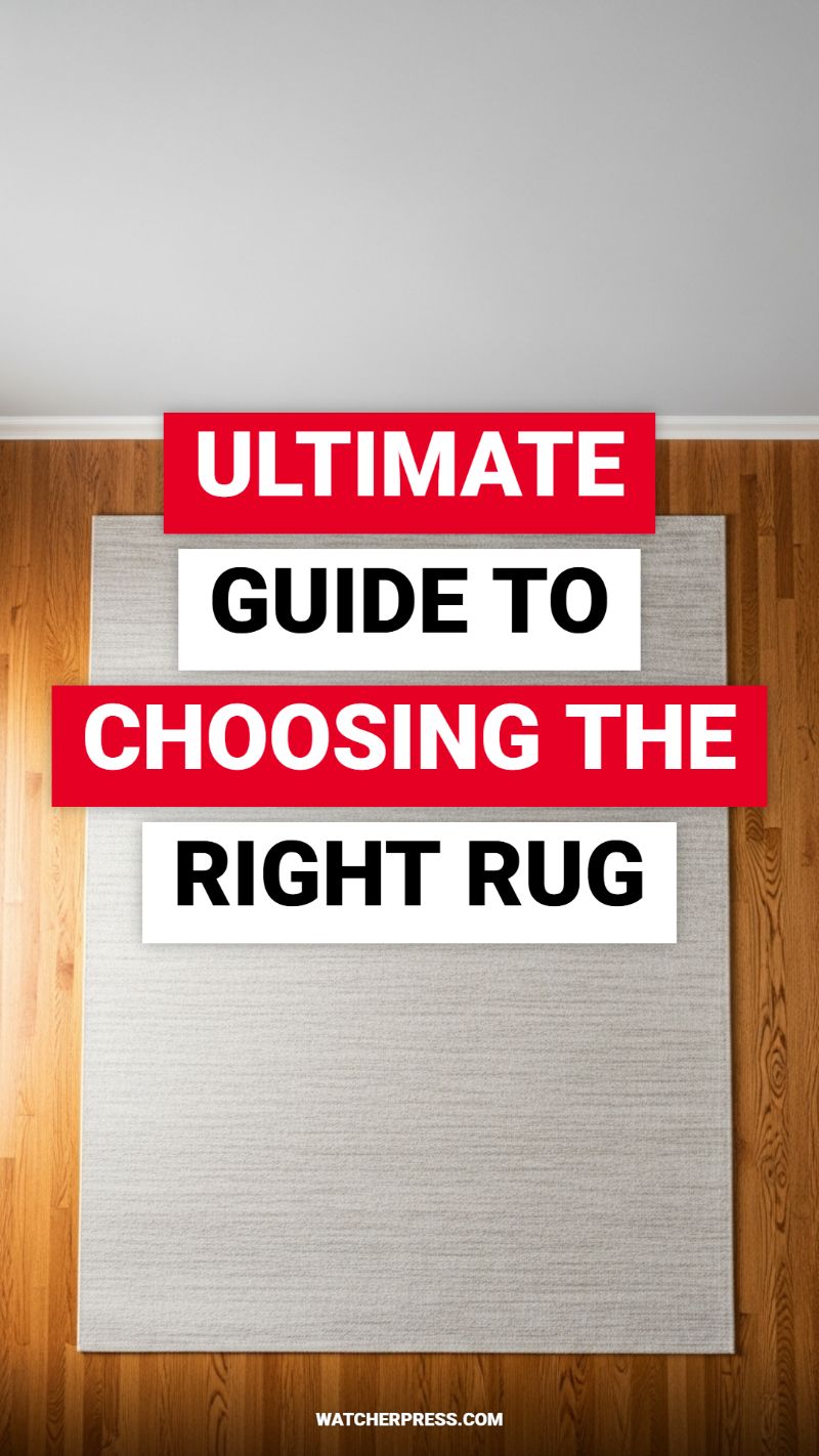
The single most common mistake in decorating is choosing a rug that is too small—and nothing screams “budget” louder than a floating area rug barely large enough for a coffee table. To instantly elevate your home and make a budget piece look expensive, you must focus on scale. A large rug serves as the luxurious anchor of a room, defining the zone and grounding your furniture arrangement, which is key to high-end design. As a rule of thumb, ensure that at minimum, the front legs of all major seating pieces (sofas, armchairs) rest comfortably on the rug. If you are decorating a dining room, the rug must be large enough so that when chairs are pulled out, all four legs remain on the rug surface. Investing in the largest size your budget allows will dramatically increase the perceived value and sophistication of the entire space, giving the illusion of custom design and expansive proportions.
Once size is determined, the material and texture become your next crucial decision for achieving that expensive look on a dime. The visual elements of texture can drastically enhance a rug’s perceived quality. Avoid thin, shiny, obviously synthetic materials. Instead, seek out subtle texture—like a tightly woven jute, a low-profile natural fiber blend, or a thick, soft synthetic that mimics wool or cotton (like the light, textured neutral gray pictured). Neutral colors, such as cream, oatmeal, light gray, or subdued earth tones, often read as more sophisticated and expensive than overly bright or trendy patterns, offering a canvas that allows your higher-end accent pieces to shine. When selecting patterns, opt for subtle, tone-on-tone designs or classic geometrics rather than loud, busy prints, ensuring the floor treatment contributes to a sense of calm elegance rather than visual clutter.
Finally, the secret weapon for making any budget rug feel like a high-end investment is the quality rug pad. A good rug pad, though unseen, is essential; it not only prevents dangerous slipping and protects your underlying hardwood, but it adds crucial cushioning and density to the rug itself. A thin, inexpensive rug instantly feels thicker, softer, and far more luxurious underfoot when paired with a dense felt or rubberized pad. This simple addition drastically improves the tactile experience, elevating the room’s comfort factor and ensuring the rug lies perfectly flat, preventing the edges from curling—a hallmark of poorly laid, cheap floor coverings. By focusing on proper scale, choosing sophisticated textures, and utilizing a high-quality pad, your inexpensive rug will perform and look exactly like a bespoke piece, instantly elevating your entire decor scheme.
You Need This Storage Solution Now
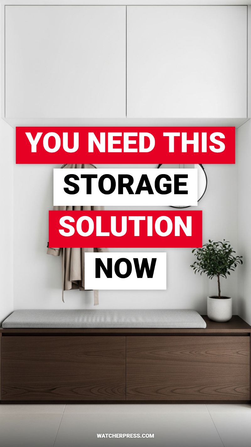
The secret to making any entryway or hallway look dramatically more expensive is to incorporate storage that mimics custom, built-in millwork. This look, often costing thousands, can be achieved on a budget using standard stock cabinets and strategic placement. To replicate the streamlined upper storage visible in the image, invest in simple, handle-less wall cabinets (often available at major home improvement stores or budget retailers like IKEA) and mount them flush against the ceiling. The key is painting the cabinets and the surrounding wall the exact same crisp white color. This trick visually eliminates the seam between the wall and the cabinet, creating the illusion that the storage is an architectural feature rather than a separate piece of furniture. Aim for doors that are completely flat and sleek—any visible hardware or detailing will immediately detract from the high-end, contemporary aesthetic. This seamless vertical storage maximizes hidden utility while providing a clean, uncluttered canvas.
The lower dark wood storage bench is the grounding element that adds contrast and richness, elevating the entire setup. If purchasing a solid wood storage bench is out of budget, hack a standard low cabinet or chest of drawers. For an instant luxurious upgrade, apply a high-quality, adhesive dark walnut or espresso wood grain contact paper to the exterior. This simple application mimics the look of expensive veneer seen in custom furniture. Crucially, ensure the base sits directly on the floor without exposed legs or feet; this ‘plinth base’ effect gives the unit visual weight and solidity, making it read as high-end custom storage. Top the bench with a simple, tailored cushion—a custom look achievable by purchasing a thick foam pad and wrapping it in a durable, sophisticated fabric like light grey linen or performance velvet. The combination of high-contrast white and dark wood textures is a hallmark of premium interior design.
To ensure this space feels intentionally designed and not just functional, styling must be controlled and minimalist. Notice the intentional placement of the elements: the simple piece of clothing hanging (a stylish trench coat acts as soft decor), the small, round geometric mirror (partially visible), and the pop of green from the potted miniature tree. These elements add life and texture without introducing clutter. For your own space, utilize sleek wall hooks rather than bulky coat racks, and limit the accessories to one or two high-impact pieces. The overall objective is to keep surfaces clear. By combining the ceiling-height, seamless white cabinets with the rich, grounded look of the dark wood bench, you create an entryway that feels tailored, spacious, and far more expensive than its budget origins suggest.
BUDGET DECOR HACKS THAT LOOK EXPENSIVE

The most immediate way to make an inexpensive object appear high-end is through elevated presentation, often achieved by adopting a gallery aesthetic. This involves giving the item deliberate visual isolation. If you have a budget vase or piece of pottery (like the simple, elegant terracotta bowl shown in the visual), don’t bury it amidst clutter. Instead, place it centrally on a clear, clean surface—a minimalist white block, a simple stack of coffee-table books, or a dedicated floating shelf. This ‘pedestal effect’ signals that the object is important and worthy of study, dramatically increasing its perceived value regardless of the price tag. Crucially, always ensure the surrounding area is pristine and uncluttered; utilizing negative space is a luxury design tool that draws the eye and highlights the object’s form and texture, turning a cheap item into a focal piece.
Budget items often reveal their cost through poor finishes or flimsy materials. To combat this, focus on simple yet impactful material hacks. For textiles, prioritize weight and natural texture (such as heavy linen or thick cotton) over thin synthetics. For decorative objects, look specifically for matte finishes over high gloss, as matte textures absorb light and tend to look richer and more sophisticated. This works particularly well for paint, metals, and ceramics. If an item is plastic or has an undesirable coating, consider spray painting it with a textured finish—like rubbed bronze or matte black—or a faux stone coating to instantly mask its origin. Simple shapes, heavy construction, and tactile surfaces, like the unglazed, speckled finish on the bowl in the image, always read as more artisanal and expensive than overtly ornate, shiny pieces.
High-end interior design relies heavily on strategic lighting to create mood and emphasize focal points. You can apply this hack to your budget decor by investing in low-cost accent lighting. Use small, hidden LED strip lights to illuminate the back of a shelf holding your collection, or install a simple puck light directly above a displayed item, mimicking museum spotlighting. Good lighting doesn’t just make an object visible; it enhances its texture, depth, and casts dramatic, defining shadows that add visual weight. Furthermore, consider scale. Rather than scattering many small, inexpensive pieces, group them to form a cohesive, substantial arrangement, or opt for one single oversized item (like a thrifted large mirror or a striking piece of abstract canvas art) that commands attention and visually anchors the space, providing instant, expensive impact on a modest budget.
TRANSFORM YOUR HOME WITH THESE 3 COLORS

The secret to a high-end aesthetic is often restraint. Instead of overwhelming your space with many colors, professional designers rely on a powerful, limited palette, often adhering to the classic 60-30-10 rule, or focusing intently on a core three as the image suggests. Strategic color application is arguably the most effective budget hack in the decorator’s arsenal, instantly redefining spatial perception and mood without requiring structural changes or expensive furniture. The visual contrast seen in the image—bold text against high-contrast backgrounds—is a metaphor for the dramatic impact a deliberate three-color scheme can have on interior spaces. To apply this hack, first define your core neutral (60%). This base color should be light, sophisticated, and airy (like off-white, warm beige, or light greige). Using this base color consistently throughout your main living spaces makes the entire room feel larger, more seamless, and instantly more intentional and luxurious.
Next, select the two complementary colors (30% and 10%) that will inject personality and necessary depth. The 30% color should be a grounding mid-tone, perhaps a deep charcoal, dusty rose, or rich forest green, used strategically on an accent wall, large area rug, or significant pieces of upholstery. This color provides a sophisticated contrast, making the room feel anchored and tailored. The final 10% is your luxury accent color—the smallest touch that provides a dazzling focal point. For a truly expensive look on a budget, choose materials over paint: think of incorporating metallic finishes (like antique brass, which reflects light and adds warmth), or a vibrant, jewel-toned color (e.g., emerald or sapphire) applied through small, high-impact accessories like throw pillows, table lamps, or framed art. The key to making these colors look expensive is texture and consistency; ensure the 10% accent is repeated minimally across the room to create a unified, layered aesthetic that speaks of meticulous design planning.
Implementing this transformative color hack on a strict budget requires disciplined shopping and DIY focus. Purchase only high-quality paint samples for the 10% accent color if you’re experimenting, or dedicate the bulk of your paint budget to the 60% neutral base, as this requires the most coverage. For the 30% grounding color, instead of painting an entire wall, consider painting only the ceiling, the trim, or the interior of a thrifted piece of furniture (like a bookcase or cabinet) to create a custom focal piece that looks professionally designed. Crucially, utilize textiles and second-hand items for color infusion. A luxurious velvet throw or custom-dyed linen curtains can introduce the necessary color dimension without the high cost of purchasing brand-new, designer-labeled items. By limiting your palette to just three carefully chosen colors, you simplify your purchasing decisions and ensure every item contributes meaningfully to a unified, elevated, and budget-savvy environment.
7 QUICK DIY PROJECTS FOR UNDER $50
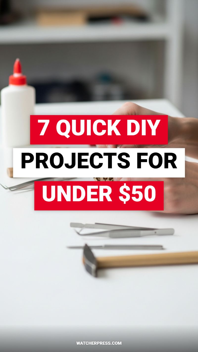
The secret to achieving designer-level decor without the hefty price tag lies in strategic, quick DIY enhancements, proving that luxury is often in the details, not the dollar amount. These seven projects are specifically curated to fall under a $50 budget, focusing on high-impact transformations utilizing basic craft supplies and precision tools, much like the adhesive and fine instruments visible in the image. To elevate standard items, we focus on material upgrades and meticulous finishing. For instance, transforming basic thrifted ceramics or dollar-store glass into high-end objects can be achieved by applying specialized finishes—think textured stone spray paint or a faux patina achieved with a chemical treatment. Always begin by thoroughly cleaning and prepping the surface, using light sandpaper (120-220 grit) if necessary to ensure optimal adhesion. This prep work is crucial; skipping it is the most common mistake that makes a DIY project look cheap and unprofessional.
One of the most effective budget hacks is elevating standard hardware and accessories. Consider replacing generic plastic components or standard chrome handles with customized finishes. For cabinet pulls or small accent items, utilize high-quality specialty paints like matte black, antique brass, or bronze. The key to a professional, expensive-looking application is layering. Apply a thin coat of metal primer, followed by two to three thin, even coats of your chosen finish, allowing ample drying time between each. For smaller elements, like tiny decorative nails or embellishments, the precise handling provided by tools like tweezers (as seen laid out on the table) becomes invaluable for ensuring perfect alignment and placement. If working with wood, incorporating simple trim pieces (like picture frame molding) to plain walls or furniture edges—secured precisely with adhesive and potentially a small, controlled tap from a hobby hammer—can instantly create the look of custom millwork, keeping the total cost well within the $50 range, leaving enough budget for the base material and supplies.
Finally, concentrate on quality control and presentation to solidify the expensive aesthetic. A successful budget hack looks intentional, not makeshift. After the finish is dry, consider adding subtle touches that indicate quality—for example, attaching small felt furniture pads to the bottoms of DIY bookends or vases to protect surfaces. This small step conveys attention to detail typically found only in high-end retail pieces. When budgeting your $50, allocate funds first to the finishing material (specialized paint, high-quality adhesive, gold leaf) and secondarily to the base item, as the transformation relies heavily on the quality of the topcoat. By approaching these quick projects with precision and an emphasis on a flawless finish, you can achieve a sophisticated, elevated look that instantly integrates with and elevates the rest of your home decor, making these DIY items practically indistinguishable from store-bought luxury goods.
Harnessing Vertical Space: The Integrated, Floor-to-Ceiling Look
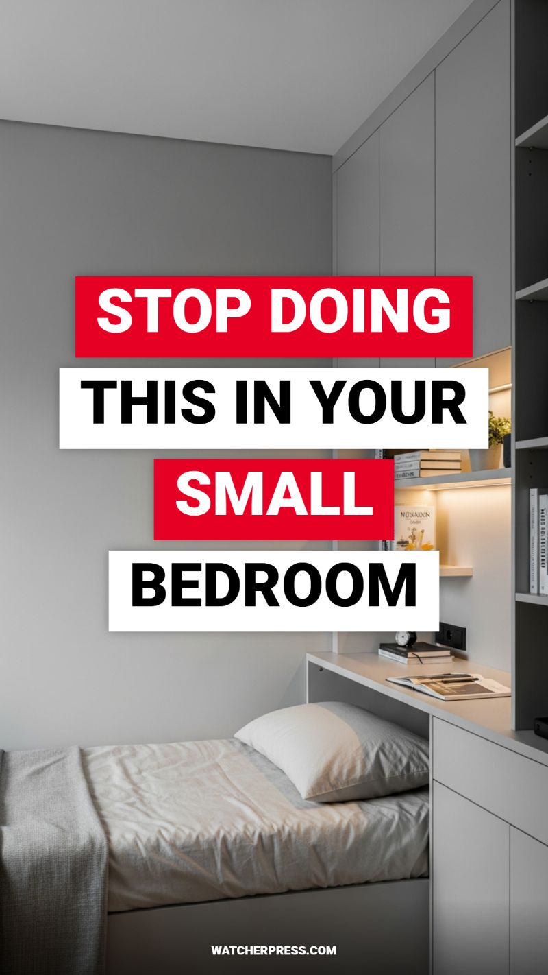
One of the most common mistakes in small bedroom decor is relying on stand-alone, mismatched furniture pieces that chop up the visual space. To make a tight area feel custom and expensive, you must shift your perspective to vertical maximization, treating the storage and bed system as one single architectural element. The ultimate budget hack for achieving this bespoke look, as demonstrated in the image, involves creating a seamless, monochromatic wall unit that extends from floor to ceiling. This unified system tricks the eye into believing the room is larger and the ceilings are higher, immediately elevating the aesthetics from standard to tailored. To replicate this, choose a flat-front, minimalist cabinet design (stock kitchen cabinets often work well for this hack) and paint all units, including the walls surrounding them, in the exact same shade of light gray or white. This consistency is crucial; the uniformity ensures the cabinets recede and feel like intentional built-in features rather than bulky additions.
The implementation of this integrated system is focused on maximizing function without sacrificing flow. Note how the bed is tucked neatly into a custom-fitted alcove, and the surrounding cabinetry—serving as the closet, shelving, and even a compact desk—envelopes the space. If purchasing actual built-ins is outside your budget, measure your space meticulously and use modular furniture systems (like IKEA’s PAX or similar customizable frameworks). The key professional step is disguising the gaps and seams where the units meet the ceiling and walls. Use simple wood trim or inexpensive crown molding, painted to match the rest of the unit, to bridge these awkward gaps. This small addition transforms off-the-shelf components into a structure that looks like it was designed by an architect, providing ample storage crucial for keeping a small bedroom perpetually clutter-free—the defining feature of luxury design.
Finally, the secret weapon to making these built-ins look truly high-end is integrated lighting. While the structure itself is monochromatic and simple, the addition of warm, subtle illumination adds depth and texture, instantly elevating the materials used. Install inexpensive LED strip lighting beneath shelves and along the back edges of the open niches. This serves two functions: it provides necessary task lighting for the integrated desk area and creates an ambient glow that highlights curated decorative elements (like books or a small plant), making them feel like gallery displays. Opt for warm white light (around 2700K) to ensure the space feels inviting and luxurious, rather than sterile. By focusing on streamlined storage, monochromatic continuity, and strategic accent lighting, you execute a budget hack that delivers the clean, sophisticated style of high-end custom millwork.
Unlocking the Cozy Aesthetic: Must-Have Items

The secret to making any room feel instantly more luxurious, regardless of your budget, lies in mastering texture layering—a technique perfectly encapsulated by the ‘cozy aesthetic’ shown here. This look focuses on creating sensory depth, ensuring the space feels both soft to the touch and visually rich. To replicate this high-end design, start with a base of neutral, high-contrast textiles. As depicted in the image, mix a chunky cable knit throw or pillow (which signifies craftsmanship and weight) with smooth linen or muslin pillows. The inclusion of a faux sheepskin or shag rug is a critical hack; these items cover less appealing flooring and immediately anchor the space, suggesting comfort and expense without the hefty price tag of a traditional area rug. When layering pillows, ensure variation in size and material, typically stacking lighter materials against a solid back wall or larger piece of furniture, allowing the textural elements to pop forward.
Strategic lighting is the second pillar of making budget decor look expensive, especially when pursuing a cozy aesthetic. Avoid harsh overhead fixtures, which flatten a space and eliminate all warmth. Instead, focus on creating pools of light using floor lamps, as demonstrated, or simple table lamps placed at mid-height. The key here is color temperature: opt for bulbs in the warm white range (2700K to 3000K), which cast a gentle, amber glow reminiscent of candlelight. This diffused light not only softens the textures of your layered textiles but also minimizes flaws in the room’s architecture or older furniture, instantly creating an inviting ambiance. Furthermore, utilize vertical space with simple floating shelves for minimalist ‘shelfscaping’—adding small, real or faux greenery provides necessary organic contrast against the neutral, monochromatic scheme, elevating the entire design without clutter.
This specific setup proves that even a neglected corner can become a high-impact design moment. To apply this hack, first, identify a corner that currently feels empty or awkward. Treat it as a miniature reading nook or relaxation station. Begin with the anchor (the faux fur rug) and lean a minimum of five different textured pillows against the wall, creating an intentional, deep seating arrangement on the floor. Crucially, introduce a single statement piece of lighting, like the adjustable floor lamp, ensuring it illuminates the layered textures directly. By focusing on deep textures, warm light, and minimal, naturalistic accessories, you transform standard store-bought items into a custom, Hygge-inspired environment that signals intentional design and instant, affordable luxury.
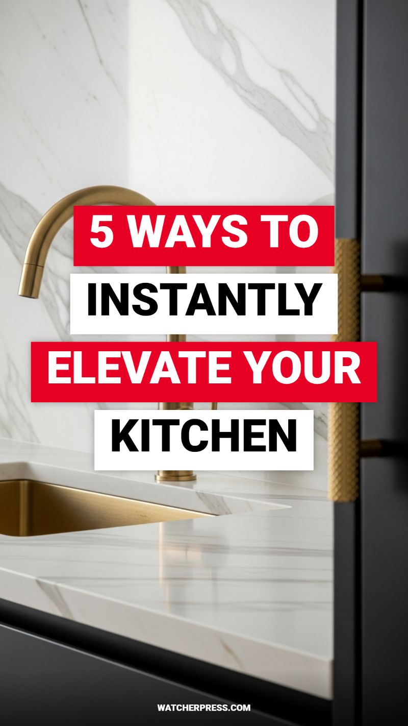
5 WAYS TO INSTANTLY ELEVATE YOUR KITCHEN
The fastest route to an expensive-looking kitchen is updating the visible metal accents. As seen in this stunning design, the choice of a warm, brushed gold or brass finish for the faucet and accompanying cabinet pulls creates immediate visual luxury, especially when contrasted with neutral backdrops. Faucets are focal points, so selecting a piece with clean, architectural lines in an artisanal finish—like the subtly textured handle shown—can transform a mundane sink area into a showpiece. While solid brass fixtures can be an investment, savvy shopping for high-quality plated zinc or even carefully executing a DIY spray paint job with a specialty metallic paint (always using a strong primer and topcoat) allows you to achieve this sophisticated look without the designer price tag. Consistency is key: ensure all metal elements, from the taps to the door hinges, share the same tone and sheen, providing a cohesive, curated aesthetic.
The secret to modern elegance often lies in dramatic contrast and material richness. This image perfectly illustrates the power of pairing light, veined marble (or a high-quality marble-look quartz or porcelain) with deep, matte cabinetry. The bright white backdrop with natural grey movement provides texture and sophistication, while the dark cabinets ground the space, making the gold accents pop. For a budget-friendly interpretation, consider using marble contact paper on existing flat cabinet doors or opting for large-format porcelain tiles on the backsplash instead of costly natural slabs. The trick is maintaining simplicity in the execution—avoid fussy trims or busy grout lines to mimic the monolithic, custom look of high-end design. This high-contrast pairing minimizes visual clutter and maximizes impact, which is the hallmark of luxury design.
True elevation comes from thoughtful, integrated details that suggest custom construction. Notice how the metallic finish isn’t limited to just the faucet; the sink basin itself carries the golden hue, creating a seamless, monochromatic look beneath the countertop. While replacing an entire sink might be outside the “budget hack” category, you can replicate this integrated effect by focusing on smooth transitions and minimal distraction. Ensure appliances are cabinet-depth, maintain handle-less designs where possible, and use under-cabinet or toe-kick LED strip lighting. This inexpensive addition highlights the texture of your materials (like the veining in the countertop) and provides warm ambient light, instantly giving the space the high-gloss, professional presentation usually reserved for multi-million dollar homes. Remember, it is the deliberate application of simple, premium-look details that sells the overall illusion of expense.
MAXIMALISM DONE RIGHT: A BEGINNER’S GUIDE

One of the most effective and affordable ways to achieve a high-impact, curated look is by embracing ‘organized maximalism,’ primarily through bookshelf styling. Instead of minimizing your possessions, leverage what you already own—especially books—to create dynamic visual zones. The key budget hack here is color-blocking. Start by removing every item from your shelves and sorting your books strictly by the color of their spines. Arrange them back onto the shelves in distinct color segments, moving smoothly through the spectrum (e.g., bright yellow transitioning into deep orange, then fiery red, followed by cool blues and greens). This intentional use of saturated color, especially against a simple backdrop like white floating shelves, instantly elevates the look from cluttered to gallery-worthy. If you encounter books with heavily damaged or distracting spines, simply turn them around so the pages face outward. This provides a neutral, textural break that further enhances the high-end feel of the display without requiring you to buy expensive matching covers.
To ensure this maximalist approach reads as sophisticated and not messy, you must master varying levels and textures. Mix up your stacking orientation: use vertical groupings for most of the books, but punctuate these segments with small horizontal stacks (no more than 3-5 books high). These horizontal stacks serve as pedestals for small, inexpensive decorative items. Look for budget-friendly accents such as ceramic succulents, small pieces of found art, or thrifted glassware. The image showcases the effectiveness of integrating small potted plants; trailing varieties like Pothos or small, sculptural houseplants provide necessary organic texture and softness against the hard lines of the books. When placing these accents, follow the rule of odds, grouping them in threes or fives, and ensure that the colors of the accessories complement the book segment they are placed within, unifying the entire display.
The overall success of this design hack lies in its perceived intentionality. While the materials used (old books, basic shelving, and inexpensive plants) are budget-friendly, the result feels bespoke because of the meticulous organization and bold use of color. Clean, simple floating shelves are essential here, as they minimize the visual weight of the structure itself, allowing the vibrant contents to shine. This technique transforms everyday items into primary decorative features, proving that style is about editing and arrangement, not expense. By treating your book collection as a deliberate color palette, you achieve a level of visual impact typically associated with high-end interior design magazines.