Discover 20 chic ways to instantly refresh your home decor. Learn how to use color pops, rich textures, and stylish accents to effortlessly transform any room from dull to dazzling.
Sculptural Vases: Mastering Triadic Contrast and Form Play
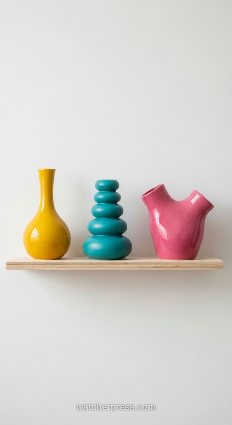
The image perfectly illustrates how three highly saturated objects, deployed against a neutral white canvas, can instantly transform a space from bland to brilliant. This approach utilizes the power of triadic color contrast—vibrant yellow, intense turquoise/teal, and rich fuchsia/pink—to create maximum visual tension and energy. The key instructional takeaway here is intentional isolation: placing high-impact color accents on a simple, unobtrusive surface (like this thin, light wooden shelf) ensures that the focus remains entirely on the art objects themselves. When selecting your colorful accents, don’t be afraid to push the saturation limit; the contrast between the vivid hues and the expansive white wall is what generates the dynamic “pop” effect, making the arrangement feel curated and modern rather than chaotic. This strategy leverages the objects’ inherent brightness to act as focal points, defining the space’s personality without requiring large furniture overhauls.
Achieving this level of chic contrast requires more than just color; it demands a sophisticated play on texture and form. Notice the deliberate juxtaposition of finishes: the yellow and pink vases boast a high-gloss, reflective sheen that catches light beautifully, while the central teal piece features a velvety, matte finish. This mix of finishes is crucial because it prevents the arrangement from appearing flat, adding tactile interest and depth even when viewed from a distance. Furthermore, the shapes are drastically different—a classic, elongated tear-drop; a modern, organic cairn of stacked pebbles; and a highly abstract, biomorphic form. When curating your own collection, follow this expert principle: aim for diversity in both texture (matte/glossy, smooth/rough) and shape (traditional/geometric/organic). This dynamic combination ensures that each object holds its own unique visual weight and story, instantly elevating the shelf from mere storage to a sculptural, gallery-like display.
To replicate this look successfully, start by defining the rhythm and flow of your arrangement. Here, the display is anchored by the two glossy, light-reflective pieces on the ends, with the textured matte piece acting as a stabilizing, calming center point. The slight difference in heights and widths across the trio prevents visual monotony, encouraging the eye to move gracefully across the composition. Expert styling tip: When using multiple colors and forms in a small vignette, maintain consistency in scale relative to the display area and ensure the background is completely stripped of competing textures or patterns. The minimalist, clean-lined backdrop is essential for making the grouping look like an intentional, powerful art installation rather than just scattered accessories, providing a refined method for injecting personality and contemporary flair into any room.
The Power of the Primary Pairing: High Saturation Meets Deep Texture
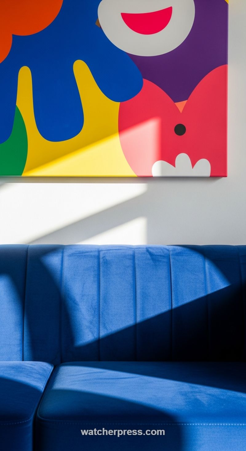
One of the most effective strategies for maximizing visual impact in a space is employing a stark juxtaposition of elements—specifically, pairing the high energy of saturated color blocking with the grounding luxury of deep texture. In this scheme, the abstract, primary-colored artwork serves as a dynamic focal point. The broad swaths of blue, yellow, red, and purple on the canvas introduce immediate playfulness and modern energy. When selecting such a piece, ensure the artwork’s scale is appropriate for the wall space, allowing it to hang several inches above the accompanying furniture to create a deliberate visual conversation. The white background of the wall and parts of the canvas act as necessary negative space, providing contrast that makes the colors almost vibrate. Expert advice: Look for artwork that uses organic, non-representational shapes, as these soften the overall geometry of the room while delivering maximum chromatic punch. This technique is especially effective in minimalist settings, transforming an otherwise neutral room into a vibrant, contemporary statement piece.
To balance the visual loudness of the canvas, anchor the composition with a piece of furniture rich in tactile texture and monochromatic depth. The choice of a deep royal blue velvet sofa is crucial here. Velvet, particularly in a jewel tone, absorbs and reflects light in a way that creates natural shadows and highlights, immediately conveying opulence and warmth. Furthermore, the vertical channel tufting (or fluting) on the sofa back adds a structured, architectural texture that contrasts beautifully with the fluidity of the art. When implementing this contrast, the key is to ensure the furniture material is dense and absorbing (like velvet, shearling, or deep wool) while the artistic accent remains flat and reflective (like acrylic paint on canvas or polished metal). This contrast between visual density and literal flatness provides the sophisticated complexity required for a high-end design aesthetic.
The final, yet often overlooked, element in this pairing is the strategic use of natural light. Notice how the sharp, angular sunlight cuts across both the artwork and the velvet sofa, transforming the shadows into temporary geometric accents. The light catches the texture of the velvet, deepening the ridges of the tufting, and simultaneously casts sharp lines onto the white wall, mirroring the clean, modern edges of the canvas. To replicate this effect, position your key textural elements in areas that receive strong directional light at peak hours. This ensures that the texture is not only felt but seen, enhancing the visual drama without adding more physical objects. By utilizing these three components—bold color saturation, anchoring deep texture, and dynamic lighting—you achieve a balanced, high-contrast interior design moment that is both chic and incredibly sophisticated.
Weaving Natural Textures with Sculptural Driftwood
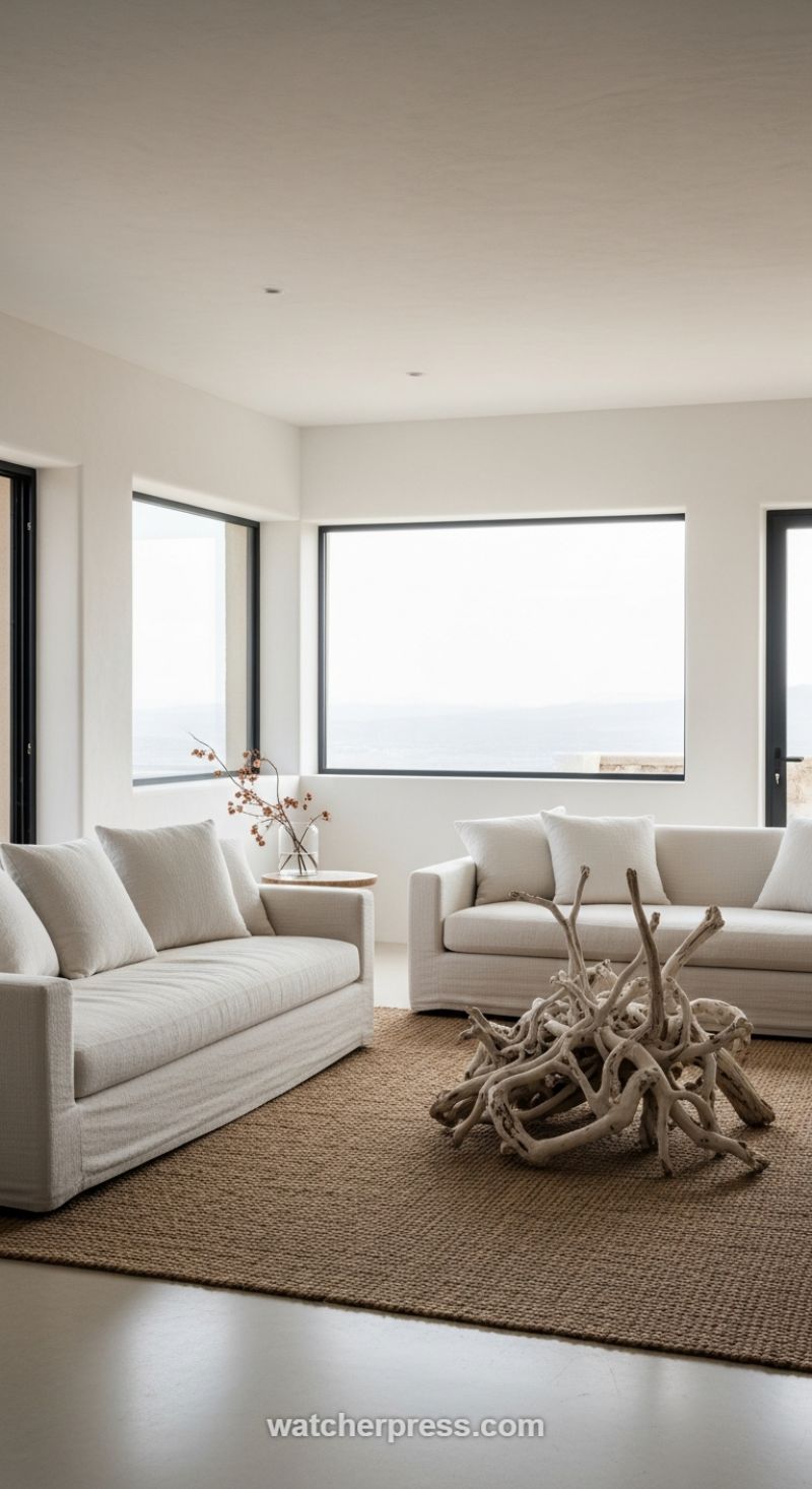
To achieve an effortlessly chic transformation, begin by establishing a foundation of serene neutrals, as demonstrated here by the crisp white walls and expansive off-white upholstered sofas. This deliberate use of light colors maximizes natural light and creates a tranquil, airy envelope, essential for highlighting the richness of subsequent textures. The “how-to” lies in immediately introducing deep textural contrast within this neutral framework. Select a large area rug crafted from raw, organic fibers like jute or sisal; the visible weave and rich, earthy tone of the rug ground the space and provide necessary visual weight, preventing the room from feeling washed out or stark. Expert advice suggests ensuring the sofa material, while neutral, possesses a subtle weave or slub texture—a tactile quality that adds depth and sophistication without introducing competing patterns.
The critical element elevating this design from simple minimalism to coastal chic is the dramatic sculptural centerpiece. By replacing a conventional coffee table with a large, artful arrangement of bleached driftwood, the room gains immediate character and a focal point that speaks directly to the natural environment visible outside the massive windows. When incorporating such organic, found objects, focus intensely on scale—the piece must be substantial enough to command attention in the center of the seating arrangement, anchoring the room without overwhelming it. Treat this element as three-dimensional art; its irregular form and pale, sun-drenched texture provide a stunning visual foil to the structured lines of the modern architecture and clean-lined sofas. This approach teaches readers to look beyond traditional furnishings for truly impactful and textured design statements.
Finally, color accents should be introduced sparingly and deliberately, primarily through texture and nature, keeping with the overarching organic theme. Notice how the only true color contrast comes from the dried branches held in a clear glass vase; the muted terracotta and brown tones subtly echo the warmth of the underlying jute rug, creating a harmonious loop of natural hues. Even the surrounding elements play a crucial role in the scheme: the thin, black framing of the windows provides sharp, contemporary delineation against the soft, white walls, effectively framing the expansive, monochromatic ocean view—which acts as the room’s single source of dynamic, ever-changing color and light. Use small, round side tables made of raw wood, cork, or stone to maintain the continuous theme of tactile, natural materials, ensuring every surface contributes to the overall feeling of relaxed, sophisticated texture.
Elevate Monochromatic Design with Delicate Layered Textures
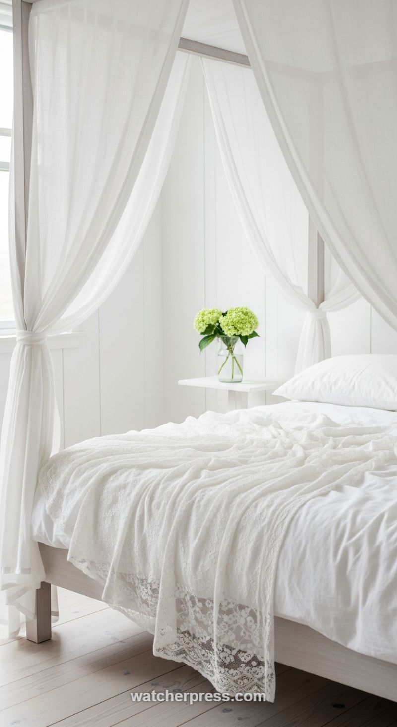
This inspiring bedroom scene perfectly illustrates how to achieve profound depth and interest using a strictly monochromatic palette, relying entirely on layered texture to carry the design load. The secret to avoiding a sterile, flat white room is incorporating textiles of varying weight, weave, and finish. For instance, notice the contrast between the rough, vertical lines of the shiplap wall paneling, the soft, crumpled appearance of the sheet and pillowcases, and the distinct, intricate pattern of the lace trim throw draped over the bed. To successfully replicate this look, start with foundational materials that have an inherent texture, such as natural linen or washed cotton for bedding, rather than slick, high-sheen synthetics. Next, incorporate structural textures, like the aged wood posts of the canopy bed or the bleached grain of the flooring, which provide grounding elements against the softness of the fabrics. The interplay between these rough and smooth, sheer and opaque surfaces creates visual friction and prevents the space from fading into a single bland hue, yielding a calming, sophisticated environment.
The intentional use of sheer canopy drapes serves as a masterclass in adding architectural texture and movement to a space. By selecting lightweight voile or gauze fabrics, the homeowner introduces an ethereal, airy quality that enhances the diffusion of natural light, giving the entire room a soft, luminous glow. Instead of allowing the curtains to hang straight, they are purposefully cinched and tied back to the bed posts, creating graceful swoops and vertical lines that draw the eye upward and emphasize the height of the room. This technique transforms a standard bed frame into a romantic sanctuary, creating a sense of enclosure without feeling heavy or closed-off. When employing sheer layers, always ensure the fabric pools slightly on the floor or is draped generously; stingy amounts of fabric will diminish the luxurious, flowing effect. The goal is to maximize the sense of fluidity, making the entire textile arrangement feel organic and soft.
In a room where texture dictates the primary design narrative, color must be introduced with extreme precision, functioning purely as an accent. Here, the sole splash of vibrant color comes from the lime-green hydrangeas in a clear glass vase. This strategic placement provides an essential visual anchor—a small, contained burst of life against the sea of white—without disrupting the tranquility. When choosing your single accent color for a monochrome space, opt for something natural and clean, such as a deep botanical green, a soft wood tone, or a muted oceanic blue. Limit this color to just one or two items of décor (a piece of artwork, a ceramic vessel, or fresh flora). The power of this approach lies in its restraint; by keeping the color minimal and contained, you amplify its impact and allow the rich layering of textures to remain the star of the show, proving that less color often results in more sophisticated design impact.
Elevate Neutrals with Travertine Texture and Warm Brass Accents
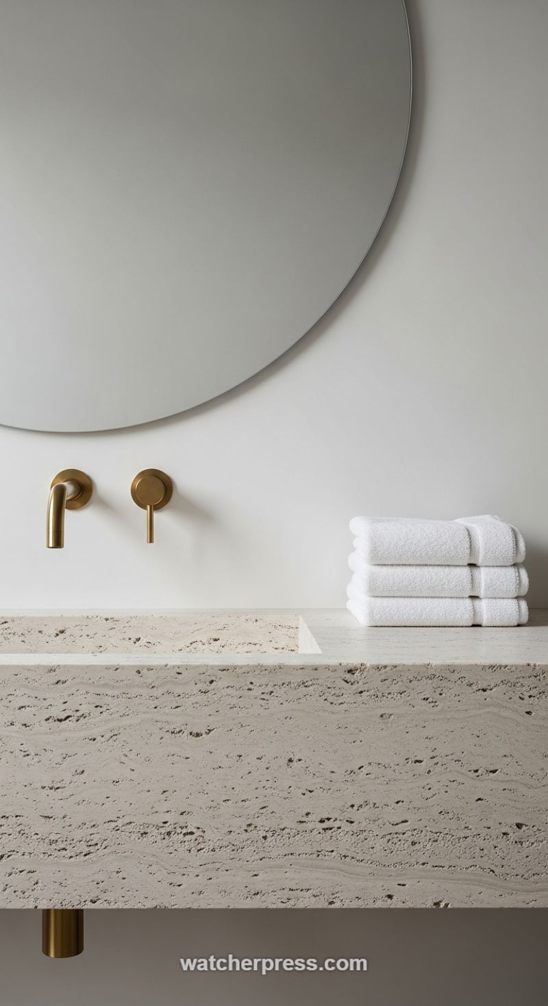
Incorporating raw, exposed textures is one of the most effective ways to introduce effortless chicness into a contemporary space, especially when working within a largely neutral palette. This bathroom setting exemplifies this strategy by utilizing a thick slab of textured, porous natural stone, likely Travertine, as the anchor for the vanity. The inherent roughness and visible layers of the stone create immediate depth, ensuring that the room, despite its white walls and minimalist layout, feels grounded and organic rather than sterile or cold. When selecting a stone, opt for pieces with prominent pitting and horizontal veining; this natural irregularity becomes the primary source of visual interest and eliminates the need for busy patterns or excessive decorative elements. The interplay between the raw, tactile nature of the stone and the smooth, matte finish of the adjacent walls provides a sophisticated textural tension essential for high-end design.
To prevent the earthy tones of the Travertine from falling flat, introduce a carefully chosen warm metallic accent. Brushed brass or matte gold is the ideal pairing, acting as the ‘jewelry’ that lights up the neutral environment. The choice of finish here is crucial: brushed brass maintains a sophisticated, subdued glow that complements the stone’s rough texture far better than highly polished chrome, which would introduce too much reflective harshness. By wall-mounting the faucet spout and handle, the design maintains sleek, uninterrupted lines while giving the brass components prominence against the clean white backdrop. Expert application requires consistency—ensure all hardware, from the faucet to any underlying support brackets (as subtly shown), adheres to the same warm metallic finish to create a cohesive and deliberate design statement. This metallic pop is the single color accent needed to transform the textured base into a luxurious focal point.
Achieving this elevated look relies on balancing complexity (the texture) with simplicity (the forms). Follow this blueprint: start by selecting oversized, simple forms, such as the large, clean-edge circular mirror, which juxtaposes beautifully against the rugged rectangular vanity. Minimize clutter by opting for wall-mounted fixtures and reserving decorative space only for necessary, clean items, such as the stack of crisp white towels. The towels not only serve a function but their soft, plush texture provides a third, subtle textural layer that contrasts with both the hard stone and the smooth wall. This disciplined approach to texture and accent color ensures that the resulting aesthetic is spa-like, sophisticated, and maintains the chic, uncluttered ethos of minimalist design while celebrating natural materials.
Creating Drama with Stone Texture and Fiery Color Accents
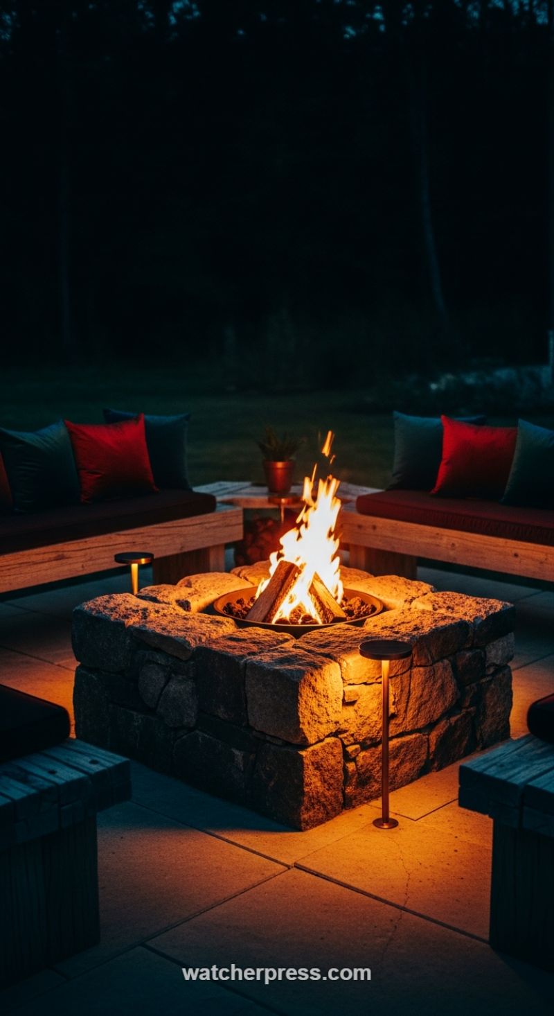
To achieve a truly chic transformation in your outdoor living space, look beyond simple furniture arrangements and focus on establishing foundational texture through hardscaping. As seen in this sophisticated patio setup, the key is the heavy, rough-hewn natural stone fire pit. This bold, multi-faceted texture serves as the rugged anchor of the space, grounding the design and providing a striking contrast to the smooth, geometric patio pavers beneath it. When selecting permanent structural elements, choose materials like stacked natural stone that feature inherent variation in tone and surface quality; this visual complexity ensures the area remains engaging even before the fire is lit. The contrast between this coarse texture and the smooth surrounding surfaces creates depth and prevents the patio from appearing flat or overly clinical, a crucial design principle for high-end exterior decorating. The deliberate selection of materials that absorb and reflect light differently—such as rough stone soaking up the amber glow while smooth pavers slightly reflect it—is fundamental to maximizing the visual interest in an evening setting.
Once the foundational textures are set, introduce impactful color accents through layered soft furnishings. The design pictured utilizes deep, sophisticated tones—such as the dark teal/charcoal seating cushions—as a neutral backdrop that absorbs light, maximizing the dramatic effect. Against this dark, reserved canvas, high-chroma accessories, like the vibrant crimson throw pillows, achieve maximum impact. This strategic use of a saturated, warm color immediately draws the eye and injects energy and luxury into the setting. Critically, the fire itself acts as the primary, dynamic color accent, casting intense, warm amber and orange hues that dramatically amplify the warm textiles and illuminate the stone’s texture. To support this effect without overwhelming the natural light source, integrate subtle, low-profile auxiliary lighting, such as the slender copper path lights shown, ensuring their color temperature matches the warmth of the fire for a seamless, cozy glow.
Implementing this look involves a careful balance of opposing forces: rough versus smooth, warm versus cool, and light versus dark. The wooden benches introduce a mediating, medium texture and earthy tone that links the permanence of the stone to the softness of the fabrics. For replication, focus on intentional layering: start with a large, heavily textured anchor (like stone or textured concrete), add intermediate textures (like durable outdoor wood), and finish with highly saturated, temporary textile accents (pillows, blankets). This design strategy is not restricted to exteriors; it translates flawlessly indoors by pairing a heavily textured wall (e.g., exposed brick or reclaimed wood paneling) with luxe, highly chromatic soft goods like velvet or high-pile rugs, all dramatically lit by concentrated, warm, dimmable accent lighting to create an environment of effortless chic and intimate sophistication.
The Subtle Impact of a Dusty Rose Crochet Throw
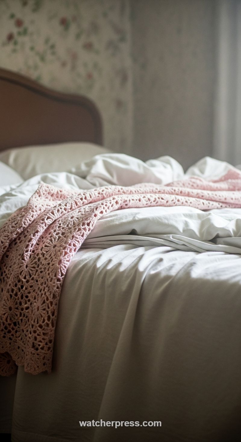
To achieve a truly chic bedroom transformation using texture and color, focus on introducing one highly detailed accent piece against a sea of calming neutrals. The visual impact seen here relies entirely on the powerful contrast between simple, smooth white or light gray bedding and an intricate, open-weave textile. The ‘how-to’ involves maximizing this tactile difference: choose a substantial primary layer (like soft linen or high-thread-count cotton sheets) that drapes and wrinkles naturally, providing a clean, matte background. Then, introduce a throw made of a completely different material—here, a vintage-inspired crochet or lace-knit blanket with complex floral or circular patterns. The open spaces within the crochet structure create shadows and depth that regular fabric cannot, instantly elevating the perceived sophistication of the entire ensemble. Ensure the throw is draped organically, allowing it to pool slightly and catch the light, rather than being folded with military precision. This effortless styling is critical for capturing the desired ‘chic’ aesthetic.
For the color accent, the choice of a dusty rose or muted blush pink is deliberate and highly effective. This soft hue provides warmth and a touch of romance without demanding attention or clashing with the subtle patterns of the surrounding environment, such as the muted floral wallpaper and dark wood headboard seen in this setting. When selecting your accent color, look for shades that complement the existing neutrals and wood tones in your room—avoid overly saturated or neon colors, which tend to break the harmony. A single, deliberately placed color accent piece like this throw acts as a focal point. Since the texture itself is so rich, you only need one item in the accent color to make a substantial statement. This minimizes clutter while ensuring the chosen color receives the spotlight, softening the otherwise crisp look of white bedding and lending an instant heirloom quality to the space.
To truly nail this aesthetic, lighting plays a crucial supporting role. The success of using highly textural materials depends on how shadows and highlights interact with the fabric folds and open weaves. Position the bed or the accent piece near a source of soft, natural light, which is essential for bringing the crochet pattern to life and emphasizing the wrinkles in the linen sheets. This technique is an expert way to introduce vintage charm without feeling dated; the use of modern, neutral bedding grounds the look, while the highly detailed textile provides the nostalgic flair. Implement this strategy by pairing a foundational smooth material (like cotton or silk) with an overlaying intricate material (like chunky cable-knit, macramé, or, as shown, delicate crochet) to instantly infuse your space with depth and effortless character.
Layering Rich Wood Tones and Delicate Porcelain for Contrast
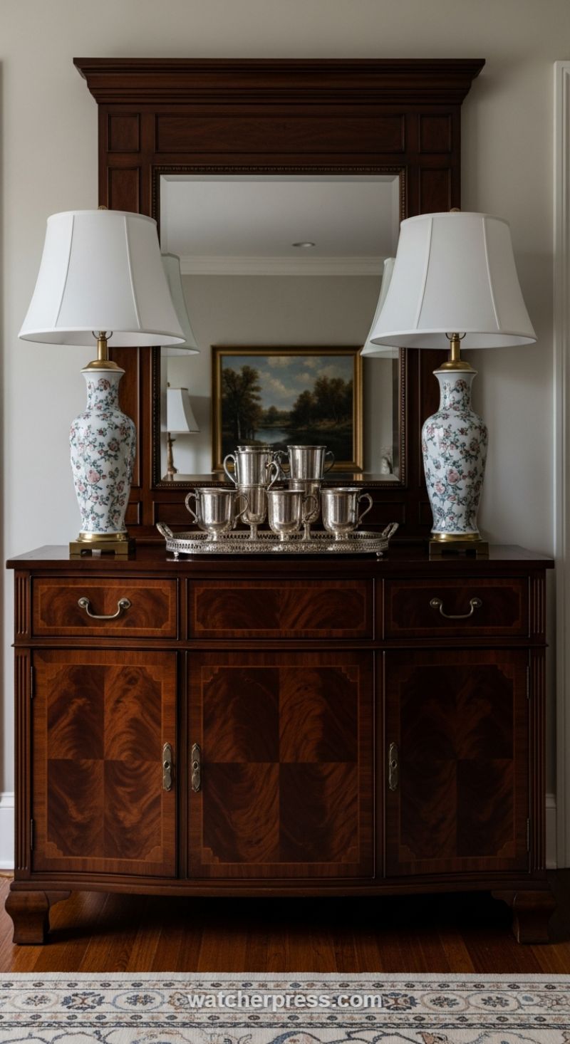
To achieve a truly chic and timeless aesthetic, begin by establishing a foundation of deep, rich texture, typically through substantial furniture like a classic buffet or credenza. The high-polish, dark wood finish seen here—likely mahogany or cherry—provides significant visual weight and anchors the entire display. Note the intricate texture of the figured veneer panels; the symmetrical grain patterns are a textural element in themselves, adding depth that simple, solid wood cannot replicate. When selecting this anchor piece, ensure it is scaled appropriately for the wall and topped with a large, framed mirror. The mirror’s dark frame reinforces the traditional feel while its reflective surface introduces depth, reflecting the opposite wall’s light and surrounding colors, effectively expanding the sense of space and providing a visual backdrop for your accessories.
The strategic introduction of delicate pattern and soft texture is crucial for balancing the formality of dark wood. This is masterfully achieved with the pair of tall porcelain lamps featuring a subtle floral pattern in soft pinks, blues, and greens. Placing identical lamps symmetrically on either side of the mirror ensures visual balance and formality. The porcelain base provides a cool, smooth texture, acting as an immediate counterpoint to the warm, deep grain of the wood. Furthermore, the selection of classic white lamp shades is a deliberate textural choice; their smooth, opaque fabric diffuses light softly and acts as a neutral canvas, drawing attention to the colorful porcelain without overwhelming the sophisticated look. Ensure the lamp height is appropriate so the shade bottom is roughly at shoulder height when seated nearby, optimizing both visual appeal and light functionality.
Finally, elevate the vignette using reflective, high-shine metallic textures to inject glamour and dynamic surface contrast. Here, a collection of sterling or silver-plated mugs resting on a textured silver tray serves as the centerpiece. This arrangement introduces a ‘cold,’ highly reflective texture that immediately pops against the warm wood and soft porcelain. The metallic sheen catches the light from the lamps and the mirror reflection, adding a layer of luxury and dimension. When curating such a centerpiece, group similar items (like these drinking vessels) to create a cohesive collection, turning functional items into decorative art. Use brass accents (visible on the lamp bases) to tie the silver elements into the warmer tones of the wood, successfully uniting all three key materials: wood, porcelain, and metal, for a balanced, textured, and colorful display.
Gothic Glamour: Elevating Your Dining Space with Deep Jewel Tones and Texture
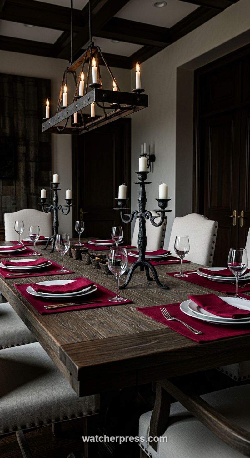
Achieving a dramatic yet inviting dining aesthetic relies heavily on pairing contrasting textures and utilizing highly saturated color accents. This Old World inspired setting anchors its design with heavy, rustic foundational elements. Start with a large, distressed wooden table—the rough, visible grain of the timber immediately introduces an earthy, rugged texture that grounds the entire space. Complement this with substantial wrought-iron fixtures, such as the rectangular chandelier and matching multi-arm candelabras. The forged iron texture, characterized by its dark, matte finish, provides a medieval or Gothic sensibility. By choosing light sources that double as sculptural elements, like this candle-style chandelier, you ensure that even the overhead lighting contributes significantly to the overall texture profile. When working with these weighty materials, ensure walls and large furniture pieces (like the ceiling beams and doors seen here) are in deep, complimentary dark tones to enhance the feeling of sophisticated enclosure.
The immediate visual impact, however, is delivered through the strategic application of color accents. Here, a deep, sumptuous burgundy or wine red is deployed exclusively in the table linens—placemats and napkins. This rich jewel tone provides essential warmth and formality, acting as a vibrant contrast against the dark wood and black iron. This is a master class in high-impact, low-commitment decorating; the intense color is easily interchangeable depending on the season or mood, yet it completely transforms the environment. To ensure the dark, dramatic palette doesn’t become overwhelmingly heavy, pair the deep accent color with clean, bright neutrals. Note the light, linen-upholstered chairs (potentially featuring nailhead trim for an added textural detail) and the crisp white plates. These elements provide necessary breathing room and reflect the limited light, keeping the atmosphere moody but never oppressive.
Finally, maximize the ambiance by focusing on layered lighting that highlights the textures you’ve curated. The soft, flickering light from the candelabras is crucial; candlelight emphasizes the rugged finish of the iron and the grain of the wood, making both textures seem richer and more profound. When selecting tabletop textiles, choose materials—like a velvety cotton or thick linen—that absorb light rather than reflect it, maintaining the elegant, matte quality consistent with the rustic iron and wood. The overall effect is one of dramatic contrast: light vs. dark, smooth vs. rough, and neutral vs. deep saturation, resulting in an effortlessly chic dining room perfect for a truly memorable gathering.
Illuminate the Journey: The Magic of Layered Outdoor Texture and Warm Light
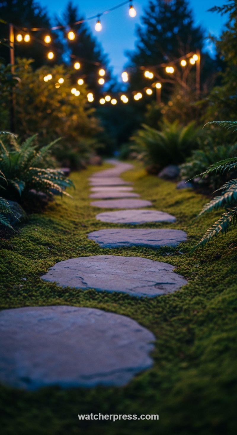
To replicate this enchanting aesthetic, focus on the deliberate juxtaposition of rough and soft materials. The foundation is a winding path constructed of large, organic-shaped natural stones, such as slate or bluestone. These cool-toned hardscapes introduce a necessary weight and permanence, serving as a subtle cool color accent against the surrounding warmth. The key textural element, however, is the living ground cover. Instead of traditional mulch or gravel, utilize a dense, low-maintenance living carpet like Scotch moss or creeping thyme. This velvety, vibrant green texture should fully engulf the spaces between the stones, creating a seamless, natural transition that feels soft underfoot and provides an intensely rich emerald color contrast to the muted gray stone. This technique instantly transforms a standard walkway into a multisensory experience, maximizing the visual impact of both the hardscape path and the surrounding foliage while establishing a deep, calming texture.
Texture extends vertically through the surrounding planting scheme. Frame the path with highly detailed, oversized foliage, such as lush ferns, hostas, or Japanese forest grass, which catch the light and add depth and complexity to the overall scene. The final, critical layer is the introduction of warmth via strategic lighting. Overhead string lights, specifically those with exposed filaments or large Edison-style bulbs, introduce a powerful color and texture accent. Opt for lights rated between 2200K and 2700K (a warm, amber hue) to mimic candlelight or firelight, ensuring the illumination complements the deep greens and cool grays of the hardscaping rather than washing them out. String these lights in a loose canopy or zigzag pattern high above the path. This creates a soft, diffused glow that highlights the various textures below and establishes a cozy, intimate ambiance, inviting guests to slowly wander and linger in the magic of the twilight garden.
Harnessing Deep Green and Matte Black for Sophisticated Depth
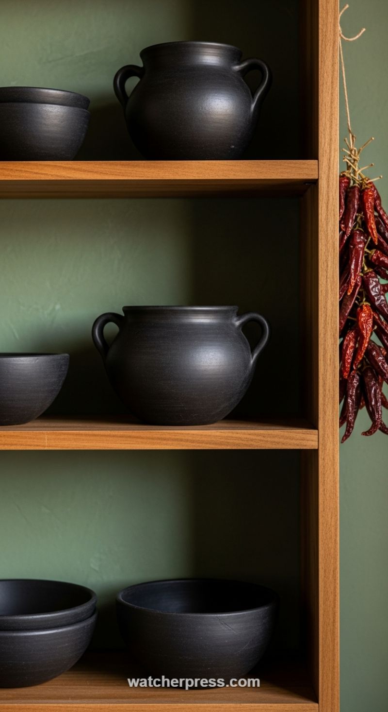
Creating a sophisticated, layered look hinges on the interplay between a deep color base and matte, tactile accents. As demonstrated by this striking arrangement, the foundation is a richly pigmented wall—specifically, a deep sage or forest green with a slight texture (achieved perhaps through limewash or a specialty paint finish). This color choice instantly wraps the space in tranquility and acts as a luxurious, muted backdrop. The key to making this color pop without feeling overwhelming is introducing its opposite: the light-absorbing quality of matte black pottery. Style expert advice dictates using pieces that are clearly handmade or raw in finish. The simple, rounded silhouettes of the black bowls and handled pots here provide a strong visual anchor, their non-reflective surface grounding the entire display and emphasizing the cozy depth of the green background. The contrast between the rich color and the stark black texture is what elevates the area from simple storage to a curated focal point. This technique is especially effective in open shelving designs common in modern kitchens or dining spaces.
To further enhance the textural experience, pay close attention to the supporting materials, particularly the shelving itself. Opt for natural wood with a warm tone, such as oak or walnut, which contrasts beautifully with the coolness of the deep green and black elements. The smooth, linear grain of the wood provides necessary structure and warmth, preventing the dark color palette from feeling cold or heavy. When styling the shelves, arrange the pottery pieces strategically, varying their size and shape (a large handled pot paired with smaller, stacked bowls) to create rhythm and movement across the vertical space. Remember that texture isn’t just about the objects themselves; it’s about how light interacts with them. Placing the matte objects within the wooden frame, where shadows naturally fall, magnifies their tactile quality, making the arrangement feel more complex and inviting.
Finally, introduce a third, unexpected color accent to complete the composition and inject life into the scheme. In this scenario, the vibrant cluster of dried red chili peppers serves as a powerful organic counterpoint. The vivid red-orange tone is a natural complement to the deep green, instantly warming the display and adding a layer of rustic, culinary charm. When selecting your tertiary accent, think beyond traditional accessories; incorporate elements that introduce an authentic, natural texture. Consider small bundles of dried lavender, cinnamon sticks, or even a branch of dried cotton bolls, depending on the desired mood. Hanging these items loosely, as opposed to placing them in a rigid container, adds soft, flowing lines that break up the geometric precision of the shelving, resulting in a perfectly balanced blend of rustic simplicity and effortless chic.
Elevate Coziness with a Chunky Crocheted Pouf
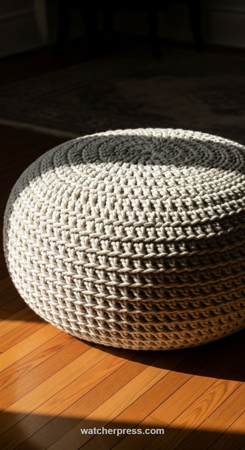
When seeking to infuse warmth and substantial texture into a minimalist or transitional space, the chunky knitted or crocheted pouf is an indispensable accent. The texture demonstrated here—a dense, oversized crochet pattern using a thick cotton or jute rope—instantly grounds the room and offers a powerful tactile contrast to smooth architectural elements and sleek furniture. This level of craftsmanship draws the eye, turning a simple functional item into a sculptural focal point. To achieve this look successfully, choose poufs crafted from natural, substantial materials. The material should be thick enough to hold its shape while displaying deep, defined stitching, which is crucial for absorbing light and creating dramatic shadows. Position your textural accents strategically to break up expanses of flat color or material, such as placing a neutral-toned pouf against sleek hardwood floors or beside a leather armchair, ensuring the unique construction is highly visible.
The genius of this specific piece lies in its restrained color palette. While the article focuses on using both texture and color, utilizing large-scale texture in sophisticated neutrals—like the light beige and subtle gray tones shown—ensures longevity and versatility. Neutral colors prevent the bold texture from overwhelming the decor, allowing it to seamlessly integrate into virtually any existing scheme, from Scandinavian hygge to coastal minimalist. Furthermore, a pouf is one of the most functional accent pieces you can introduce; it serves as an instant extra seat for guests, a comfortable footrest, or even a casual side table when topped with a small tray. When selecting your pouf, prioritize dimensions that feel substantial; a large, well-stuffed piece will look more luxurious and intentional than a small, floppy alternative, dramatically increasing the perceived value and comfort level of your living area.
To maximize the impact of your newly introduced texture, pay close attention to lighting and placement. As illustrated in the image, strong, directional light—such as natural sunlight streaming through a window or the focused beam of a nearby floor lamp—is essential for highlighting the intricate structure of the crochet pattern. The shadows cast within the deep crevices of the stitches are what give the piece its three-dimensional quality and visual depth. When arranging your living room, consider where the sun hits during the day and place your textural accents in those illuminated spots. This interaction between light, shadow, and fiber transforms a simple home accessory into a dynamically changing piece of art, showcasing the effortlessness with which texture can truly transform a room’s aesthetic and emotional tone.
Layering Natural Textures for a Warm, Spa-Inspired Retreat
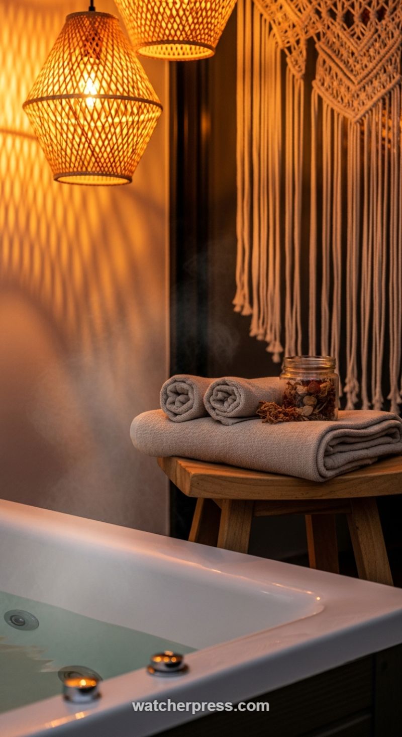
Creating an atmosphere of serene relaxation relies heavily on the strategic layering of natural textures and warm color accents, transforming a functional space into a personal sanctuary. Begin by setting the tone with atmospheric lighting. As seen here, the primary color accent isn’t paint, but the amber glow emitted by the lighting fixtures. Opt for woven bamboo or rattan pendant lights, which diffuse light warmly and cast intricate, graphic shadows on the surrounding surfaces—an often-overlooked form of visual texture. This warm, golden hue instantly elevates neutral materials like off-white towels and natural wood, making the entire palette feel richer and more inviting. Ensure these light sources are paired with foundational organic materials, such as a simple teak or reclaimed wooden stool, to anchor the aesthetic and provide a robust counterpoint to softer elements.
Next, introduce soft, textural accents that invite touch. The macrame wall hanging is a perfect example of a vertical textile accent; its intricate knotting and flowing fringe soften the wall space and add a necessary bohemian chic element. When selecting textiles for the spa area, move beyond standard white. Choose towels in deep oatmeal, beige, or soft taupe, focusing on materials with high tactile texture, such as chunky cotton or a linen blend. Presentation is key to luxury: roll some towels for height and structure, and stack others folded flat to create substantial visual layers on your chosen wood accent furniture. This method ensures that the textures don’t blend monotonously but instead stack up to create depth and visual interest.
Finally, maximize the sensory experience with small, curated textural details. The inclusion of a clear glass jar filled with dried botanicals, wood shavings, or potpourri introduces subtle, fragile textures and earth-toned color variation (reds, browns, pale greens) that serve as a mindful focal point. Position these accents near elements that engage other senses, such as the gentle steam rising from a warm bath. Even functional elements, like small, metallic tea light holders placed near the tub’s edge, contribute a final hint of contrasting polished texture against the softer backdrop. This blend of rough woven materials, soft cottons, hard woods, and delicate botanicals creates a holistic environment where texture and accent color work seamlessly to promote ultimate relaxation.
Elevating Ambiance: The Power of Backlit Textured Stone
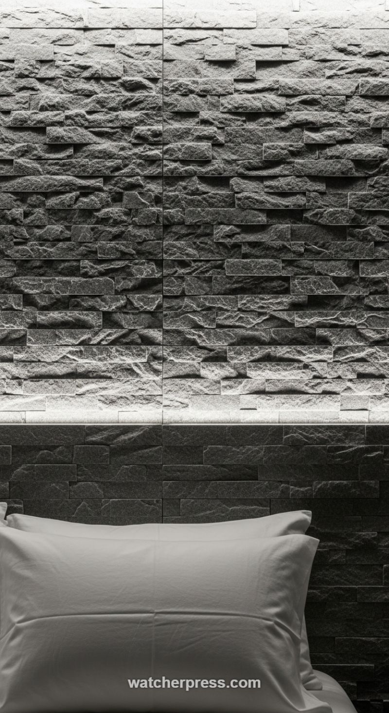
Incorporating large-scale texture, particularly natural stone or materials mimicking its irregular surface, is a guaranteed way to add architectural gravitas and a moody, sophisticated atmosphere to any space, especially a master bedroom. The key to maximizing this texture, as demonstrated in this striking design, lies in selecting materials with significant dimensional variation—such as split-face slate or rough-hewn ledger stone in a deep charcoal or obsidian hue. When planning this application, ensure the stone is installed tightly to emphasize its stacked nature. This intense texture demands to be the sole focal point of the wall, instantly transforming a simple sleeping area into a luxury retreat. Since the natural texture is irregular, the resulting pattern is dynamic and forgiving, making it an excellent choice for walls that might otherwise feel cold or flat.
To truly bring the depth of the stone to life, strategic lighting is essential. This technique utilizes ‘grazing light,’ achieved by installing a linear LED strip within a shallow, concealed channel or soffit, positioned close to the top edge of the stone wall. The light source must run parallel and very close to the surface—ideally 6 to 12 inches away—so that the illumination catches only the highest peaks of the rough stone, plunging the crevices into dramatic shadow. This high-contrast lighting effect defines every ridge and valley, creating an incredible tactile experience. When selecting LED lighting, opt for a light temperature in the warm white range (2700K–3000K) to ensure the ambiance remains cozy and inviting, rather than harsh and industrial, which is critical for a restful bedroom environment.
To successfully integrate such a dramatic accent wall, balance is necessary. The visual weight and rugged texture of the stone should be offset by soft, refined elements elsewhere in the room. Notice how the bright, crisp white bedding provides a sharp, clean contrast to the dark, chaotic texture of the wall. Stick to a tight, sophisticated monochromatic or grayscale palette (charcoal, slate, deep grey, and white) to prevent the textured wall from feeling overwhelming or busy. By maintaining clean lines and neutral colors in surrounding furniture and textiles, you allow the stone accent wall to function as the primary piece of art and texture, ensuring the final look is chic, controlled, and deeply luxurious.
Elevating Cozy Corners with Rich Leather and Chunky Knits

The secret to creating a truly enveloping and luxurious textural space, as showcased in this intimate reading corner, lies in the strategic juxtaposition of contrasting materials. Start with a foundational piece that offers inherent textural interest, such as a deep cognac-colored leather armchair. Leather, especially when aged or upholstered in a traditional style like a Chesterfield, provides a smooth, cool, and robust texture. This is instantly softened by draping an oversized, chunky cable-knit throw blanket across the seat and arm. The dramatic three-dimensional relief of the heavy knit (think wool or a high-quality acrylic blend) provides maximum hygge and comfort, immediately signaling warmth and invitation. When layering, ensure the throw is large enough to spill casually, avoiding overly neat folds, which allows the textile’s volume and movement to become an active decorative element. The contrast between the rigid, lustrous leather and the soft, voluminous knit is the primary design lesson here: texture is elevated by contrast.
Beyond the tactile elements, the lighting in this vignette serves as a critical color and texture accent. The warm, low-Kelvin light (ideally 2200K to 2700K) emanating from the directional lamp casts an amber glow, emphasizing the rich, reddish-brown tones of the leather and making the creamy knit appear golden. Directional lighting, such as that provided by this adjustable wooden floor lamp, is essential for adding ‘shadow texture’ to a room. It creates deep pools of shadow and bright highlights, giving the room a sense of dimension and drama known as chiaroscuro, which is often more compelling than evenly lit spaces. Position the light source to shine directly onto the focal point (the book and the chair) to achieve this effect, using the light not just for illumination, but as an integral color layer.
Finally, accessorize with materials that reinforce the rich, academic mood while offering secondary textural elements. The stack of dark, antique books on the floor adds a subtle vertical element, grounding the scene and introducing the texture of aged paper and cloth bindings. These smaller accents should adhere to the established warm color palette—deep browns, blacks, and golds—to maintain visual harmony. The overall effect is one of intentional density; every piece, from the functional wooden joints of the lamp to the simple, open pages of the book, contributes to a rich tapestry of tactile and visual textures, transforming a simple seating arrangement into a truly chic and comforting home haven.
Textural Contrast: Pairing Luxurious Neutrals with Bohemian Color
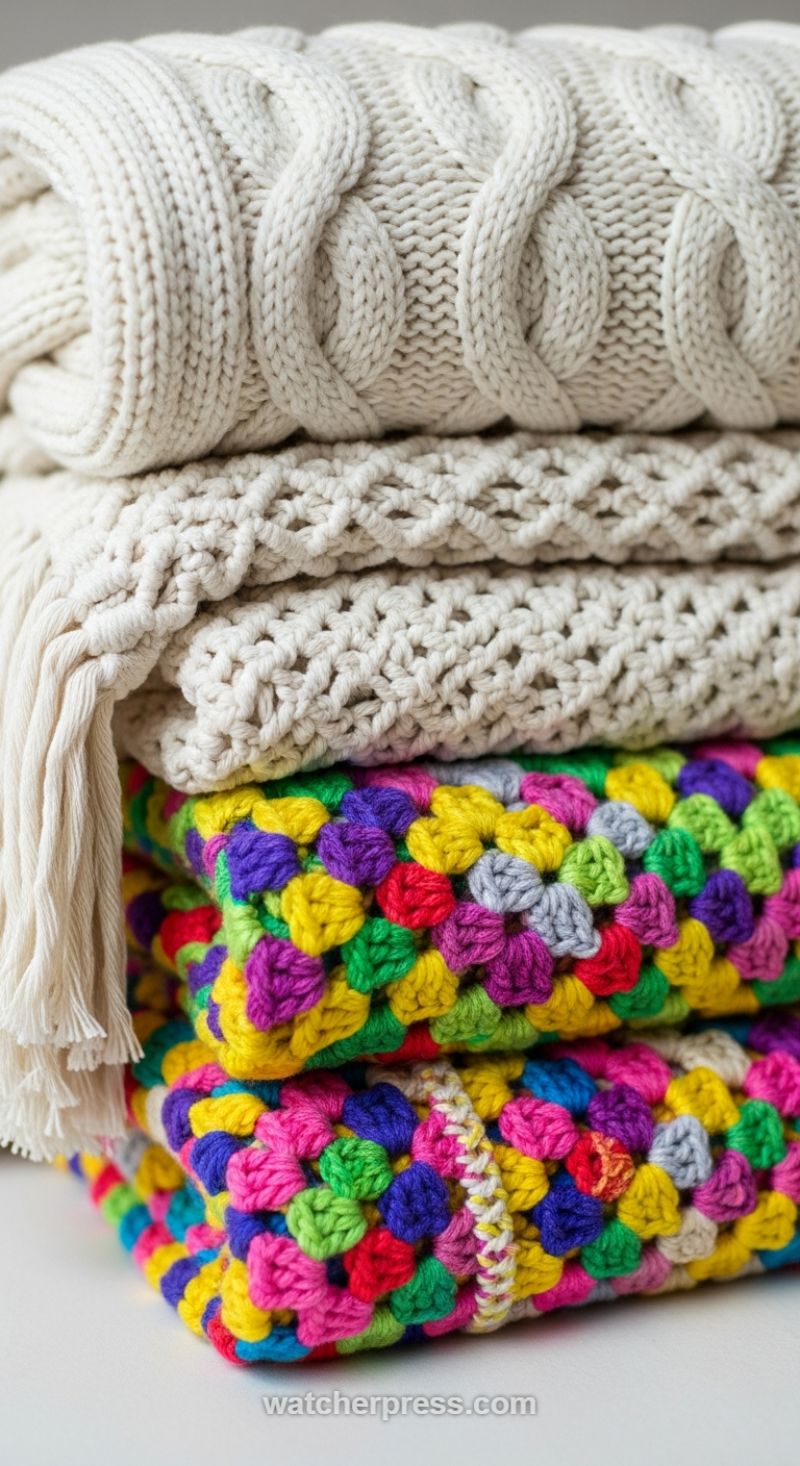
One of the most effective yet simple ways to add depth and warmth to a room is through strategic layering of textiles. As shown here, the key is to build a sophisticated foundation using neutral tones but varying the tactile dimension. Begin with creamy, off-white throws that offer a dense, architectural structure, such as the chunky cable knit seen on the top layer. This traditional pattern immediately conveys luxury and comfort. Layer in a second, tighter-weave neutral blanket featuring a geometric or lattice pattern; this provides visual complexity without introducing competing colors. By sticking to a monochromatic palette for the first few layers, you allow the textures themselves to become the dominant design element, creating a sense of quiet elegance that anchors the entire display. Ensure these layers are folded neatly to showcase the various knitting and weaving techniques, presenting them as curated sculptural elements rather than haphazard clutter.
The real magic lies in introducing bold color accents that peek out from beneath this neutral base. The stack is dramatically energized by the inclusion of vibrant, multi-hued granny square throws. These bohemian, hand-crafted pieces are fantastic choices for color accents because the high contrast and density of the colors (pinks, purples, yellows, and greens) provide maximum visual impact. Expertly fold these colorful items so that only a prominent border or corner is visible. This prevents the color from overwhelming the space and allows it to act as an intentional pop against the creamy, soothing foundation. The juxtaposition of the refined, structured cable knits with the cheerful, playful granny squares creates a dynamic balance—a perfect representation of effortless chic.
To apply this technique in your home, consider the placement. A stack of layered throws looks exceptional draped over the arm of a sofa, piled neatly in a large wicker basket, or folded at the foot of a bed. Beyond just aesthetics, focus on fiber content for added versatility; use heavy wool or thick cotton for the neutral layers to signify substance and warmth, and lighter acrylics or fine cottons for the colorful accents. This variation ensures that your textile arrangement is both visually compelling and practically functional across different seasons. Remember, the goal is intentional variety: let the textures speak volumes in the neutrals, and let the saturated colors provide unexpected moments of joy and personality.
Anchor Your Outdoor Space with Classic Gingham and Cozy Solids
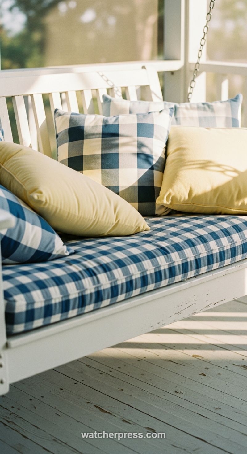
To achieve a look that feels both timeless and current, take a cue from classic farmhouse or coastal styling by anchoring your seating with a bold, traditional pattern like buffalo check or gingham. This technique requires disciplined color selection: choose one high-impact print (here, a navy and white check) and pair it with a single, contrasting solid color (buttery yellow or soft cream). The gingham serves as the textural and colorful foundation, demanding attention while remaining visually calming due to its predictable grid structure. When implementing this in your own space, ensure your chosen blue hue complements the natural light—cobalt and navy tones stand up well to bright sun exposure without fading visually, while the yellow injects the necessary warmth and soft contrast, preventing the overall scene from becoming too monochromatic or chilly. Expert designers advise starting with the largest textile (the seat cushion) in your dominant pattern, as this dictates the color values for the smaller, accompanying accents.
The key to achieving this specific ‘effortlessly chic’ vibe lies in masterful pattern and texture layering. To avoid visual overload when using a strong print like large-scale gingham, strategically use solid pillows to create points of rest. Notice how the solid yellow pillows are layered over the patterned cushion and also nestled next to the patterned back pillows—this variation in density and scale is crucial. When shopping for fabrics, focus not just on the pattern, but the actual hand-feel and weight; while these pieces must be weather-resistant (Durable outdoor poly-canvas is ideal), they should mimic the softness of indoor textiles to maintain an inviting and luxurious feel. Further textural contrast is provided by the setting itself: the crisp, clean lines and soft fabrics are juxtaposed against the rustic, distressed white paint of the porch swing and the chipped floorboards, lending an authentic, lived-in charm that prevents the scene from looking overly staged or new.
When applying these textile accents, consider the surrounding environment and the lighting. This setting capitalizes on bright, natural light, which highlights the crispness of the white components and casts sharp shadows that add an extra dimension of contrast and depth. To replicate this ambiance, think about how the light hits your chosen seating area throughout the day. If your area is heavily shaded, opt for brighter versions of blue and yellow to compensate. To finalize the look and ensure cohesiveness, always group your pillows in odd numbers (e.g., three or five) and vary their shapes slightly—mixing standard squares with longer lumbar styles, as seen here, adds dimension. This strategic combination of bold pattern, solid balance, and naturally weathered textures creates a serene, high-impact retreat perfect for stylish outdoor relaxation.
Introduce Organic Texture with Woven Rope Accents

The image beautifully illustrates how intricate textile work can be used as a striking focal point, even in an outdoor setting, perfectly embodying the concept of adding chic texture. The hammock, constructed from thick, creamy macrame-style rope, provides exceptional visual interest through its tight knotting and complex diamond pattern. The textural contrast is paramount here: the refined, handmade quality of the woven cotton stands in sophisticated opposition to the raw, rugged simplicity of the surrounding elements—the dark, textured wooden support post and the lush, blurred greenery of the background. To replicate this effect in your own space, focus on substantial, natural fibers that carry visual weight. When selecting outdoor or indoor accents, opt for materials like chunky cotton, sisal, or jute. This material choice immediately grounds the space, lending a relaxed, sophisticated bohemian feel that is far superior to standard synthetic or minimalist options. Ensure the weave pattern is pronounced, utilizing complex knotting like the basketweave or classic macrame shown here, as the shadow and light caught within the knots enhance the dimension and textural depth.
Integrating this type of organic texture is a high-impact design technique that transforms the functionality of an object into an artistic accent. The neutral color palette—a creamy off-white—serves a critical purpose: it allows the texture to do all the heavy lifting without overpowering the natural color accents of the environment. Expert designers often use light, neutral textures to interrupt large blocks of color, such as a deep green lawn or dark stained deck. When applying this rule, consider using similar woven rope accents beyond seating, such as chunky braided ottomans, large woven floor cushions, or even decorative rope coiled around planters or lighting fixtures. The key instruction is to avoid thin, flimsy rope, which can look cheap; the thickness of the individual strands must be substantial enough to hold the light and create those appealing deep shadows, ensuring the accent feels luxurious and durable.
This approach is effortlessly chic because it fuses comfort with nature-inspired design. If you cannot accommodate a full hammock, translate this look to indoor applications by incorporating macrame wall hangings above a sofa, choosing thick knit throws for bedding, or selecting window treatments with natural woven textures (like bamboo or thick linen). The goal is to introduce handcrafted elements that tell a story, moving away from purely manufactured surfaces. The soft, sunlit glow catching the edges of the hammock highlights its inviting nature, proving that texture, when executed thoughtfully with natural fibers and sophisticated knotting, is one of the most powerful tools available for transforming a mundane space into a textured retreat.
Anchoring Your Space with Retro-Inspired Color and Plush Textures
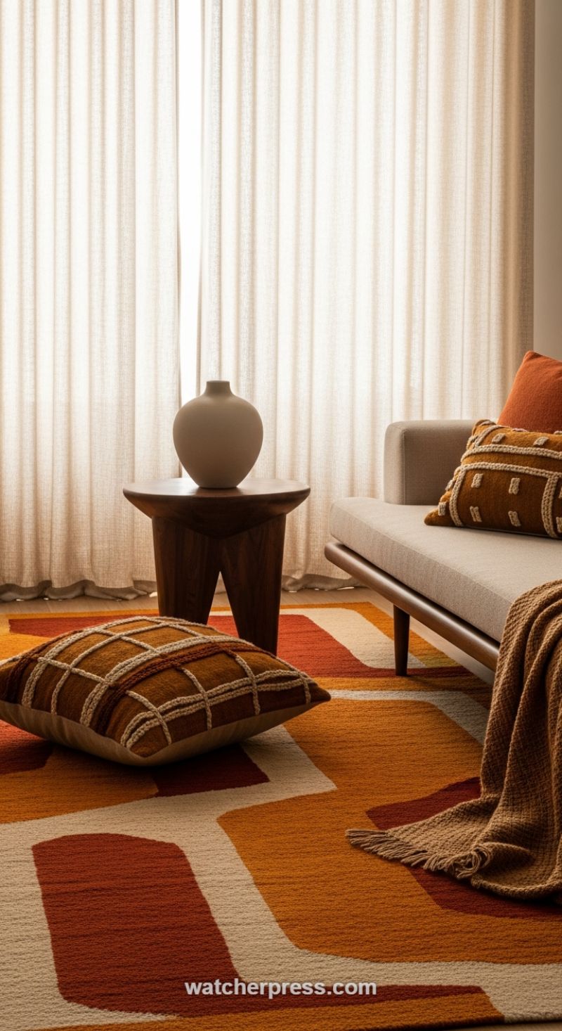
The foundation of an effortlessly chic, texture-rich space begins with a dramatic, statement-making area rug, as demonstrated by this vibrant arrangement. To successfully replicate this look, select a rug that acts as the core color story for the room. Here, the abstract geometric design, saturated in a warm, mid-century palette of burnt orange, rust, ochre, and cream, immediately grounds the setting and injects personality. This color combination is simultaneously energetic and comforting, perfect for a cozy living area. When integrating such a bold piece, balance is crucial: pair the warm, high-energy floor covering with neutral, clean-lined furniture, like the tailored beige daybed shown. This allows the rug to be the undeniable focal point while ensuring the space remains sophisticated and uncluttered rather than chaotic. Expert tip: Ensure your chosen rug is large enough to extend well beyond the primary seating area to truly unify the various elements and maximize the feeling of warmth.
Texture layering is the next essential step in mastering this sophisticated bohemian aesthetic. Instead of relying solely on pattern, use tactile differences to add depth and luxury. Notice the stark contrast between the smooth, tailored upholstery of the daybed and the heavily embellished throw pillows. These accents utilize chunky yarn, macrame, or tufting techniques to create pronounced, three-dimensional geometric patterns, instantly elevating the comfort level and visual interest. Further enhance this tactile experience by incorporating a contrasting knit throw blanket, preferably one with a substantial weave and fringed edges, draped casually over the seating. This intentional layering provides visual weight and beckons users to sit and relax. Balance these soft textures with grounding, organic elements like the smooth, dark, sculptural wooden side table and the matte ceramic vase, which offer a visual break and a distinct textural counterpoint to the plush textiles.
Finally, control the ambiance to showcase your chosen textures effectively. The use of sheer, light-filtering curtains is pivotal; they diffuse harsh natural light, creating a soft, warm glow that highlights the varying depths and textures of the fabrics and the rug pile. This soft lighting prevents the strong colors from appearing abrasive and makes the room feel airy despite the intense palette. The finishing accessories should be chosen for their shape and neutrality. The simple, curved form of the vase provides a moment of visual calm, emphasizing form over ornamentation. When combining bold colors and textures, remember the rule of three: introduce the main texture (rug), contrast it with a secondary texture (pillows/throw), and ground it with a smooth, firm texture (wood/ceramic) to achieve a balanced, deeply personalized, and effortlessly chic space.
Embracing Earth Tones: Sculptural Plants and Stucco Texture
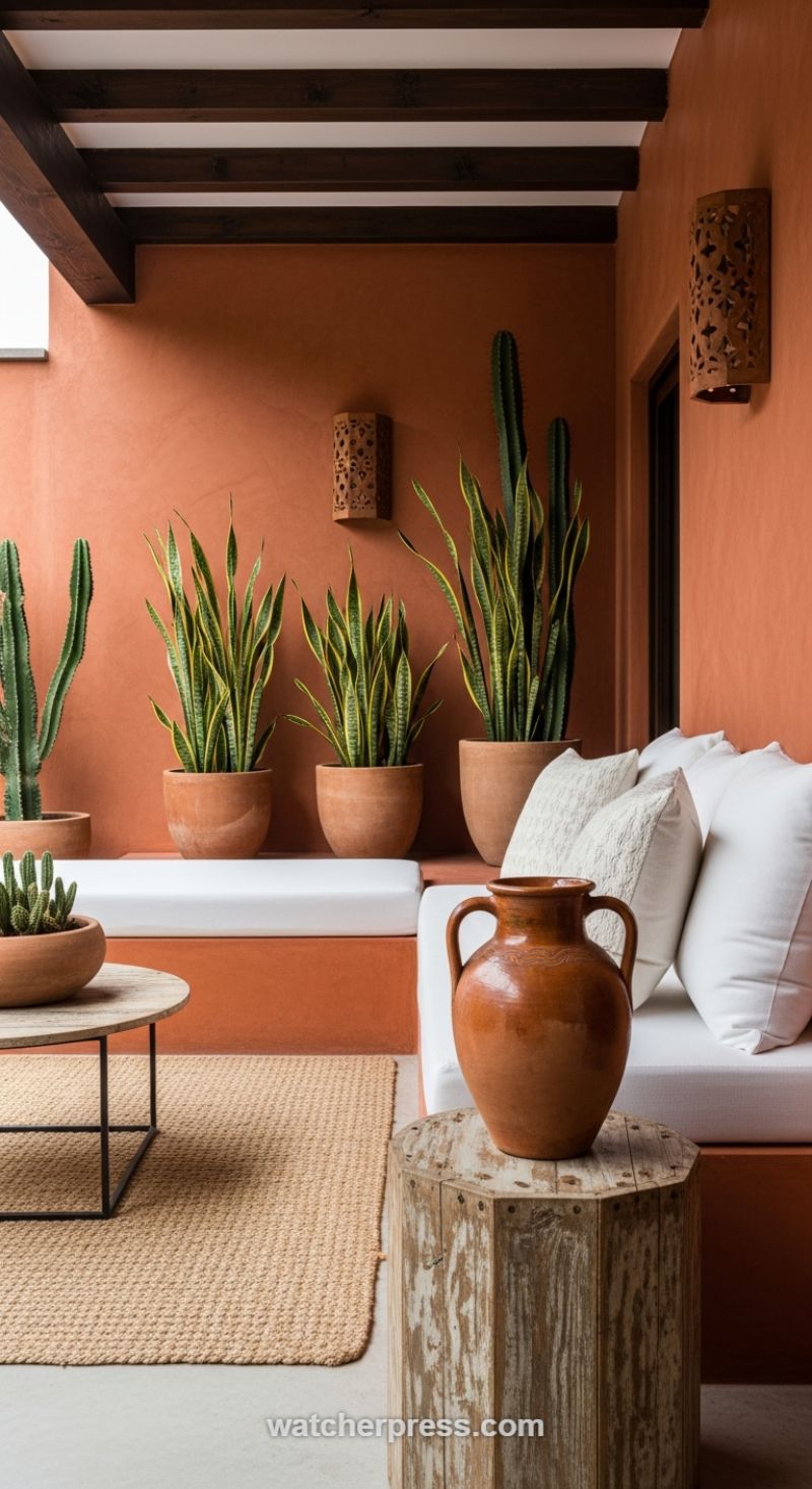
To achieve a design aesthetic rooted in Southwestern or Mediterranean warmth, begin by committing to a dominant, saturated earth tone, such as the deep terracotta or burnt sienna seen here. Using this color on expansive wall surfaces instantly imbues the space with a sun-drenched, cozy ambiance, transforming a bland patio or sunroom into a richly textured retreat. The secret to making such an intense color scheme feel sophisticated, rather than overwhelming, lies in strategic contrast. This design skillfully utilizes crisp white upholstery and cushions, providing necessary visual relief and a modern, clean counterpoint to the rustic wall finish. Furthermore, structural elements should enhance the depth of the color palette; dark, exposed ceiling beams, typically stained in a rich walnut or espresso, anchor the space visually and tie into the darkest greens of the surrounding plants, creating a cohesive, high-contrast framework that is both dramatic and inviting. The choice of matte, rough stucco or plaster for the wall texture is crucial, catching the light and emphasizing the pigment’s richness in a way that flat paint cannot.
Layering organic textures is paramount when working with such a dominant color. Introduce materials that complement the earthen pigment while providing varied tactile experiences. Notice the use of a coarsely woven natural fiber rug—likely jute or sisal—which adds a soft, nubby ground beneath the smooth concrete or tile floor. This foundation is essential for delineating the lounging area and muffling sound. Pair this with raw, imperfect wood accents, such as the octagonal side table featured here, which showcases a beautiful distressed patina and irregular grain. This rough-hewn element stands in stark contrast to the smoother lines of the built-in seating. Don’t overlook smaller textural details; incorporating ornate, carved wooden sconces is an excellent way to introduce intricate shadow play and a handcrafted feel that elevates the overall design from simple to curated, reflecting light subtly across the textured wall surface.
Finally, utilize botanicals and handcrafted vessels as living sculpture and key color accents. The warm terracotta walls demand the cool, sharp contrast of robust greenery. Desert plants, such as Sansevieria (Snake Plant) and tall columnar Cacti, work perfectly because their strong, vertical forms and vibrant green hues stand out dramatically against the orange backdrop. Ensure that the planters themselves contribute to the texture story by using unglazed terra cotta pots of varying sizes and heights to create a dynamic grouping, emphasizing the handcrafted, elemental feel of the space. Complete the vignette with a large, statement ceramic jar or amphora. This piece serves as a weighty focal point, adding historical gravitas and yet another layer of texture—whether it’s the high sheen of a dark glaze or the rugged finish of rough-fired clay—firmly grounding the design in an elegant, enduring style.