Discover 20 essential interior design ideas for masterfully blending textures and tones. Elevate your space with depth, warmth, and sophistication using these curated tips.
The Art of Contrast: Dark Kitchens Elevated by Warm Wood and Metallic Accents
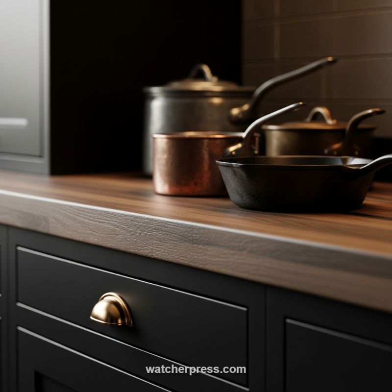
Creating a sophisticated, moody kitchen palette relies heavily on the expert blending of dark tones and the strategic introduction of tactile textures. To replicate this dramatic effect, begin by establishing a deep, saturated base using matte black cabinetry. This deliberate choice absorbs light and immediately introduces a sense of contemporary drama and timeless elegance. The ‘how-to’ lies in the counterpoint: instead of pairing the dark cabinets with a cool, light-absorbing countertop like granite or quartz, choose a rich, warm wood grain. This engineered wood surface introduces a vital organic texture and color warmth (a deep brown-red tone), preventing the black from feeling too harsh or monolithic. Ensure the wood has a prominent grain pattern and a slightly textured finish rather than a high-gloss lacquer; this subtle textural difference is key to adding depth above the smooth cabinet faces, making the surface feel lived-in and inviting.
Once the foundational color block is set, the next critical step is layering complementary textures through hardware and objects. This is where reflectivity and micro-texture come into play. Contrast the flat, dark cabinet fronts with highly reflective, warm metallic hardware, such as the polished brass or gold cup pull seen here. The smooth, curved brass acts as a focused light reflector, breaking the matte darkness and drawing the eye. Expertly curated utilitarian objects, like cookware, serve as functional textural anchors. Introduce variety by juxtaposing different metallic finishes: the rough, pitted surface of cast iron provides a heavy, matte texture; the slightly tarnished, warm patina of copper adds historic warmth and reflection; and a cooler, smooth stainless steel or pewter piece provides visual relief. This ensemble of varied materials ensures that even within a dark palette, the surfaces interact dynamically with ambient light.
To master this look, focus on the principle of variation within darkness. The success of this design is not just the presence of black, but the slightly different textural appearances of the dark elements—the matte black paint, the dark brown wood grain, and the potential dark, horizontal tile backsplash visible in the background. When executing this design, consider light sources carefully; dramatic downlighting or focused spotlights will emphasize the difference between the reflective brass and copper versus the texture-heavy cast iron and wood. Treat the countertop as a stage for functional sculpture, allowing beautifully textured cookware to remain visible, reinforcing the tactile narrative that defines this sophisticated, textural design scheme.
The Art of Contrast: Integrating Raw, Organic Textures with Serene, Muted Tones
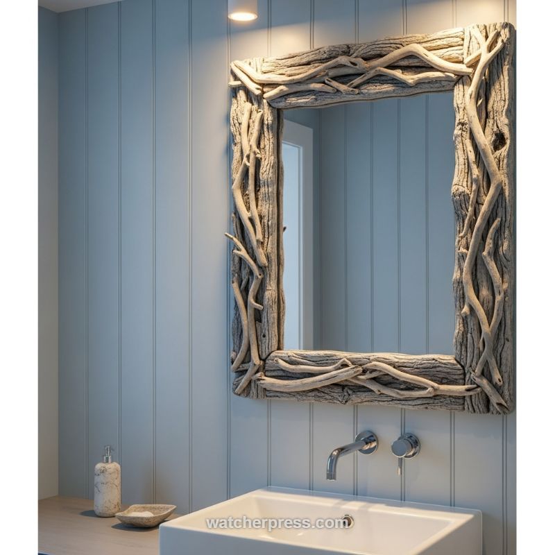
Achieving masterful texture blending starts with establishing a solid, controlled foundation. In this design, the walls are coated in a sophisticated, desaturated blue-grey tone, which immediately sets a mood of coastal serenity and calm. Crucially, the wall itself provides a subtle textural element through vertical planking or shiplap. This linear detail adds structure and depth without competing for attention, acting as the perfect structured backdrop. When recreating this look, choose cool, airy paint colors (think Farrow & Ball’s light blues or soft sage greens) and utilize architectural details like paneling or wainscoting to introduce a fine layer of tactile interest. The goal is to create a soft, uniform field that allows the highly textured focal points to truly pop off the surface. This tonal restraint maximizes the visual punch delivered by the next, highly organic layer.
The centerpiece of this design is the oversized mirror, framed in genuine, intertwined pieces of sun-bleached driftwood. This element serves as the essential textural counterpoint. Where the walls are smooth, cool, and linear, the mirror is rough, warm (in material, though neutral in color), and irregular. To execute this contrast successfully, the chosen organic element must be substantial and high-quality; a thin or flimsy frame would look incidental, whereas this thick, deeply layered driftwood commands attention. Expertly balancing this raw texture requires pairing it with intentionally sleek, modern amenities. Notice the high-gloss ceramic of the vessel sink and the highly polished chrome of the wall-mounted faucet and controls. These smooth, reflective surfaces provide a necessary modern anchor, preventing the overall space from feeling too rustic or beach-shack themed, effectively bridging the gap between natural decay and contemporary luxury.
To complete the integrated look, pay attention to the transitional surfaces. The vanity countertop is rendered in a smooth, light wood or stone that acts as a visual break between the rough mirror and the bright white sink. Accessories follow the same blending principle: the soap dispenser and dish feature a slightly variegated or marbled texture, echoing the organic color palette of the driftwood while maintaining a polished, usable finish. This technique ensures seamless material flow. When implementing this principle, remember the 80/20 rule: allow 80% of your primary surfaces (walls, floors, large furniture) to maintain a consistent, muted tone and subtle texture, dedicating the remaining 20% to hyper-textured statement pieces (like the mirror) that draw the eye and provide the essential visual drama necessary for a truly layered and high-end aesthetic.
Mixing Crisp White Terrycloth with Organic Weaves
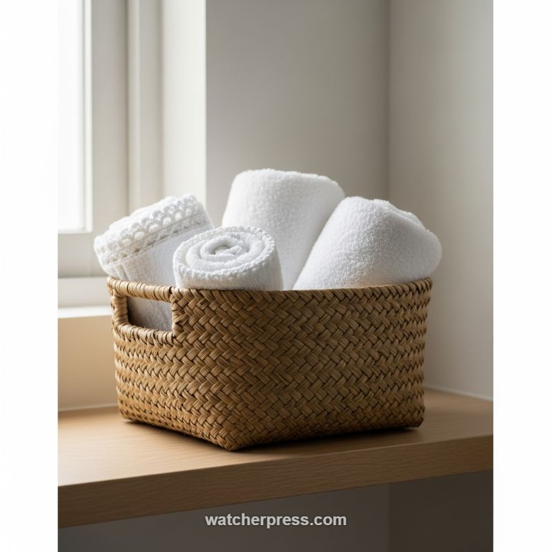
The mastery of texture is perhaps best demonstrated in functional utility spaces like the bathroom, where simple organization can become a high-impact design feature. This scene showcases a perfect blend of high-contrast textures anchored by sophisticated, tonal consistency. To replicate this effect, the key is pairing a rugged, organic container with extremely soft, plush contents. Select a basket woven from natural materials—such as rattan, seagrass, or water hyacinth—that possesses a noticeable, irregular texture and a warm, grounding tone. This rough exterior acts as the visual counterpoint to the soft, highly refined texture of the cotton terrycloth towels. Ensure the towels are perfectly white or cream to provide a crisp, clean aesthetic that allows the basket’s warmth and texture to truly pop. When staging, roll some towels tightly to expose the spiraling loops, fold others simply, and perhaps include one piece featuring a delicate detail, like the visible crocheted edge shown here. These minor variations within the same color family are essential for creating textural depth without introducing distracting visual clutter.
Achieving this blended tone and texture requires precise material selection that speaks to both nature and luxury. The warm, earthy undertones of the woven basket and the light wooden shelf prevent the stark white of the towels from feeling cold or sterile, creating an immediate sense of inviting warmth, reminiscent of a high-end spa. Expertly utilize natural light, as seen in this image, which emphasizes the dimensional quality of the materials; the soft light catches the loops of the terrycloth, defining its fluffiness, while casting slight shadows that deepen the grooves of the basket’s weave. Furthermore, consider the inherent weight and scale of the elements. The basket must be substantial enough in proportion to the counter to feel purposeful, grounding the composition. If the basket is too small, the display loses its impact and risks looking merely decorative rather than functional and integrated.
To integrate this principle into other areas of the home, think beyond typical storage. This technique is fundamentally about presenting everyday items as curated pieces of art. For instance, apply the same approach in a living room by placing a stack of soft cashmere or linen throw blankets inside a hammered metal or distressed wood chest. The resulting contrast between the hard, cold surface of the container and the soft, warm textile creates immediate tactile curiosity. Alternatively, use a woven tray on a coffee table to house smooth ceramic coasters or glass objects. The ultimate ‘how-to’ here is to always ensure that the physical characteristics of the container (rough, hard, geometric) are in direct opposition to the characteristics of the contents (soft, pliable, fluid), while maintaining a restricted, harmonious color palette to keep the focus strictly on the interaction of textures.
Amigurumi Accents: Blending Cozy Textures and Muted Tones

This inspiring nursery accent demonstrates how fiber arts can be utilized to introduce profound softness and tactile interest into a minimalist space. The tonal strategy relies on matte, earth-derived neutrals—oatmeal beige, soft taupe, and rich cocoa brown—paired with gentle, barely-there pastels like light blue and pale lavender. This palette achieves a powerful calming effect, crucial for a nursery environment, by deliberately avoiding high-saturation colors that might overstimulate the eye. To replicate this masterful blend, select a core neutral (like the central crocheted bunnies and main ring) and use it as your primary texture driver. Then, introduce secondary tones through small, repeating elements like the colored spherical accents, ensuring they remain muted and dusty rather than bright or shiny. This provides necessary visual break points and subtle contrast without sacrificing the overall tranquility of the design.
The genius of this idea lies in the application of high-relief texture via the amigurumi crochet technique. In a typically smooth environment—featuring painted walls, smooth wood crib rails, and cotton bedding—the repetitive, soft geometry of the yarn immediately softens the architectural lines of the room. This introduces an organic, handmade quality that elevates the design from purely functional to deeply sentimental and warm. For expert application, designers must consider the contrast ratio between textures. If your nursery utilizes smooth, modern furniture, you need a highly tactile element like this mobile, a chunky knit blanket, or a woven jute rug to act as a counterbalance. The tactile warmth of the yarn invites touch and enhances the feeling of security and comfort, a cornerstone of successful nursery design.
Beyond simple visual appeal, this implementation provides actionable steps for textural longevity in design. Notice how the elements are uniformly scaled yet varied in shape (bunnies, a bear, stars, spheres), which maintains balance while offering visual complexity. When integrating such detailed fiber elements, ensure they are placed where they can be appreciated close-up, maximizing their textural impact. Furthermore, these handcrafted pieces offer inherent flexibility; once the mobile is no longer needed, the individual crocheted figures can transition seamlessly into shelf decor, integrating the room’s original textural scheme into its later phase of development. By choosing quality, handcrafted fiber textures in complementary tones, you create personalized, enduring design statements that masterfully blend cozy tactile sensations with serene visual palettes.
Juxtaposing Geometric Vases with Organic Shell Textures
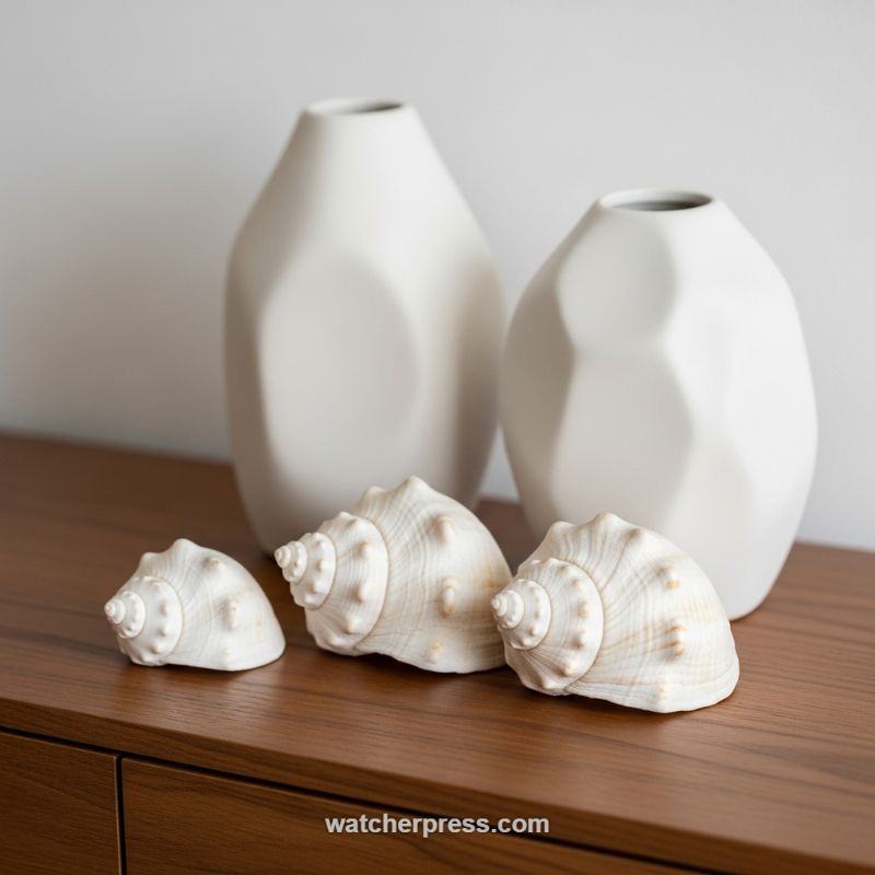
Mastering the blend of texture and tone is often about finding the right contrast within a restrained color palette. This vignette demonstrates the power of utilizing stark whites and natural creams against a single, warm background, allowing the tactile quality of the materials to take center stage. To replicate this high-impact, low-color design strategy, select foundational items—such as the matte, faceted ceramic vases shown here—that possess a clear, modern, and man-made geometry. Place these objects against a strongly contrasting surface, like the rich, smooth, reddish-brown wood, which provides necessary grounding and anchors the brilliant white objects. The key tonal lesson is that limiting your color choices forces the eye to appreciate the subtle shifts in shade (like the difference between the stark white vase and the creamy, porous shell) and the interplay of light and shadow created by the objects’ varied forms.
Once the tonal base is set, introduce opposing textures to create visual tension and depth. The clean lines and angular surfaces of the vases provide an excellent modern foil for the highly organic, naturally formed textures of the sea shells. The shells, with their intricate spirals, knobby protrusions, and subtle ridges, introduce an element of biophilic design—bringing the natural world indoors. When combining items, look for extremes: pair materials that are engineered (like geometric ceramics or polished metal) with those that are found (driftwood, coral, or sea shells). This technique ensures that your display is dynamic and not visually monotonous. This careful juxtaposition prevents the scene from becoming sterile, even when adhering strictly to neutral tones, by offering the viewer a variety of surfaces that imply different weights and origins.
Composition is crucial when layering varied textures. Notice how the arrangement follows the Rule of Odds (five items total) and utilizes different heights to guide the eye. The two tall vases act as the primary anchors and provide necessary verticality and balance. The shells are then strategically positioned in the foreground, tiered by size, to draw the viewer’s attention to the details and intricate organic texture. When creating your own grouping, always layer from back to front, using the largest, simplest items for height and background support. Reserve the most texturally complex and smallest objects for the front, where their details can be fully appreciated upon close inspection. By balancing scale, you ensure that the texture of each piece—from the smooth facets of the vase to the delicate ridges of the shell—contributes harmoniously to the overall artistic statement.
The Art of Coastal Calm: Blending Softness and Transparency
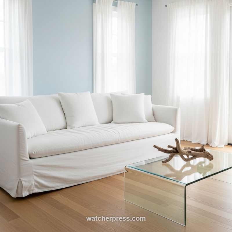
Achieving a masterfully serene aesthetic relies on a delicate balance between cool tones and tactile textures, a principle perfectly executed in this bright, coastal-inspired living space. The tonal foundation is built on crisp white and tranquil pale blue. To replicate this level of serenity, select a single, low-saturation accent color—like a light sky blue or seafoam green—for one wall, contrasting it sharply against pure white trim and surrounding walls. This limited, cool palette immediately expands the perception of space and maximizes the effect of natural light. Crucially, the major fabric elements, such as the sofa and curtains, must be pure white. Opt for slipcovered furniture, which introduces a relaxed, rumpled texture that keeps the atmosphere casual and inviting, preventing the high-contrast white from feeling too formal or cold. This strategy effectively utilizes color to establish a profoundly calming mood before textural layering begins.
The interplay between soft and hard textures is key to giving this minimalist space depth. The large, deep-seated white sofa, dressed in a soft linen or cotton slipcover, provides the main anchor of comfort and tactile softness. To balance this overwhelming plushness, introduce elements that are sleek and transparent. The bent glass coffee table serves this function perfectly; its smooth, non-visual surface provides necessary functionality without adding bulk or competing visually with the sofa. Furthermore, the window treatments should amplify this textural theme. Sheer, flowing voile curtains diffuse harsh daylight, turning bright sunlight into a soft, ambient glow while adding a vertical, airy texture that is intrinsically connected to movement and light. This contrast—heavy, soft fabric below meeting light, ethereal fabric above—is a foundational technique for creating sophisticated balance in monochromatic or limited-palette rooms.
To prevent the overall design from leaning too far into sterile minimalism, integrate organic, rough textures derived from nature. The light hardwood flooring adds necessary warmth and a subtle, polished grain texture, but the most powerful grounding element is the centerpiece. A piece of raw, natural driftwood placed atop the glass table serves as a vital focal point, providing a moment of sharp, weathered contrast against the smooth glass and soft fabric. This piece introduces the concept of the shore—the source of the room’s color inspiration—and grounds the sleek design with an element of rugged authenticity. When replicating this, ensure your organic accent (be it driftwood, stone, or a woven basket) is truly natural and features prominent graining or roughness; this deliberate juxtaposition of raw nature against high design is what elevates the scheme and ensures the room feels lived-in and texturally rich.
Architectural Texture Meets Industrial Contrast: The Stone and Mirror Juxtaposition
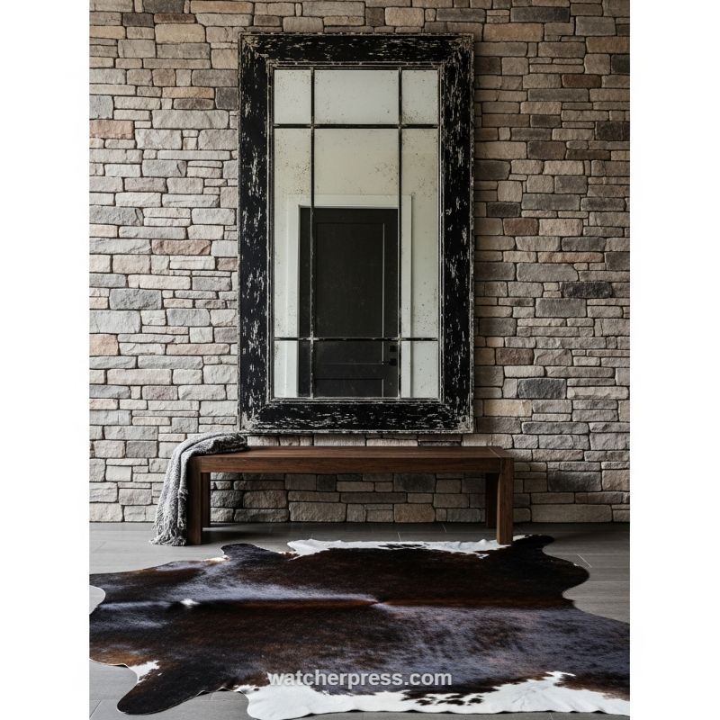
To truly master the blend of texture and tone, start with an architectural anchor that features extreme natural variation. In this stunning entryway, the use of a stacked stone wall serves as the primary textural canvas. The key ‘how-to’ here is recognizing that such a busy, tactile background requires an equally dramatic, yet simpler, focal point to prevent the space from feeling cluttered. Select an oversized, rectangular mirror—ideally one with an industrial or window-pane motif—to provide necessary geometric contrast against the organic, irregular lines of the stone. Furthermore, the mirror’s frame must feature heavy visual texture, such as the chipped, distressed black finish seen here, to bridge the rustic quality of the wall while introducing a sharp, modern tone. Expert advice dictates using large-scale pieces to counter overwhelming textures, allowing the reflective surface to add depth and visual space without competing with the backdrop’s rough surface.
The next layer involves introducing varied materials to build tactile richness and tonal warmth. Below the dramatic verticality of the mirror, a sleek, minimalist wooden bench provides a smooth, horizontal counterpoint. This transition from highly distressed (mirror frame) and rough (stone) to refined (bench wood) is crucial for a balanced design. Further anchoring the floor space is an organic, asymmetrical element: the cowhide rug. This piece introduces a rich, natural, and highly variable texture that immediately warms the cool grey tones of the stone and floor. When selecting a hide rug, choose one that mirrors the high-contrast color palette of the rest of the setting (dark brown/black and white) to ensure the textures feel cohesive, rather than chaotic. Drape a simple knit throw over the bench to add a small, soft textile texture, completing the layered effect of wood, metal, stone, and animal hide.
A crucial element of this design is the strategic use of high tonal contrast. The palette relies heavily on stark black and various shades of cool grey, tan, and cream. The black elements—the mirror frame, the dark patches of the hide, and the dark door reflected in the glass—act as visual weights that ground the installation and emphasize the textures they frame. By using a bold color (black) on the distressed mirror, you highlight the frame’s texture through sharp contrast against the lighter stone and wall mortar. For your own space, use this technique by pairing cool-toned, light base textures (like grey stone or concrete) with highly saturated, dark accent pieces. This juxtaposition ensures that every tactile detail—from the roughness of the stone to the patina of the distressed wood and the smoothness of the finished bench—is amplified, resulting in a sophisticated, multidimensional space that truly masters both texture and tone.
The Power of High-Contrast Texture: Emerald Velvet Against Midnight Walls
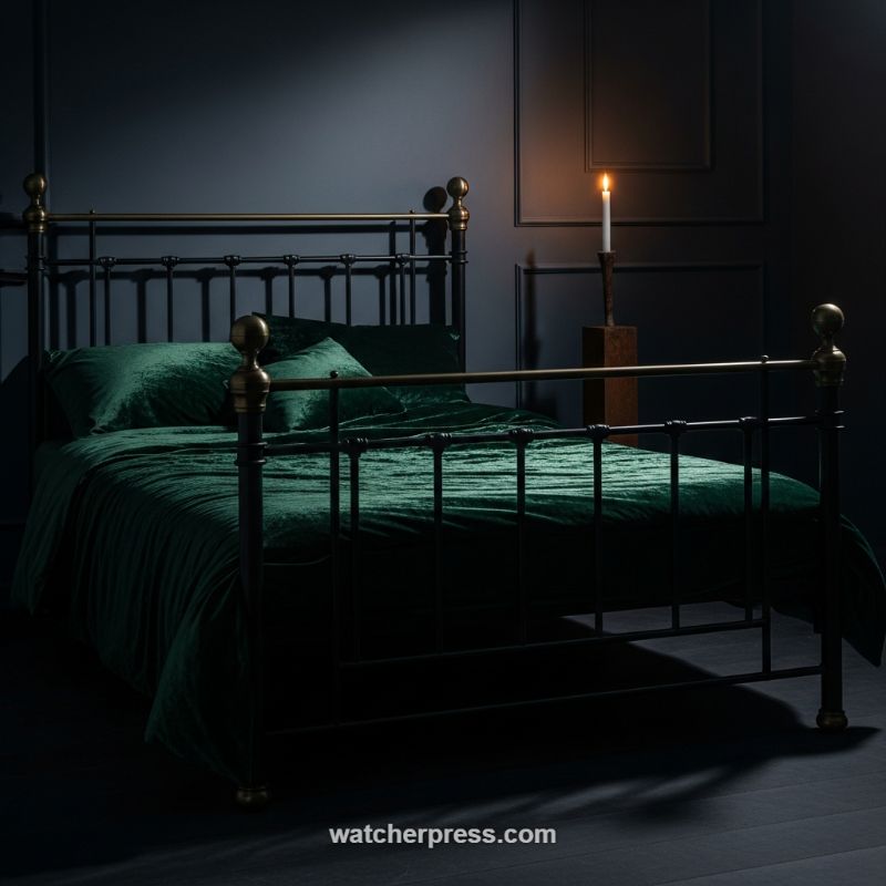
This dramatic design scheme masters the art of tone by enveloping the space in deep, saturated color, creating an atmosphere of immediate luxury and intimacy. To replicate this moody aesthetic, begin by selecting a matte paint finish in a shade close to black—deep charcoal, midnight blue, or forest green. These dark tones serve as the perfect backdrop, absorbing light and making anything placed in front of them appear instantly more vibrant and rich. The critical step is embracing low-level, localized light sources; avoid harsh overhead fixtures. Here, the sole light is a tall, flickering candle, providing a warm, golden cast that dramatically highlights the textures it grazes, reinforcing the theatrical and secluded nature of the room. This technique turns the bedroom into a cozy, glamorous retreat, making the space feel intentionally designed for comfort and dramatic flair.
The true lesson in textural mastery here is the powerful juxtaposition of hard and soft materials. The bed itself features a classic Victorian-style frame constructed of dark wrought iron accented with polished brass finials. This rigid, cold, and structured material provides the architectural skeleton of the design. Against this hardness, introduce the sensory pleasure of deep emerald green velvet bedding. Velvet, especially crushed velvet like this, is the ideal fabric for a dark room because its directional pile reflects and catches the limited light unevenly, creating shadows and highlights that give the textile a dimensional, liquid movement. When implementing this design principle, ensure your textures are highly contrasting; pair the coolness of metal or stone with the deep warmth and plushness of a heavy textile like velvet, mohair, or high-pile wool.
To complete this sophisticated look, focus on integrating warm metallic accents that reflect the candlelight. Notice the brass detailing on the bed frame posts; brass is a warmer metal than chrome or steel, aligning better with the cozy mood and the fiery glow of the candle. These small reflective elements prevent the room from becoming overwhelmingly dark by providing small, sparkling pockets of visual interest. Finally, utilize accessories that reinforce the height and drama of the setting, such as the tall, slender pedestal supporting the candle. This draws the eye upward and emphasizes the vertical scale, preventing the low light from making the space feel cramped. By deliberately balancing matte, light-absorbing surfaces (walls) with highly reflective, plush textiles (velvet) and warm metals (brass), you achieve a layered aesthetic where tone and texture work in symbiotic harmony.
Moody Contrast: The Academic Study in Distressed Leather and Oxblood
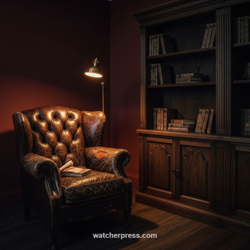
Achieving this level of deep, academic mood relies heavily on a deliberate tonal strategy where color acts as a frame for texture. To replicate this look, start by embracing highly saturated, dark wall colors—specifically rich maroons, oxblood reds, or deep plum—applied with a matte or eggshell finish. Unlike bright colors that reflect light, these deep tones absorb it, instantly creating a sense of intimacy and historical depth essential for a study or library aesthetic. This tonal base should be strictly consistent across all walls to eliminate distraction and maximize the cocoon effect. The key expert advice here is selecting the right lighting Kelvin temperature; stick to very warm sources (2200K to 2700K). This amber glow interacts with the red pigment in the walls, softening the shadows and amplifying the luxurious, velvety appearance of the color itself, which makes the whole space feel physically warmer and more inviting than a cool-toned room would be.
Once the tonal foundation is set, introduce textures that tell a story of longevity and character. The centerpiece, the distressed leather armchair, is non-negotiable for this design idea. Look for full-grain or vintage leather pieces featuring heavy patina, cracking, and deep button-tufting (like a classic Chesterfield wingback). This highly tactile texture provides a necessary rough, human element that contrasts sharply with the smooth, deep wall color. Complement this worn textile with the sturdy, formal texture of dark, highly grained wood, as seen in the tall barrister-style bookcase. The wood should possess visible, vertical detailing (fluting or paneling) to provide visual structure and weight. The juxtaposition of the soft, aged, yielding leather against the hard, formal, dark wood cabinetry creates a complex visual hierarchy that prevents the dark room from feeling flat or monolithic.
Finally, master the technique of directional lighting to define both texture and tone through high-contrast chiaroscuro. Instead of overhead ambient light, employ task lighting, such as the brass floor lamp positioned directly next to the seating area. This focused light source illuminates the textural details of the leather (highlighting the cracks and buttons) and casts dramatic shadows, enhancing the room’s cozy, dramatic mood. The warm metallic finish of the brass lamp introduces a small, precise metallic texture that catches the light without disrupting the overall earthy color palette. To complete the look, ensure the flooring—dark-stained wood planks are ideal—grounds the space and extends the rich, deep tones down, creating a unified, enveloping environment where the textural interplay between the worn leather and dark wood becomes the primary design focus.
Masterful Mix: Blending Distressed Leather Texture with Deep Wood Tones
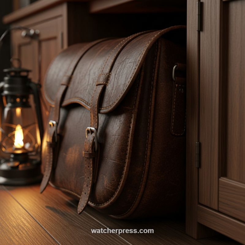
This evocative composition showcases the supreme power of blending tactile textures to create immediate visual interest and depth. The focal point is the deeply textured, distressed brown leather bag, whose inherent ruggedness
characterized by subtle creases, natural variations, and thick stitching
provides a striking contrast to its environment. The surrounding elements, specifically the richly grained wooden floorboards and the adjacent cabinet structure, offer a smoother, more polished finish. When integrating such elements, the designer must pay close attention to the scale of the texture; here, the large-scale wood grain complements the fine-scale texture of the leather, preventing either material from overpowering the other. The key takeaway is that true textural mastery lies in juxtaposition: pairing a resilient, aged material like saddle leather with the sleek sophistication of dark, finished wood ensures a grounded yet refined aesthetic.
Beyond texture, this scene is a study in tonal harmony and dramatic lighting. The palette is dominated by deep, warm earth tones
mahogany, espresso, and rich caramel browns
which inherently lend themselves to cozy, masculine, or library-inspired designs. Crucially, the entire mood is elevated by strategic low-key lighting, exemplified by the vintage lantern. The warm, amber glow from the flame acts as a powerful accent, dramatically sculpting the three-dimensional quality of the leather and highlighting the sheen of the polished wood. This technique of using a singular, low-level, warm light source creates deep, pronounced shadows, adding layers of mystery and intimacy to the space. Designers should replicate this approach by utilizing task or accent lighting (like vintage brass lamps or wall sconces) rather than overhead ambient light to intensify the material richness of the chosen textures.
To successfully recreate this sophisticated blend of rustic warmth and tailored detail in an interior space, designers should adopt a layered approach, starting with the foundation. Choose flooring in a dark, saturated wood tone (such as walnut or ebony stained oak) with a moderate sheen to reflect light and enhance depth. Incorporate leather goods sparingly but effectively, perhaps opting for a few key pieces like a chesterfield sofa, deep-seated accent chairs, or even custom leather drawer pulls, ensuring the leather possesses genuine, natural variation rather than a uniform machine finish. Finally, curate your lighting fixtures to continue the story; prioritize materials like aged bronze or blackened iron for the fixtures themselves, and always opt for bulbs with a color temperature below 2700K (warm white/amber) to maintain that essential atmospheric glow that ties the rich textures and deep tones together seamlessly.
The Artful Blend of Rustic Wood and Woven Rattan for Coastal Texture
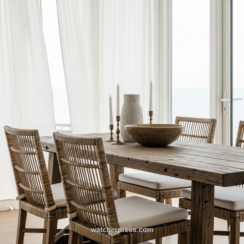
This setting masterfully demonstrates how to layer raw, organic textures to create a coastal-inspired yet sophisticated dining experience. The foundation is the heavily distressed, reclaimed wood table, whose deep grain, natural wear, and inherent imperfections provide a rich, tactile anchor. Counterbalancing this visual and physical weight are the dining chairs, crafted from natural woven rattan or wicker. The open, linear weave of the chair backs introduces a crucial element of contrast: the chairs feel incredibly light, airy, and breathable, preventing the heavy, dark table from dominating the entire space. To successfully replicate this blend, ensure your primary furniture pieces exhibit a clear textural dichotomy—pairing a robust, aged material (like reclaimed wood or stone) with an intricate, open weave that maximizes transparency and movement.
The overall palette relies on earthy neutrals and bright whites, allowing texture, rather than color, to define the design’s narrative. Note the strategic use of pure white elements to soften and elevate the raw materials. The sheer linen or cotton drapery diffuses the harsh exterior light, transforming it into a soft, ethereal glow, which is essential for achieving coastal serenity and highlighting the subtleties of the wood grain. Furthermore, the crisp white seat cushions not only provide necessary comfort but also offer a smooth textural counterpoint to the rough wood and the intricate rattan. This high-contrast pairing (rough/smooth, dark wood/light fabric) is crucial to preventing the neutral space from falling flat. When applying this technique, utilize light textiles—sheer window treatments and pure white upholstery—to bounce light and emphasize the natural variation in the brown and beige materials.
Finally, the centerpiece accessories provide the final, expert textural layer, demonstrating that successful material blending happens at every scale. A large, rough-hewn wooden serving bowl echoes the material of the table, unifying the aesthetic, while a speckled, matte ceramic vase introduces a stone-like grittiness. These natural elements are elegantly punctuated by slender brass candlesticks. The introduction of a metallic element like brass is subtle but powerful; its refined reflection adds a polished gloss that contrasts beautifully with the primitive feel of the wood and the rough texture of the vase. The design lesson here is the importance of specificity: layer objects that have distinctly different surface qualities (porous, reflective, smooth, or gritty) in your accent pieces. Ensure the arrangement maintains the overarching neutral tones, allowing the ‘feel’ of the material—not its color—to be the absolute star.
The Power of Contrast: Pairing Refined Matte Ceramics with Rustic Wood Grain
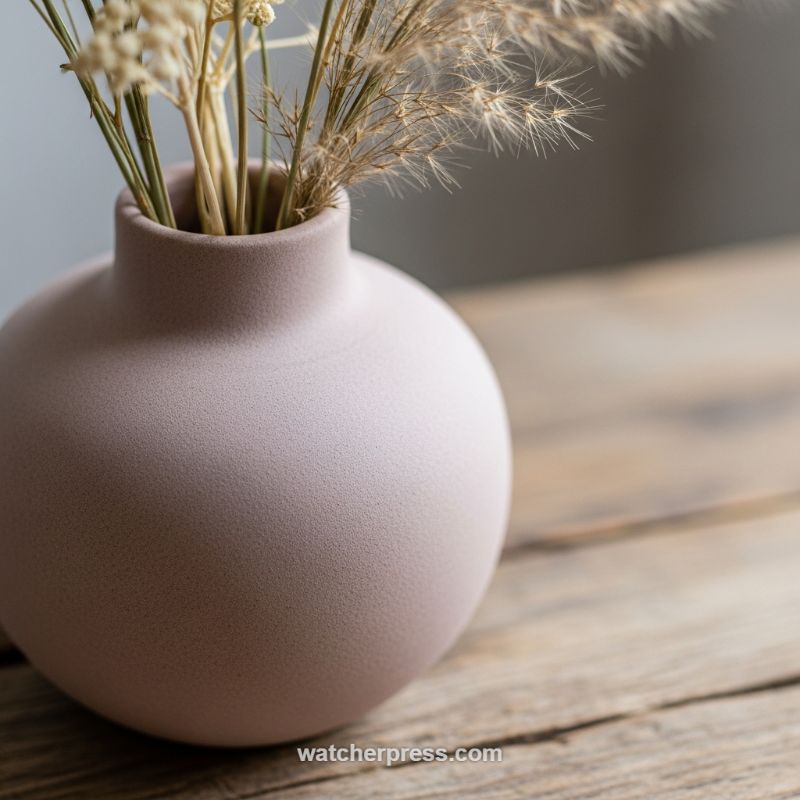
Achieving depth and interest in a minimalist space often relies on a masterful combination of opposing textures, maintained within a strict, harmonious tonal framework. As demonstrated by the image, the successful execution of this principle involves juxtaposing highly refined elements with profoundly rugged ones. The spherical vase itself serves as the perfect textural anchor: its matte, dusty rose finish absorbs light rather than reflecting it, creating a soft, slightly porous tactile quality. To replicate this effect, consciously seek out accessories with a sandblasted or unglazed finish. Then, introduce a contrasting backdrop, such as the weathered, coarse-grained wood surface seen here. The roughness of the wood’s deep ridges provides instant visual friction against the smooth, modern silhouette of the vase, preventing the arrangement from feeling overly polished or sterile. This contrast is essential: the ‘soft’ touch of the ceramic must meet the ‘hard’ reality of the rustic surface.
To elevate the arrangement beyond simple display, the choice of filler material must also align with the textural narrative while complementing the muted palette. Instead of vibrant, live florals that demand attention, select dried botanicals, such as airy grasses or fine seed pods. These materials add a delicate, brittle texture and a high degree of fragility, reinforcing the overall sense of calm and organic naturalism. When styling, pay close attention to the visual weight and negative space. A compact, rounded vessel like this works best when topped with light, wispy elements that extend upward, softening the transition from the thick base to the airier top portion. The key instructional takeaway here is to ensure the color tones (light mauve, muted tans, and cool grey backdrop) are uniform in saturation and darkness, even as the textures shift dramatically, ensuring the look remains coherent and balanced.
Applying this concept to wider interior design projects requires scaling up the textural juxtaposition used in this vignette. If using a high-sheen or highly pigmented piece of furniture, balance it with matte wall coverings or a textured sisal rug. Conversely, if your room features exposed beams or reclaimed wood flooring (the ‘rustic’ element), ensure your accessories, such as lamps or side tables, introduce that necessary counterpoint—clean lines, monolithic shapes, and velvety or matte finishes. This approach creates an environment where every touchpoint, from the smooth base of the ceramic to the jagged edge of the wood, offers a new sensory experience. Remember that tonal subtlety is the glue that holds these contrasting textures together; restrict your main color scheme to three closely related neutral hues to maximize the focus on the materials themselves.
Implementing High-Contrast Texture in Modern Mediterranean Design
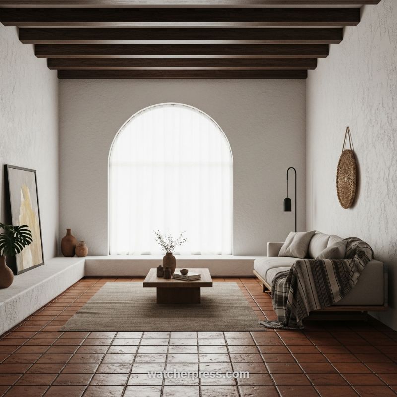
To successfully execute this look—a blend of rustic Mediterranean warmth and minimalist serenity—you must prioritize foundational textures that work in direct contrast. Begin with the flooring and walls. The selection of warm, high-gloss terracotta or saltillo tile for the floor instantly grounds the space with history and warmth, contrasting dramatically with the rough, matte finish of the surrounding walls. Opt for heavy textures here, such as stucco, Venetian plaster, or a deeply textured limewash, maintaining a strictly neutral, off-white palette. This rough-and-smooth, warm-and-cool dichotomy is amplified by the exposed ceiling structure. Install dark, heavy wooden beams (walnut or espresso finish) to provide a deep, linear architectural anchor overhead, defining the volume of the room while visually bridging the gap between the earthy floor and the bright white walls. This initial layering of foundation materials establishes a tactile environment that feels authentic and layered before any furniture is introduced.
Once the architectural base is established, the next step is softening the high-contrast shell with refined, comfortable elements. Select low-profile, modern seating (such as the simple wood-framed sofa shown) upholstered in creamy linens or woven cottons that closely match the wall color. This creates a visually continuous flow, allowing the furniture to recede into the textured walls rather than competing with them. Introduce a medium-toned, woven area rug—ideally a flatweave jute or wool blend—to delineate the living zone and provide a transitional buffer between the hard, glossy terracotta and the soft upholstery. Use simple wood furniture for accent pieces, like a solid block coffee table, maintaining clean lines that prevent the space from veering too heavily into overly rustic territory. Finish the seating area with highly textured throws or pillows featuring subtle striping or natural fibers, providing warmth and depth without relying on complex patterns.
Finally, utilize strategic focal points and minimalist decor to complete the tone. A grand, simple architectural feature, such as a large arched window dressed with sheer curtains, should serve as the primary source of light and visual drama. The sheer fabric diffuses sunlight beautifully, softening the intense texture of the stucco walls. Decorative accents should be sparse and intentional, adhering strictly to natural materials: unglazed ceramic vases, dried botanicals, and handwoven wall hangings. Expertly balance the rustic elements by introducing one or two modern, dark metal accents—like a sleek black floor lamp—to provide a sharp, contemporary edge. This deliberate mix of primitive textures and modern simplicity ensures the space remains elevated, restful, and masterfully balanced in both tone and tactile appeal.
Layering Linen: Achieving Coastal Calm Through Neutral Tones and Tactile Textures
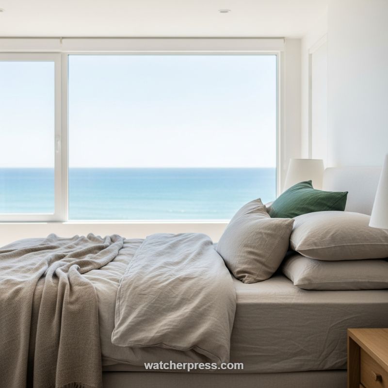
This seaside bedroom perfectly exemplifies how a commitment to a neutral color scheme can create profound depth and serenity, provided the tones are carefully selected and layered. The foundation relies on washed-out, earthy shades—specifically taupe and soft beige linen for the majority of the bedding. These tones avoid the harshness of pure white while still reflecting the immense natural light flooding in from the expansive window, resulting in a soft, sun-drenched glow across the space. The visual impact is one of instant calm, where the interior materials recede slightly, allowing the breathtaking blue of the ocean view to function as the primary, high-saturation color element. To successfully replicate this tone-on-tone mastery, start with a base color that reads as “sandy” or “oatmeal” and ensure your walls and major structural elements remain a crisp, bright white to maintain necessary contrast and reflect maximum light, which is crucial for subtly highlighting the subsequent textures. Choosing natural fibers like linen also instantly introduces a relaxed, organic feel that synthetic materials cannot achieve, giving the room its signature effortless luxury.
When working with a monochromatic or highly neutral palette, texture becomes the most critical tool for dimensional design. The visual interest in this setting comes entirely from the variety of tactile finishes in the textiles. Notice the crucial juxtaposition: the main duvet and sheet set feature the inherently wrinkled, relaxed quality of washed linen, suggesting deep comfort and ease. This soft, rumpled foundation is then contrasted with a densely woven or waffle-knit throw blanket draped casually across the foot of the bed. This second layer provides a crucial textural shift—a tighter, more geometric pattern against the loose, organic drape of the linen, preventing the overall scheme from falling flat. Expert instruction dictates layering pillows not just in size, but in finish; utilize large, structured shams as a backdrop, add slightly smaller pillows in the crinkled linen, and finally, introduce accent pillows in a differing, perhaps tighter, weave. This systematic build-up ensures that even without loud patterns or colors, the bed looks rich, complex, and irresistibly inviting.
While the design is overwhelmingly neutral, the inclusion of a single, well-placed accent color prevents the space from feeling visually monotonous. Here, a deep forest or moss green pillow is strategically positioned amongst the neutrals. This specific hue is derived from nature, connecting the interior scheme to the blues of the water and sky, and subtly referencing coastal foliage or sea moss. It serves as a visual anchor, grounding the light colors and confirming the organic mood of the room. When implementing this technique, select one accent shade that possesses depth and saturation—avoiding light pastels—and ensure its placement is singular and deliberate. Furthermore, maintain the room’s minimalist structural integrity: opt for clean lines in furniture (like the simple wooden bedside table glimpsed) and keep wall accessories sparse. This disciplined approach ensures that the blend of sophisticated natural textures and serene, restful tones remains the undisputed focus of the retreat.
Mastering Monochromatic Texture with Oversized Knits
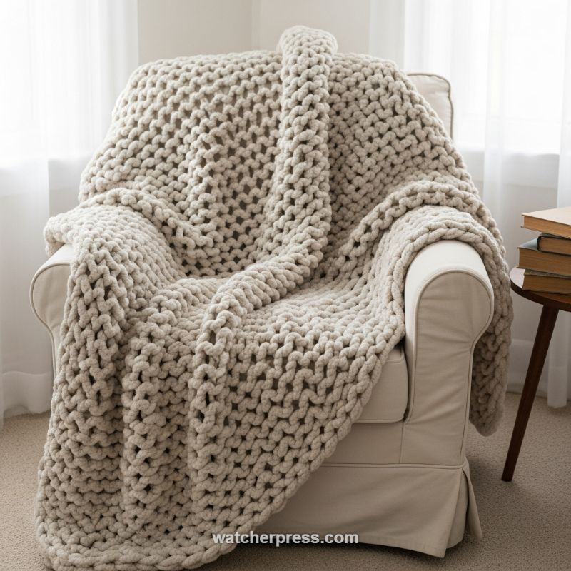
Achieving depth in a neutral palette often requires maximizing physical texture, a principle perfectly illustrated by the use of oversized knit throws. When designers opt for a tone-on-tone aesthetic, such as the cream and oatmeal hues seen here, the visual interest cannot rely on high color contrast; it must be generated through tactile variation and scale. This technique utilizes a chunky, open-weave fiber (often arm-knitted merino or heavy chenille) which, when draped, creates deep shadows within the loops and stitches. These inherent shadows function as the ‘contrast’ in the absence of color variance, lending instant three-dimensionality to an otherwise flat space. To replicate this effect, prioritize materials that have a significant loft and stitch definition. Look for throws or rugs featuring techniques like basketweave, popcorn stitch, or cable knits, and ensure the surrounding furniture fabric (like the armchair’s smooth slipcover) is a distinct counterpoint, highlighting the blanket’s voluminous nature.
The key to this masterful blend of tone and texture lies in the careful selection of adjacent neutrals. The armchair, serving as the anchor piece, provides a smooth, light cream base. The throw introduces a slightly darker, warmer oatmeal tone. Expert blending requires understanding that ‘monochromatic’ does not mean identical; rather, it means utilizing shades and saturations within the same family (e.g., ecru, beige, cream, sand). When curating your space, ensure the base shade of your largest item is complemented by accessories that are either 1-2 steps lighter or darker on the neutral scale. This subtle tonal shift prevents the throw from visually disappearing into the chair, giving it prominence while maintaining a harmonious, calming effect. When purchasing fibers, check how natural light interacts with them; highly textured items will look darker in shadows and lighter where the sun hits directly, further enhancing the dynamic tonal relationship.
Finally, the styling of the throw itself is crucial for achieving that inviting, ‘top-tier blog’ look. Avoid stiff, perfectly folded blankets. Instead, employ the ‘intentional drape’ technique: toss the throw casually over the back and arm of the chair, allowing it to spill naturally toward the floor. This relaxed placement emphasizes the material’s softness and volume, communicating warmth and approachability. Consider the complementary elements: here, the light, sheer curtain diffuses the window light, softening edges and minimizing harsh shadows, while the simple, rustic wood side table and stack of books anchor the space with natural, slightly rougher textures. This integration of raw wood and soft textile provides a grounded balance, proving that luxurious design often rests on the successful interplay of simple, earthy elements.
Elevating Neutrals with Chunky Woven Texture
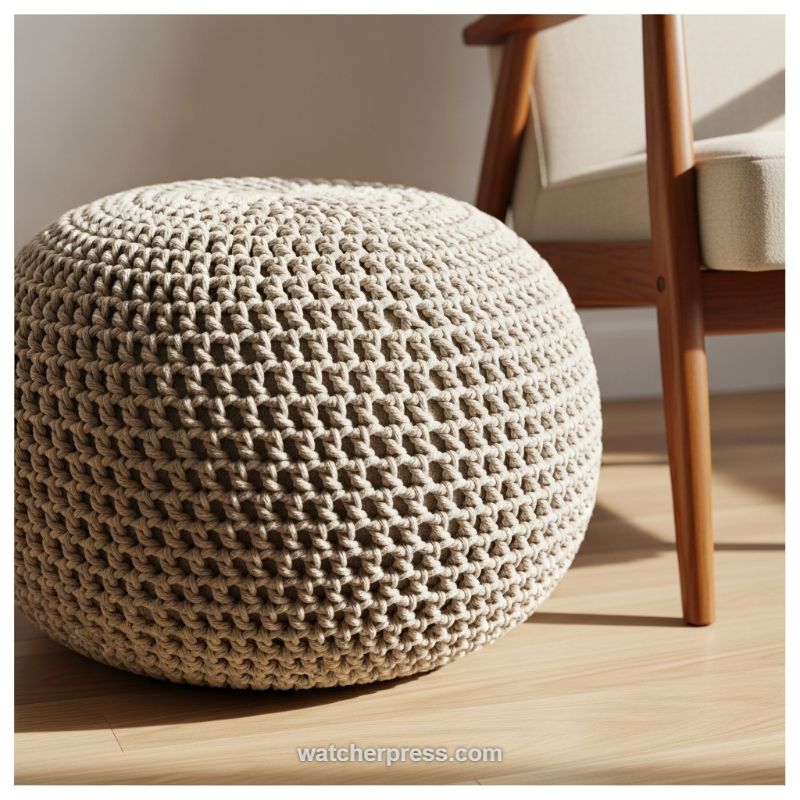
The masterful integration of texture is the secret weapon of this otherwise monochromatic design vignette. Rather than relying on bold color shifts, this approach utilizes a deeply tactile, chunky knit pouf to inject dynamic visual interest into a calm, neutral space. The key is the scale and openness of the weave; the thick cordage creates deep recesses and pronounced shadows when hit by light, turning a simple beige accessory into a sculptural element. Expert advice dictates creating a textural ‘dialogue’ in the room. Here, the soft, rounded, highly tactile surface of the pouf offers a crucial contrast to the smooth, angular lines of the wooden armchair frame and the polished sheen of the hardwood floor. This deliberate juxtaposition prevents the neutral palette from falling flat, giving the eye multiple surfaces to engage with and conveying a sense of grounded, effortless coziness.
To replicate this high-end aesthetic, focus on anchoring your design with materials that vary significantly in their feel and finish. When working within a beige or light taupe color scheme, the material itself must do the heavy lifting. Choose furnishings that maximize textural depth, such as the open-weave cotton or jute used in this pouf, chunky bouclé fabrics on the chair, or ribbed textiles for throws. This strategy ensures the light color scheme feels rich and layered, rather than sparse. Furthermore, consider the functionality of accent pieces. A round pouf acts as an exceptionally versatile piece of furniture—it can be used for extra seating, as a relaxed footrest, or even topped with a tray to serve as an impromptu side table. Its placement near the mid-century modern armchair in the background highlights how natural textures soften the sometimes rigid lines of wooden-framed furniture, contributing to a welcoming, Scandi-inspired environment.
Achieving this texture-centric design requires meticulous attention to lighting, especially natural light. Position your furniture in a way that allows sunlight to rake across the surface of the textured elements. As demonstrated in the image, the strong diagonal light casts defined shadows within the chunky stitches of the pouf, dramatically emphasizing its three-dimensionality. In spaces lacking ample natural light, use strategically placed spotlights or floor lamps to mimic this effect, directing the beam onto the tactile surfaces. When purchasing textured accents like these, ensure the scale aligns with the surrounding furniture; large-scale furniture pairs best with large-scale textures, maintaining visual harmony. Always prioritize natural fibers for the most authentic and enduring aesthetic, focusing on wool, thick cotton, jute, or natural linen to guarantee that your neutral tones feel organic and luxurious.
Harnessing High-Contrast Color and Organic Texture: Cobalt and Terracotta
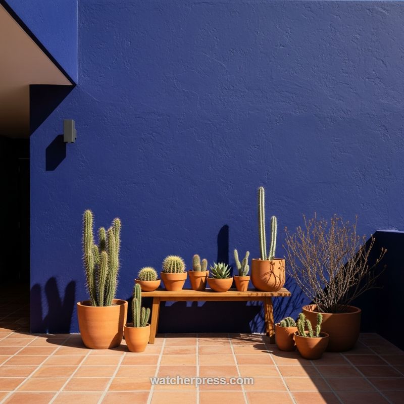
This striking design vignette perfectly exemplifies how to use extreme color contrast and natural materials to create a dramatic, architecturally sophisticated space. The foundation of this look is the pairing of the vibrant, matte ultramarine or cobalt blue wall with the warm, earthy tones of terracotta, clay planters, and rust-colored tile flooring. The highly textured finish of the stucco wall prevents the vast expanse of blue from feeling monolithic; instead, it absorbs light and provides a rich, deep background against which the organic shapes of the cacti truly pop. To replicate this masterful blend of tone, designers must commit to saturation. Select a deep, pigmented shade for your primary wall treatment and ensure the finish is ultra-matte or lime wash to maximize the tactile visual effect and deepen the perceived color.
Expert application of this technique relies heavily on material grounding. While the intense blue provides the modern drama, the use of unglazed terracotta is essential for anchoring the space and introducing crucial texture. Terracotta, being inherently porous and natural, contrasts beautifully with the uniformity of the painted surface. When curating a botanical display like this, use planters of varied sizes and heights but keep the material consistent (all terracotta) to maintain harmony despite the chaos of different plant shapes. Furthermore, notice the importance of lighting: the strong, directional sunlight casts crisp, architectural shadows, transforming transient shade into dynamic graphic elements. If recreating this indoors, directional spotlights or strategically placed uplighting can mimic this high-drama effect, highlighting the texture of the wall and the silhouettes of the plants.
Finally, focus on textural variation within the planting itself. The grouping features diverse cacti from the tall, smooth, vertical columns to the smaller, prickly globes and spiky succulents introducing a complex layer of fine texture against the coarse backdrop. This juxtaposition of sharp, vertical lines (plants) against the geometric stability (wall, floor, bench) adds visual interest and movement. For implementation, select contrasting plant forms and sizes, grouping them organically on a simple, low wooden bench, which adds yet another layer of organic texture. This concept proves that intentional simplicity limiting the color palette to three main tones (blue, terracotta, and green) while maximizing textural contrast creates the most powerful, memorable design statement.
Harmonious Contrast: Layering Textured Knit Pillows in a Muted Palette
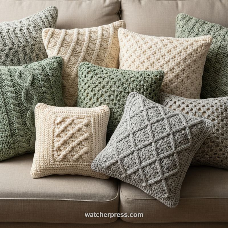
The image is a masterclass in leveraging textile texture to create profound visual interest within a tight, controlled color palette. This approach proves that depth doesn’t require loud colors, but rather the masterful layering of tactile surfaces. To replicate this look, begin by focusing entirely on high-relief textures, such as the classic Irish Aran knitting and crocheting techniques displayed here—think complex cables, raised diamond patterns, basketweave, and dense popcorn or bobble stitches. The goal is to maximize shadow play across the fabric surfaces. Notice how the light catches the peaks and valleys of the stitches, making the muted colors (soft gray, sage green, and rich cream) pop without introducing overwhelming visual noise. This dense concentration of varying textures prevents the arrangement from appearing flat, transforming simple throw pillows into sculptural elements that invite touch.
Achieving this level of sophisticated texture blending hinges on strict tonal control. Our expert advice is to select three to four non-primary, nature-inspired tones that are closely related—here, earthy greens, natural linen creams, and cool grays. This restrained color strategy is essential because intense texture paired with intense color often leads to chaos. By keeping the colors muted and harmonious, you allow the texture itself to become the dominant pattern. When selecting materials, ensure the fibers feel substantial; wool, thick cotton, or heavy acrylic blends will best hold the dimensional stitches required for cables and diamonds. Furthermore, use the foundational furniture (like the neutral sofa shown) as your anchor, ensuring the pillow colors complement, rather than clash with, the larger backdrop, grounding the entire composition.
The final step is the artful arrangement, which should feel abundant and intentionally casual. Avoid strict symmetry. Instead, layer the pillows, mixing sizes and shapes to create height variation. Crucially, pay attention to the scale of the texture itself when placing items. Ensure a small, tightly patterned pillow (like the cream square with the central diagonal cable) is juxtaposed against a pillow featuring a larger, bolder motif (like the oversized cable or the expansive gray diamond pattern). This contrast in textural scale ensures that each individual pillow is highlighted, preventing the textures from blending into a single, overwhelming heap. This method provides the tactile richness of maximalism while maintaining the calm and sophistication characteristic of a modern, well-curated interior space.
Blending Patina and Pattern: A Mediterranean-Inspired Kitchen Corner
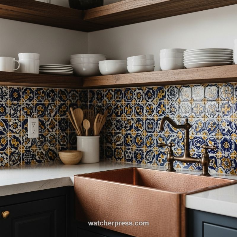
Achieving a successful blend of texture and tone requires fearlessly juxtaposing elements that typically seem mismatched. This design scheme demonstrates how to utilize a high-impact patterned backsplash as the centerpiece, then strategically introduce natural materials and hammered metals to build complexity. The foundation is set by the vibrant ceramic tile, likely a Spanish or Talavera-style pattern featuring bold blues and striking yellow-gold motifs. Because this element introduces significant pattern density, the surrounding tones must be selected carefully: grounding the scheme with dark, saturated cabinetry (navy or deep charcoal) provides necessary visual weight, while clean white countertops and walls offer breathing room and prevent the look from becoming overwhelming. When working with such rich pattern saturation, treat the backsplash colors as your anchor palette, pulling out the secondary tones (like the deep blue or warm gold) to inform hardware and fixture choices.
The secret to this design’s mastery lies in the introduction of the hammered copper farmhouse sink. Copper serves as a powerful textural counterpoint to the smooth, glazed tile and cool, linear lines of the white countertop. The metal’s inherent warmth and rich patina immediately elevate the space, transforming a simple corner into a feature. To integrate this warm metal successfully, echo its tone through adjacent features: here, the open floating wooden shelves provide natural texture and a complementary mid-tone brown that frames the intense tile work. Furthermore, the selection of an oil-rubbed bronze bridge faucet is critical. This dark, textured finish reads almost black, matching the depth of the lower cabinets while its aged patina harmonizes with the rustic quality of the hammered copper, successfully bridging the cool and warm elements within the design.
To perfect the balance when layering such intense textures and tones, rely on simple, repetitive accessories. Notice the use of stacked white dishware on the open shelving—this repetition of smooth, neutral white material provides a clean visual break and highlights the underlying texture of the wood shelves. Similarly, the use of natural wooden utensils displayed in a plain white ceramic crock repeats the wood tone of the shelves, ensuring that every element, even the smallest accessory, contributes to the overall textural narrative. This technique—framing dramatic design choices with simple, neutral, and repetitive utilitarian objects—is essential expert advice for ensuring that a highly layered space feels curated and dynamic rather than cluttered or visually chaotic.
Integrating Organic Weaves with Textured Plaster Bases
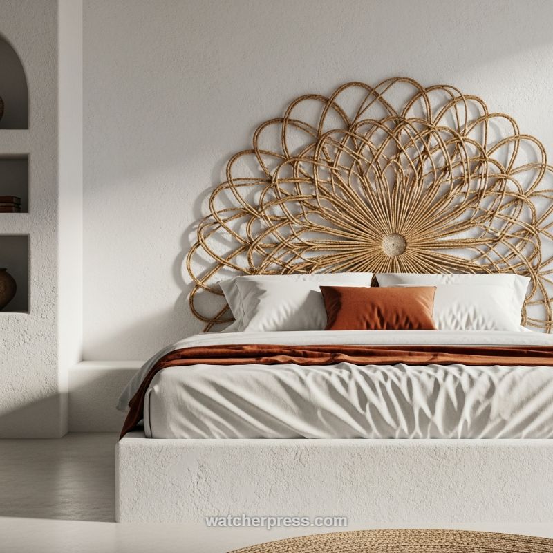
The foundational strategy for mastering this blend of texture and tone lies in establishing a rough, monochromatic base. Here, the walls and the built-in platform bed are rendered in a thick, matte, off-white plaster or stucco finish. This heavily textured material immediately introduces an organic, handmade quality, often associated with Mediterranean or modern Wabi-Sabi design. To utilize this technique effectively, ensure your base materials—whether walls, floors, or large furniture pieces—have tangible depth. The imperfections and irregularities of the plaster capture light dramatically, creating pronounced shadows that constantly shift throughout the day. This dynamic interplay of light and shadow is crucial; it allows the white tone to read as complex and engaging rather than flat or sterile. When selecting paint or finishes, opt for warm whites or creams with substantial aggregate to maximize the surface grit, providing the perfect stage for contrasting elements.
The introduction of a dramatically scaled, woven element is the next critical step for injecting natural warmth and defining the focal point. The oversized, sunburst rattan headboard is a masterclass in contrasting texture. Its delicate, open weave provides a visual lightness that prevents the substantial plaster walls and bed frame from feeling too heavy or monolithic. Unlike solid wood, the semi-transparent quality of the rattan allows the underlying wall texture to peek through, ensuring cohesive integration rather than stark separation. To replicate this effect, choose natural fibers like rattan, wicker, or jute for statement pieces. Expert tip: Ensure the woven piece is significantly larger than conventional furniture for maximum impact. The warm, honeyed tone of the rattan serves as the primary grounding color, seamlessly transitioning the crisp white base to the richer accent colors used in the soft furnishings.
Finally, layering soft textiles is necessary to introduce softness and necessary tonal depth. Start with smooth, crisp white cotton or linen sheets, which provide a clean textural counterpoint to both the rough plaster and the rigid rattan. The key to tonal mastery, however, lies in the carefully selected accent color. A deep, earthy rust or terracotta is used here for the throw blanket and a strategically placed lumbar pillow. This specific tone is pulled from the deepest browns of the rattan and intensified, offering a powerful, yet natural, burst of warmth. When applying accent colors in a heavily textured, neutral space, follow the 80/20 rule: maintain 80% neutral texture (white/cream/rattan) and dedicate 20% to rich, earthy color (terracotta/rust). This restraint allows the accent color to feel intentional and luxurious, providing the necessary emotional warmth and color contrast without disrupting the serene, textural complexity of the overall design.