Master sketching everything from detailed human anatomy and figure drawing to precise architectural blueprints and dynamic car designs. Comprehensive tutorials for versatile artists.
Capturing Complex Seated Poses with Contour Line Drawing
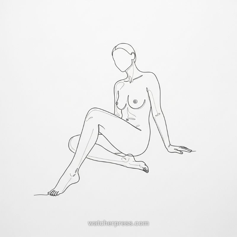
Figure drawing tutorials often start with standing poses, but mastering complex seated anatomy—like the relaxed, asymmetrical pose shown here—is crucial for dynamic human representation. Begin your sketch by establishing the core foundation: the weight distribution. Since the figure is sitting and leaning back slightly, the primary weight rests on the ischial tuberosities (sitting bones) and the supporting arm. Block out the torso as a simplified mass, noting the gentle ‘C’ curve of the spine that creates the subtle dip in the neck and the slight forward tilt of the head. Next, tackle the legs, which present the pose’s main challenge in foreshortening and overlap. The leg closest to the viewer is bent and angled inward, requiring careful consideration of the knee’s placement relative to the hip. The extended leg provides a crucial diagonal line that establishes depth and anchors the composition, ensuring its length and angle correctly convey relaxation without stiffness. Focus on these primary geometric shapes before committing to any delicate contour lines.
Once the foundational structure is sound, transition into the minimalist contour style demonstrated in the image. This technique relies on line economy, demanding that every line effectively communicate volume, tension, and texture without the aid of hatching or shading. Use a consistent line weight to trace the outermost edge of the form. Pay particular attention to transitions: the smooth slope from the neck to the shoulder, the roundness of the breast forms (achieved through perfect, unbroken arcs), and the gentle indentations that define the ribcage and abdomen. When lines overlap, such as where the arm rests against the torso or where the thigh crosses the hip, ensure a clear hierarchical relationship is established. The line belonging to the object closer to the viewer must read as continuous and dominant, implying that the further form recedes into the background. This practice is essential for maintaining clarity and avoiding a flattened appearance, even in the absence of traditional volumetric shading.
The final stages involve refining the extremities and embracing the stylistic choices of the piece. The hands and feet, often neglected, require precise contour work to suggest articulation—note the delicate curves defining the individual digits and the subtle definition of the ankle bone. For the face, the artistic decision to render it featureless (a common practice in studies emphasizing the body) allows the viewer’s focus to remain entirely on the anatomy and the implied emotional state conveyed through the posture, rather than distracting facial expressions. The overall success of this line drawing hinges on the fluidity and rhythm of the line work. Review your sketch, looking for areas where the line feels hesitant or broken. A continuous line approach, even if not strictly drawn in one go, should convey an unbroken sense of flow, linking the various parts of the body into a unified, breathing whole, capturing the quiet elegance of the complex seated pose.
Mastering the Complexity of Intertwined Hands: A Detailed Anatomy Study
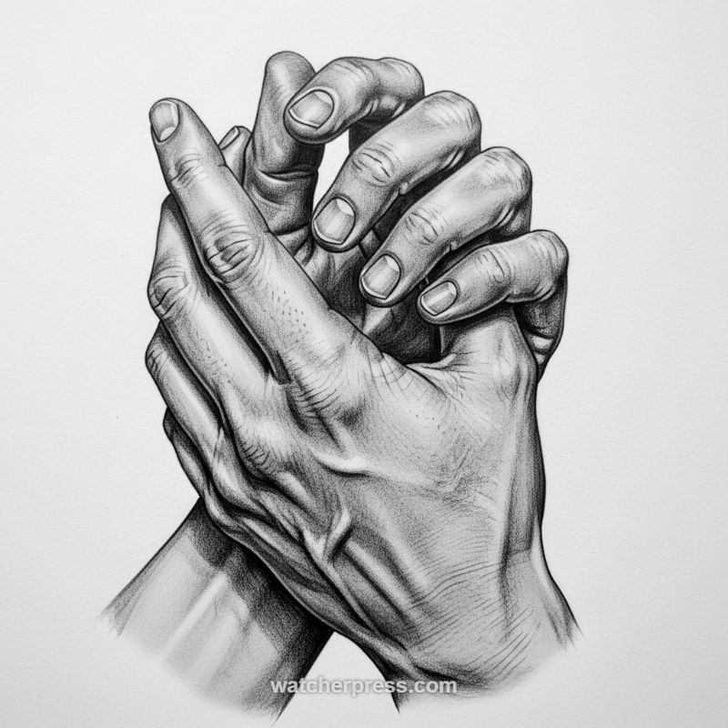
Sketching the human hand is perhaps the greatest challenge in figure drawing, and rendering them intertwined elevates that complexity dramatically. Before addressing detail, begin by establishing the underlying structure, proportion, and overall gesture. The drawing above showcases a strong sense of depth achieved purely through overlapping forms and careful value placement. Treat the hands not as amorphous shapes, but as intricate mechanisms built from metacarpals (palms) and phalanges (fingers). Lightly sketch the major forms—the overall curve established by the wrists and the interlocking rhythm of the fingers. Use simple geometric approximations: modified cuboids for the palms and tapered cylinders for the fingers. Critical to the success of an intertwined pose is defining the negative space between the fingers, which helps determine the exact point of intersection and overlap. Pay meticulous attention to the angle of the wrist joint visible at the bottom of the composition, as this grounds the entire structure and ensures anatomical stability.
Once the basic structure is defined, the modeling of form through value becomes paramount. The artist here utilizes fine hatching and stippling (a technique of applying values using dense dots) to achieve remarkably smooth tonal gradients, mimicking the softness of skin while highlighting tension. To replicate this effect, first identify your dominant light source (here, strong and directional from the upper left). Use deep, high-contrast values to define cast shadows—the sharp, dark marks where one finger rests directly against another. Then, transition gradually into form shadows, which define the curvature of the knuckles, tendons, and muscle mass. Expert advice for realistic skin texture: avoid rendering every wrinkle as a hard line. Instead, define anatomical features like veins or tendons by slightly darkening the area immediately surrounding them, treating them as subtle topographical rises in the form. This technique uses shadow manipulation, not outlining, to convey texture and volume simultaneously.
The final phase involves refining the micro-details that inject life and realism into the study, focusing specifically on joints, nails, and skin imperfections. Knuckles and finger joints tend to exhibit more tension and wrinkles than the smooth mid-sections of the fingers; use a tighter grouping of short, dense pencil strokes in these areas to convey that rugged texture. Fingernails must be rendered as distinct, hard surfaces contrasting sharply with the surrounding soft tissue. Define the cuticle line carefully and utilize subtle, highly localized reflected light or highlights on the nail plate to emphasize its smooth, curved, and reflective nature. To achieve the overall hyper-realistic skin texture seen in this drawing, practice dramatic variations in your stroke work and pressure. Employ soft, long strokes for the smooth surfaces of the forearm and wrist, and reserve tight, controlled cross-hatching for areas of deep shadow or visible porous texture, ensuring that the direction of your hatching follows the curve and flow of the underlying muscle and bone structure.
Mastering Dynamic Figure Poses and Realistic Denim Folds
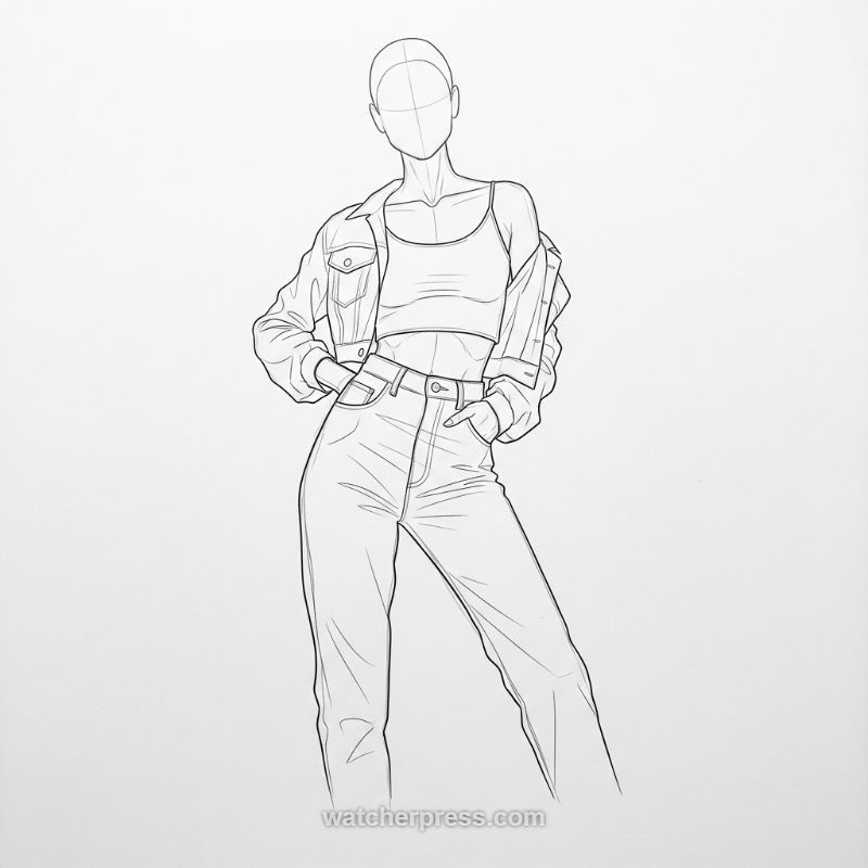
To capture a confident, casual figure like this, start by defining the gesture and the underlying anatomy using construction lines. The figure utilizes a subtle contrapposto stance; notice how the hips are tilted due to the hands resting in the high-waisted jean pockets, creating a pronounced curve from the waist down to the standing leg. Begin by sketching the basic geometric forms—the oval for the head, the centerline for balance, and the ribcage and pelvis blocks. Pay close attention to the arm placement; the elbows are bent, and the fabric of the denim jacket bunches significantly around these joints, indicating tension. Even without facial features, the simple cross-hairs on the head block establish the gaze direction and symmetry, ensuring the neck and shoulders align naturally with the assertive posture.
Sketching realistic clothing requires understanding how different materials react to movement and gravity. Focus on the sharp contrast between the light, close-fitting crop top and the heavy, structured denim jacket and jeans. The jacket is draped casually, primarily defining its form through gravity and the structure of the shoulders and collar, resulting in cascading folds on the arms. Conversely, the high-waisted jeans, being a stiff material, primarily show “tension folds” radiating from stress points—specifically the fly, the front pockets (where the hands are placed), and the inner thigh area. When rendering denim, use sharper, straighter lines for folds compared to the softer, rounded lines you might use for the cotton crop top. This manipulation of line quality is essential for communicating the material’s inherent weight and texture.
Finalizing the sketch involves adding critical structural details that ground the clothing in reality. For the denim jacket and jeans, carefully render seams (often indicated by parallel lines to suggest double stitching), belt loops, buttons, and pocket shapes. The high-waistline is crucial here; ensure the top edge of the jeans sits precisely at the natural waist, defining the flattering silhouette. A professional illustration benefits greatly from varying line weight; use slightly thicker lines for the primary outline of the figure and the edges of the jacket (where it casts a slight shadow) and reserve lighter, finer lines for the internal folds, seams, and minor fabric wrinkles. This technique not only adds depth and dimension but also cleanly separates the figure from the background, elevating the drawing from a basic sketch to a polished figure study of contemporary fashion.
Mastering Controlled Complexity: The Scribbled Massing Exercise
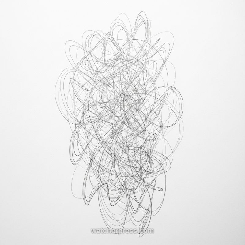
The image presented is a powerful example of a foundational exercise known as controlled scribbling or line massing. While seemingly chaotic, this method is instrumental in training artists to capture the overall volume, flow, and interconnectedness of complex subjects—from the intricate musculature of human anatomy to the dense component structure of engine blocks. To execute this technique, begin with a light, continuous line, focusing on rapid, looping motions (ellipses and figure-eights) that traverse the defined area. The objective is not to draw a specific object, but to build an implied mass. Notice how the lines in the example overlap and intersect, creating varying levels of gray value. This variation in line density immediately suggests depth; areas where lines are closer together recede or imply shadows, while the lighter, more open paths push forward, establishing a quick, volumetric sketch that requires minimal rendering time. This rapid gestural approach allows the artist to focus on the overarching shape and directional force, rather than getting bogged down in minute details prematurely.
Expert utilization of this scribble technique requires careful control over line weight and movement boundaries. Start by lightly defining the exterior envelope of your subject (e.g., the general shape of a car, or the torso’s gesture). Within this boundary, maintain a swift, dynamic pace; hesitation leads to stiff lines. Practice varying your pencil pressure: use a very light touch for the initial, underlying structure, and gradually apply slightly heavier pressure as you loop lines that appear to wrap around or define the closer surfaces. The key instruction here is layering: do not draw dark lines too soon. By allowing the density itself to create the value, you ensure the structure maintains a breathable, transparent quality, making it easier to refine specific forms later. This approach is particularly effective for mapping out areas of high complexity, such as the rib cage, bundles of tendons, or intricate pipework, allowing the artist to feel the subject’s structure and volume rather than meticulously plotting individual elements.
To integrate this abstract skill into practical tutorials for architecture, cars, and anatomy, artists must practice translating the generalized tangle into specific forms. Use the finished scribble mass as an armature—a dense wire framework upon which to lay clearer definition. For complex human anatomy, once the muscle group is sketched as a dense mass of overlapping curves, you can selectively darken the contours and boundaries where fascia or bone meets the surface, giving definition to the implied volume. For mechanical objects, the complex scribble can represent wiring harnesses or overlapping assemblies; here, you would sharpen the lines into straight edges and defined curves to reveal the geometric components hidden within the volume. The exercise trains visual acuity and develops the hand-eye coordination necessary to maintain consistent flow over a large, complex area, transforming initial chaos into a robust, three-dimensional foundation for detailed, complex representation.
Mastering Value and Form: Sketching the Human Skull
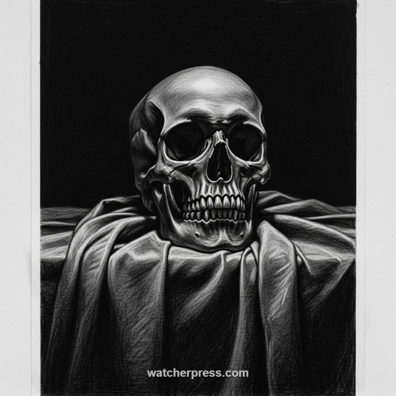
Sketching complex anatomy like the human skull requires more than just outlining shapes; it demands a deep understanding of volumetric form. Begin by treating the skull as a collection of nested, simplified geometric shapes—a sphere for the cranium, and simpler box or wedge shapes for the jaw and cheekbones. Establish a clear, single light source immediately. In this study, the illumination is directional and high-key, creating pronounced highlights along the forehead and cheekbones. Focus on rendering the convex and concave surfaces (like the orbital sockets and nasal aperture) by carefully manipulating transitions between light and shadow. The key to anatomical realism lies in defining the bony landmarks (such as the temporal lines and zygomatic arches) where light sharply catches the surface, contrasting them against the deep, recessed areas where shadows pool, giving the drawing its three-dimensional depth and structure.
The dramatic realism seen in this piece is achieved through an expert application of chiaroscuro—the use of strong contrasts between light and dark. To replicate this effect, work on a toned paper, using charcoal or carbon pencils for the deep blacks and white chalk or pencil for the highlights. Reserve your deepest blacks for the negative space surrounding the subject (the background and the empty orbital sockets) and the brightest whites for the areas directly facing the light, such as the edge of the forehead or the tooth surfaces. This extreme contrast makes the skull appear to glow against the darkness. When rendering the bone itself, vary your pencil pressure to convey texture; use smoother blending for the broad, polished surfaces of the cranium and employ cross-hatching or subtle speckling to suggest the slight roughness or pores of the bone structure, ensuring your mid-tones seamlessly bridge the highlights and core shadows.
Beyond the main subject, mastering the accompanying elements, such as the supporting drapery, is crucial for compositional integrity. Drapery drawing serves two main purposes here: framing the subject and providing texture contrast. Observe how the fabric folds are rendered not as arbitrary lines, but as three-dimensional topographical features. Each fold consists of a crest (highlight), a slope (mid-tone), and a valley (core shadow and reflective light). When sketching, analyze how tension points (where the fabric catches on the table or supports the skull) radiate folds outward. Use directional strokes that follow the path of the fabric to enhance the sense of silkiness or weight. The deep shadows cast by the hanging fabric also help push the background into complete darkness, further amplifying the dramatic focus on the brightly lit skull, completing the effect of a professional still life.
Mastering the Modern Architectural Elevation Sketch
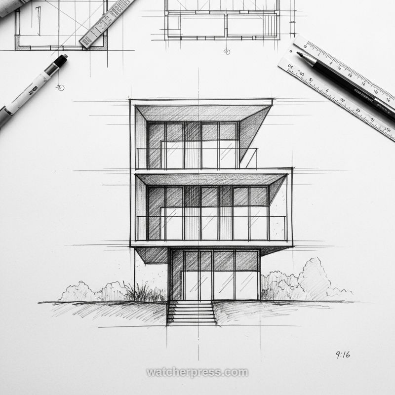
To successfully sketch a modern architectural elevation, begin by establishing a robust framework using light construction lines. Modern design relies heavily on geometric precision and stacked volumes, making accurate ratios paramount. Use a T-square or straightedge (as suggested by the tools in the image) to ensure all vertical lines are perfectly parallel and horizontal lines define clear floor plates. First, block out the overall height and width of the structure, then meticulously divide the façade into its component stories and bays. Note how the volumes are cantilevered or recessed; for example, the sketch shows the ground floor partially recessed beneath the upper structure. This initial geometric grid is crucial for ensuring the structural integrity of the design appears sound and proportional before moving on to detailed rendering.
The key to rendering modern architecture lies in capturing the contrast between solid mass and expansive fenestration (window systems). Use sharp, consistent lines to define the edges of the balconies and roof overhangs, paying attention to the varying depths these elements create. For the large glass areas, use subtle vertical lines to represent mullions and reflections, maintaining the transparency of the material. In the example provided, the artist employs cross-hatching to quickly shade recessed areas, such as the eaves and the undersides of the cantilevers. This shading technique is vital for instantly communicating depth and volume. Furthermore, detail the minimal glass balustrades with thin, fine lines to maintain the sense of lightness characteristic of contemporary structures, contrasting them against the bolder outlines of the concrete slabs.
A successful architectural sketch must feel grounded within its environment. Once the structure is complete, anchor the building by adding foundational elements like steps and basic landscaping. The steps leading up to the entrance should follow the same perspective rules as the building itself, directing the viewer’s eye into the drawing. Use quick, loose sketching techniques (like scribbling or light contour lines) to suggest foliage and bushes around the base of the building, providing necessary texture and scale reference without distracting from the main architectural subject. Finally, review your line hierarchy: use the heaviest line weights for the primary contours of the building and the nearest elements (like the steps or ground plane) and lighter weights for secondary details and distant objects, ensuring the sketch has clarity, focus, and a professional, finished appearance suitable for presentation or documentation.
Mastering Symmetrical Structural Grids
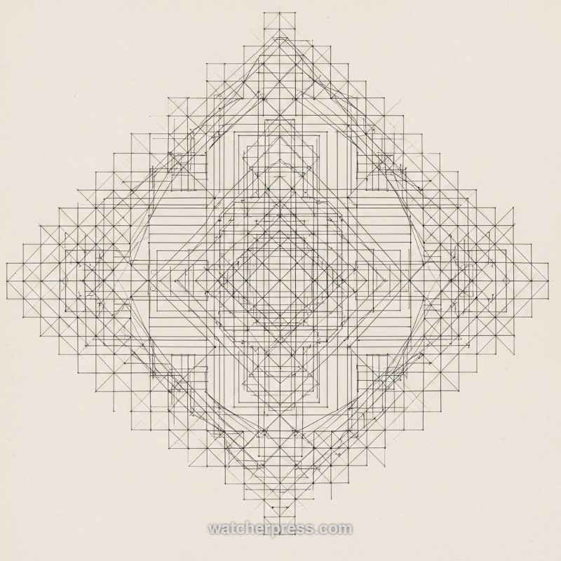
The foundation of sketching complex, highly detailed subjects—be they architectural elevations, mechanical schematics, or even the underlying symmetrical structure of the human skeleton—is the disciplined use of a structural grid. The geometric complexity visible in this image is achieved not through freehand talent, but through rigorous adherence to proportional measurement and precise plotting. To begin this advanced technique, first establish the central axis. Draw a bounding square or diamond (depending on the desired orientation) and divide it perfectly using horizontal, vertical, and diagonal construction lines. These lines must be executed lightly, as they will serve as temporary scaffolding. The key insight is the implementation of radial symmetry: notice how the image layers multiple, nested squares and diamonds, each smaller iteration perfectly centered within the last. Use consistent incremental measurements to subdivide the primary shape repeatedly, creating a dense coordinate system of small squares and triangles. This meticulous initial setup ensures that every subsequent line drawn maintains perfect proportionality and bilateral balance, crucial for designs that demand technical accuracy.
Once the base grid is fully mapped, begin plotting the primary internal forms. This is where the grid transitions from a simple scaffolding into an active map. Rather than drawing continuous lines immediately, identify critical intersection points—the image clearly features small dots marking these exact coordinates. Using these points, you can precisely define the corners and transitions of the inner shapes. Work outwards from the core or from the largest internal shape, gradually building density. Pay close attention to line direction and weight. Many lines follow the primary 0, 45, and 90-degree angles of the underlying grid, creating a sense of rigid, interlocking structure. Expert draftsmanship dictates varying your line weights; the foundational grid should remain the lightest, while the distinct internal patterns should be rendered with slightly heavier lines to separate the final form from the construction lines. This layering technique prevents the finished sketch from becoming visually overwhelming while maintaining maximum detail and precision.
This grid-based methodology is directly applicable to technical drawing fields, particularly in rendering the spatial relationships inherent in complex objects. When sketching a detailed elevation for a building facade, for instance, this grid allows you to perfectly align windows, columns, and decorative elements across a broad span. For anatomical drawing, it provides the necessary framework to plot the proportional length and precise joint alignment of bones before laying down musculature. The exercise demonstrates that complexity is manageable when broken down into repeatable, measurable units. After all the defining elements are plotted and inked (or executed in the final line weight), the light construction lines can be gently erased, leaving behind a crisp, robust, and highly accurate technical drawing. The takeaway is clear: mastering complex form begins with mastering the simple, foundational grid.
Mastering the Anatomical Heart: A Line Drawing Tutorial
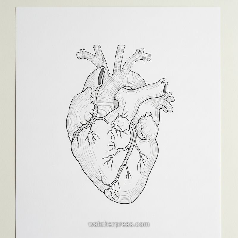
Sketching complex human anatomy, such as the heart, requires both scientific precision and artistic technique. Begin by establishing the fundamental shape: the heart is roughly an inverted, blunt cone nestled within the chest cavity. Start with light, geometric construction lines to define this basic volume and its subtle leftward tilt. The most challenging aspect is accurately placing the major vessels emerging from the superior surface—the Aorta, Pulmonary Trunk, and Vena Cavae. These vessels must appear voluminous, not flat. Use ellipses to represent the openings of these vessels and ensure they overlap realistically. Focus on defining the coronary sulcus, the primary groove separating the atria from the ventricles, as this establishes the main mass distribution. Resist the temptation to jump straight to surface details; a strong structural foundation is paramount for conveying realistic anatomical complexity.
Once the overall structure and major vessels are lightly mapped, begin detailing the muscle tissue and surface veins. The key to giving the heart its characteristic organic texture is using precise hatching (parallel lines) and cross-hatching for shading. Crucially, these lines must follow the curvature of the muscle masses (the ventricles). For instance, lines on the lower left ventricle should curve downward and slightly inward to suggest its rounded, muscular form. Use varying line weights to differentiate components: thicker lines for the primary contours where two distinct structures meet (e.g., the edge of the heart against the background, or where the right auricle overlaps the aorta), and finer lines for internal details like the delicate network of coronary vessels that crisscross the anterior surface. This deliberate modulation of line weight aids significantly in achieving visual hierarchy and depth.
To achieve true depth and realism, pay close attention to implied light and shadow. The illustration provided suggests a light source originating from above and slightly left. Where light hits, the hatching should be sparse or absent; in areas where surfaces recede or turn away from the light—such as beneath the major vessels or within the grooves (sulci)—increase the density of your hatching. Expert anatomical drawing demands that these shading techniques highlight the three-dimensional relationship between adjacent structures. Ensure that the atrial appendages (auricles) appear slightly textured and slightly separate from the main ventricular mass. Finally, double-check that the overall drawing maintains the heart’s natural asymmetry; the left ventricle is thicker and dominates the apex, giving the structure a robust and powerful appearance indicative of its function.
Mastering the Realistic Human Eye and the Detail of Tears
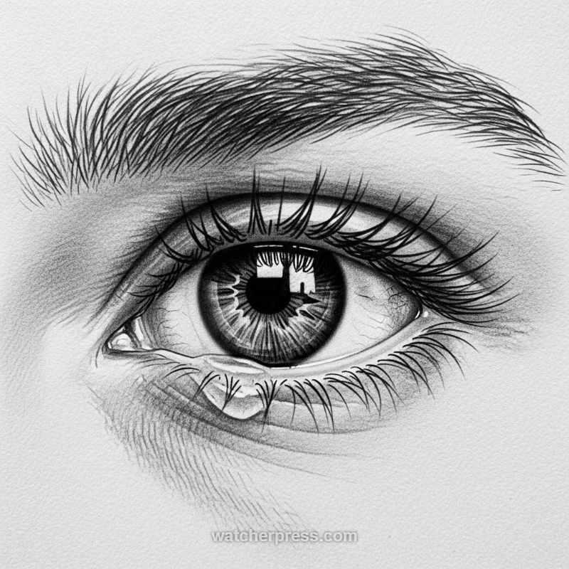
Drawing a realistic human eye moves beyond simple geometric shapes; it requires meticulous attention to depth, texture, and light to convey life and emotion. Begin by establishing the fundamental spherical form of the eyeball within the complex structure of the orbital socket. The eyelids must be rendered with thickness and curvature, recognizing that they wrap around the sphere, not just sitting flat on the surface. Use subtle, cross-hatched shading to capture the soft, delicate texture of the skin surrounding the eye, focusing on the slight creases beneath the lower lid and the brow bone structure above. Establishing a deep, solid black for the pupil early on is crucial, as this high contrast will anchor the entire drawing, allowing the lighter tones and intricate details of the iris to stand out.
Achieving photorealistic quality depends heavily on rendering the internal textures of the eye and the surrounding hair. For the iris, use very sharp pencils (H and 2H) to draw fine, radiating lines emanating from the pupil outward, varying the pressure to simulate the intricate, organic patterning. Layer these lines and gently blend them, ensuring a final, darker limbal ring defines the outer edge of the iris for maximum depth. Eyelashes and eyebrows should never be drawn as solid blocks; instead, they are individual, tapered hairs drawn with deliberate, overlapping strokes. Pay close attention to the natural direction of growth—eyebrows fan out and curve, while eyelashes spring directly from the lid line, often crossing slightly to enhance realism. The contrast between the soft shading of the skin and the sharp lines of the hair is vital for a convincing three-dimensional effect.
The ultimate challenge in this piece is the depiction of the tear, which requires mastering the illusion of transparency and liquid surface tension. The wet appearance of the eye is primarily achieved through highly concentrated, sharp highlights reflecting light sources within the dark, glossy surface of the cornea and the moist area of the lower lid. When drawing the tear drop itself, avoid outlining it heavily. Instead, focus on using negative space: define the shape of the water drop by shading the skin underneath it and placing a distinct, bright highlight along the upper curve of the drop. This precise application of light and shadow simulates the way light passes through the transparent liquid and emphasizes the gravity pulling the water mass down onto the lower lid, creating the powerful emotional impact visible in the final sketch.
Mastering Bold Line Work and Symbolic Flash Art
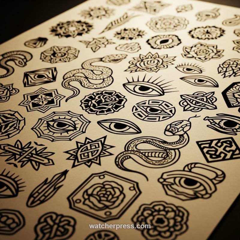
The traditional style of sketching, often exemplified by tattoo flash art, is an invaluable tool for mastering line weight, composition, and high-contrast design—skills that directly apply to technical drawing in architecture or complex anatomical diagrams. To achieve this look, your primary focus must be on unwavering line consistency. Begin by using a thick technical pen or brush pen to establish the main structural outlines. Unlike pencil sketching where varying pressure creates depth, this style relies on consistent, heavy black lines that clearly define the boundary of every element. Notice how motifs like the roses and geometric seals utilize fundamental geometry—perfect concentric circles and radial symmetry—as a scaffolding, ensuring the final organic elements remain anchored and balanced, maximizing visual impact against the blank page. This practice sharpens your ability to translate three-dimensional concepts into clear, two-dimensional symbols.
When tackling organic forms like the serpents and eyes, the key is stylized simplification rather than photorealistic detail. For the serpent, establish the dynamic flow first by sketching a clean ‘S’ curve centerline, determining the pose and momentum. Then, build the volume around this curve, paying attention to how the body overlaps itself to create depth. The small, repeating patterns (like scales or cross-hatching) should be uniform and deliberate; they serve only to suggest texture, not to mimic reality. Similarly, the symbolic eyes are often rendered with intense radial symmetry. Sketch the basic almond shape and then define the internal patterns (like rays or interlocking shapes) using strong, solid fills. The strategic use of large areas of solid black—known as negative space management—is critical. These black voids create powerful visual anchors and define the shape of the white elements, forcing the viewer’s eye exactly where you intend.
Finally, integrating complex geometry, such as the mandalas and knotwork seen here, requires precision and patience, methods indispensable for architectural drafting. Start by lightly penciling in construction lines—dividing your circle or square into 4, 6, or 8 equal segments. Every subsequent line, whether an angular spike or a curved petal, must adhere to these initial guides to maintain perfect symmetry. When sketching knotwork, remember the fundamental rule of ‘over and under’ to maintain the illusion of continuity; lightly plot the crossing points before applying the final, heavy ink. By consistently practicing these high-contrast, symmetrical, and boldly outlined forms, you train your hand and eye to execute precise details that read clearly, whether the finished subject is a symbolic flash piece or a detailed cross-section of a complex machine.
Mastering Expressive Profiles: Integrating Accessories and Atmosphere
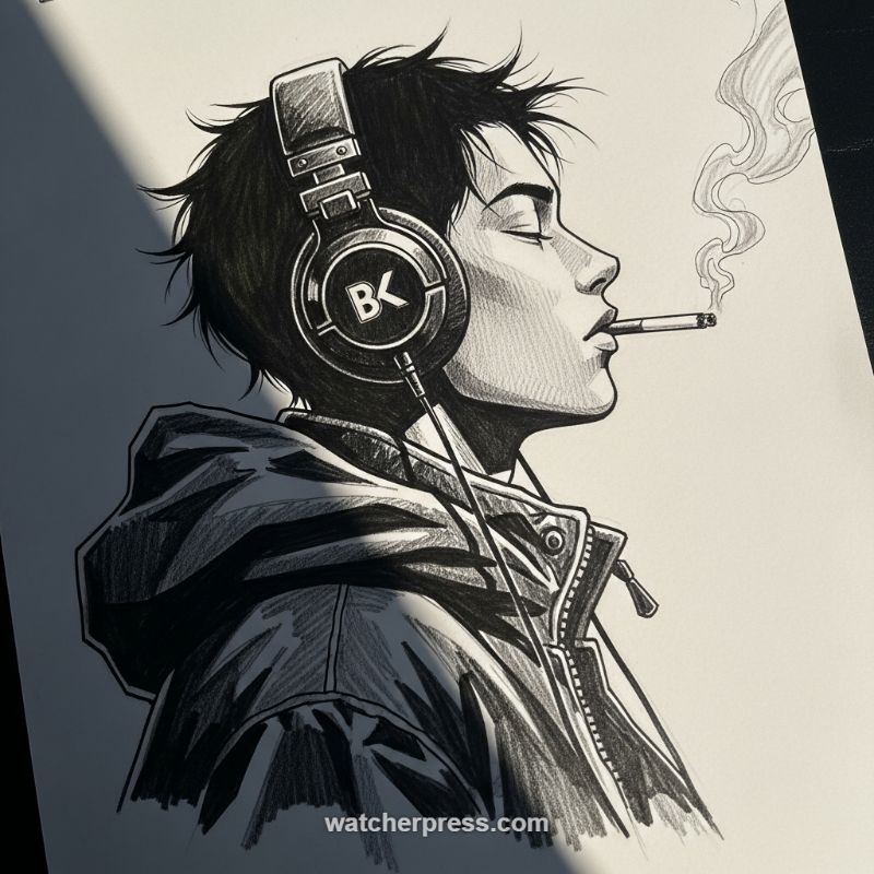
Sketching the human profile view requires precise proportional understanding, particularly balancing the forehead, nose, and chin projection. Start by establishing a clean, curved line for the back of the neck and jawline, which dictates the overall posture. Notice how the subject’s head is slightly tilted back, conveying relaxation or intensity. The subtle closed-eye expression is crucial for mood; avoid drawing harsh lines and instead use careful shading beneath the brow bone and along the upper eyelid to imply depth and tranquility. For this stylized look, utilize sharp, deliberate outlines for the primary features (nose, lips) before moving into volumetric shading. Remember that the placement of the ear, though mostly covered, still dictates the position of the headphones; ensure the head shape underneath the hair mass feels substantial and three-dimensional, not flat.
Integrating complex accessories like over-ear headphones and clothing requires shifting focus from organic curves to precise geometric forms. When sketching the headphones, establish the main circular cup in two-point perspective, ensuring the arc of the band correctly follows the curve of the head. Pay close attention to rendering different materials—the plastic/metal of the headphones and the woven fabric of the jacket—using varied line work. Cross-hatching is essential here: employ dense, perpendicular lines for the dark areas of the jacket to suggest a thick, matte texture, contrasting them with the smooth, high-detail lines defining the zipper teeth and pull tab. The small details, such as the connected wire leading down from the earcup and the simple cylinder of the cigarette, add crucial realism and anchor the figure in reality, making the sketch more complex than a simple head study.
The dramatic impact of this sketch hinges on high-contrast lighting and atmosphere. To achieve this, identify a clear directional light source (here, top-left) and commit to deep shadows. Use solid black fill or intensely dense cross-hatching for areas like the hair and parts of the headphones, juxtaposing them sharply against the bright white of the paper where the light strikes the cheekbone and neck. For atmospheric elements, like the smoke plume, use a much lighter touch. Draw the smoke with soft, swirling, almost ghost-like lines, ensuring they don’t overpower the crisp detail of the profile. This contrast between crisp edges in the foreground (the face and jacket) and diffused lines in the background (the smoke and ambient shadow) gives the piece its dynamic mood and finished, professional quality.
Rendering the Organic: Achieving Depth in Botanical Illustrations
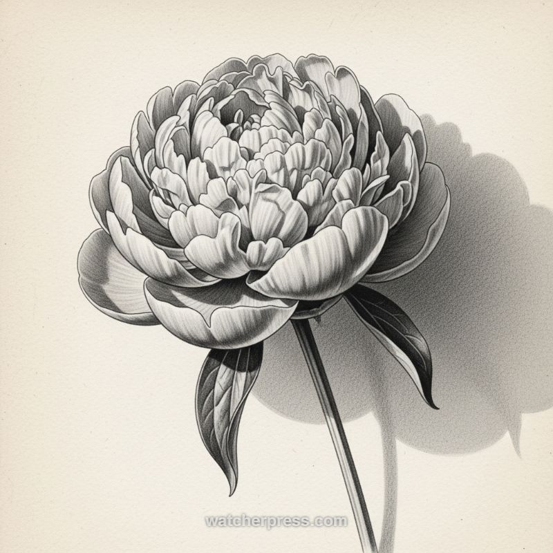
The secret to sketching complex floral forms, such as the voluminous peony shown here, lies in establishing the underlying structure before diving into individual petals. Begin by treating the main flower head as a large hemisphere or sphere to quickly block in its overall mass and determine the dominant light source. Notice how the artist uses deep shadows beneath the outermost petals to separate them from the core, creating an immediate sense of depth. When laying down the initial structure, focus on grouping petals rather than drawing them one by one. The tightly packed center requires a different approach than the softer, more relaxed exterior petals, demanding subtle shifts in value to convey the chaotic yet beautiful density of the bloom. This foundational geometric approach ensures the final rendering maintains structural integrity, preventing the elaborate detail work from resulting in a flat or confusing composition.
Achieving photorealistic texture and volumetric realism requires meticulous control over graphite values. Observe how the artist utilizes smooth, blended gradients on the broad surfaces of the petals to define their gentle curvature and volume, a technique crucial for rendering soft, organic material. Conversely, fine, directional pencil strokes are employed to denote the delicate veins and creases, particularly where petals fold or overlap, adding necessary textural variation. The strongest contrast is strategically saved for the areas where reflected light is absent or where overlaps create sharp dividing lines, such as the underside of the flower facing away from the light. Furthermore, the prominent, soft-edged cast shadow grounding the bloom serves two purposes: it emphasizes the three-dimensionality of the subject by contrasting the bright highlights on the petal tips, and it defines the immediate environment, suggesting the flower is resting against a textured wall or backdrop.
When detailing the supporting elements, such as the stem and leaves, adjust your technique to match the difference in material. The stem is rendered with firm, parallel strokes to convey its rigidity and cylindrical form, while the leaves require focused attention to their distinctive veining pattern and undulating edges, often achieved through controlled hatching. Notice the sharp, dark outlines used selectively on the leaves and certain petal edges; these are strategic accents used to pop the element forward from the softer background shadow. A professional botanical illustration benefits greatly from careful consideration of the background value and negative space. Here, the background is empty space contrasted only by the complex, shapely cast shadow. By varying the shadow’s density—darker closer to the object and fading gently outwards—the artist controls the viewer’s focus, ensuring the intricate beauty of the peony remains the undisputed focal point of the sketch.
Mastering High-Speed Automotive Concept Sketching

To capture the dynamism of a high-performance vehicle, as seen in this futuristic concept sketch, you must first establish a dramatic perspective. Start by sketching a low horizon line and utilizing a two-point perspective setup, which places the viewer close to the ground, emphasizing the aggressive stance and low profile of the supercar. The foundational step involves blocking out the primary geometric forms—the wedge shape of the body and the perfect ellipses for the wheels—ensuring the wheelbase and overall proportions convey speed and stability. Crucially, master line weight variation: use light, fast lines for interior details and surface transitions, but employ heavy, dark, decisive lines for the outer silhouette and any edges that define aerodynamic functionality, such as the front splitter and side skirts. This variation is what lifts the 2D sketch into a highly defined 3D representation.
Achieving the highly reflective, metallic surface characteristic of concept car design relies entirely on sophisticated value control, even in monochrome. Identify your primary light source (in this example, striking the car from the upper-front) and strategically apply highlights. Reserve pure white (or the color of your paper) for the sharpest reflections, typically along body creases, hood lines, and above the wheel arches, creating a sense of tautness and polished metal. The transition from light to dark must be abrupt yet controlled; use smooth marker gradients (e.g., C3 to C5) to describe curvature on the doors and fenders, and immediately jump to deep shadows (C7 or C9) for areas like the air intakes and the underside of the vehicle. These deep shadows not only define complex sculpting but also provide the necessary contrast to make the bright highlights dazzling.
Finally, inject motion to elevate the sketch from a static drawing to a narrative piece. The sense of high-speed travel is achieved through deliberate background streaking and wheel treatment. Use rapid, diagonal strokes of black or dark gray marker, starting heavily near the car and quickly fading out, to simulate the road surface blurring away from the viewer. For the wheels, render the main spokes clearly, but introduce slight blurring on the tire treads to suggest rotation. Pay close attention to functional details: the lighting signature, such as the sharp, angular LED-style elements, should be rendered last, using crisp white lines against a dark background to make them glow. This comprehensive approach, combining structural integrity, high-contrast rendering, and dynamic effects, is the hallmark of professional automotive design illustration.
Rendering Volume and Sheen: A Masterclass in Drawing Drapery Folds
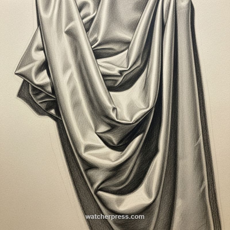
The ability to render convincing drapery is a cornerstone skill, translating directly to accurately drawing clothing on figures or soft textures in still life. When tackling highly reflective fabrics, such as the satin or silk depicted here, the core instructional principle is the immediate establishment of extreme contrast. Begin by accurately mapping the light source and blocking in the major masses of light and shadow. Unlike drawing matte fabric, reflective materials demand a greater separation between value groups; the shadow areas must be deep and rich (using hard leads or charcoal), while the highlight areas must be pristine and brilliant. Crucially, pay attention to the form shadows, which define the rounded nature of the folds, and the sharp, dark cast shadows, which indicate how the folds overlap and create abrupt breaks in the light. This initial, aggressive lay-in is non-negotiable for achieving the illusion of depth and weighty volume.
To truly capture the sheen of reflective fabric, focus meticulously on managing the mid-tones and highlights. Note how the highlights are not broad, generalized patches, but rather sharp, linear streaks following the crests of the folds. These sharpest light points should transition almost immediately into dark values—this rapid value change is what communicates the slick, high-gloss surface. Use smooth, precise layering (cross-hatching that is then carefully blended or refined pencil strokes) to build up the silky gradients in the mid-tones. Avoid over-blending the core shadows; they must retain enough texture and depth to provide a grounded contrast against the brilliant highlights. The quality of your pencil application dictates the perceived texture; soft, meticulously layered transitions suggest the silkiness, while the sharpest edges define the structure and tension of the material.
Expert drafting of drapery relies heavily on controlling edge quality. Examine the areas where the folds pinch inward and create tight valleys; these spots require the absolute darkest occlusion shadows—points where light cannot penetrate. Ensure these areas have hard, crisp edges against the adjacent illuminated folds to maximize the sense of three-dimensionality. Conversely, where the fabric curves gently around a form (such as the outer, hanging edges), soften the transitions slightly to convey a gradual turning away from the light. By strategically alternating between razor-sharp, defining edges (for highlights and cast shadows) and slightly softer, graduating edges (for form shadows), you successfully communicate the complexity of the folded structure and the material’s inherent weight and movement. This precise attention to edge control is the difference between a flat rendering and a truly volumetric representation.
Sketching Complex Organic Anatomy: The Barn Owl in Graphite
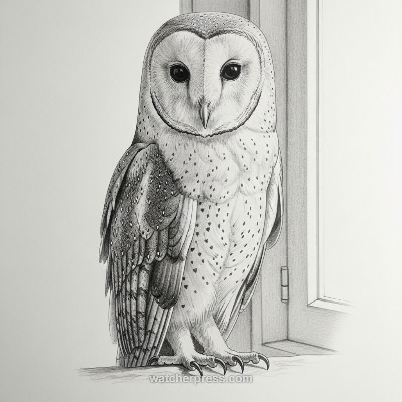
Mastering the rendering of natural forms, particularly complex anatomy like avian plumage, requires precision in structure and variation in technique. When approaching the barn owl, the first and most critical step is establishing the form, beginning with basic shapes—a large oval for the body and a slightly flattened circle for the head. The distinguishing feature is the heart-shaped facial disc; map this precisely, as it defines the species and provides the focal point. Use sharp, clean lines to delineate the contour of this disc. The eyes must be rendered using the darkest possible graphite to create maximum contrast against the light facial feathers, giving the owl its characteristic penetrating gaze. Ensure the initial feather texture surrounding the eyes transitions smoothly from soft down to structured outlines, establishing the foundation for intricate detail. Expert advice dictates spending ample time on the foundational structure before introducing texture; rushing this step can lead to disproportionate or flat results.
The next phase involves differentiating feather textures and applying dynamic shading. Barn owls exhibit two primary types of feathering: the soft, downy feathers on the chest and face, and the highly structured flight feathers on the wings and back. For the softer areas, use fine, short strokes and controlled blending to achieve a velvety appearance. The chest plumage features unique, tear-drop shaped spots; these should be delicately rendered using a stippling technique or fine-point work, ensuring the spots follow the underlying volumetric contours of the bird’s body rather than appearing randomly applied. For the wings, use layered, directional strokes with varying pressure. The darkest areas will be where shadows deepen, such as the overlaps between primary and secondary flight feathers, creating the illusion of stacked depth and weight. Remember that light is the primary driver of form; identify a single consistent light source (in this image, coming from the left) and ensure all shadows, highlights, and feather directionality align with it.
Finally, integrate the subject with its environment and focus on the small, yet powerful, details. The talons and feet are essential for conveying the raptor’s strength; sketch these with sharp, angular lines and heavier pressure to emphasize their bony structure and sharp points. Observe how the talons grip the perch, using subtle shadow beneath the feet to ground the owl in the composition. The background elements, such as the window frame, should be drawn using architectural techniques—clean, linear strokes and flat shading—to intentionally contrast with the soft, organic form of the owl. This contrast enhances the visual realism and pushes the subject forward, making the detailed rendering of the plumage even more impactful. Maintain high detail in the central subject, allowing the background to fade slightly to ensure the owl remains the indisputable focus of this complex anatomical study.
Mastering Urban Perspective and Atmospheric Reflections: The Rainy Day Study
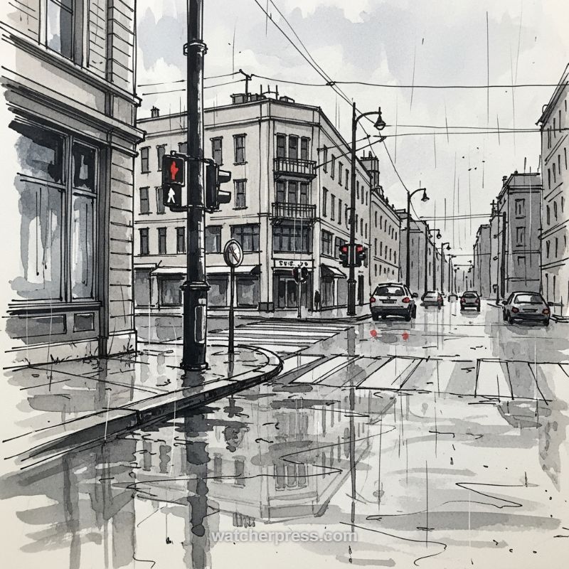
Sketching a complex urban street scene requires a solid foundation in perspective, especially when introducing atmospheric elements like rain. Begin your composition by establishing a modified two-point perspective, allowing the main street to converge rapidly toward a central vanishing point to maximize depth. The foreground, dominated by the curb, crosswalk, and the central lamppost, should be drawn with the thickest, most deliberate lines to ground the viewer. Use architectural elements—the prominent corner building and the receding facades down the street—as anchors. Apply a subtle but consistent grayscale wash to the buildings; lighter tones for direct surfaces and slightly darker tones for recesses, under balconies, and windows. This initial stage establishes the structural skeleton upon which the entire moody atmosphere will rest. Focus on creating rhythm with your repeated window patterns, ensuring they scale accurately as they move away from the viewer to maintain the illusion of depth.
To truly capture the essence of a wet cityscape, leverage the power of a limited palette, utilizing ink for definition and grayscale wash for volume and mood. The overcast sky should be rendered with a flat, muted gray wash, providing a soft backdrop that emphasizes the contrast of the dark foreground elements, such as the lamp post and traffic signals. The pen work should remain loose and slightly agitated, hinting at the complexity of the buildings without demanding photo-realism. Crucially, the appearance of rain is achieved not just by darkening the atmosphere, but by introducing visual texture. Consider adding faint, slightly angled lines across the sky and distant view to suggest precipitation, and use spattering techniques in the foreground wash to mimic tiny splashes and wetness on the pavement. These subtle textural cues transform a simple line drawing into an evocative study of weather.
The most challenging, yet rewarding, aspect of this sketch is rendering the reflections on the wet asphalt. Water on the pavement acts as a series of distorted, textured mirrors. To execute this, draw the vertical structures (buildings, lamp posts, car shapes) first, then immediately sketch their reflections below. These mirrored shapes should be slightly compressed and drawn with looser, less defined lines than the original objects, using a wash that is often slightly darker and more saturated than the structure above it. Pay close attention to the highlights, leaving patches of the paper white, particularly where direct light might catch the water’s surface, enhancing the slick, shiny appearance. A key technique for realism is introducing small, sharp spots of color—like the reflected red from the brake lights or traffic signal—which immediately draws the eye and vividly contrasts against the monochromatic urban environment, adding life and focus to the finished piece. This contrast between crisp structural lines and soft, watery reflections is the hallmark of a successful rainy street sketch.
Sketching Drapery and Oversized Garments: Mastering Volume and Flow
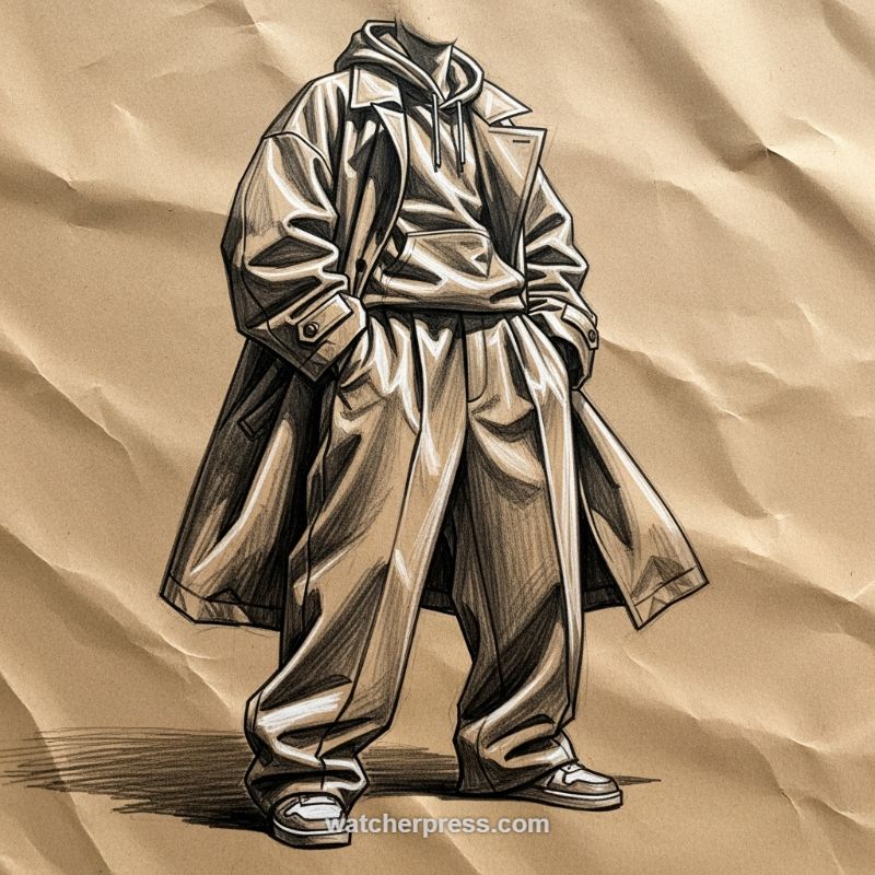
When tackling complex human subjects, sketching the drapery and clothing is often as challenging as rendering the anatomy itself. The illustration provided demonstrates an effective approach to capturing the heavy volume and dramatic folds of an oversized streetwear silhouette. To replicate this effect, begin by focusing on the overall mass rather than the individual wrinkles. Establish the main silhouette with broad strokes, recognizing that voluminous garments like the trench coat and baggy trousers derive their shape primarily from the fabric’s weight and gravity, not the body beneath. Pay close attention to the points of tension (where the fabric is pulled, such as the shoulders or waistband) and the points of compression (where the fabric bunches up, especially around the ankles and elbows). Use clean, decisive outlines to define the edges of the layers—the coat cuff over the hoodie sleeve, or the overlapping folds of the wide pants. This structural groundwork is essential for ensuring that the subsequent shading gives the clothes realistic weight and heft.
Mastering the rendering of folds requires a strategic understanding of light and shadow to create depth. In monochrome studies like this, high contrast is your best friend. Identify the core shadows—the darkest areas nestled deep within the folds or where layers overlap (such as the interior of the trench coat or under the hoodie’s pouch pocket). Use directional shading, following the curve or flow of the fabric, to build up the mid-tones. Notice how the lines in the image are deliberately placed to emphasize the angular, almost crisp nature of the folds, typical of heavy material. Utilize a soft eraser or white pencil to introduce sharp highlights on the convex surfaces of the fabric, contrasting sharply with the adjacent deep shadows. This technique instantly separates the planes and amplifies the perception of three-dimensional volume. Remember that shadows cast by the garment onto itself are crucial for defining depth and separating the different pieces of the layered ensemble.
Finally, integrate the garment into its environment and refine the overall mood. The choice of a textured paper background, as seen here, instantly adds atmosphere and a sense of handmade quality. By allowing the paper’s natural tone (a mid-tone) to serve as part of the shading, you can reserve your darkest pencils for defining form and your brightest whites for key highlights, streamlining the rendering process. Ensure that the figure is grounded compositionally; note the strong cast shadow extending from the feet, which anchors the heavy, standing figure. When drawing highly stylized or voluminous clothing, maintain consistency in your line quality and tonal values across the entire outfit. This attention to detail ensures that while the garments are dramatically oversized, they feel unified, forming a cohesive and powerful visual statement that celebrates the artistry of fabric and form.
Mastering the Draped Form: Sketching Casual Streetwear (Hoodies and Joggers)
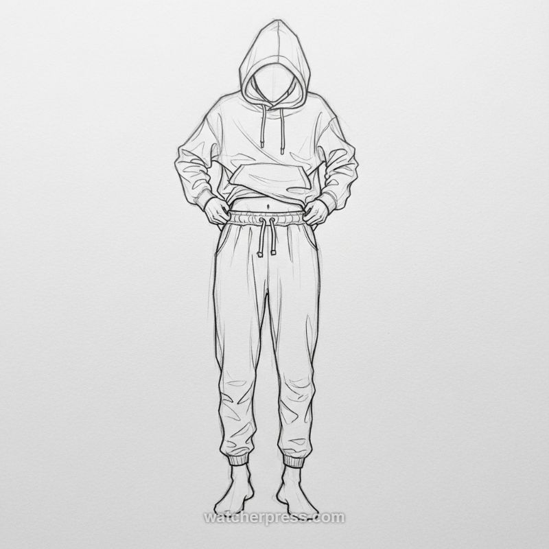
When sketching casual streetwear, particularly the ubiquitous hoodie and jogger combination shown, the primary challenge lies in capturing volume and natural drapery. Begin by establishing the basic, oversized silhouette of the figure. For the hoodie, focus on the broad, dropped shoulders and the generous slack in the torso. Notice how the weight of the fabric causes soft, sweeping folds rather than sharp creases. Pay close attention to the intersection where the hands pull the hem upward, creating tension wrinkles radiating from the grip points and exposing a slight portion of the midriff. The hood itself should be rendered as a heavy, simple shape, obscuring the facial features and adding a sense of anonymity or weight to the garment. Ensure the drawstring ties hang naturally, following gravity and slightly curving to indicate their flexible material, and remember to include the large kangaroo pocket centered on the chest, a key characteristic of this garment style.
Transitioning to the sweatpants (joggers), emphasize the critical contrast between the fitted, elasticized waistband and cuffs and the voluminous legs. The waistband, held taut by elastic and a drawstring, creates tight, delicate horizontal folds just below the waist. The fabric then falls relatively straight down the legs, exhibiting natural vertical compression folds where the material bunches subtly, particularly around the hips and crotch area. The most crucial detail for joggers is the gathered elastic cuff at the ankle. This feature concentrates all the slack fabric above it, resulting in dense, intricate folds that abruptly halt the vertical movement of the textile. Use varied line weight—thicker lines for the seams and the main outlines, and lighter, quicker lines for the internal folds—to suggest the softness and inherent thickness of the fleece or heavy cotton material that defines comfort wear. Since the figure is depicted barefoot, ensure the cuff meets the ankle joint convincingly, suggesting the form of the feet underneath the fabric’s edge.
Expert sketching requires understanding the underlying anatomy even when it is mostly covered by fabric. The successful depiction of this outfit relies on suggesting the human form beneath the loose clothing. Before detailing the garments, it is crucial to sketch the core skeletal structure and major joint placements (shoulders, elbows, hips) to ensure the clothing hangs correctly and follows the body’s natural axis in three dimensions. For instance, the curve of the knees influences the tension in the pants, and the position of the hands dictates the pull on the hoodie hem. To enhance the realism and dynamism of the sketch, study how the fabric interacts with the pulling motion shown in the image—the hands elevating the hem create localized tension that subtly reveals the anatomical form of the torso and navel. Finally, while rendering line art, mentally establishing a consistent light source will help you place folds and wrinkles logically, adding necessary volume and preventing the garments from appearing flat or weightless.
Sketching Stylized Figures: Dynamic Poses and Urban Clothing

Mastering dynamic character sketches begins with establishing a strong gesture and silhouette. Observe how the weight is distributed in this figure: the stance is casual, with one hand loosely tucked into the pocket, creating an appealing, asymmetrical curve through the hips and shoulders. Start by sketching the central line of action, a gentle S-curve running from the head down to the grounded leg. Use simple geometric forms—spheres for the head and chest, a cylinder for the waist—to build the basic structure before adding anatomy. Pay close attention to the head area; features like oversized glasses and headphones require careful placement over the cranium form. These accessories, while simple, define the character’s persona and should be constructed using precise ellipses and vanishing points to ensure they wrap naturally around the head in three dimensions, avoiding a flat, pasted-on appearance.
The effectiveness of this sketch lies significantly in the rendering of the urban, baggy attire, specifically the cargo pants. When drafting loose-fitting clothing, abandon the idea of drawing the underlying body structure directly; instead, focus on capturing the volume and the major points where the fabric bunches. Note the heavy, rhythmic folds concentrated at the beltline, the knees, and most critically, around the massive break where the fabric meets the large sneakers. The deep pockets and utility patches on the cargo pants add geometric contrast to the organic flow of the fabric; sketch these first as sharp rectangles before adding subtle folds or tension lines around their edges. For the cropped top and backpack, use light, quick strokes to indicate thinner fabric and material texture, contrasting sharply with the thick outlines used for the heavy pants and boots, which helps ground the figure visually and defines the material difference.
To elevate a sketch from a simple pose study to a compelling character illustration, you must utilize expressive line work and strategic shading. Notice the varied line thickness used throughout this drawing: thicker, confident lines define the external silhouette and major contours (like the bottom of the pants and shoes), while lighter, hatch marks are reserved for internal details, wrinkles, and shading (such as under the chin or beneath the backpack straps). This variation adds depth and focal interest and directs the viewer’s eye. Furthermore, consider the overall mood; the use of a sepia-toned paper and the slight vignette framing isolates the character, emphasizing the sense of individuality. Expertly sketched figures carry attitude; ensure your final details—the slight tilt of the head, the relaxed placement of the hands—communicate a backstory, making the drawing not just anatomically correct, but narratively engaging for a complete character study.
Mastering the Anatomy: Sketching the Defined Abdominal Musculature
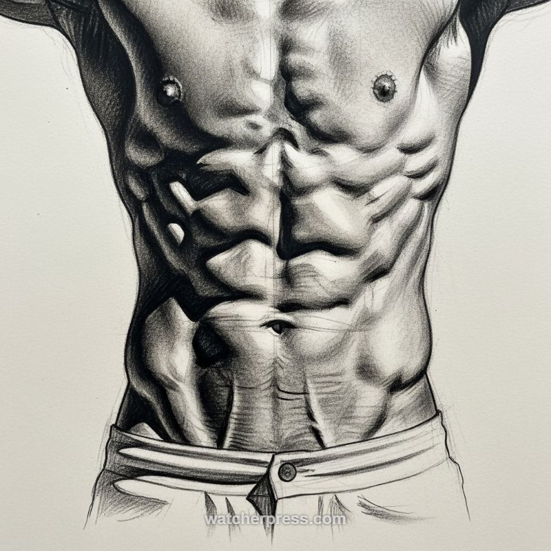
The abdominal region, with its complex arrangement of the rectus abdominis, obliques, and serratus muscles, presents a significant challenge for any figurative artist. To accurately capture the highly defined look shown in this graphite study, begin by establishing the foundational geometry. Sketch a central vertical line (representing the Linea Alba) running from the sternum to the navel, and then drop to the pelvic crest. This line serves as your axis of symmetry. Next, use horizontal and slightly curved intersecting lines to map out the four to six segments of the rectus abdominis. Remember that these muscles are not flat tiles; they are individual volumes that curve slightly outward. Treat the initial block-in of the torso as a cylinder or modified box structure, focusing on the overall tapering shape towards the waist. Pay particular attention to the external obliques, which angle inward and create a subtle, but crucial, ‘V’ shape just above the waistband. Keep these initial construction lines light, as they will guide your rendering of form and shadow.
The key to achieving the intense definition evident in high-contrast anatomy sketches lies in the careful management of light and shadow, especially in the valleys between the muscle bellies. Identify the direction of your light source (in this example, it appears strong and directional, coming from the upper left or right). Shadows will pool intensely where the tendons of the rectus abdominis insert, creating the deep depressions that define the ‘pack.’ Use a soft pencil (like a 4B or 6B) for the deepest core shadows and employ careful blending techniques to transition smoothly across the surface of the muscle. Each abdominal segment should be rendered as a slightly convex form; the highlight will sit on the peak of the muscle, and the shadows will fall dramatically into the creases. Expertly detailing the transition zone along the Linea Semilunaris (the vertical line separating the rectus abdominis from the obliques) is critical, as this sharp edge enhances the illusion of depth and thickness.
For advanced rendering, focus on texture and secondary forms like the Serratus Anterior, which tucks beneath the pectoral muscles and interlocks with the obliques along the ribcage. Use careful cross-hatching, ensuring your pencil strokes follow the direction of the muscle fibers—vertical for the rectus abdominis and diagonal for the obliques. Avoid making the navel a simple hole; it is a feature that exists within the context of skin folds and muscular tension. Finally, ensure your contrast ratio is maximized: utilize the purest white of the paper for specular highlights on the most convex surfaces, and use the darkest graphite tones in the deepest crevices, such as the umbilical area and the extreme edges where the figure meets the background. This high contrast is essential for making the musculature visually ‘pop’ and achieving a hyper-realistic, sculptural effect, as demonstrated by the strong rendering of the figure’s core.