Unlock the secrets to a luxurious, layered home. Learn the 10 essential texture design tips professional decorators use to add depth, warmth, and stunning visual appeal to any space.
Elevating Mood with Monochromatic Texture and Deep Folds
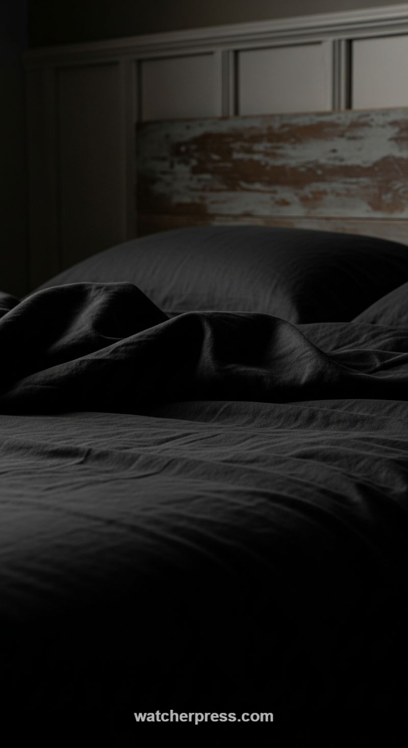
One of the most effective texture secrets professional decorators employ is utilizing monochromatic palettes to amplify the tactile qualities of textiles. When color saturation is high, or, as seen here, deeply dark, the material itself becomes the primary focus. In this stunning example, the charcoal or deep slate gray bedding—likely linen or a heavy-weave cotton—is draped and arranged to maximize the natural folds and valleys, creating shadows that sculpt the surface. This technique turns the bed into a three-dimensional landscape rather than a flat, uniform surface. To achieve this look, opt for natural fibers that possess inherent texture and body; stiff, overly starched materials will not hold these expressive, soft folds. The goal is intentional rumpling: arrange the duvet cover so that it gathers beautifully at the foot or side of the bed, allowing the natural weight of the fabric to create dramatic peaks and troughs.
To ensure these rich textures are truly appreciated, lighting is paramount. As demonstrated in this image, subtle, directional light source—perhaps a bedside lamp or a low window light—is used to graze the surface of the fabric. This creates high contrast (chiaroscuro) where the peaks of the fabric are softly highlighted, while the folds drop into deep shadow. This dramatic play of light is what defines the texture, making the dark fabric visually compelling rather than simply heavy. Avoid bright, overhead lighting which tends to flatten surfaces; instead, focus on layered and localized lighting to ‘sculpt’ the textiles. Furthermore, introducing contrasting textures nearby, such as the rustic, distressed wood and chipped paint of the headboard, further emphasizes the soft, organic texture of the bedding, grounding the sophisticated drama with a touch of raw, natural element.
Implementing this design secret requires a commitment to quality over quantity. Invest in high-thread-count natural linens or thick cottons that feel substantial and drape well. When styling, move away from rigid perfection; the beauty of this texture secret lies in its relaxed, lived-in luxury. The moody, rich color scheme contributes to a sophisticated and calming atmosphere, making this approach ideal for bedrooms, studies, and intimate living spaces where comfort and depth are priorities. By letting the fabric speak for itself through high contrast and artistic arrangement, you move beyond simple decoration into true textural artistry, a hallmark of professional design.
Master the Art of Contrasting Textures: Rattan, Bleached Wood, and Ceramic

Achieving a truly texture-rich home relies heavily on deliberate contrast, and nowhere is this more evident than in the strategic pairing of materials seen in this bright kitchen. The island, often the anchor of a modern kitchen, utilizes a white-washed or bleached wood finish. This choice is crucial: while the color remains pristine and airy, the visible wood grain and vertical paneling (reminiscent of beadboard or shiplap) instantly inject character and dimension. This linear, slightly rigid architectural texture provides a solid foundation, which is then dynamically challenged by introducing soft, organic elements. By using a pale finish, the texture remains visible but doesn’t introduce visual weight, maintaining the overall light aesthetic.
The rattan bar stools are the essential counterpoint to the island’s crisp structure. Rattan, a natural fiber, offers immediate warmth and an intricate, woven texture that softens the otherwise modern, hard surfaces (like the stone countertop and stainless steel sink/faucet). Professional decorators understand that these organic, curved elements prevent a bright white space from feeling sterile or flat. Furthermore, notice the small but effective use of color and texture in the light blue ceramic dishes. The smooth, glossy finish of the stacked bowls and plates provides a third distinct texture
To replicate this look, focus on layering materials of differing hardness and sheen. When working with neutral base colors (like white or gray), textures become your primary tool for adding depth. Ensure you include at least one raw, unrefined material (like rattan, woven jute, or raw wood) alongside one polished surface (like marble or high-gloss ceramic) and one architectural texture (like planking or paneling). The key is maintaining visual harmony; by keeping the overall color story muted and bright, the textures can speak volumes without the room feeling cluttered or overly busy. This strategy works particularly well in high-traffic areas like kitchens, transforming functional spaces into comfortable, layered havens.
Mastering the Art of Material Juxtaposition for Maximum Depth
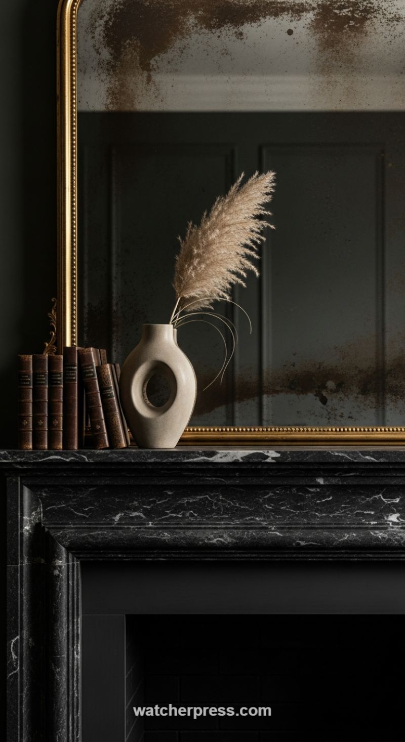
The secret to achieving profoundly rich texture in a space is not merely accumulation, but intentional juxtaposition. This visual demonstrates a masterclass in contrasting materials and eras, all set against a deeply saturated, dark backdrop. Professional decorators understand that texture is revealed through light and contrast. Start by anchoring your vignette with foundational materials that have inherent visual texture, such as the heavily veined black marble of this mantelpiece. The subtle sheen and intricate white fissures of the stone provide a dynamic base. Crucially, the antique, foxed mirror adds a layer of patina and temporal depth; the gold frame’s ornamentation and distress are textures that cannot be faked, instantly elevating the design from simple staging to a curated collection of objects with history. This approach ensures that even with a dark color palette, the surface interest remains palpable and engaging.
To create a truly compelling textural narrative, adhere to the design principle of combining at least three contrasting material types within a tight grouping. In this arrangement, we see three distinct families: the historic and worn (leather-bound books, aged brass frame), the organic and ephemeral (pampas grass), and the modern and smooth (the minimalist ceramic vase). Notice how the heavy, rigid, and warm tones of the antique books are immediately offset by the light, airy, and soft plumes of the dried grass. The centerpiece, the matte, ovoid vase, provides necessary visual tension. Its contemporary shape and smooth texture interrupt the rustic and traditional elements surrounding it, proving that mixing stylistic eras—old leather and new ceramic—magnifies the tactile experience of the whole setup. For maximum impact, ensure your objects vary significantly in scale and reflectiveness to catch light differently.
Finally, professional decorators utilize light to draw the eye to these textural differences, rather than relying on bright, flat illumination. Low, directed lighting or soft natural light is essential to create shadow and dimension. Observe how the light skims the velvet-like surface of the pampas grass, causes the gold frame to glint, and highlights the subtle dust and decay on the mirror’s surface. This dramatic, high-contrast effect is only achievable when light is allowed to interact with complex surfaces. When styling your own mantel or console, treat the setup as a stage: use your foundational materials (marble, wood) for weight, your historic objects (books, antiques) for soul, and your modern elements (ceramics, minimalist art) for sophisticated contrast, ensuring that every piece contributes a unique tactile quality to the composition.
Harness the Power of Texture Contrast: Pairing Raw Organic Materials with Polished Stone

The secret to achieving sophisticated depth in a neutral space, as brilliantly executed here, lies in deliberately juxtaposing wildly different material textures. Professional decorators understand that in the absence of vibrant color, texture must carry the visual weight. The primary ‘how-to’ instruction is to layer organic, rough elements against polished, smooth surfaces. Notice the commanding driftwood mirror: its raw, tactile, and highly irregular texture immediately draws the eye, establishing a rustic, coastal anchor. This visual roughness is then intentionally set against the sleek, large-format slab of veined white marble used for the countertop and backsplash. The coolness and pristine lines of the marble serve as the perfect foil, preventing the space from feeling cluttered or overly rustic, instead elevating the overall design into a modern, textured sanctuary. When attempting this technique, ensure your foundational textures (like the vanity wood grain and the wall paint) are also present to mediate the contrast.
To execute this pairing successfully, focus on selecting materials that offer maximal tactile difference. For instance, the vanity itself features natural, light oak cabinetry with a clear, visible grain—a mid-level texture that bridges the gap between the driftwood and the marble. The choice of hardware (brushed metal knobs and the vintage-style three-piece faucet) further refines the tactile experience; their soft, diffused finish adds warmth without being aggressively reflective, ensuring the light highlights the textures rather than creating harsh glare. When sourcing materials, avoid homogeneity; if your countertop is smooth, your focal mirror or wall treatment should be intensely textured. Conversely, if your vanity is weathered wood, opt for a highly polished surface finish on your fixtures or floor tile to maintain that crucial tension.
Finally, use soft accessories and natural light to soften the hard boundaries created by stone and metal. The large window floods the room with natural light, which is essential for making textural variations visible and vibrant. Introduce soft, organic accents like the delicate sprigs of lavender in a clear glass vase and the small, smooth wooden soap dish. These final layers add fragility and life, contrasting with the heavy stone and wood. This technique of balancing hard architectural lines (marble edge, window frame) with soft, flowing elements (plant life, liquid soap dispenser) ensures the room feels inviting and balanced, not merely a display of materials. By treating texture as the primary color, you create a home that is visually compelling and deeply satisfying to inhabit.
The Art of Liquid Texture: Harnessing High-Gloss Reflections

Professional designers utilize highly polished surfaces, like the rich, dark wood table shown here, as a form of “liquid texture” to dramatically alter the perception of light and depth within a space. This technique goes beyond simple aesthetics; it turns a piece of furniture into an active mirror, manipulating natural light and doubling the perceived scale of vertical elements. When implementing this in your own home, choose lacquers or high-gloss finishes on surfaces positioned to capture primary light sources, such as windows or central overhead fixtures. Notice how the immaculate polish on this table captures the entire arched window structure and reflects it back into the room, instantly adding visual drama and magnifying the incoming daylight, making the space feel expansive and airy despite the use of deep wood tones. This is a crucial strategy for making darker, traditionally heavy furniture feel contemporary and buoyant.
To execute this high-gloss design principle successfully, you must master the art of juxtaposition. A room overwhelmed by reflective surfaces will feel cold and sterile; therefore, the visual energy of the high-gloss table must be grounded by contrasting, light-absorbing textures. Observe how this formal setting pairs the mirror-like wood with sheer curtains, which diffuse the harsh sunlight, and matte ceramic tableware and a decorative teapot. The soft, flowing texture of the curtains and the unpolished finish of the ceramic pieces provide a necessary visual break and tactile warmth. When recreating this look, balance high-sheen furniture with elements like raw silk, velvet, boucle, or thick wool rugs. These soft textures absorb sound and light, ensuring the room remains inviting and sophisticated rather than museum-like.
Furthermore, strategic reflection reinforces architectural integrity and symmetry. By centering the highly reflective table beneath the prominent window, the designer ensures that the reflection emphasizes the elegant arches and strong vertical lines of the architecture. The polished surface naturally draws the eye toward the center of the room, highlighting the precise placement of formal elements, such as the symmetrical place settings and the central decorative urn. When sourcing high-gloss furniture, pay attention to the underlying material; the V-match or sunburst veneer pattern visible in this table is intrinsically complex, and the high-gloss finish enhances this intricate grain detail, providing an additional layer of fine texture that signifies luxury and exceptional craftsmanship. This combination of reflective polish and detailed grain is an expert hallmark of intentional, texture-rich design.
Juxtaposing Rough and Refined Textures for Dramatic Contrast
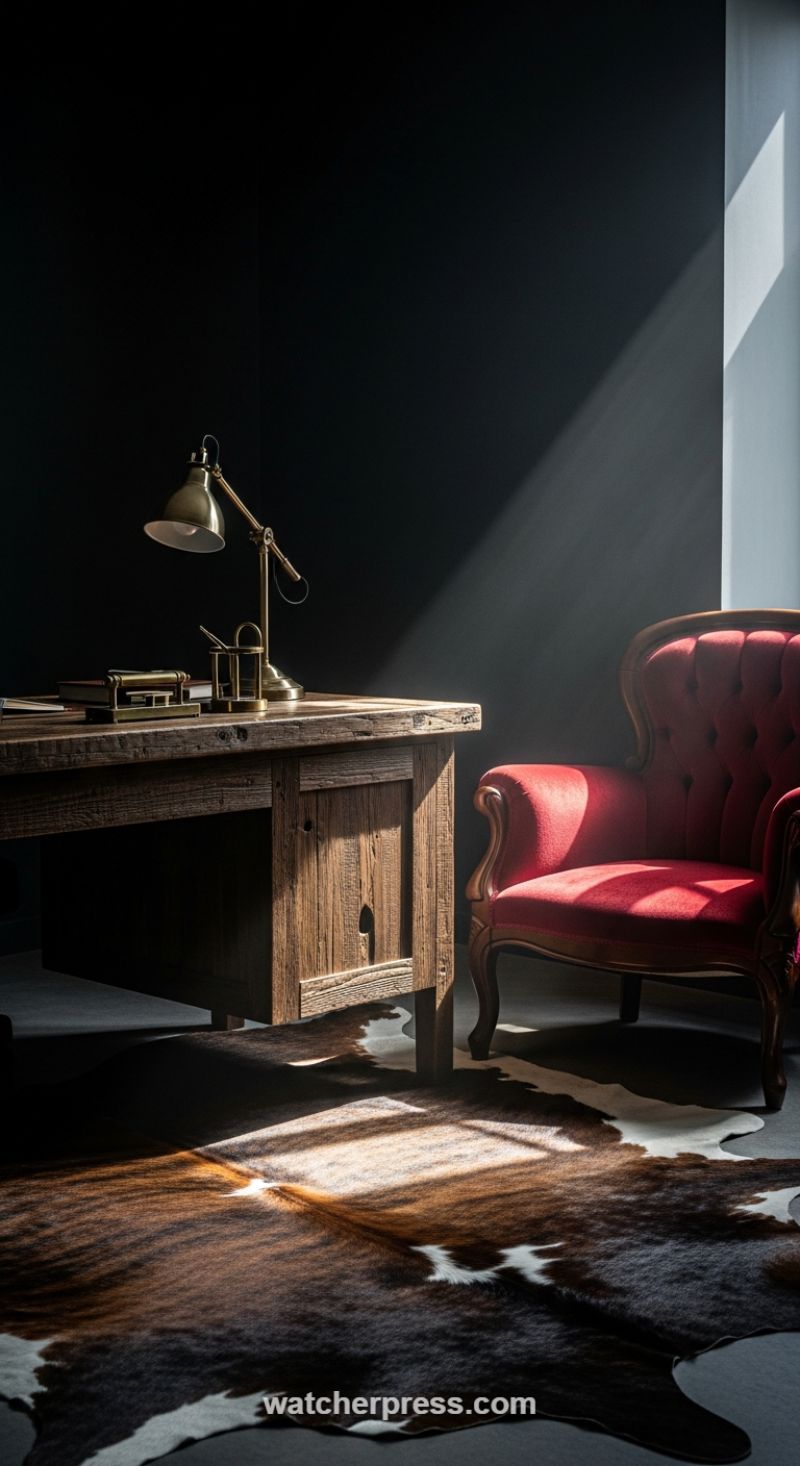
The secret to an intensely textural space lies not in layering similar materials, but in the deliberate juxtaposition of rough and refined surfaces. As professional decorators know, this high-contrast strategy creates immediate visual tension and depth, preventing the room from feeling dull or static. Examine the pairing of the distressed, rugged wood desk with the smooth, deeply tufted velvet of the crimson armchair. The desk, likely crafted from reclaimed timber, features deep graining and a matte finish that reads as historical and masculine. In sharp opposition, the luxurious red velvet chair offers a rich, soft tactile experience with its glossy sheen, communicating comfort and classic elegance. To bridge this material dialogue, incorporate transitional textures like polished metals, such as the brass lamp and desk accessories, which reflect light and introduce a cool, sleek contrast to the warmth of the wood and the depth of the fabric.
To amplify the tactile experience, grounding elements must continue the textural conversation in an organic way. The floor is covered by an irregularly shaped cowhide rug, providing a multi-layered, organic texture that is both soft underfoot and visually striking due to its natural variation in color and pile length. The rug serves as a crucial intermediary, breaking up the flat floor plane while connecting the dark color palette of the walls to the natural tones of the wooden desk. Furthermore, texture is dramatically enhanced by light management. Notice how the single, strong shaft of daylight rakes across the scene. This directional lighting technique casts deep, dramatic shadows that meticulously outline every ridge on the desk surface, every fold in the velvet tufting, and the variable height of the rug’s fur, proving that visual texture is as much about illumination as it is about material selection. To replicate this effect, strategically place lighting (or embrace natural light) so it grazes surfaces rather than washing them out evenly.
Applying this principle requires a calculated balance. Avoid overcrowding the space, allowing each textural element—the rustic wood, the rich velvet, the varied hide—to have its own moment. Start by defining your ‘rough’ anchor piece (the desk in this case) and your ‘refined’ counterpart (the armchair), dedicating approximately 60% of your primary materials to one category and 40% to the other for a balanced yet dynamic feel. The use of a matte, dark, or even black backdrop is essential, as it minimizes competition and allows the complexity of the materials to take center stage. This high-contrast setting ensures that the eye registers the depth and detail of the textiles and wood grain, elevating simple furnishings into a sophisticated, visually rich design statement.
Creating High-Contrast Drama: How Focused Lighting Elevates Glass and Crystalline Textures

Professional decorators understand that true texture is not just tactile; it is amplified by light and contrast. The key design secret illustrated here involves marrying two fundamentally different materials—dark, opaque wood and delicate, reflective crystal—and using directional lighting to create a sense of theater and depth. To replicate this effect, start by selecting a rich, dark backdrop (like walnut or mahogany paneling, or even a deep charcoal paint) that acts as a visual anchor. This matte, absorbent surface is essential, as it minimizes glare and allows the brilliance of the transparent objects placed upon it to truly ‘pop.’ The resulting high-contrast pairing immediately registers as sophisticated and deliberate, lending weight and perceived value to the items being displayed.
The essential element for maximizing crystalline texture is directional accent lighting. Unlike general ambient light, a focused spotlight, typically recessed into the top of the cabinet or shelf, is designed to catch the complex facets and edges of the glassware. When the light hits these intricate cuts, it fractures and scatters, creating brilliant highlights and deep, intentional shadows. This dramatic interplay is what transforms simple glassware into sculptural pieces, making them appear dimensional and dynamic. When planning your lighting, opt for a warm color temperature (around 2700K–3000K) to complement the warm tones of the wood, and ensure the beam is narrow enough to illuminate the collection without spilling over harshly onto the surroundings. The goal is to bathe the objects in light while keeping the surrounding framework cloaked in shadow, enhancing the mood.
To achieve a truly texture-rich display, avoid uniformity in your materials and embrace subtle layering. While the primary material is glass, notice how the image incorporates varying levels of opacity and pattern: highly faceted crystal glasses, smooth clear tumblers, and slightly darker, smoky glass pieces on the lower shelves. This subtle variety prevents the display from becoming monotonous. Furthermore, utilize glass shelving instead of solid wood shelves for the tiers, as this allows the focused spotlight to penetrate down through the levels, creating beautiful reflections and shadows on the surfaces below. By carefully curating the placement—using negative space to frame the most detailed pieces, like the central bowl—you ensure that the lighting can fully interact with every facet, offering depth and dimensionality that is the hallmark of professional-grade design.
The Power of Symmetry and Multi-Layered Finishes

Creating a truly texture-rich home starts with anchoring the space using strong symmetrical arrangement and highly varied finishes. In this entryway display, the foundation is a dark, classical console table, whose polished surface introduces a smooth, dense wood grain texture and sets a formal, high-contrast tone against the crisp white walls. To achieve the balanced serenity professional decorators love, flank your centerpiece with identical pieces. Here, two large blue and white porcelain ginger jars establish perfect visual equilibrium, offering a repetitive, intricate glazed texture that provides a cool contrast to the warm wood beneath them. The careful selection of these foundational pieces ensures the eye is immediately drawn to the display, prepared for the richer layers to follow.
The most compelling texture, however, often comes from high-relief details. Notice the selection of the oversized mirror: its highly ornate, aged silver or pewter frame provides immediate visual density and complexity. This carved metallic element is a masterclass in textural layering; its detailed, uneven surface contrasts sharply with the flat, reflective glass and the smooth surrounding walls. When selecting a feature mirror, choose one whose frame material contrasts with the furniture material—a dark wood table paired with a metallic frame, or a light-toned table paired with a dark, distressed wood frame. This interplay of materials (polished wood, ornate metal, slick ceramic) prevents the symmetrical setup from becoming monotonous and adds significant depth.
Finally, introduce a soft, organic texture to break the stiffness of hard lines and ceramics. The lush arrangement of white hydrangeas in a simple, unobtrusive square glass vase acts as the crucial third textural layer. The soft, clustered nature of the blooms introduces an organic, voluminous texture that absorbs light and softens the surrounding structure. When styling your console, always remember the Rule of Three: one hard structural element (the table), one high-relief reflective element (the mirror), and one soft, life-filled element (florals or greenery). Ensure the centerpiece is proportionate to the flanking items; the height of the hydrangeas is intentionally kept low enough to complement the jars without obscuring the ornate details reflected in the mirror, completing a stunning, multilayered tableau.
The Essential Role of Tactile Textiles
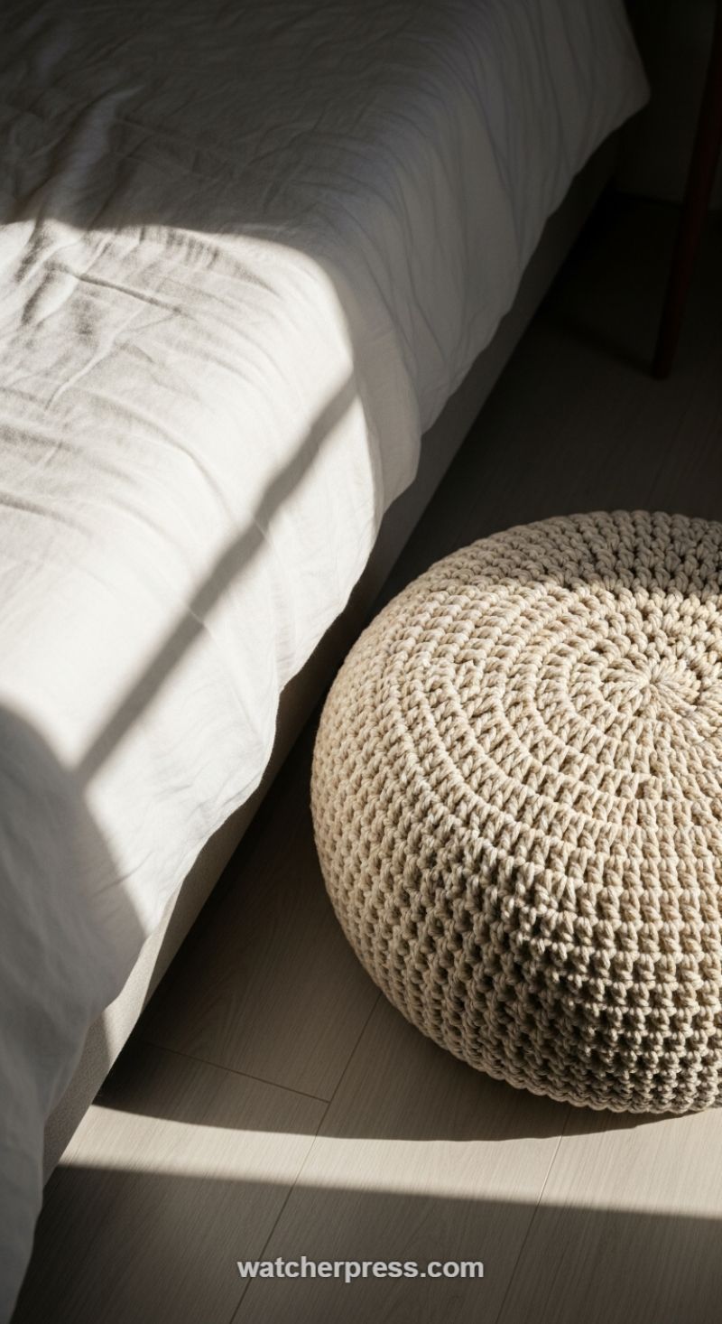
Achieving true depth in a neutral color scheme relies heavily on the juxtaposition of varied textures. Professional decorators understand that using only one type of texture—say, sleek, smooth surfaces—in a monochromatic room results in a flat, uninspired space. The secret lies in deliberately pairing materials with opposing tactile qualities. Observe how the loose, soft, and slightly rumpled white linen bedding, which offers a foundation of airy comfort, is dramatically contrasted by the presence of a substantial, round crocheted pouf. This pouf, with its intricate, dense, looped knit pattern, provides significant visual weight and rugged texture. This dynamic interplay prevents the light color palette from feeling sterile, instead creating a comforting, layered environment that invites touch and exploration.
To implement this technique, think beyond just standard upholstery. Look for statement pieces that are inherently textural, such as chunky knitted poufs, woven baskets, or heavy cable-knit throws. When selecting these items, prioritize natural fibers like thick wool, organic cotton, or jute, as these materials naturally possess irregularities and tactile depth that synthetic materials often lack. Placement is key; position these highly textured elements where they interact directly with light—especially natural sunlight—as the shifting shadows and highlights profoundly accentuate the weaving patterns and material density. This strategic positioning doesn’t just decorate the room; it turns the texture itself into a design feature, adding dimensionality and high-end visual intrigue.
Dramatic lighting is the decorator’s best tool for maximizing the impact of varied textures. As seen in this scene, the low, sharp angle of the morning or afternoon sun creates distinct shadows that highlight every fold in the bedding and emphasize the repetitive, geometric pattern of the crocheted weave on the pouf. When designing your room, ensure your foundational layers—such as the wood flooring and the bedding—offer subtle texture, providing a backdrop for more prominent, functional textile pieces. By layering smooth, foundational surfaces (like the polished floor) with soft, medium-texture linens and culminating in one intensely tactile item (the pouf), you create a visual hierarchy of texture. This thoughtful layering ensures the space feels complete, rich, and sophisticated, embodying the highest standard of texture-rich interior design.
Curating Domestic Vignettes with Intentional Shadow and Grain
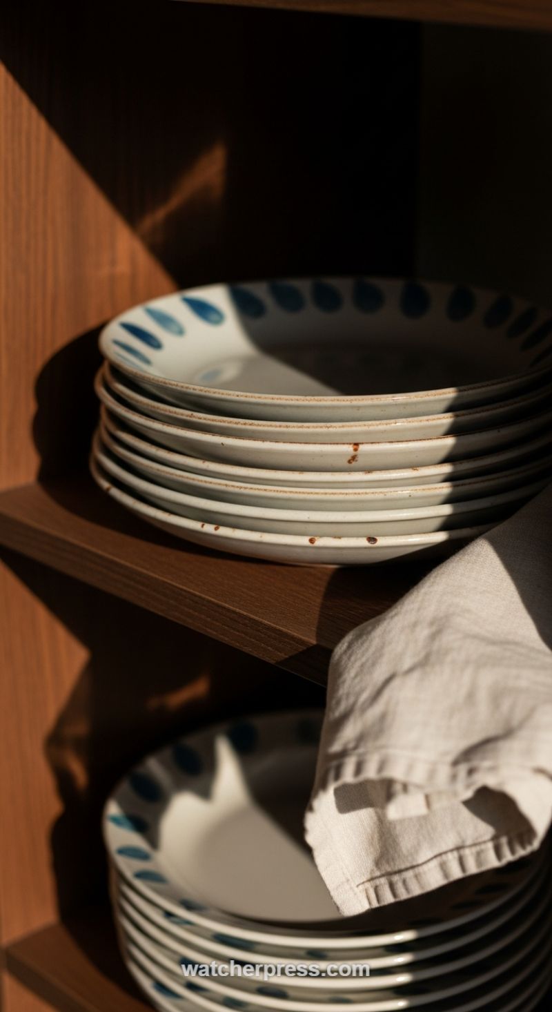
Professional decorators understand that dramatic, directional lighting is one of the most powerful and inexpensive tools for introducing texture and mood into a space. In this vignette, sunlight acts as a structural element, carving out deep shadows and sharply defined highlights that accentuate the inherent textures of the materials. Notice how the sharp geometric shadow dramatically contrasts the rich, smooth darkness of the cabinet interior with the light-absorbing matte finish of the stacked ceramic plates. This interplay transforms a simple functional area, like a dish cupboard, into a focal point. To replicate this effect, strategically place high-texture items where they will catch the strong light—near a window, or under targeted low-voltage spotlights. The objective is to use contrast to define depth; deep shadows make the light-catching surfaces, such as the white ceramics, appear brighter and more voluminous.
The secret to rich texture layering lies in combining materials with wildly different tactile qualities. This scene successfully layers three distinct textures: the hard, deep grain of the wooden shelving (earthy and grounding), the rustic, speckled ceramic of the plates (cool and imperfectly smooth), and the soft, rumpled weave of the linen or cotton napkin (warm and inviting). The plates themselves contribute subtle texture through their handmade quality—the slightly uneven rims and the iron specks introduced during the firing process signal authenticity and artisan craftsmanship, a key characteristic of elevated home design. When styling your own shelves, avoid homogeneity; if your shelving is smooth wood, introduce woven baskets or rough-hewn stone elements. If your dishes are sleek and modern, soften the presentation with a thick, folded textile draped casually nearby.
Furthermore, this vignette showcases the design principle of ‘Wabi-Sabi,’ finding beauty in imperfection and daily life. The plates are not pristine; the slight rust-colored speckling and the natural, organic shape of the blue dots prevent the scene from feeling overly manufactured or sterile. This approach suggests that these items are used and loved, contributing to a sense of genuine domestic warmth. To achieve this curated, lived-in feel, choose everyday objects over purely decorative tchotchkes for display. Stack dishware, fold useful textiles, and allow the natural patina of wood and ceramic to age gracefully. The repetition of the blue dot pattern across the stacks also introduces visual rhythm, drawing the eye down through the composition and ensuring that even in shadow, the elements remain visually engaging and intentionally placed.
Leverage Integrated Lighting to Accentuate Depth and Texture
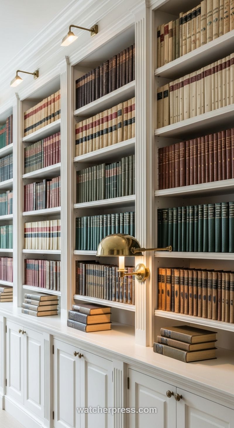
The secret to transforming a simple storage unit into a stunning architectural feature is the strategic use of integrated lighting, which activates and amplifies the textures within the space. Professionals understand that a deep, layered look starts with custom millwork; notice the fluted pilasters and robust crown molding here, providing essential shadow lines and structure. The white finish on the cabinetry serves as a clean, expansive backdrop, but it is deliberately flat, ensuring that the visual texture is provided entirely by the objects placed within it. To replicate this level of sophistication, choose a matte or satin finish for the woodwork and ensure your shelves are substantial enough to hold the weight of a dense collection, anchoring the room with permanence.
The contents of the shelving unit are the primary source of organic texture and visual history. Instead of covering books, let their original bindings—aged leather, linen, and varying paper textures—act as natural artifacts. Curate your collection by tonal richness, mixing deep forest greens, oxblood reds, and warm tans against the cool white shelving to instantly create depth. Avoid making every shelf uniform; notice the intentional stacking of books horizontally in the lower sections. This variation breaks up the vertical rhythm of the spines and adds essential dynamic layering, providing visual rest points and emphasizing the dimensionality of the shelf depth. This simple rotation shifts the eye and underscores the curated nature of the collection.
Finally, the strategic lighting is the element that breathes life into the texture. Picture lights, such as the brass fixtures seen here, are positioned to skim the surface of the books, casting soft shadows that dramatically define the texture of the bindings and the architectural details of the shelves. This backlighting technique adds immense warmth and tactile richness that overhead lighting cannot provide. When selecting fixtures, opt for a warm metal finish like aged brass or bronze to complement the traditional colors of the books. Use bulbs with a warm color temperature (around 2700K) to draw out the richness of the reds and browns, turning the collection into a glowing, textural focal point that feels deeply inviting and highly refined.
Layering Opposing Textures: Live Edge Wood and Matte Black Accents
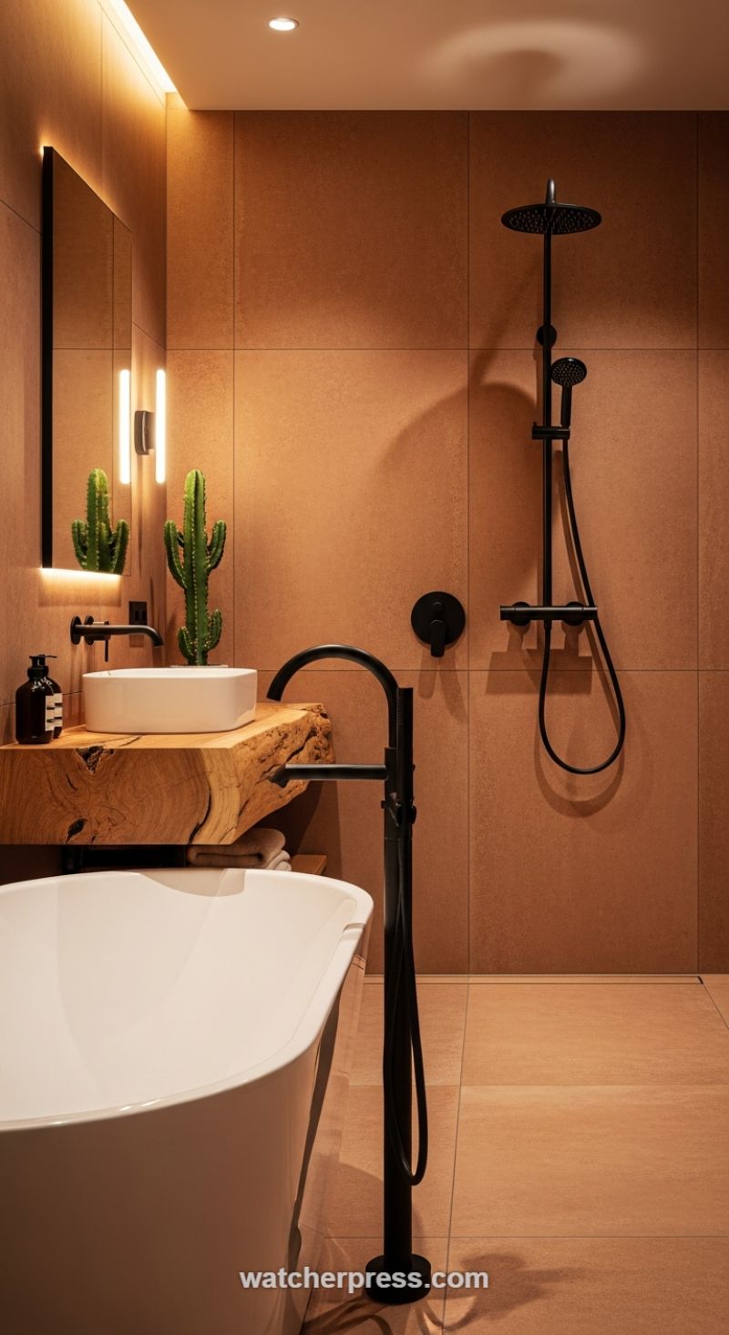
Creating a truly luxurious and texturally rich space requires balancing materials that fundamentally contrast, allowing each element to enhance the beauty of the other. The foundation of this design is established by the large format, monochromatic terracotta-toned tile covering both the walls and floor. This provides a warm, monolithic canvas that immediately feels grounded and earthy. The critical move, however, is the introduction of the live-edge wood vanity. This piece is intentionally rugged and raw, presenting a powerful juxtaposition against the tile’s refined flatness. When incorporating such a striking natural element, ensure that the wood is properly treated and sealed for bathroom use, protecting the raw edge while highlighting its intrinsic grain and knots. This contrast between the smooth, manufactured tile and the organic, unrefined timber is the secret to achieving immediate depth and visual interest in a minimalist palette.
The next layer of textural contrast is provided by the fixtures: a complete suite of matte black hardware, including the wall-mounted sink faucet, the rain shower system, and the sculptural freestanding tub filler. Black is a highly effective choice here because it reads as both industrial and contemporary, offering a sharp, graphic anchor against the soft, warm backdrop. Professional decorators understand that texture extends beyond touch; it includes visual weight and reflectivity. The matte finish of the black metal absorbs light, creating striking silhouettes that define the geometry of the room, contrasting sharply with the bright, reflective white of the angular vessel sink and the gracefully curved freestanding bathtub. To apply this technique, commit to a single high-contrast finish (like matte black or brushed bronze) for all fixtures to maintain visual cohesion.
Finally, expert lighting and organic staging elevate the overall textural experience. Notice the use of warm, indirect lighting, particularly the hidden strip lights accenting the mirror and ceiling cove. This soft illumination washes the terracotta tiles, revealing their subtle aggregate texture rather than washing them out, adding a layer of atmospheric warmth. The styling choice—specifically the tall, architectural cactus—serves two purposes: it introduces a third, living texture that is spiky and vertical, and it reinforces the desert modern or natural spa aesthetic. When replicating this technique, remember that ambient lighting should enhance, not flatten, your chosen textures, and sculptural, low-maintenance plants are essential for bringing life and final punctuation to the composition.
Layering Woven Textures to Maximize Natural Light
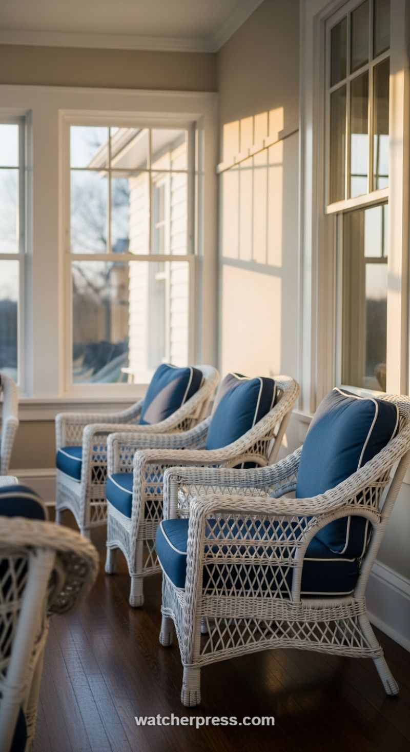
Creating a truly texture-rich home often requires moving beyond flat surfaces and incorporating woven elements, particularly in transitional spaces like sunrooms or enclosed porches. The key design secret here is the expert deployment of highly structured natural fibers, such as classic painted wicker or rattan. These materials inherently offer a deeply textured, three-dimensional surface that catches light and shadow beautifully. When selecting furniture like these white wicker armchairs, ensure the woven pattern is pronounced. The visual weight of the basketweave and open lattice patterns, juxtaposed against the smooth, dark wood flooring and the large expanse of glass, prevents the space from feeling too sterile or flat, even with a light wall color.
To make this layered texture feel sophisticated rather than rustic, professional decorators rely heavily on strategic contrast and detailing in soft furnishings. Notice how the deep, saturated navy cushions provide a rich counterpoint to the bright, almost ethereal white of the wicker frames. This high-contrast palette ensures that both the hard texture (the weave) and the soft texture (the fabric) are clearly defined. A subtle, yet powerful, detail is the white piping or cording tracing the edges of the blue cushions. This small, crisp line acts as a textural delimiter, framing the softness of the cushion and reinforcing the clean, architectural lines of the room, instantly elevating the furniture from basic outdoor pieces to tailored indoor seating.
Finally, the most dynamic texture in this space is kinetic: the interplay of light and shadow. The sun, streaming through the grids of the multi-pane windows during the golden hour, projects bold, geometric stripes onto the smooth beige wall. This technique harnesses architectural features to create a temporary, ever-shifting texture that changes throughout the day. To successfully integrate this effect, ensure your wall surfaces are a matte or eggshell finish. High-gloss paint would reflect too much light, softening the shadow lines. By combining permanent physical texture (wicker, wood) with deliberate ambient texture (light and shadow), the resulting atmosphere is complex, welcoming, and deeply layered, achieving the core goal of a professional decorator’s touch.
Integrating Organic Materials and Culturally Rich Textiles
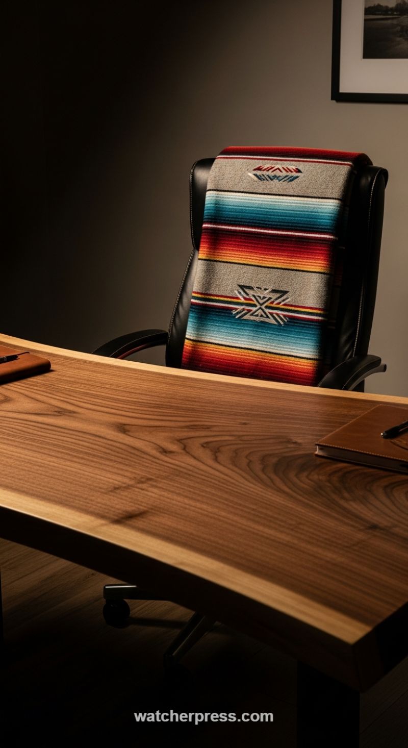
Professional decorators understand that the most luxurious spaces are built on authentic, tactile foundations. In this design, the selection of a live-edge wooden desk serves as the primary anchor for texture. A piece like this—likely thick walnut or similar dark wood—immediately introduces an organic, rough texture via the prominent grain and the natural, unrefined edge. This bold material choice counters the formality often associated with an office, providing warmth and history. To achieve this balance, ensure your anchor wood piece is finished well but not overly polished; the goal is to feel the wood’s inherent character. Pair this natural, broad texture with something sleek, like the matte black leather office chair, creating a striking contrast between raw earthiness and refined manufacturing. This deliberate contrast prevents the room from feeling monotonous or overly rustic, establishing an immediate sense of sophisticated equilibrium.
The secret to moving beyond basic contrast lies in layering soft textures and intentional pattern placement. Here, a brightly striped, patterned textile (such as a Southwestern-style serape or blanket) is draped casually yet thoughtfully over the leather chair. This element is crucial for several reasons: it injects a vital dose of color saturation and personality into the otherwise muted palette, and more importantly, it introduces the soft, woven texture of wool or high-quality fiber against the taut, smooth leather. When selecting textiles for professional settings, opt for pieces with deep, established patterns—like the traditional geometric eagles or chevrons shown—which feel deliberate and sophisticated, rather than merely decorative. This specific use of a textile transforms the functional chair into a sculptural, inviting piece, immediately elevating the space’s perceived value and global sensibility.
Further texture complexity is achieved by integrating smaller details and managing the light. Notice how the rich color and distinct grain of the wood desk are meticulously emphasized by focused, directional lighting. When designing your textured space, consider how light will fall across your chosen materials. Low lighting, particularly in an executive or study setting, accentuates the depth of the wood grain and the raised nap of the woven textile, making both surfaces appear significantly deeper and richer. Even minor elements, such as the smooth, warm-toned leather notebook placed on the desk, contribute to the layered tactile experience. Professional design is about curating a comprehensive sensory journey; every material—from the sturdy desk to the soft throw and the smooth writing surface—must contribute distinctly to the overall desired texture profile and ambiance.
Layering Textures for Architectural Depth
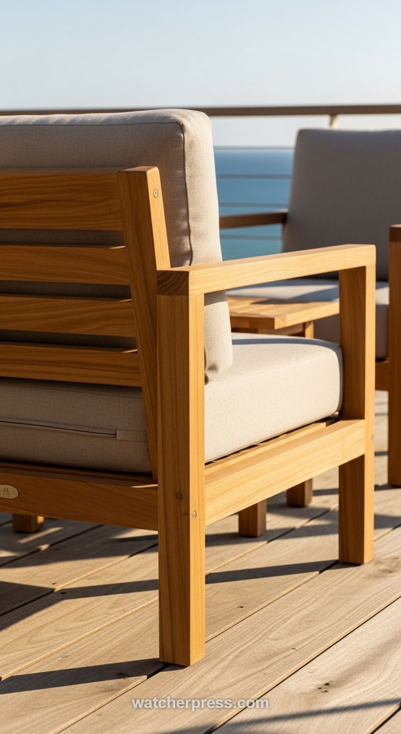
True texture richness begins with the architectural elements themselves. As seen in this pristine outdoor setting, the professional decorator deliberately chooses materials that offer both visual warmth and tactile complexity. The robust, rectilinear frame of the armchair, likely crafted from high-density teak or iroko, provides a foundational layer of smooth, hard texture. The natural grain and honeyed hue of the wood immediately introduce an organic element that contrasts sharply with the precise, modern lines of the design. When selecting large focal pieces, always opt for natural, durable materials that will age gracefully, such as untreated woods or natural stone accents. These core materials set the stage for subsequent soft layers and ensure longevity, which is a key component of high-end, sustainable design that transcends trends.
The critical next step is introducing contrast through opposing textures to achieve real architectural depth. Notice how the thick, plump outdoor cushions in a light, neutral tone (like oatmeal or pale linen) immediately soften the rigid lines of the teak frame. This juxtaposition—hard and smooth structure versus plush and slightly coarse fabric—is essential for creating an inviting space. When replicating this technique, choose outdoor fabrics (such as Sunbrella or marine-grade canvas) that have a pronounced weave or slub to maximize the textural difference; avoid overly slick or shiny materials. The goal is a matte finish that absorbs light and highlights the inherent texture. The neutral color palette here is also strategic, allowing the wood grain and the fabric weave to become the primary visual interest, rather than relying on jarring color combinations. Ensure the scale of the soft goods (the cushion thickness) complements the robustness of the structure, preventing the piece from looking flimsy or overstuffed.
A final, often overlooked design secret is using environmental factors, particularly natural light, to amplify textural impact. In this sun-drenched scene, the strong, directional light casts long, dramatic shadows across the wooden decking and the chair legs. Shadows physically define the planes and joints of the furniture, highlighting the craftsmanship and adding a temporary, dark textural element (the shadow itself). To harness this effect indoors or out, strategically place high-texture elements where light is strongest, such as near large windows or under focused ambient lighting. Furthermore, seamlessly integrate the surrounding environment by using the base material, like the wide wooden deck planks, as a continuous layer. This continuity reinforces the linear geometry of the chair, tying the furniture directly to the site architecture and resulting in a cohesive, texture-rich envelope that feels curated and deeply intentional.
Anchor Your Space with Layered, Opposing Textures
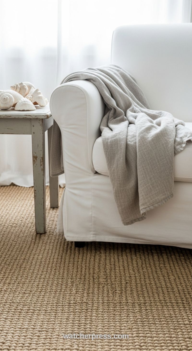
Professional decorators understand that a lack of color in a room must be compensated for by an abundance of tactile variation. This image perfectly illustrates the art of monochromatic texture layering, which begins from the ground up. Start by anchoring your space with a substantial, organic base, such as a thick woven jute or sisal rug. The coarse, uniform pattern of this natural fiber provides immediate grounding and contrast, setting a rugged baseline against which all subsequent soft elements will stand out. This foundational choice is crucial because its earthy tone and deep texture prevent the surrounding crisp whites and pale neutrals from feeling sterile or flat. Ensure the scale of the weave is noticeable—if the texture is too fine, the desired effect of depth will be lost. This technique creates a rich, sensory experience even before the furniture is placed, ensuring a home feels instantly warm and inviting.
Once the foundation is set, introduce sensory balance by juxtaposing the coarse textures with exquisite softness. The white slipcovered sofa provides a clean, tailored contrast to the rugged rug below, acting as a smooth, bright canvas. The true magic lies in the addition of the throw blanket, which should be chosen for its drape and fine weave (like cashmere, linen, or brushed alpaca). Draped casually over the arm, the light grey throw introduces a mid-tone color and a luxurious, finely milled texture that opposes the thickness of the rug and the firmness of the sofa structure. This deliberate layering of opposing textures—rough against smooth, thick against thin—stimulates the visual and tactile senses, confirming that sophisticated design relies not on vibrant hues, but on the complexity of touch.
To complete this expert texture recipe, use accent pieces to add small, unexpected moments of weathering and sculptural interest. The small side table, featuring a distressed, chipped, pale-grey finish, offers a moment of rustic imperfection, introducing the hard, splintered texture of weathered wood that breaks the dominance of fabric fibers. Finally, integrate organic, non-textile elements, like the smooth, porcelain-white seashells. These shells are structurally complex and sculptural, their polished, cool surfaces providing a final, polished contrast to all the woven and draped elements. Following this sequence—grounding texture, soft fabric contrast, and hard, sculptural accents—allows you to build a stunning, complex room using only a palette of white, beige, and grey.
Master the Art of High-Contrast Architectural Texture
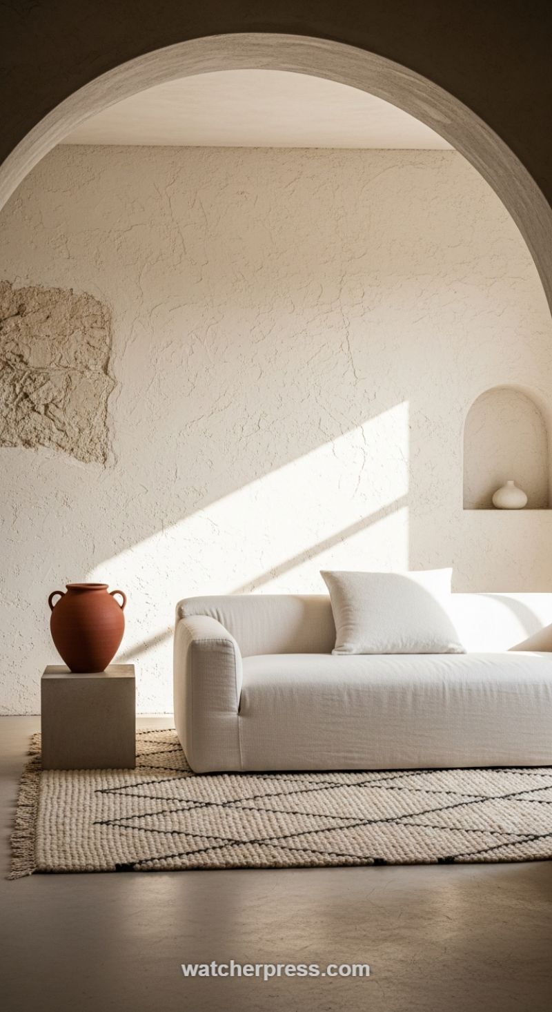
To create a truly stunning, texture-rich environment using a minimalist or neutral palette, professional decorators understand that the most important canvas is the architectural shell itself. Rather than relying on simple painted drywall, the foundation of this look is a deeply tactile wall finish, such as heavy stucco, limewash, or deeply troweled plaster, applied in a soft, monochromatic tone like bone or warm beige. This deliberate choice turns the wall into a sculptural element; the uneven surface texture becomes a highly reactive canvas that eliminates the need for excessive art or ornamentation. Furthermore, incorporating curved architectural elements—such as wide arches and deep recessed niches—softens the structure and allows light to travel and fall gently, ensuring that the room feels expansive and grounded simultaneously. The shadows cast by the arches and the texture itself are often more visually captivating than any flat color could be.
The secret to moving from merely textured to truly rich lies in the deliberate juxtaposition of tactile materials across the different layers of the room. Notice how the rough, porous quality of the wall contrasts immediately with the smooth, tightly woven natural linen upholstery of the sofa. This tension between hard and soft is mirrored on the ground plane. A cool, matte concrete or micro-cement floor provides a stark, minimalist base that is instantly softened by a thick, hand-loomed rug made of natural fibers like wool or jute. The rug, often featuring simple, bold geometric lines in a contrasting tone, introduces a secondary layer of complexity that keeps the monochromatic scheme from feeling dull. By ensuring that adjacent surfaces utilize vastly different textures—for instance, rough terracotta next to smooth linen—the designer heightens the sensory experience of the space.
Finally, the expert deployment of lighting and organic objects serves as the textural punctuation for the room. Sculptural objects should possess an inherent, raw materiality; here, a substantial, unglazed terracotta pot sits upon a smooth, geometric concrete cube, utilizing simple forms but rich, earthy surface quality. Most critically, professionals harness directional lighting, either through natural sunbeams or strategically placed spotlights, to emphasize the textures they’ve introduced. This raking light catches the peaks and valleys of the heavily plastered walls and the weave of the rug, transforming two-dimensional materials into dynamic, three-dimensional visual effects. This masterful control over light and shadow is the ultimate technique used by top-tier designers to ensure that a simple, neutral space feels profoundly deep and texturally compelling.
Harnessing Fiber Art to Introduce Layered Tactile Depth

One of the most effective ways professional decorators introduce texture is through large-scale fiber art, moving beyond simple framed prints to utilize highly dimensional pieces like macrame wall hangings. The secret lies in selecting items that exploit the natural properties of the material—usually thick, cream-colored cotton or jute—to create complex shadow play. As seen here, the varying knot techniques (including double half hitches for structure, square knots for solidity, and loose vertical fringe for movement) are layered over one another, resulting in an almost architectural textile surface. When placed correctly under directional light, whether natural sunlight or targeted interior lighting, the depth of the knots and the fall of the fringe cast dramatic, ever-changing shadows on the wall, instantly elevating the space from two-dimensional flat decor to a fully realized, texture-rich environment. This interplay of light and shadow is the hallmark of sophisticated textile usage.
To replicate this high-impact texture strategy, focus on pieces featuring complex, tiered construction rather than single, flat panels. The layering visible in this design—with distinct patterns overlapping and cascading downward in a V-shape—creates a waterfall effect that draws the eye and emphasizes volume. When designing, ensure the macrame’s color palette remains neutral (creams, ivories, ecru) to guarantee that the viewer’s focus is entirely on the structure and texture, not competing color elements. Furthermore, scale is critical; this fiber art should function as the primary focal point of the wall, commanding attention due to its size and intricate detail. Look for quality craftsmanship where the raw materials are substantial, giving the hanging a weighty, luxurious feel that thin, flimsy cord cannot achieve.
Integrating macrame art successfully means using it as a deliberate contrast within the space. Fiber art naturally introduces softness and organic shapes, making it the perfect counterpoint to hard architectural lines, smooth modern furniture, or industrial materials like concrete and metal. For a truly rich sensory experience, professional decorators suggest pairing the wall hanging with other contrasting textures: a polished wood sideboard below, a sheepskin rug on the floor, or cushions made of woven linen or velvet. This juxtaposition amplifies the tactile quality of the macrame. As an additional benefit, large, dense fiber pieces can also serve a practical function by absorbing sound, effectively softening the acoustics in open-concept living areas and adding functional luxury to a beautifully textured home.
Embrace the Cozy Contrast: Juxtaposing Softness and Stone

The secret to achieving a stunning, texture-rich home, as demonstrated in this image, lies not just in adding texture, but in layering textures that are diametrically opposed. Professional decorators understand that high contrast is key to preventing a room from feeling flat. In this composition, the rough, cold, and rigid quality of the stacked stone fireplace is brilliantly set off by the luxurious, yielding, and warm texture of the chunky knit throw. This deliberate pairing creates immediate visual and tactile friction, inviting the viewer to imagine the comfort of the soft material against the backdrop of natural architectural elements. When applying this technique, assess the existing ‘hard’ surfaces in your space—be it concrete floors, glass tables, or brick walls—and then seek out textiles that offer the maximum possible softness and volume to counteract that severity.
The textile itself is paramount. Notice the specific knit pattern in the throw: it utilizes thick, rope-like yarn in an exaggerated basketweave or moss stitch, creating deep crevices and substantial mass. This level of chunky texture ensures that the blanket makes a significant visual statement, rather than blending into the chair. When sourcing textiles for texture layering, invest in materials that hold their shape and density, such as heavy cotton cords, premium wool blends, or chunky chenille. These materials possess the necessary weight to drape beautifully and naturally. A professional styling tip is to avoid folding the throw perfectly; instead, casually toss or drape it across the arm of the furniture. The resulting folds, shadow play, and sense of spontaneity enhance the feeling of lived-in comfort.
Finally, integrate secondary elements of texture, such as the polished warmth of the wooden armchair arms and the soft, diffused light from the fireplace, which acts as a textural element itself by illuminating the yarn’s depth. The overall color scheme—muted grey, warm brown wood, and natural stone—is sophisticated and neutral, ensuring the visual focus remains squarely on the material structure. By anchoring your design with substantial, neutral textures, you create a rich, comforting foundation that feels timeless, proving that tactile experience is just as crucial as color in high-end interior design.
Elevate Organization: Mastering the Art of Cohesive Coarse Texture
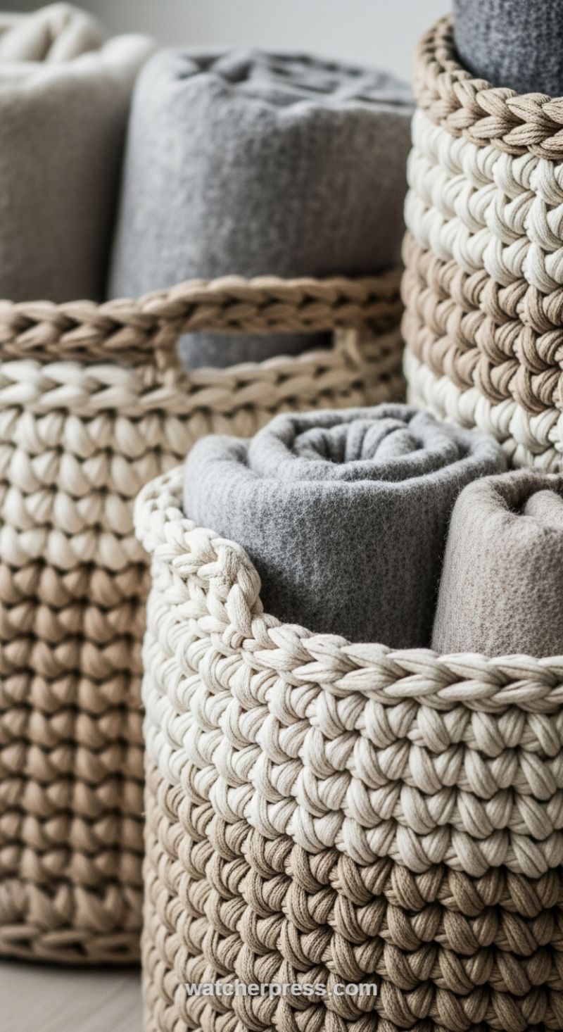
Professional decorators understand that texture is the silent language of luxury, and functional storage provides a perfect canvas to express it. The secret lies in deliberately contrasting coarse, tactile outer materials with smooth, dense inner materials, all while maintaining a tightly controlled neutral palette. As illustrated here, the chunky, oversized crochet or woven baskets, likely made from thick cotton rope or t-shirt yarn, create a deep, shadow-rich surface texture. When sourcing similar pieces, look for baskets where the stitching or weave pattern is visibly substantial—this ensures the texture registers powerfully even from a distance. The natural, unbleached tones of the rope baskets and the subtle variation in the beige and taupe yarns further emphasize this organic richness, proving that sophistication doesn’t require bright color, but rather depth of material.
To execute this look flawlessly, focus on the contents of the storage as much as the vessel itself. Rather than simply stuffing blankets inside, tightly roll throws or heavy-knit materials (like felted wool or thick cashmere blends) to create neat, sculptural cylinders. This technique turns the contents into an intentional visual element. The rolled gray and beige blankets shown provide a softer, finer texture that beautifully offsets the roughness of the woven baskets. The key instructional advice here is layering: group several baskets of varying heights and widths, ensuring each piece is functional (holding blankets, pillows, magazines) but styled to contribute to the overall tactile narrative. By limiting the color scheme to monochromatic neutrals—creams, taupes, grays, and natural brown fibers—you ensure the eye focuses purely on the intricate patterns and material differences.
Integrating texture-rich storage is a high-impact design secret because it brings warmth and intimacy (often referred to as ‘hygge’) into a space without clutter. This approach moves beyond simple functionality; the baskets become primary decorative elements that anchor the room. To successfully replicate this strategy, assess the material composition of your existing furnishings. If your sofa is smooth leather or fine linen, introducing chunky woven baskets provides essential contrast. Conversely, if your room already has heavy texture (like rough brick or shag rugs), select baskets with a slightly tighter, less pronounced weave. This mastery of textural juxtaposition is what separates everyday organization from a professionally designed, deeply comforting, and visually stunning home interior.