Unlock viral DIY hacks for transforming your home. This ultimate handbook covers trendy decor ideas for every room and easy, stunning decorations for all major holidays.
GRUNGE ROOM DIY WALL ART: MUST-SEE TUTORIAL!

The ‘grunge room’ aesthetic, inspired by late 80s/early 90s punk and underground music culture, relies heavily on raw, dense, and non-uniform wall treatments. This DIY technique is highly effective because it embraces imperfection and affordability. To start, success hinges on sourcing the right visuals. Unlike typical gallery walls that demand matching frames and curated spacing, the grunge wall thrives on volume and chaos. Focus on black-and-white graphics, photocopy-style zines, band flyers, abstract typography, or distressed imagery. The cheapest and most authentic way to achieve this look is by printing large quantities of images on standard, uncoated printer paper. This paper type naturally creates a matte finish and subtle crinkling that enhances the distressed look. For expert-level execution, consider varying the poster sizes slightly, incorporating elements that look hand-drawn or bootlegged, and ensuring the color palette remains restricted primarily to black, white, and deep, muddy tones to maintain that essential brooding atmosphere.
The installation process is where the ‘tutorial’ aspect truly shines. The key is strategic, intentional overlapping—this is what distinguishes a messy collection from a genuine grunge art wall. Begin by selecting 3 to 5 primary pieces that will serve as visual anchors, spreading them across the intended wall area. These pieces should be secured first. Then, build layers around them. We highly recommend using painter’s tape rolled behind the posters or removable mounting putty, especially if you are a renter, as standard adhesives can tear up the paper or the wall when removed. Place pieces at slightly crooked angles, intentionally overlapping corners, edges, and even obscuring essential text or graphics. Do not strive for symmetry; instead, aim for density. A common mistake is leaving too much empty space between posters; the goal here is to create a monolithic visual texture where individual pieces blend into a single, cohesive statement wall. For durability, you can apply a light, matte-finish spray sealant over the finished wall to protect the paper edges from peeling over time.
Finally, the environment and lighting are crucial multipliers for the grunge aesthetic established by the DIY wall art. The dark, highly contrasted look of the posters on the wall (often a deep gray or black) requires mindful illumination to truly pop. Avoid harsh, bright overhead lighting. Instead, opt for localized, dramatic lighting such as directional spotlights aimed directly at the wall, or low-slung floor lamps and string lights (preferably with warm, dim bulbs) that cast shadows and highlight the texture and depth created by the overlapping paper. Integrate other foundational elements of the grunge aesthetic into the room, such as dark-colored textiles, rough wood textures, or salvaged industrial pieces. This wall technique is not just about decorating; it’s about transforming the room’s energy into a defiant, creatively charged space where the walls themselves tell a gritty story.
TRANSFORM YOUR ROOM: VALENTINE’S AESTHETIC UPGRADE

The key to achieving this cozy Valentine’s aesthetic is leveraging foundational white bedding as a neutral base, which maximizes the visual impact of blush and rose accessories. Begin by ensuring your duvet is crisp white, creating a clean canvas that instantly brightens the space. Introduce color through layered textiles, strategically incorporating two primary tones: soft pinks (blush, dusty rose) and deep, comforting neutrals like charcoal gray. This high-contrast pairing is essential; the gray prevents the look from becoming overly saccharine, lending a sophisticated, modern edge to the traditional Valentine’s palette. For maximum texture and warmth—a crucial element of high-end decor—drape a voluminous, chunky knit throw in rose pink across the foot of the bed. Expert tip: Instead of buying expensive holiday-specific items, invest in affordable pink and gray pillow covers that can be easily swapped onto existing pillow inserts, making this a budget-friendly and reversible seasonal transformation.
The romantic ambiance visible in this upgrade is largely achieved through strategic, diffused lighting, a key viral hack for bedroom decor. Recreate the signature soft, rosy glow by installing an inexpensive, flexible LED strip light (often found battery-operated) behind the headboard or along the bottom edge of the frame. Utilizing strips that change colors allows you to dial in the perfect diffused pink or red tone, creating the subtle ‘neon’ effect without the cost or complexity of permanent fixtures. Next, focus on subtle heart accents to tie the theme together without overwhelming the space. Instead of flimsy paper cutouts, craft sophisticated, textured heart decor—either simple wire silhouettes or small, hand-knitted hearts—to hang above the bed or place delicately on the nightstand. These tactile, handcrafted elements add a refined feel superior to typical mass-produced holiday decorations, ensuring your upgrade looks bespoke.
Complete the Valentine’s aesthetic by maximizing coziness and mood. Ensure the nightstand holds a single element of soft, practical light, such as a small white pillar candle or a simple table lamp with a warm-toned bulb, contributing to the overall gentle glow and eliminating harsh overhead lighting. While focusing on the visual, don’t neglect the sensory experience: use a subtle scent like rosewater, vanilla, or sandalwood to elevate the atmosphere and tie into the holiday theme. This decor methodology is designed to be temporary and modular, focusing on easily removable items. The clever use of foundational blush pinks and soft grays ensures that once the holiday passes, you can simply remove the small heart accents and red lighting, leaving behind a perfectly stylish, comfortable, and spring-ready bedroom featuring comforting knit textures and timeless pastel hues.
5 Unexpected Thrift Finds for Viral Decor

The secret to achieving the ‘viral’ home aesthetic isn’t expensive shopping trips—it’s carefully curated thrift finds arranged to tell a story, as demonstrated by the perfect vignette shown here. To recreate this effortlessly chic look, you must first master the art of selection. When hitting up secondhand stores, focus your search on three key categories: ornate gold frames, leather-bound books, and matte, neutral ceramics. For the frames, look for real metal or heavy wood construction rather than plastic; the small, intricate details seen in the pictured mirror instantly elevate the piece, providing a touch of classical elegance. For the books, prioritize rich textures like aged leather or linen covers, often found in sets or collections, which add immediate warmth and gravitas. Finally, select ceramic pieces (like the small bowl or planter) that are unglazed or feature a muted, hand-thrown appearance, providing a grounding, organic element to balance the sparkle of the gold and the texture of the leather. The success of this décor style lies in quality over quantity, ensuring each piece you select looks intentional and expensive, despite its low price tag.
Once you have secured your unexpected finds, mastering the styling involves strategic placement utilizing the rules of scale, height, and layering. The basic floating shelf setup seen here relies on the ‘Rule of Three’ or the ‘Rule of Odds,’ where items are grouped in sets of three or five to create visual interest that feels dynamic rather than static. Start by placing your tallest piece, typically the framed mirror or artwork, leaning against the wall rather than hanging it—this casual approach is key to achieving that relaxed, high-end look popular on platforms like Instagram and TikTok. Next, use the stacked vintage books to provide a stable, weighty foundation on the opposite side, ensuring they are slightly lower than the mirror for visual height variation. Lastly, introduce the small ceramic piece in the center, positioning it slightly forward or backward to create depth. This triangular arrangement guides the eye across the entire shelf, turning a simple collection of objects into a balanced, professionally styled moment.
To ensure your thrifted shelf achieves true ‘viral potential,’ focus on maximizing its visual impact through context and lighting. Expert stylists recommend treating the shelf as a small stage, ensuring all items are clean and well-maintained—gently polish the gold frame and condition the leather books before display. For an extra DIY hack, consider adding a tiny, hidden LED strip light or puck light behind the mirror or beneath the shelf; this uplighting creates dramatic shadow play that looks fantastic on camera and adds cozy ambiance, especially during evening hours. Remember, the true genius of this decor lies in its narrative: each found object hints at a history, making your décor feel meaningful and unique, a quality that resonates deeply with audiences seeking authentic home inspiration. By applying these specific selection and styling techniques, you can transform simple secondhand treasures into the most talked-about feature in your room.
“BABY IN BLOOM” SHOWER TABLE SETTING SECRETS
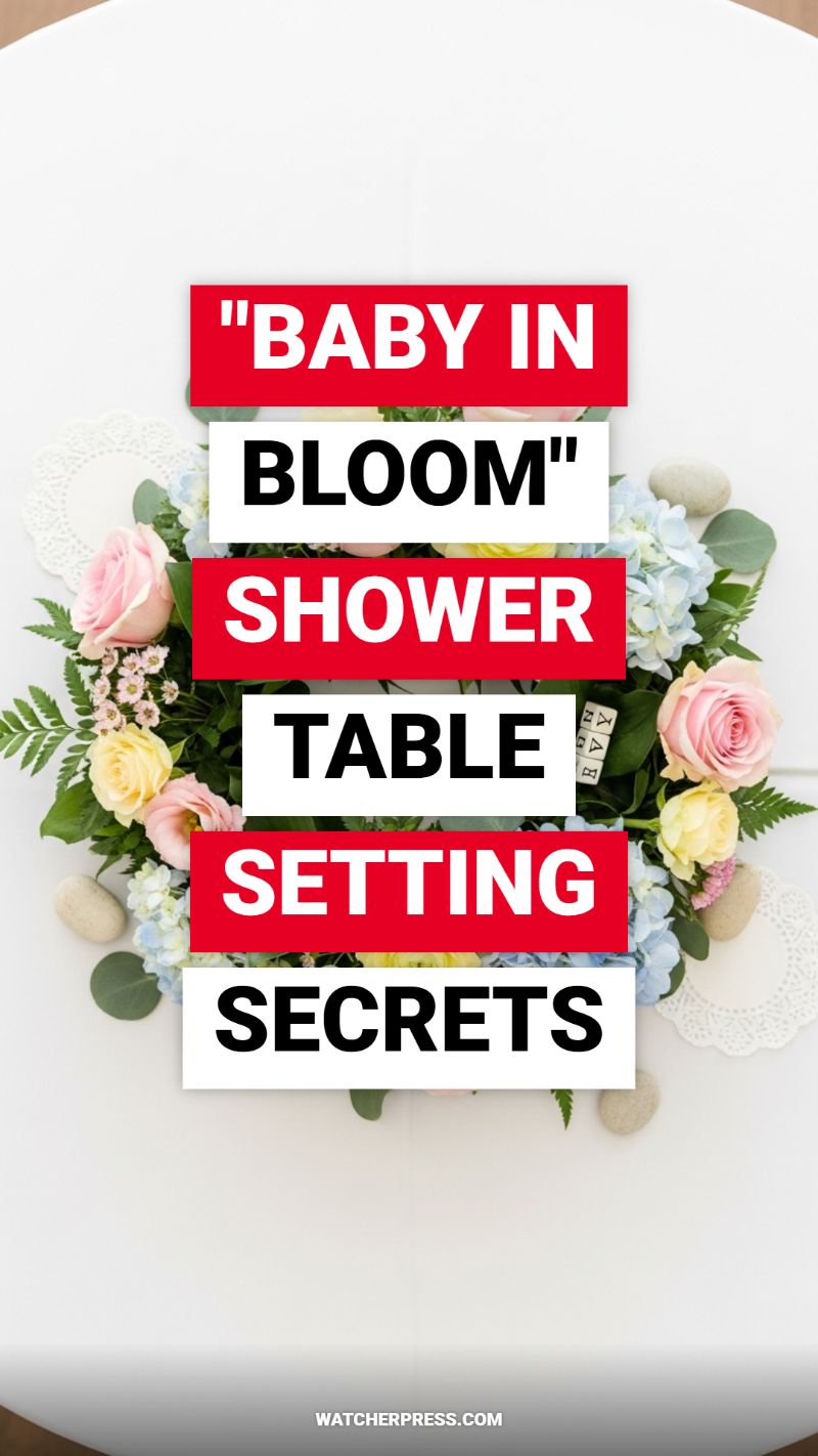
The “Baby in Bloom” theme is a perennial favorite for baby showers, leaning into the soft, optimistic palette of spring and the promise of new beginnings. The secret to mastering this viral table setting—as seen in the centerpiece design—lies in creating a lush, ground-level arrangement that maximizes visual impact without obstructing guest conversation. To replicate this look, start with your floral base. You’ll need a mix of soft pastels: think pale pink and buttery yellow roses for the focal points, complemented by airy light blue hydrangeas. For the necessary greenery, skip sparse filler and opt for full-bodied foliage like soft eucalyptus and textural ferns. The DIY hack here is to build the arrangement on a low-profile foam or wire wreath base directly on the table. Instead of cutting stems short for a traditional vase, allow the greenery to spill outward, creating an expansive visual footprint that makes the arrangement look significantly larger and more expensive than it is.
Once the foundational floral wreath is established, the magic happens in the detailing. This setting transcends simple flowers by introducing whimsical, natural textures. Scatter polished river stones or decorative pebbles intermittently around the exterior of the floral arrangement; these grounded elements provide a crucial rustic contrast to the delicate blooms. Next, incorporate the ‘baby’ aspect using subtle props. Tuck small, natural wood letter blocks (often found cheaply in craft stores or repurposed Scrabble tiles) strategically into the greenery to spell out ‘BABY’ or the baby’s initial. Finally, introduce texture under the setting by layering white lace paper doilies. Place these under the centerpiece itself and, for an extra touch of elegance, use larger doilies as placemats for your dinnerware. This layering effect adds a vintage, handmade touch, fulfilling the DIY handbook requirement perfectly.
To ensure the theme translates successfully across the entire event space, remember the principles of scalability and light. If you are decorating a long banquet table, you don’t need to repeat the full, dense centerpiece multiple times. Instead, use your remaining flowers to create continuity by placing smaller bud vases containing a single rose and a sprig of eucalyptus every few feet down the table. Keep your serving ware simple and white to allow the vivid floral colors and textures to shine. Expert advice for an elevated look involves subtle lighting: use unscented tea lights in low glass votives placed alongside the arrangement. The gentle, warm glow will highlight the petals and the glossy sheen of the leaves, transforming this simple DIY centerpiece into an unforgettable, top-tier tablescape, proving that the most impactful decor often requires clever hacking rather than a massive budget.
7 VIRAL DIY ROOM DECOR IDEAS FOR TEENS
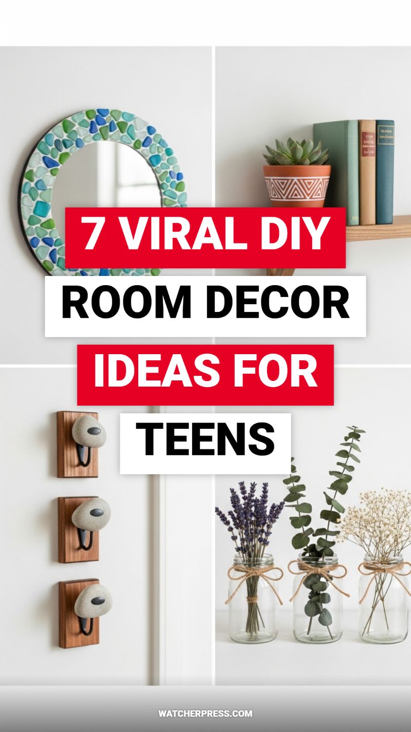
Creating a bedroom aesthetic that reflects personal style doesn’t have to require a massive budget; the key is utilizing strategic DIY projects that deliver maximum impact. One of the most stunning yet simple transformations visible here is the mosaic mirror. To replicate this, acquire a basic round mirror and gather a supply of tumbled glass, sea glass, or colorful acrylic gems. While standard craft glue works, for a long-lasting, water-resistant finish, use an adhesive like E6000 or even a small amount of white tile mortar for an authentic, textured mosaic look. Carefully adhere the pieces around the frame, ensuring you mix colors and sizes randomly for the best effect, avoiding large gaps. For added durability and a professional finish, consider sealing the gaps with white or light gray sanded grout, wiping the excess clean immediately. This project instantly elevates a plain wall and adds a unique, high-end, coastal or boho vibe to any space.
Functionality can be beautiful, as demonstrated by the clever stone wall hooks and rustic floral arrangements. The stone hooks offer an organic, minimalist solution for storage. To achieve this look, source smooth river stones and small, rectangular pieces of stained wood. Secure the wooden plaque to the wall first. Next, attach a simple U-shaped metal hook to the wood. Using strong epoxy or construction adhesive, affix the stone directly over the upper part of the hook hardware so that the stone serves as the decorative anchor or knob, leaving only the practical curve of the hook exposed below. This technique not only hides hardware but integrates natural materials seamlessly into the decor. Complementing this organic look are the dried flower vases. This involves repurposing clear glass jars—whether mason jars or standard food jars—and tying simple twine bows around the neck. Fill them with long-lasting dried elements like lavender, eucalyptus branches, or baby’s breath. Using dried florals eliminates maintenance while providing texture and softness, perfect for creating a relaxed, cottage-core aesthetic.
Finally, maximize small spaces and showcase personality through expert shelf styling and custom planters. A bare wooden shelf is practical, but the details make it viral-worthy. The key DIY hack here is the custom patterned planter. Take a plain terracotta or ceramic pot, clean it thoroughly, and apply primer. Once dry, use specialized paint pens or painter’s tape and acrylic paint to create graphic, geometric patterns, such as the trendy tribal motif shown. When styling the shelf, remember the design principle of layering: use books to create height and texture, then anchor one end with a heavier item (like the stacked books), and use the personalized succulent pot to introduce life and color. Always vary the height of objects, avoiding strict symmetry, and utilize negative space effectively. These small, personalized touches make a room feel curated, stylish, and reflective of a teen’s unique taste.
DIY Valentine Decor Ideas Under $20

Creating high-impact Valentine’s Day decor doesn’t require a large budget; it requires maximizing a few simple materials like felt, cardstock, and paint. This setup beautifully demonstrates how a cohesive color palette—ranging from deep red to soft blush and bright white—can unify disparate DIY elements. To recreate the charming heart garland shown, start by gathering scraps of various pink and red papers or felt. We recommend mixing textures: some hearts should be solid colored cardstock, others patterned scrapbook paper, and a few cut from thick red felt for depth. Use a heart-shaped punch or stencil to ensure uniformity, then punch a small hole on either side of the top curve of each heart. Thread the hearts onto a length of red and white baker’s twine, ensuring you alternate colors and patterns. The key to making this garland look professional is giving each heart just enough space so they don’t overlap, allowing the twine to create a graceful drape that can be hung across a mantel or shelf edge.
The centerpiece of this affordable arrangement is the hand-painted heart vase, an excellent way to upcycle old glass jars or bottles. After thoroughly cleaning your chosen vessel, use a permanent paint marker or specialized glass paint (available cheaply at any craft store) in white and bright red. The beauty of this design lies in its spontaneous, overlapping pattern. Start by painting several large, solid red hearts, then layer in smaller, outlined white hearts. Don’t worry about perfection; mixing thick and thin outlines and letting hearts slightly overlap creates a playful, dense motif. Once the paint is cured, fill the vase with simple white twigs or reeds rather than expensive cut flowers. This maintains the clean, graphic aesthetic established by the heart pattern and serves as a minimalist, long-lasting vertical element for your display.
To complete the vignette while staying well within the $20 budget, incorporate a simple block sign. You can replicate the ‘LOVE’ sign pictured using an inexpensive wooden cube (often sold for under $2) and a coat of pink spray paint. Once dry, use a stencil and white acrylic paint to apply the word ‘LOVE’ in a clean, uppercase font. The combination of the textured, dangling garland, the graphic painted vase, and the solid wooden block provides visual balance—a crucial element for professional styling. Remember that the ‘under $20’ rule relies heavily on leveraging what you already own (jars, paint remnants, scrap paper), focusing your small purchase budget on necessary elements like twine or specialty markers to achieve this curated, high-impact holiday look.
THE ULTIMATE GUIDE TO DIY BOHO DECOR
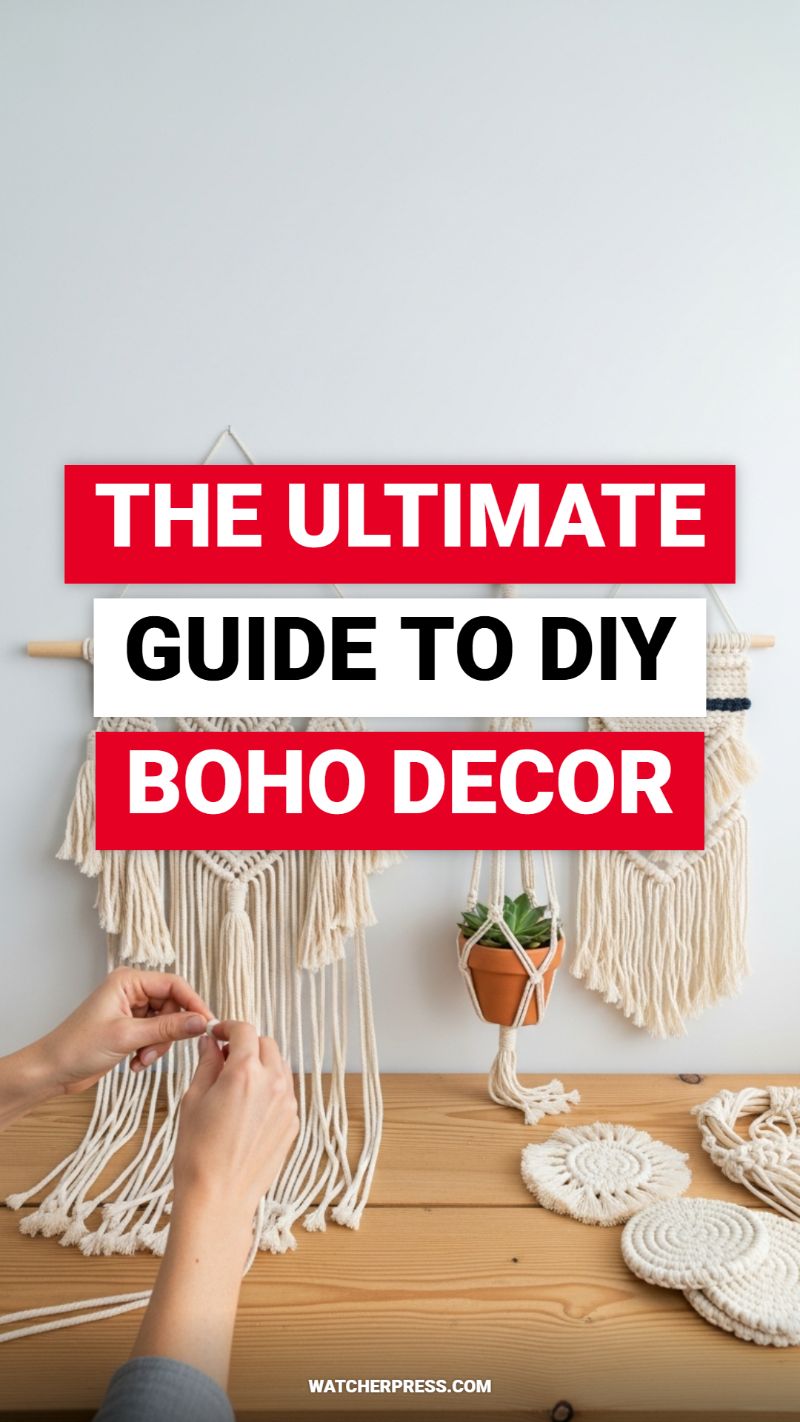
The Bohemian aesthetic is defined by natural textures, intricate knotwork, and a cozy, layered approach to textiles—elements perfectly captured by the resurgence of macrame. To successfully create your own signature Boho pieces, like the substantial wall hanging and delicate coasters pictured, you must start with the right foundation. Select high-quality, unbleached single-twist or 3-ply cotton cord, typically between 4mm and 6mm in diameter, as this thickness provides the weight and texture necessary for durable, chunky knots. You will also need a sturdy wooden dowel or branch for wall hangings, a reliable pair of sharp scissors, and a measuring tape. When planning your project, remember the golden rule of macrame: your working cords must be significantly longer than the final piece—often six to eight times the desired length—to account for the material consumed during the knotting process. Pre-cutting and wrapping your ends with tape can prevent fraying, allowing for a cleaner and more professional final result.
Mastering just two foundational knots will unlock the entire world of Boho macrame shown here. The first is the Lark’s Head Knot, which is used universally to attach your cords securely to the dowel rod or starting ring, creating the uniform, cascading vertical lines essential for wall hangings. The second, and arguably most crucial, is the Square Knot. This knot is the backbone of most geometric macrame patterns and is formed by two half hitches working in opposite directions. Practice maintaining even tension when tying the Square Knot; consistency is key to achieving the tight, uniform texture seen in the upper panel of the finished wall piece. Variations, such as alternating the direction of the half hitches, create the Half Square Knot Spiral, a technique used extensively in plant hangers (like the one suspending the terracotta succulent) to give them that distinctive twist and hang.
Once you’ve mastered the core techniques, expand your repertoire to smaller, highly functional pieces that reinforce the overall natural aesthetic. The macrame coasters shown are created using the same basic Square and Half Hitch knots but are started around a central metal or wooden ring, knotting outwards in a flat, circular pattern. This circular technique allows you to create mandala-like decorative pieces, adding layering and dimension to your wooden surfaces. For overall room styling, integrate these tactile DIY items with complementary natural elements: utilize earth-toned materials like jute and linen, incorporate thriving greenery (succulents and ferns work wonderfully), and ensure ample use of warm, exposed wood grain. This layering of textures and neutral colors is the secret to transforming simple cord and knots into a fully realized, curated Bohemian sanctuary.
MAKE YOUR FRONT PORCH POP FOR EASTER!
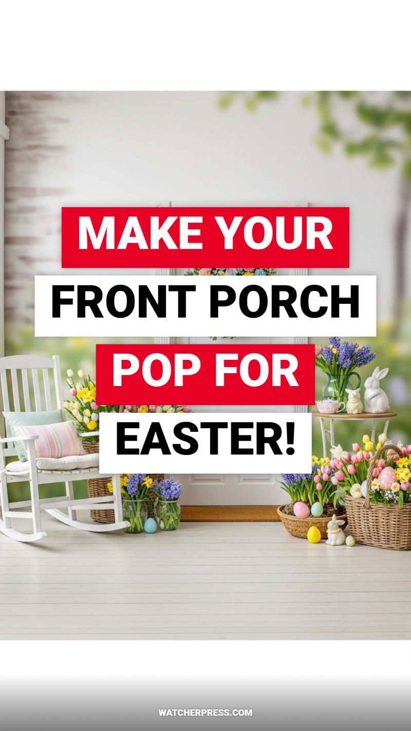
Transforming your front porch into a welcoming, festive Easter haven requires a strategic layering approach that balances comfort, color, and natural elements. Start by anchoring your display with comfortable seating, such as the classic white rocking chair visible in this design. Since the goal is maximum visual impact, use textiles (pillows and cushions) to introduce your foundational Easter color palette—soft pastels like mint green, pale pink, and light blue. The brilliance of this design hack lies in using a clean, white backdrop (white chair, white flooring, white door) to ensure every bloom and accent color truly ‘pops.’ For curb appeal that lasts, ensure your furniture is durable and that the porch itself is clean; a fresh coat of paint on wooden planks, even a simple white-wash, can elevate the entire scene and make the seasonal decor shine.
The key to achieving this abundant look is the strategic use of clustered florals and varying textures. Instead of relying solely on cut flowers, incorporate potted plants like tulips, daffodils, and hyacinths directly into large, rustic wicker baskets. Wicker provides an essential natural texture that grounds the bright colors of the blooms and Easter eggs. For an expert touch, utilize clear glass jars and vases to display fresh-cut flowers; the transparency allows light to pass through the stems and water, adding a crisp, clean contrast to the heavy wicker. When placing your themed elements, always cluster pieces in groups of three or five to create organic, professional-looking vignettes. Eggs should be integrated seamlessly—tucked into the flowering baskets, resting on the floor near the steps, or scattered subtly on side tables alongside ceramic bunny figurines, rather than grouped in single, obvious containers.
To ensure your front porch achieves a ‘top-tier’ magazine-ready finish, focus on integrating height and depth. Place a small, elegant side table near your seating area; this provides a perfect platform to lift smaller decorative elements, such as charming ceramic rabbits and smaller vases of Muscari, ensuring the display is multi-dimensional and catches the eye from the street. Finally, consider durability and longevity. If using real potted bulbs, ensure they are watered regularly, or swap them out for high-quality faux florals that can withstand unpredictable spring weather. This DIY hack is about creating a visual narrative that whispers ‘Spring is here,’ blending cozy outdoor living with joyful holiday celebration, setting the tone for your entire home.
CHIC BACHELORETTE DECOR THAT ISN’T TACKY
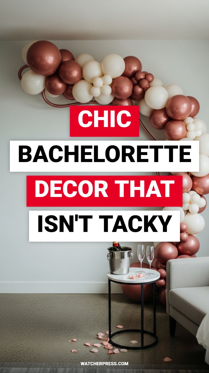
The secret to elevating a bachelorette party or bridal shower from cliché to covetable lies entirely in the refined use of color and texture. To replicate this ultra-chic setup, the focus must be on creating a high-impact, low-saturation statement piece: the balloon garland. Instead of defaulting to traditional novelty colors, opt for a sophisticated palette combining high-sheen metallics, such as rose gold or copper, with matte neutrals like cream, ivory, or warm beige. When constructing the garland, the ultimate design hack is varying the balloon sizes dramatically. Incorporate standard 12-inch and large 24-inch balloons for volume, but strategically fill gaps and create organic texture using clusters of tightly bundled 5-inch mini balloons. Secure the structure to a lightweight, semi-rigid frame or a specialized balloon strip, allowing the garland to drape gracefully rather than sitting as a stiff arch, providing that high-end, asymmetrical flow seen in top-tier event design.
Beyond the primary backdrop, the ancillary details must be equally intentional. Create a dedicated celebration vignette by setting up a minimal beverage station. Opt for small furniture pieces with modern structure, such as a black metal and white marble side table, which provides a clean visual contrast to the softness of the balloons. Place a classic, stainless steel champagne bucket on the table to keep beverages chilled—avoiding plastic containers is crucial for maintaining the elevated aesthetic. Pair the chilled bottle with elegant, thin-stemmed champagne flutes instead of disposable glassware. This small but significant choice instantly transforms the functionality of the space into a styled moment.
Finally, the addition of organic elements provides the necessary finishing touch to tie the decor into the surrounding room. Scatter a few handfuls of fresh or high-quality silk rose petals around the base of the table and the surrounding floor area. Use petals in a soft pink hue that harmonizes perfectly with the rose gold balloons, connecting the vertical installation to the floor plane. This attention to detail creates an impression of romance and luxury without feeling overwhelming. When placing the final setup, ensure it’s situated against a neutral backdrop and near comfortable, modern seating (like a neutral gray sofa) to naturally draw guests toward the photo opportunity, guaranteeing a polished, high-style atmosphere for the entire celebration.
STOP IGNORING THIS SPRING TABLE DECOR TREND
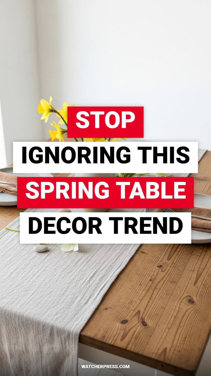
The secret to achieving a viral-worthy spring tablescape lies in mastering the balance between rustic, foundational textures and airy, seasonal color pops—a design aesthetic often referred to as ‘Cottagecore Light.’ To replicate this look, start by establishing your base. If you have a natural wood table, allow the grain to shine by eschewing a full tablecloth. Instead, introduce a highly textural table runner. The pictured material is a lightweight, crinkled gauze or muslin fabric in a soft neutral tone (light gray or cream). This choice is crucial as its soft drape and subtle texture immediately contrast with the sturdy, rich quality of the wood, adding immediate visual depth and a sense of effortless elegance. When choosing textiles, remember that spring decor thrives on tactile experiences; the runner should look and feel relaxed, not stiffly pressed. Anchor this look by utilizing simple stoneware or matte white plates, allowing the neutral foundation to serve as a versatile canvas for the bright seasonal accents you’ll layer on top.
The next step is integrating the essential spring elements—fresh florals and earthy accents. Select seasonal blooms that provide an immediate burst of color, such as cheerful yellow daffodils or tulips, and arrange them in a simple glass vase. The key here is keeping the arrangement conversational height, ensuring guests can see each other across the table. For the place settings, use warm-toned napkins (think terracotta, rust, or deep peach) folded simply and placed atop the plate, providing a beautiful color bridge between the wood tone and the neutral ceramics. For a truly professional and organic touch, mimic the trend shown by adding subtle, natural décor pieces directly onto the runner. A small, smooth river stone or a single delicate flower petal introduces a meditative, zen quality that elevates the entire arrangement from standard dining setting to high-end styled tableau. This small detail communicates a deep connection to nature, which is the heart of popular spring and Easter decorating.
To ensure your tablescape feels light and ready for the season, pay close attention to the visual weight of your decor choices. The trend leans heavily on maximizing natural light. Avoid heavy curtains or dark centerpieces. The overall palette should feel bright, breezy, and clean, using the white walls (or backdrop) to bounce light and highlight the vibrancy of the yellow flowers. For a final DIY touch that personalizes the setup, consider hand-tying your napkins with simple twine or raffia instead of relying on metal napkin rings. This reinforces the rustic, natural theme. By combining the rough texture of exposed wood with the soft, airy quality of crinkled linen and the clean lines of simple place settings, you achieve a sophisticated yet welcoming environment perfect for hosting any spring gathering, transforming your dining room into a highly celebrated aesthetic.
THE SECRET TO STYLING KITCHEN COUNTER CORNERS
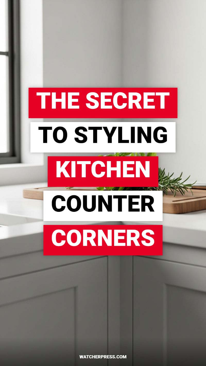
Kitchen counter corners are notoriously difficult to style effectively. Often, they become neglected dead zones or, conversely, catch-all clutter traps. The secret to transforming these awkward intersections into intentional vignettes lies in mastering verticality and texture layering. Rather than placing a single, bulky item that isolates the space, focus on creating varying levels of height to draw the eye upward and utilize the full dimension of the corner. Start by anchoring the space with a functional piece, such as a tiered shelf, a stack of aesthetically pleasing cookbooks, or a tall, decorative canister used for frequently accessed dry goods or utensils. This central anchor sets the scale. When selecting accessories, ensure the pieces chosen are scaled appropriately; they should be substantial enough to feel grounded but not so large that they impede food preparation on the adjacent counter runs. Always favor pieces with utility, making the corner a helpful organizational point rather than just visual filler.
To soften the hard lines inherent in modern kitchen design—like the sharp edges of stone countertops and shaker cabinetry visible in this setting—incorporate organic elements and contrasting textures. The inclusion of wood and fresh greenery is crucial for warmth. Mimic the visual shown by leaning a beautiful, well-maintained wooden cutting board (ideally a rustic or oversized piece) against the backsplash in the corner, allowing its natural grain to act as a backdrop. Next to this, place a small, decorative crock or planter containing fresh herbs like basil or rosemary. This instantly adds a vibrant pop of living color and practical functionality. The layering of wood against the stone countertop provides necessary textural contrast, while the height of the herbs contributes to the desired vertical arrangement, creating a miniature, balanced scene that feels curated and dynamic. Utilizing natural materials ensures the corner feels integrated and warm, preventing it from appearing sterile or overly decorated.
Finally, focus on achieving a balanced, asymmetrical grouping using the decorative principle of the Rule of Three. Style the corner with three distinct items of varying materials and heights—for instance, a tall, slender vase, a medium-sized bowl (perhaps a stylish fruit bowl or salt cellar), and the low-profile cutting board. Ensure these items are grouped closely enough to read as one deliberate composition, but not so tightly packed that they look crowded. Consider lighting: if possible, a small, task-oriented counter lamp or ambient light source tucked into the corner can elevate the arrangement significantly, especially in kitchens lacking overhead lighting in that specific area. By treating the corner as an opportunity for functional organization paired with intentional textural contrast, you transform a tricky spot into a major decorative focal point without sacrificing valuable working counter space.
EPIC Galentine’s Party Decor You Need Now!
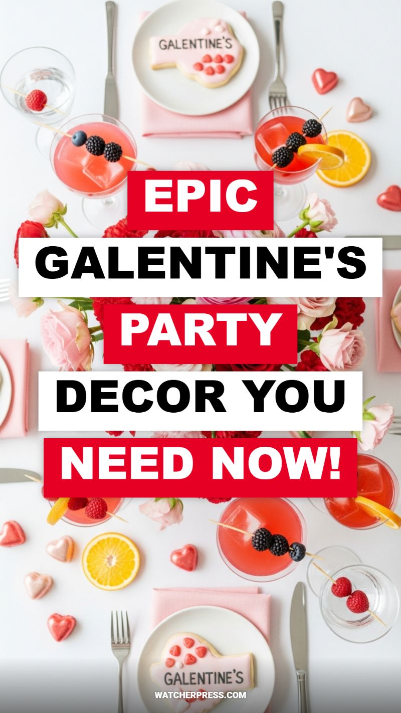
The secret to an epic Galentine’s tablescape lies in creating a high-contrast foundation that allows the feminine details to truly pop. Start with a crisp, pure white tablecloth or table surface to maximize the visual impact of your pink and red scheme. Layering is essential for sophistication; instead of standard linens, incorporate pale blush or soft pink cloth napkins, folding them neatly beneath the plate for a soft, textural base. The centerpiece should be a lush, impactful floral arrangement, focusing on rich ruby reds and delicate blush pinks—think densely packed groupings of roses, peonies, or carnations running low along the center of the table. This keeps the sightlines clear while providing a vibrant, continuous ribbon of color that ties the entire setting together. Ensure the cutlery is minimalist and sleek, allowing the decorative elements—like custom cookies and specialty glassware—to take center stage.
Elevating the beverage service is perhaps the quickest decor hack for any social gathering. For this Galentine’s theme, utilize clear, wide-mouthed cocktail glasses or coupes to showcase the striking pink drinks. Whether you are serving sparkling rosé, cranberry spritzers, or pomegranate cocktails, the ruby liquid itself becomes a key visual element. The truly professional touch comes from the garnishes: create visually dynamic skewers featuring blackberries and blueberries—the deep purple-black offers a stunning contrast against the pink liquid. For non-alcoholic glasses, thread vibrant raspberries onto a pick. Further enhance the look by scattering fresh citrus slices, such as bright orange or lemon wheels, on the table near the glasses. These simple, edible additions introduce complementary colors and freshness, transforming basic drinks into decorative focal points.
Personalized edible embellishments provide the crucial finishing touch and serve a dual function as decor and party favors. Invest in customized sugar cookies, perhaps shaped like hearts or lips, and iced in soft pink with ‘GALENTINE’S’ explicitly written on them. Placing one directly on each white dinner plate not only reinforces the theme but makes the seating arrangement feel curated and thoughtful. Finally, don’t neglect the scattered details: purchase small, high-gloss heart-shaped chocolates or candies in metallic rose gold, shimmering pink, and red hues. Lightly scatter these across the white surface, ensuring they fill the negative space between the plates and flowers. These reflective, romantic tokens catch the light beautifully, adding a subtle sparkle and depth, solidifying the entire tablescape as truly festive and Instagram-ready.
Beauty Room Decor Hacks You Need Now: Mastering the Vanity Setup

Creating a highly functional yet aesthetically pleasing beauty room begins with optimizing the centerpiece: the vanity. The visual success of this setup relies heavily on reflective surfaces and strategic organization. To replicate the crisp, professional look shown here, start with the surface material. Opt for high-gloss white laminate or, better yet, secure a custom-cut piece of tempered glass to place directly over your existing vanity top. This glass hack serves two crucial purposes: it enhances light reflection, making the space feel instantly brighter and cleaner, and it provides an incredibly resilient and easy-to-clean barrier against inevitable makeup spills and setting spray residue. The mirror itself should be large and unframed, or minimally framed, to blend seamlessly with the wall, maximizing the perceived size of the room and ensuring optimal viewing angles. When positioning the vanity, always aim to utilize natural light; placing it adjacent to or across from a window ensures the most accurate color depiction for flawless foundation matching.
The single most impactful hack for maintaining this high-end aesthetic is the aggressive adoption of clear acrylic organization systems. The beauty of these containers lies in their visual invisibility; they minimize clutter while maximizing accessibility, effectively turning your makeup collection into a curated display. Instead of relying on a handful of large, generic boxes, invest in specialized, modular pieces. Look for stackable drawers for larger palettes, tiered lipstick holders that keep products upright, and segmented organizers for brushes and liners. Expert tip: Group items not just by type, but by frequency of use. Keep daily essentials on the top tier and reserve lower drawers for specialty items like seasonal colors or lashes. This systematic organization streamlines your morning routine and forces you to tidy up immediately, ensuring the pristine, clutter-free look is sustained.
Finally, elevate the functionality with targeted lighting and clever accessory management. Since the image highlights a brightly lit, clean setup, ensure your light source is diffuse and shadow-free. If natural light is inadequate, install LED strip lighting vertically along the sides of the mirror frame; this provides professional-grade illumination without the harsh shadows traditional overhead fixtures create. For the finishing touches, practice intentional minimalism. While the makeup is on display, avoid adding unnecessary decorative elements that compete with the clean lines. Use small, elegant trays (marble or mirrored) for items that can’t be stored in acrylic, like perfumes or skincare staples, keeping the desk surface reserved strictly for the products needed during application. By employing these hacks—optimizing the reflective surface, utilizing specialized acrylic storage, and perfecting the lighting—you transition your vanity from a cluttered corner into a professional-grade, enviable beauty station.
THE HOTTEST PROM SEND OFF DECORATIONS

Creating a show-stopping Prom Send-Off display requires mastering the art of the deluxe balloon garland combined with impactful, light-catching elements. To achieve this viral look, start by sourcing materials in a high-contrast, sophisticated color palette—typically deep matte navy blue, crisp white, and highly reflective chrome silver balloons, varying widely in size from five to eighteen inches. The key to the ‘hottest’ aesthetic is the asymmetry and density of the garland. Begin by threading your balloons through a specialized plastic balloon strip, ensuring you inflate them in staggered sizes to avoid a uniform, weak appearance. Construct a sturdy base frame (PVC pipe works well) anchored with sandbags, and build the garland onto this frame. For the organic, luxurious appearance seen in the visual, cluster groups of three to four small balloons (the five-inch size) around the larger anchor balloons using fishing line, filling any visible gaps to give the display an expensive, professional finish.
The essential backdrop element that elevates this setup from a simple balloon display to a monumental photo opportunity is the reflective tinsel curtain, set directly behind the main balloon structure. Use multiple panels of high-quality silver or chrome tinsel, ensuring they overlap generously to create a dense, opaque screen that catches the sunlight and adds immense shimmer to every photograph. Expert tip: affix the tinsel to a standing vertical frame (like a photo booth stand) rather than trying to tape it directly to a wall or hedge, ensuring a flat, wrinkle-free drape. In front of this dramatic backdrop, position large, illuminated marquee letters spelling out a celebratory word like “PROM” or “PARTY.” These oversized, light-up letters provide a second layer of texture and serve as the absolute focal point. If purchasing marquee letters is outside the budget, you can DIY a similar effect by using large, thick cardboard letters painted white and affixing battery-operated globe lights into pre-drilled holes for a convincing, glowing replica.
Successfully executing an outdoor setup like this requires careful attention to stability and lighting. Choose a location on a flat, easily accessible lawn that provides a clean, green contrast to the dark blue and silver decor. Since wind is the nemesis of balloon installations, use fishing line or heavy-duty zip ties to secure the entire arrangement—the marquee letters, the balloon frame, and the tinsel backdrop—to prevent shifting. For the final flourish, incorporate weighted balloon clusters at the base of the structure using the largest navy balloons; this not only adds structural support but grounds the entire display aesthetically. Finally, designate a clear path leading up to the decorations and ensure the space is clutter-free. This setup creates a stunning, unforgettable entrance for guests, resulting in shareable, professional-quality photos that make this send-off truly viral-worthy.
MASTER BEDROOM DECOR SECRETS FROM DESIGNERS
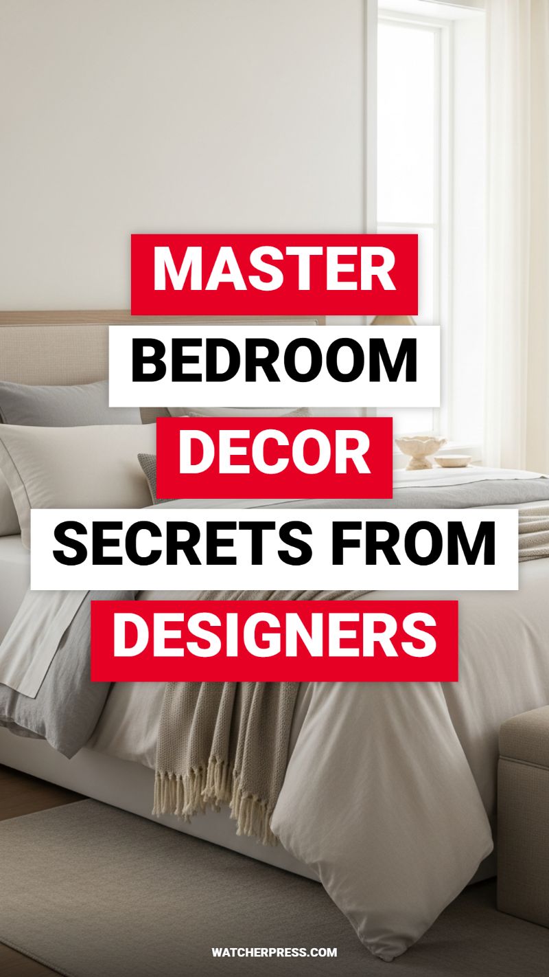
Achieving the serene, effortlessly luxurious look of a designer master bedroom hinges on mastering two key principles: layered texture and a curated neutral palette. As seen in this example, professionals intentionally strip away distracting colors to create a true sanctuary, focusing instead on the tactile experience. To replicate this high-end aesthetic, start with your foundational layers—the bedding. Select a tone-on-tone color story (think cream, beige, taupe, or soft gray) and commit to maximizing volume. A truly plush designer bed requires an oversized duvet insert paired with a high-quality linen or cotton cover that drapes beautifully over the sides. The secret is the layering sequence: begin with crisp, flat sheeting, then the voluminous duvet, followed by a contrasting accent throw (like the chunky knit seen draped at the foot of the bed) that introduces warmth and depth. The variation in textile materials—from smooth cotton to rough woven linen to fuzzy knits—is what prevents the monochromatic scheme from falling flat. This focus on material over color is a viral DIY hack that immediately elevates your space from standard retail to sophisticated custom design.
Once the bedding is perfected, turn your attention to the structural elements and strategic scale. Designers utilize subtle, grounding textures to anchor the room, such as the upholstered headboard and the flatweave area rug that peeks out from beneath the bed. When DIYing this look, prioritize pieces that offer tactile interest. If installing a new headboard isn’t feasible, consider a DIY fabric slipcover for your existing frame using a textured linen or boucle material to instantly introduce warmth. Furthermore, mastering light management is crucial for the ambiance. The sheer, flowing window treatments seen here diffuse natural light, casting a soft, dreamy glow across the neutral surfaces. To achieve this, hang your curtains rods dramatically higher and wider than the window frame—a classic designer trick. This exaggerates ceiling height and allows the fabric to stack on the wall, maximizing the available glass space and replicating that airy, bright quality without requiring an expensive window replacement.
Finally, the finishing touches in a designer bedroom are all about intentionality and balance. Notice the limited use of accessories; surfaces are deliberately decluttered, allowing the quality of the textiles and furniture to speak for themselves. This is where you implement the ‘less is more’ secret. Focus on one or two sculptural objects on each bedside table, such as a delicate ceramic bowl or a small vase, ensuring they maintain the light, natural color scheme. Symmetry is your best friend in this setup—matching lamps and nightstands create a sense of equilibrium essential for restful design. For a quick DIY win, apply this symmetry to your pillow arrangement: two larger shams against the headboard, two standard sleeping pillows, and one small decorative accent pillow. By choosing items that are natural, neutral, and textural, you maintain the tranquil atmosphere while following the core philosophy of top-tier designers: luxurious comfort is always built from the ground up using sophisticated, intentional layers.
KITCHEN COUNTERTOP DECOR MISTAKES TO AVOID
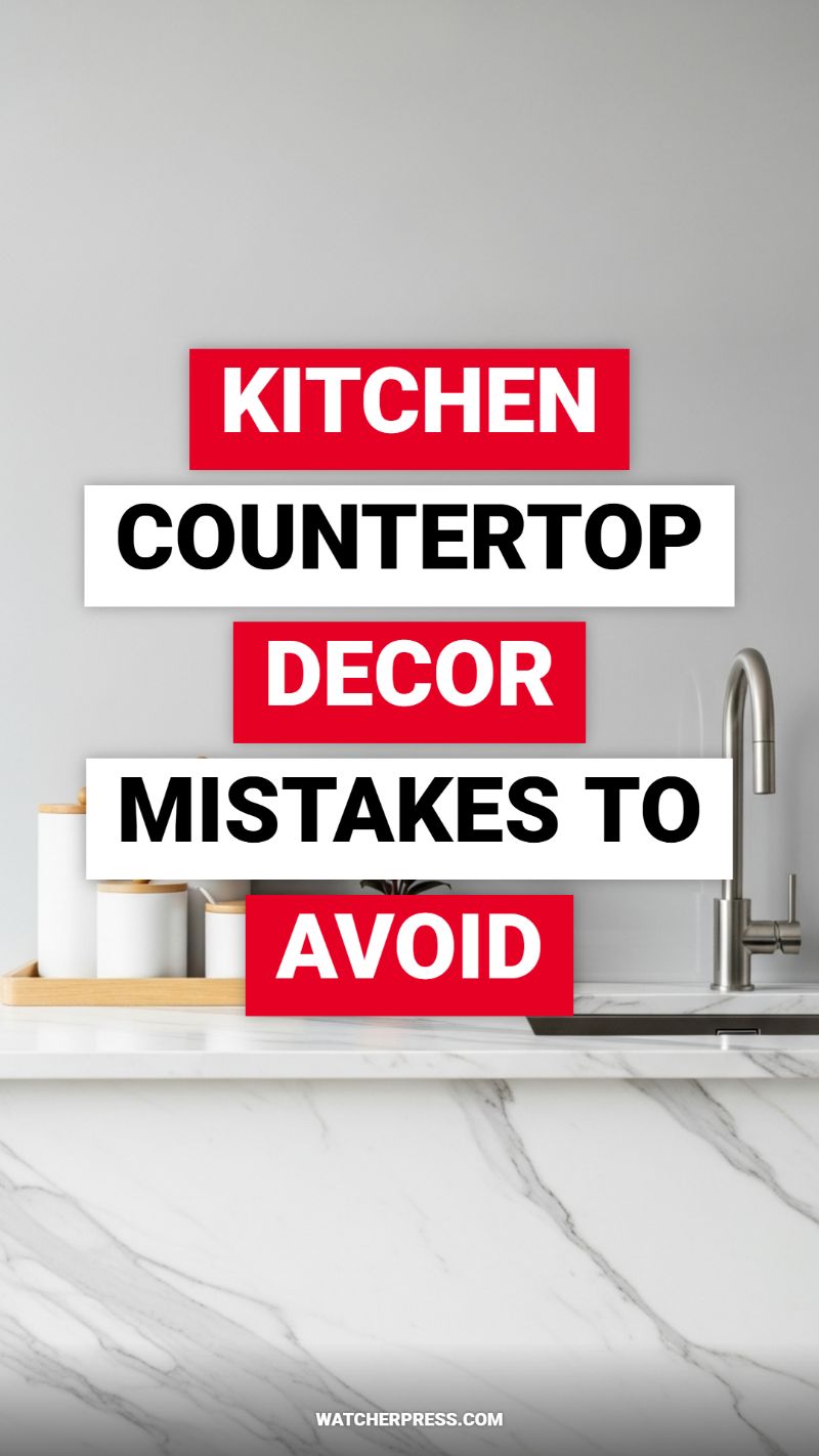
The kitchen countertop is arguably the most valuable real estate in your home, yet it is often the first place clutter accumulates. The number one decorating mistake to avoid is treating this functional workspace as auxiliary storage. To combat this, categorize every item currently residing on your counter into one of three groups: daily essentials (items used every day, like a coffee maker or frequently used oil/vinegar set), functional decor (cutting boards, fruit bowl), or non-essentials (mail, junk gadgets, appliances used weekly or less). A crucial hack is defining your ‘decor zone’ using grounding elements, like the sleek wood tray seen in the visual, which organizes the white canisters. By consolidating necessary items onto a tray or trivet, you instantly frame the collection, making it look intentional rather than scattered. If an item is a non-essential, find a home for it in a drawer or pantry. Maintaining 70% clear counter space ensures visual rest and maximizes the actual working area, promoting both aesthetic appeal and culinary efficiency.
Another common error is failing to incorporate visual flow and texture, resulting in decor that feels flat or unbalanced. When arranging groupings, always utilize the rule of odds (threes, fives, or sevens) and vary the height and material of your objects. For example, instead of lining up three identical canisters, try grouping a tall vase, a medium-height stack of cookbooks, and a small trailing plant. This variation prevents monotony and guides the eye across the surface gracefully. Examine the sleek marble countertop in the image: its cool, flowing lines benefit immensely from the introduction of warm, natural elements—the wood lids and the wooden tray—which provide essential contrast and warmth. If your decor is too monochromatic (e.g., everything stainless steel on a black counter), introduce a contrasting color or texture, such as a piece of stoneware pottery or a vibrant herb garden, to break up the surface and add character without increasing clutter.
Finally, overlook maintenance mistakes at your own peril. Choosing countertop decor materials that require excessive upkeep or can damage the underlying surface is a costly oversight. For instance, leaving acidic items like lemons directly on delicate natural stones like marble can lead to etching. Similarly, neglecting to use protective felt pads under heavy, frequently moved appliances, such as stand mixers or toasters, can cause unnecessary scratching on solid surfaces. A top-tier design strategy dictates that all decor should be easily removable for cleaning. If you have to fight to lift a decorative item because it’s covered in grease or dried grime, it’s a failed piece of decor. Ensure your decorative groupings are lightweight or set on an easily movable base (like the tray pictured), enabling you to wipe the entire counter clean quickly and effectively, ensuring your beautiful surface, whether it’s high-end quartz or butcher block, remains pristine and functional.
EASY SUPER BOWL PARTY DECORATIONS

Creating a sophisticated and exciting Super Bowl setting doesn’t require expensive novelty items; it’s all about high-contrast staging and clever thematic incorporation. The key aesthetic seen here relies on a dramatically dark backdrop—opt for a charcoal gray or deep navy tablecloth, which immediately elevates the look beyond standard party hues and ensures the white serving ware and bright food stand out. For the essential football theme, utilize multi-sized confetti made of reflective silver, stark white, and matte black shapes (stars, circles, and moons work perfectly). An easy DIY hack is to purchase custom hole punches (like a tiny star punch) to create your own high-end scatter elements, mixing them sparingly with miniature decorative foam footballs. Distribute these elements strategically across the dark surface, allowing them to frame the food and primary decorative items rather than cluttering the entire table.
The centerpiece of this arrangement cleverly merges function with decoration. Use clean, white serving dishes—like the deep ceramic bowls shown—to display your game day fare, ensuring the vibrant colors of dips (like guacamole) and appetizers are the visual focus. Integrate authentic or realistic sporting accessories to add visual weight and theme reinforcement. The miniature white football helmet, for instance, is not just a prop but can serve as a quirky container for smaller snacks like pretzel bites or nuts, provided it is lined with a coordinating napkin for food safety. Furthermore, look for graphic napkins (like the star-printed white ones pictured) which bridge the gap between simple service items and patterned decor, adding texture and depth without competing with the bold food presentation.
Finally, focus on high-impact, inexpensive vertical decor, such as a custom Super Bowl banner or bunting. Instead of purchasing generic plastic lettering, craft your own pennants using heavy white cardstock and bold, block typography. String these flags together using natural twine or jute rope to give the banner a rustic, handmade quality that contrasts beautifully with the sleek white paper. This small detail adds essential height to your display and defines the party zone. When arranging all these elements, remember visual balance: stage the larger decorative items (like the helmet and plates) around a central point, then feather the confetti and smaller footballs outward in a relaxed, organized manner to achieve a highly photogenic and effortlessly cool game day setup.
COZY COTTAGE CORE DECORATING GUIDE
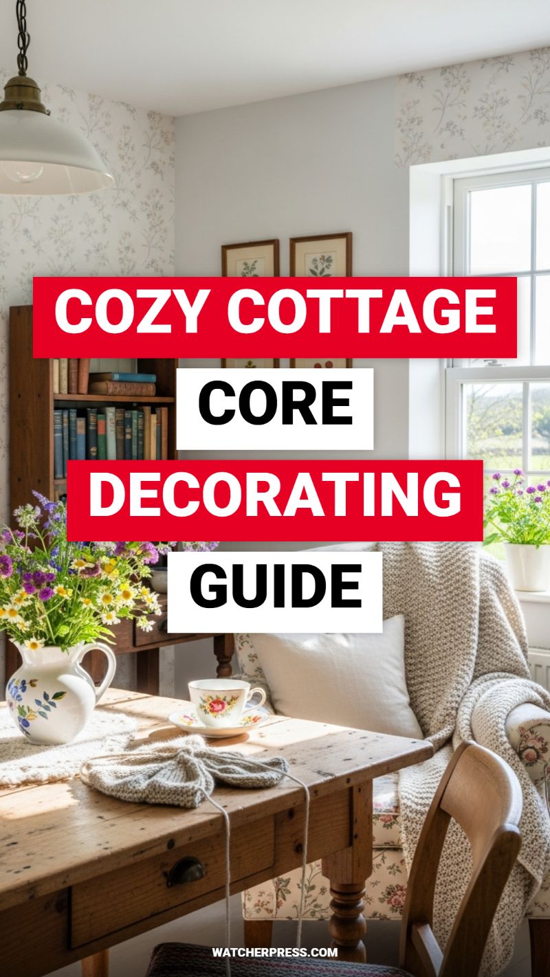
To successfully execute the Cozy Cottage Core aesthetic, begin by anchoring the space with tactile, rustic foundations, prioritizing natural materials that show their age. Focus on sourcing wooden furniture, such as the sturdy, worn plank table and the classic, small bookshelf shown here, ensuring they display a rich, authentic patina rather than being faux-distressed. This heavy wood grounds the room, which should then be softened and layered with voluminous, comforting textiles. Incorporate a variety of natural fibers—think a chunky cable-knit throw blanket draped carelessly over an armchair, mixed with soft linen pillows and delicate crocheted runners on surfaces. Instructional emphasis should be placed on leveraging natural light; position your reading or crafting nook directly by a large, airy window to maximize the effect of sunlight streaming onto the varied textures, creating deep shadows and highlights that enhance the inherent warmth of the materials. The strategic pairing of sturdy, dark wood with light, bright windows and cream textiles is key to preventing the space from feeling heavy or enclosed.
Next, introduce the essential element of botanical whimsy through pattern and organic display. Cottagecore is defined by its affinity for delicate floral prints; use these sparingly on large surfaces like upholstery (note the ditsy floral pattern on the armchair) or opt for a single accent wall covered in a light, trailing vine or meadow print wallpaper, as seen in this setup. Complement these fabric patterns by hanging framed botanical illustrations—small, matching prints add a curated, historical feel without overwhelming the wall space. Crucially, integrate fresh life into the room by arranging wildflowers, daisies, or herbs in vintage pitchers or ceramic creamers. This introduces vibrant, seasonal color—purples, yellows, and fresh greens—which pop against the muted palette of the walls and wood. Seek out mismatched ceramics, like a rose-patterned teacup or a hand-painted jug, as these small, charming imperfections are vital in achieving the authentic, inherited feel of the style.
Finally, imbue the space with personality by incorporating elements of everyday function and quiet domesticity, essential components of a truly lived-in cottage atmosphere. Curate your shelves not just as storage, but as a visual narrative; fill the small, antique bookcase with vintage hardback books, prioritizing rich, varied spine colors (deep reds, blues, greens) that add visual depth to the dark wood. Leave subtle signs of activity—a partially finished knitting or crochet project casually resting on the table next to a warm beverage—to suggest occupancy and immediate comfort. Expert advice dictates avoiding overly tidy displays; the charm lies in the curated clutter. Every item, from the lighting fixture (a simple enamel pendant lamp adds a utilitarian, vintage touch) to the small drawers on the table, should suggest utility and history, transforming the room from a decorative scheme into a functional, inviting retreat centered around cozy crafts and quiet contemplation.
LUXURY BRIDAL SHOWER TABLE DECORATIONS
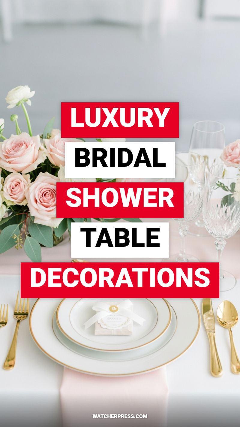
Creating a luxury tablescape for a bridal shower is less about budget and more about meticulous layering, utilizing high-impact textures and reflective elements. To achieve the sophisticated aesthetic visible in this arrangement—characterized by blush, white, and dazzling gold accents—start with your foundation. Opt for crisp, heavy white linens, then introduce the primary color theme (soft pink/blush) using a silky table runner or carefully draped napkins. The ultimate trick for achieving depth is layering your place settings: utilize a simple, affordable white charger (or even a decorative placemat) underneath two plates—a larger dinner plate and a smaller salad or appetizer plate. The visible ‘luxury hack’ here is the consistent use of a thin gold rim on the china, which seamlessly connects the flatware to the dinnerware, making even rental or thrifted pieces look bespoke. Ensure your glassware is equally elegant; etched or crystal champagne flutes catch the light beautifully and add a historical touch that screams timeless elegance.
Next, focus on the centerpiece, which anchors the entire decorative theme. The key to replicating this lush, romantic feel without breaking the bank lies in composition and color harmony. Use low-profile floral arrangements composed of dense, soft blooms like the blush roses and white ranunculus shown, interspersed liberally with textured greenery such as eucalyptus. Keeping the centerpieces low is crucial for facilitating conversation—a hallmark of true luxury dining. For a successful DIY application, select one expensive ‘hero’ flower (the rose) and bulk up the arrangement using budget-friendly fillers that share the same texture (e.g., standard carnations or hydrangeas dyed a pale hue). Place these floral arrangements atop mirrored pedestals or interspersed with small, flickering votive candles housed in crystal-cut glass to magnify the light and sparkle created by the gold accents and etched glassware.
Finally, the smallest details are what elevate the setup from nice to truly luxurious. Pay close attention to the gold flatware—if purchasing full gold sets is prohibitive, a viral hack involves sourcing high-quality, weighted, gold-colored plastic cutlery for appetizers or dessert, or investing only in gold accent pieces like butter knives or small spoons. The personalized favor resting perfectly centered on the top plate provides the final touch of tailored elegance. Whether it’s a gourmet truffle or a small personalized soap, wrapping the favor in a delicate ivory ribbon tied with a small, customized tag demonstrates extreme attention to detail. This element acts as a mini place card and a keepsake, completing the cohesive, high-end bridal shower experience where every visual element contributes to a sense of thoughtful celebration.
GRADUATION PARTY DECORATIONS CHECKLIST!
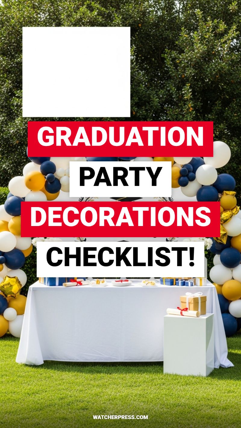
Creating an impactful and photogenic outdoor graduation party setting requires balancing dramatic accents with clean, sophisticated staging. The key focal point, as seen here, is the oversized balloon garland, which serves as a vibrant, celebratory arch framing the central display. To replicate this high-end look, select a cohesive three-color scheme (navy, gold, and white offer a rich, collegiate feel) and purchase balloons in multiple sizes (5-inch, 12-inch, and 18-inch). Utilizing a simple balloon strip, adhere the balloons, alternating sizes and colors to create texture and depth. Position this arch directly against a natural backdrop, such as lush greenery, as the contrasting textures will make the colors pop instantly. Remember to integrate a few specialty balloons, like a metallic star or a branded school logo shape, to add unexpected shimmer and personalization to the overall design, ensuring the backdrop is sturdy enough to withstand outdoor conditions.
Once the celebratory arch is secured, attention must turn to the display table, which functions as both a gift station and a dessert bar. Adopt the expert design hack of keeping the foundation simple: use a clean, floor-length white tablecloth to create a blank canvas that instantly elevates the space. This uncluttered base prevents the visual field from becoming overwhelming against the dramatic balloons. The styling of the table itself should utilize vertical variation—a crucial design principle often overlooked in DIY setups. Notice the inclusion of a simple white pedestal or riser next to the main table; this strategic placement allows key commemorative items, such as the rolled diploma and a beautifully wrapped gift, to be showcased prominently at a different height, adding dimensional interest and making them prime photo opportunities. Ensure that any treats or favors displayed on the table follow the color palette, reinforcing the theme through small details like ribbon colors or dessert frosting.
To complete your ultimate graduation decor checklist, focus on ambiance and practical lighting. Since outdoor parties often transition from late afternoon to evening, incorporate string lights or solar-powered lanterns discreetly placed within the foliage or along the perimeter of the grass. This soft lighting not only adds warmth but also ensures that your meticulously constructed balloon arch remains visible and vibrant after sunset. For a true ‘viral hack,’ maximize your photo zone potential by including a small sign near the pedestal instructing guests to tag their photos with a specific hashtag. Finally, always include practical, yet stylish, elements like weighted serving utensils and discreet trash receptacles nearby. By focusing on high-impact areas like the themed balloon installation and employing strategic staging techniques using varying heights and clean linens, you can achieve a sophisticated, magazine-worthy graduation celebration without hiring a professional planner.
You have explored the foundational principles of budget-friendly, high-impact design. ‘The Ultimate Decor Handbook’ is not just a collection of ideas—it is your master key to transforming mundane spaces into personalized, Pinterest-worthy havens, regardless of the season or your current budget. We hope this preview has empowered you to stop scrolling through inspiration and start engaging in creation. Remember that successful home decor is truly defined by its ability to reflect the unique personality of its inhabitant. Embrace the process, don’t fear minor mistakes, and always prioritize the joy of building something beautiful with your own hands.
**Helpful Final Thoughts:** We encourage you to start with the room or holiday project that excites you the most. High energy leads to higher quality results. Block out an hour this week, gather your supplies, and commit to completing one viral hack—the immediate satisfaction of a finished project is the best motivation for the rest of your decor journey.
**Call to Action:** Ready to unlock every room guide and holiday project planner? Download the complete, comprehensive edition of ‘The Ultimate Decor Handbook: Viral DIY Hacks for Every Room and Major Holiday’ now. Gain instant access to our exclusive resource library and subscribe to our newsletter for weekly updates on new viral trends and seasonal hacks.