Master effortless seasonal decor transitions with our ultimate guide. Get chic styling tips for spring, summer, fall, and winter to keep your home fresh all year long without the fuss.
Elevating Style with Soft Textures and Transitional Pastels
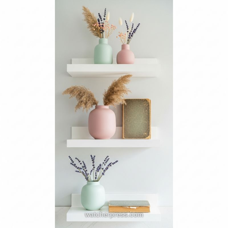
The image perfectly encapsulates transitional decor through its intentional use of color and geometry. Three floating white shelves create a clean, modern backdrop against a soft, neutral wall, immediately offering a calming aesthetic. The key to this look lies in the pairing of minimalist structure with delicate, organic elements. Notice the strategic color story: muted mint green and blush pink matte vases. These soft pastels are not overtly seasonal, making them ideal anchor pieces that feel fresh in spring and summer, yet cozy and warm enough to carry through autumn and winter. To replicate this effortless foundation, start by installing simple, clean-lined floating shelves. Ensure your foundational palette (wall and shelves) is neutral and light, allowing the curated accessories to truly pop without overwhelming the space. This approach minimizes visual noise, making the subtle shifts in your decor feel more impactful.
The true “effortless chic” factor is achieved through the choice of fillers and highly textural elements. Instead of high-maintenance fresh flowers that demand constant replacement, this display utilizes various dried botanicals—airy pampas grass, calming lavender sprigs, and smaller delicate blooms. Dried arrangements are highly textural, require zero maintenance, and effectively solve the seasonal rotation dilemma. Contrast is crucial here: note the smooth, matte surface of the vases set against the feathery, organic quality of the dried grass. Furthermore, incorporating non-floral elements grounds the vignette. The inclusion of vintage, distressed books adds an intellectual, timeless patina and a necessary rectangular counterpoint to the curved vases. Expert placement involves varying heights and positions; placing one book vertically on the middle shelf and another horizontally on the bottom shelf ensures visual interest and guides the eye across the entire multi-shelf composition.
This shelfscape is inherently adaptable and transitional. To efficiently shift the mood seasonally, you simply adjust the subtle details rather than replacing entire segments. For a movement into early fall, swap out the smaller, brighter dried blooms for darker wheat sheaves or deeper-toned dried hydrangeas, maintaining the pastel vases as the consistent element. In winter, introduce a few sprigs of dried eucalyptus or small brass accents placed beside the books for a subtle nod to the season. The expert technique is substitution, not overhaul. By keeping the main vessels (the mint and pink vases) and the core structure (the white shelves) constant, the entire display remains cohesive and transition-ready. Focus on varying the scale4using tall, dramatic pampas grass provides volume, while the smaller lavender offers delicate refinement, ensuring a dynamic and balanced arrangement.
The Organized Vanity: Integrating Seasonal Elegance with Essential Structure
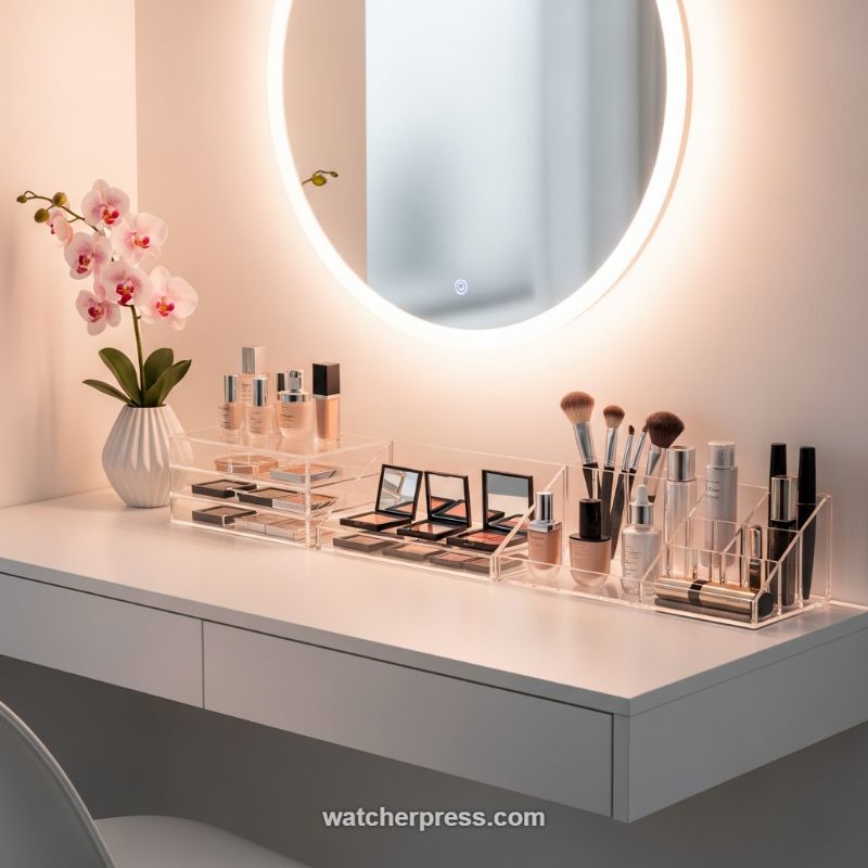
The foundation of an effortlessly chic seasonal transition lies in maintaining a neutral, highly organized base. As demonstrated by this sleek vanity setup, the focus is on maximizing light and maintaining clean lines, which allows smaller, rotational elements to make a significant impact. To replicate this look, prioritize permanent fixtures that support versatility, such as a floating white desk and an illuminated, backlit mirror. The brilliant white surface serves as the ideal canvas, reflecting light and preventing the space from feeling cluttered or heavy during any season. Crucially, invest in high-quality, clear acrylic organization systems—these are the workhorses of the chic vanity. By making your storage transparent, you allow the colors of your curated products (which can change seasonally) to become part of the decor, while the physical structure remains unobtrusive and timeless. Group like items together, using stacking drawers for compacts and a segmented long tray for brushes, bottles, and mascaras, ensuring every item has a dedicated, easy-to-access home. This foundational structure is key to reducing visual noise and making subsequent seasonal swaps feel minimal rather than overwhelming.
The true art of seasonal vanity transition happens through carefully curated product rotation and the addition of organic elements. For the spring/summer months, switch out heavier moisturizing creams and deep-toned lipsticks for lighter serums, SPF products, and brighter makeup palettes. Use the transparent acrylic drawers to showcase these seasonal color shifts. The quickest and most impactful change comes from your floral arrangement. The delicate pink orchid pictured offers a beautiful example of year-round elegance, but for true seasonal accuracy, swap faux stems for live or seasonal representations. In the autumn, consider miniature gourds or rich-hued preserved foliage tucked into a small white vessel; for winter, replace the florals entirely with a decorative candle or diffuser that features warming notes of cedar or spruce. This rotation method ensures that the vanity feels fresh and current without requiring you to move the primary organizational tools.
Beyond product and flora, attention to ambiance and negative space elevates the entire station from functional to truly luxurious. Ensure the lighting temperature from your mirror complements the season—a warmer glow is inherently inviting during cooler months, while crisp, white light is excellent for detail work during brighter times of the year. Always maintain a generous amount of negative space, especially on a floating desk unit like this; overcrowding, even with beautiful items, destroys the ‘effortless’ aesthetic. Expert tip: While acrylic organizers keep essential products visible, utilize the desk drawers to store bulkier items, tools, or products that are out of season. This ‘out of sight, out of mind’ approach maintains the chic, curated look on the surface, ensuring that your daily beauty routine remains a serene and organized experience, regardless of the month or the weather outside.
The Spring Awakening: Transitioning Your Entrance from Winter to Bloom
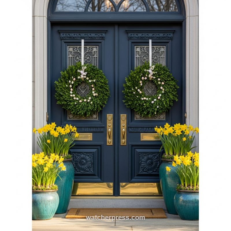
Achieving an effortlessly chic seasonal transition begins with maximizing the impact of your existing architectural elements. In this stunning example, the deep navy blue double doors serve as a powerful, elegant canvas. This sophisticated base dictates a high-contrast scheme, utilizing warm brass hardware (handles, kick plates) to anchor the look and provide a rich metallic element that works across all seasons. The primary instructional takeaway here is perfect symmetry: matching boxwood wreaths and paired groupings of planters create instant, high-end visual balance. To execute this, use the door panels or window grids as precise markers for hanging decor; for instance, the wreaths are intentionally centered over the decorative glass panels, ensuring every element reinforces the grand verticality of the entryway. This foundational structure makes the seasonal change feel intentional and polished.
The immediate transition to spring is signaled through two key introductions: lush greenery and vibrant bloom. Boxwood wreaths are the ideal choice for early spring decor as they provide year-round texture but can be customized for specific holidays. For an Easter or early spring look, simply adorning the wreaths with small, pastel-toned eggs creates a subtle yet festive touch. The true visual ‘pop’ comes from the use of clustered daffodils. Their intense yellow hue is the perfect foil for the cool navy doors and the glossy, rich teal of the ceramic planters. When arranging planters, emulate this technique by grouping containers of varying sizes and heights (large urns paired with smaller, wider pots) to add dimension and visual interest while maintaining the overall symmetrical footprint. This layering effect ensures the display is robust and does not get swallowed up by the scale of the front door.
For top-tier longevity and ease of transition, focus on selecting high-quality materials and creating a multi-stage plan. The choice of glazed, high-saturation teal planters is crucial, adding a textural element that elevates the display above standard terracotta or plastic. Expert advice for extending this look is to utilize the elements that are easily swapped: once the daffodils have passed their prime, replace the spent bulbs with summer annuals like white geraniums or light blue hydrangeas, maintaining the visual freshness without needing to replace the expensive base materials (the wreaths and the ceramic pots). Similarly, swapping the miniature eggs for a simple white linen ribbon or small faux butterflies effortlessly transitions the decor from Easter specific to general spring, ensuring maximum visual impact for minimal maintenance effort throughout the entire season.
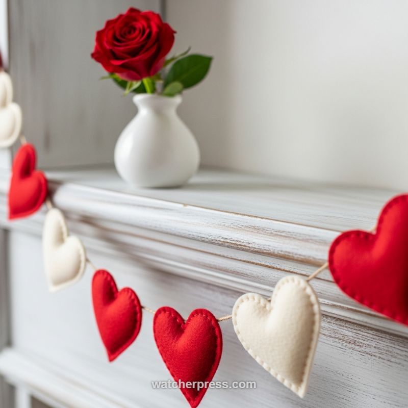
Distressed Layered Hearts: Transitioning Branches from Winter to Spring
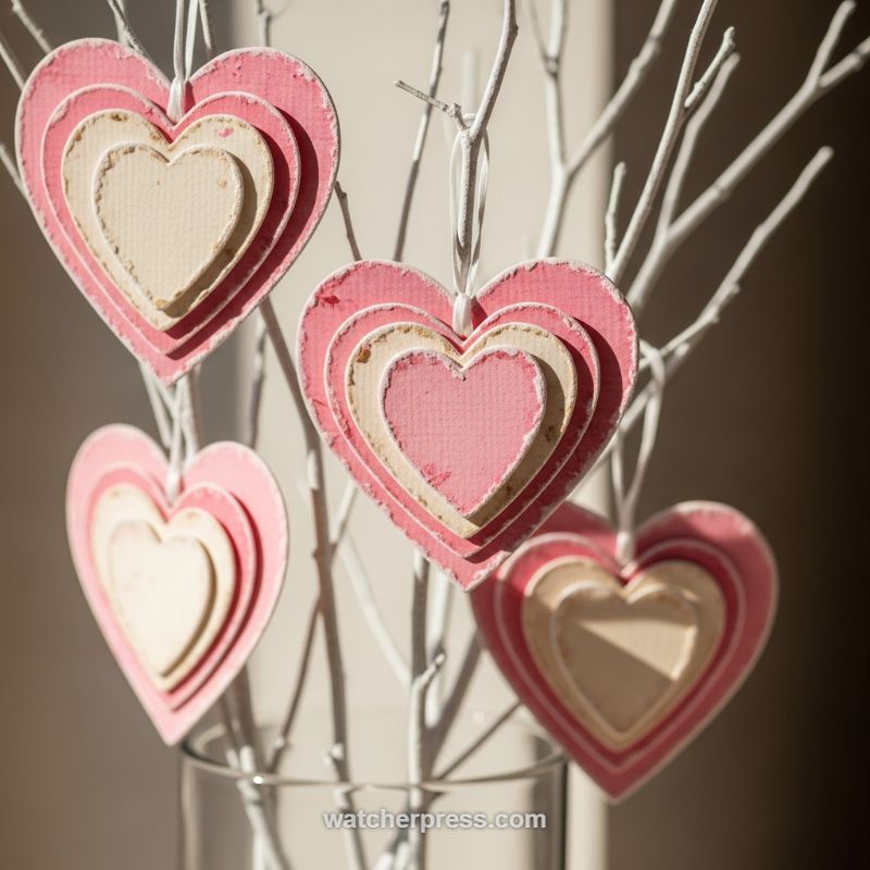
The key to an effortlessly chic seasonal transition is incorporating elements that speak to both the passing season and the incoming one. This centerpiece, featuring distressed layered heart ornaments hung on stark white branches, provides a perfect visual bridge between Valentine’s Day warmth and the clean anticipation of early spring. The aesthetic relies heavily on texture and subtle color—moving away from deep reds and high gloss to embrace muted, romantic tones like dusty rose, blush pink, and natural cream. The use of bare, white-painted branches—often mimicking birch or dogwood—is a nod to Nordic winter decor, yet when dressed with these light, airy hearts, they instantly feel hopeful and fresh. This style maintains visual interest through layering, adding depth and shadow that single-layer ornaments often lack.
To recreate these dimensional ornaments, focus on nesting cuts and material variation. You will need four descending sizes of heart shapes, ideally cut from heavy cardstock or lightweight chipboard. For the authentic distressed look shown here, select colors such as a dark, dusty pink for the largest outer layer, followed by a natural, slightly textured cream, a lighter blush pink, and finally, a pale cream center. Before assembly, lightly sand or dry-brush the edges of each layer with white or light brown ink to create that desirable shabby chic wear. Assemble the layers using small foam adhesive dots or squares, which are crucial for lifting each layer and emphasizing the three-dimensional effect. This technique ensures that even in low light, the shadows define the shape and texture of the ornament. Finish by threading a thin white ribbon or twine through the top for a delicate, almost invisible hanging mechanism.
Integrating this look into your overall decor requires minimalist staging to let the ornaments shine. Place the white branches in a simple, clear glass vase or a clean white ceramic container; avoiding patterned vessels keeps the focus strictly on the delicate craft. Expertly styled seasonal decor is often about restraint. Since the branches provide height and texture, and the hearts provide color and detail, the rest of the setting should remain clean. Pair this display with natural textures nearby, such as linen throws or small bundles of unvarnished wood. This heart motif, rendered in subtle tones, offers far greater longevity than traditional Valentine’s decor; its romantic, textured quality allows it to remain an appropriate and stylish focal point well into the beginning of March, serving as a gentle visual reminder that warmer weather and blooming are just around the corner.
Transitioning the Bedscape: Swapping Winter Weight for Light Seasonal Layers
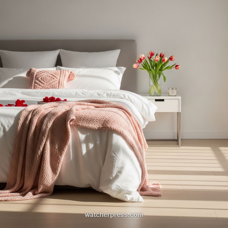
The key to achieving an effortlessly chic seasonal bedroom transition lies in strategic textile swaps, moving away from heavy winter weight without sacrificing textural interest. As seen in this bright bedroom setup, the foundation remains crisp and neutral—pure white sheets and duvet covers—allowing seasonal accents to truly pop. During the shift from deep winter coziness to lighter spring air, prioritize swapping out weighty velvets or faux fur throws for breathable, textured cotton or open-weave knitted blankets. The blush pink throw draped across the foot of the bed serves as the perfect example; its subtle hue provides warmth and color while its lighter knit texture signals the arrival of spring. Crucially, the blanket is draped loosely and naturally rather than folded precisely, ensuring the look remains inviting and lived-in, a hallmark of truly effortless style.
Beyond textiles, the careful introduction of seasonal color and natural elements is crucial for a truly successful pivot. Florals immediately revitalize a space, and the choice of vibrant pink and red tulips in a clean glass vase on the nightstand is exemplary. Tulips are classic harbingers of spring and their soft tones intentionally echo the blush blanket and pillow, fostering undeniable visual harmony. This principle extends to accessories; note the curated simplicity of the nightstand—a small candle and the vase. This intentional minimalism ensures that the focus remains on the textile and color transition rather than clutter. Furthermore, capitalize on natural light exposure (as evidenced by the shadow stripes cast across the floor), as bright light intrinsically amplifies the feeling of freshness and openness, making the room feel seasonally aligned.
To perfectly execute this specific style, focus on intentional, high-impact layering. Start by ensuring your core, neutral bedding is impeccable. Next, select a complementary decorative pillow that introduces tactile dimension without overwhelming the bed—the small, tassel-edged knit pillow here adds detailed depth. Finally, drape your chosen light seasonal throw with a relaxed hand, aiming for curves and volume rather than flatness. If applicable to the season (like early spring or a romantic holiday), carefully scatter small, thematic accents, such as the red hearts, to finalize the theme. This structured yet relaxed approach guarantees that the bedroom feels instantly refreshed and current, maintaining the foundational elegance established by the neutral base and modern furniture design while embracing seasonal joy in small, sophisticated doses.
Transitioning to Tranquility: The Year-Round Shelf Styling Guide
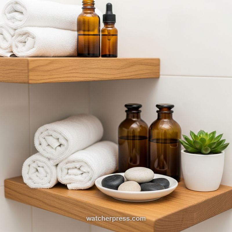
Achieving an effortlessly chic look that seamlessly transitions through the seasons requires balancing fixed structural elements with fluid, natural accessories. The foundation of this design strategy, as seen here, rests on high-quality neutral textures: floating wooden shelves and plush, rolled white cotton towels. The shelves provide essential visual warmth and grounding, contrasting perfectly with stark, clean white walls. For a successful year-round base, ensure your largest, most functional items—like the towels—remain neutral. Rolling them creates a deliberate, spa-like aesthetic and provides texture that catches the eye without adding disruptive patterns or color. This 80% foundational setup means minimal effort is needed when performing seasonal swaps, allowing the small accessory changes to carry the weight of the transition.
The key to seasonal fluidity lies in the purposeful placement of apothecary and natural elements. Utilize amber glass bottles, which suggest wellness and self-care, to hold your bath oils, toners, or hand soaps. The rich, dark color of the glass acts as a subtle anchor, pairing equally well with warm autumn tones as it does with cool spring pastels. For an expert-level transition, focus on scent and texture swaps rather than large item replacement. During winter, fill these bottles with essential oils featuring deep, woodsy notes (cedar, pine); in spring and summer, opt for lighter, refreshing scents like citrus or eucalyptus. Introducing natural texture via smooth stones (black and white) set on a clean ceramic dish adds a grounding, tactile element. This entire vignette should be placed centrally on the shelf to maximize its visual impact and organize the smaller items.
To execute the final, easiest seasonal transition, focus on the living element: the potted plant. The small succulent shown here is ideal for low-maintenance style and year-round freshness, providing a pop of vibrant green that works in any season. However, for a more dramatic but simple swap, replace the succulent with a seasonally appropriate cutting or bloom. For a late fall or winter transition, swap the succulent for a vase holding a few dried eucalyptus stems or pussy willows. In spring, switch to a small ceramic pot holding fragrant lavender or a few tight buds of ranunculus. Remember to maintain high-low visual grouping; place tall items (bottles with droppers) alongside low, wide items (rolled towels) to maintain visual interest and prevent the arrangement from looking blocky or cluttered. By mastering these small, intentional swaps against a strong neutral backdrop, your shelves will look perpetually updated and effortlessly chic.
Mastering the Dramatic Contrast: Emerald & Navy Bar Cart Styling
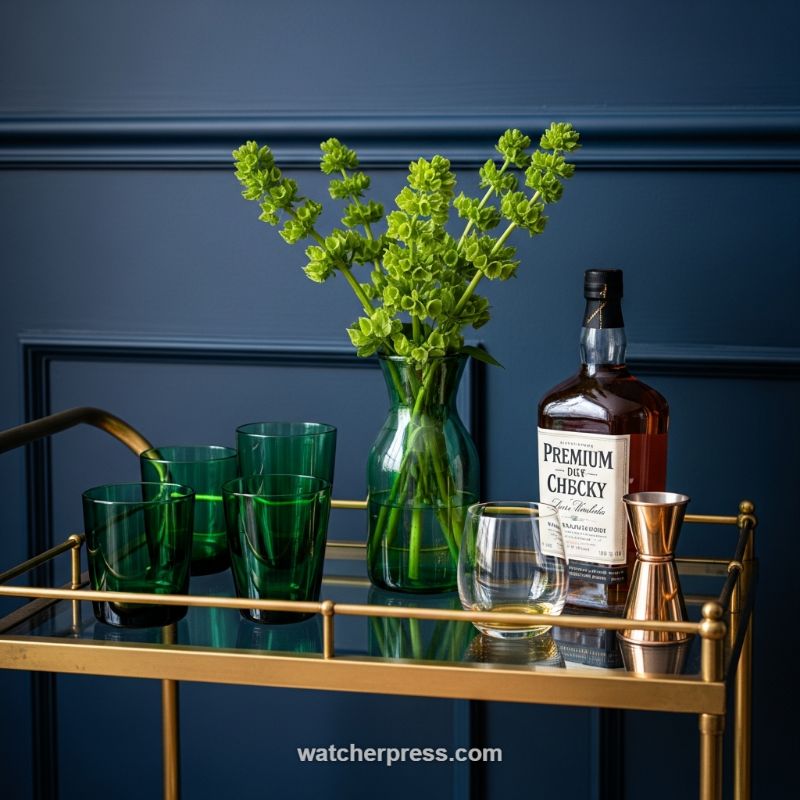
Transforming a simple utility piece like a bar cart into a seasonal focal point is key to achieving effortlessly chic decor transitions. Begin by setting a dramatic stage. In this setup, the deep, matte navy wall paneling provides a luxurious, tailored backdrop, instantly elevating the items placed against it. The contrast is achieved through the use of high-sheen materials and vivid color: a glossy gold or brass bar cart structure topped with a reflective glass shelf. For immediate seasonal freshness, incorporate a vertical element, such as the clear emerald vase filled with bright lime-green spires. Arrange your glassware strategically; here, the varying heights of rich green tumblers and highball glasses create visual depth, proving that monochromatic color schemes in accessories are powerful when combined with varying forms and translucency. This intentional grouping turns everyday objects into a sophisticated visual display.
This styling is a masterclass in using color for sophisticated transition. While the navy and brass combination is inherently rich and warm—suitable for year-round luxury—the introduction of the vibrant, electric green botanicals instantly pivots the entire aesthetic towards spring and summer lightness. The instruction here is to use nature’s seasonal palette as your primary accent. Choose foliage or flowers in colors that pop sharply against your permanent backdrop (the wall or cart). The whiskey bottle, with its warm amber hue, acts as a grounding element, echoing the brass tones and ensuring the green accessories don’t feel isolated or overly bright. To replicate this effect, ensure your chosen glassware color is rich enough to hold its own against the background, rather than fading into it. This technique allows you to swap out only the floral element for a completely different seasonal feel—for example, deep burgundy branches for winter or soft pink blossoms for early spring—without redesigning the entire space.
Beyond the aesthetics, a chic bar setup must remain functional. Pay meticulous attention to the supporting accessories to complete the curated look. A clear, low-slung rocks glass, pre-filled with a measure of drink, adds an inviting, ready-to-use touch. The final touch of polish comes from high-quality metallic tools. The choice of a copper or brass jigger, strategically placed next to the bottle, ties back to the brass structure of the cart and introduces a reflective texture that catches the light beautifully. Expert tip: always keep a selection of aesthetically pleasing specialty bottles on display. Their unique labels and bottle shapes contribute significantly to the overall design, transforming them from mere ingredients into elegant decor elements. Remember to maintain spotless glass surfaces to maximize the reflectivity and sparkle inherent in this luxurious styling choice.
Elevating the Morning Routine: Transitional Coffee Nooks
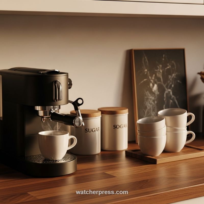
The transition to a cozier season starts with anchoring your most frequented daily spots, and the coffee station is prime real estate. To effortlessly shift your kitchen decor, begin by establishing a foundation of deep, warm textures. As seen in this chic setup, a rich, dark wood countertop (such as walnut or a stained butcher block) instantly introduces a grounding element that speaks of autumn and winter warmth, moving away from light, airy summer palettes. Expertly utilize lighting to enhance this effect; soft, warm-toned under-cabinet lighting or a small, focused accent lamp should be employed to mimic the golden hour glow, providing an inviting ambiance that encourages slow, mindful mornings. This intentional focus on rich material and amber illumination sets the emotional tone for the entire seasonal shift.
Functional items must double as decor in a high-end transitional design. The espresso machine, typically a utilitarian object, should be chosen in a sophisticated matte black or deep charcoal finish to act as a grounded, sculptural focal point. This darker appliance provides a stark, modern contrast to the softer surrounding elements. Crucially, upgrade your drinkware from light glasses to heavy, creamy ceramics. Stacked white or off-white mugs and bowls, ideally featuring soft curves and substantial walls, convey comfort and substance, perfect for holding warming beverages. Displaying these items grouped on a simple, light wood serving tray adds necessary textural layering and provides definition to the coffee nook, making the display look curated rather than cluttered. This simple swap elevates the daily ritual from routine preparation to a luxurious, seasonal moment.
Finally, integrate minimalist accessories to lend personality and depth without overwhelming the space. Introduce functional storage that aligns with the aesthetic—sealed ceramic canisters with natural wood lids, perhaps labeled with understated typography, seamlessly blend utility and sophisticated design. The mix of hard ceramic and organic wood is a key hallmark of transitional style. To complete the vignette, consider adding a piece of art that leans into the seasonal mood, such as a framed, dark-toned abstract print. Leaning the art against the backsplash adds casual elegance and vertical interest, preventing the setup from feeling too horizontal. The key to making this transition effortlessly chic is maintaining clean lines while emphasizing textural richness and warm tones, transforming a basic kitchen counter into a highly desirable, seasonally appropriate retreat.
Mastering the Coastal-Neutral Base for Seamless Seasonal Swaps
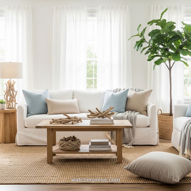
Achieving an effortlessly chic aesthetic that can pivot between seasons begins with establishing a strong, light-filled foundation, a cornerstone of transitional design. As demonstrated here, the use of large, foundational elements in stark white—the walls, the sheer curtain panels, and the linen slipcovered sofa—creates an expansive, luminous canvas that maximizes natural light exposure. This is crucial for maintaining an airy feel year-round. Expert advice dictates anchoring this lightness with organic, grounding textures. The substantial, natural fiber area rug (jute or sisal) prevents the room from feeling cold or sterile, providing warmth and texture underfoot. When selecting these large-scale pieces, prioritize neutrality and washability (like the slipcovers) to ensure they withstand frequent use and provide maximum versatility for accent changes, regardless of whether you are transitioning to summer pastels or deeper autumnal shades.
The key to this look’s success lies in the judicious use of soft accents that whisper rather than shout seasonal change. For a coastal feel that remains sophisticated, incorporate textiles in muted, water-inspired tones—think gentle sky blues, sandy beiges, and oatmeals—as seen in the throw pillows and layered knit blanket. The seasonal swap is executed by integrating found and sculptural natural elements. The driftwood pieces displayed on the coffee table and the structurally interesting driftwood lamp base are prime examples of leveraging organic shapes to add visual weight and connection to the environment. These pieces are timeless but highly evocative of warmer seasons. To easily transition this look later, swap out the light blue pillows for deep charcoal or emerald green, and exchange the driftwood for heavier materials like stacked slate or dark ceramics, instantly shifting the mood without replacing the core furniture.
Finally, elevate the styling through intentional layering and functional decor placement. The two-tiered wooden coffee table is a practical asset, allowing the surface to remain dedicated to curated sculptural displays while the bottom shelf handles functional storage, preventing clutter. Here, a woven basket filled with organic material (like acorns or large pinecones) pairs beautifully with a stack of neutral-toned books, providing depth and contrasting texture against the smooth wood grain. Do not overlook the power of large-scale greenery; the tall Fiddle Leaf Fig, housed in a textured woven basket, introduces height, life, and architectural structure without requiring bright florals that can quickly date a space. This strategy ensures the room feels alive and inviting while minimizing the work needed for a truly effortless seasonal refresh.
Elevating Your Entertaining: The Floral-Inspired Seasonal Bar
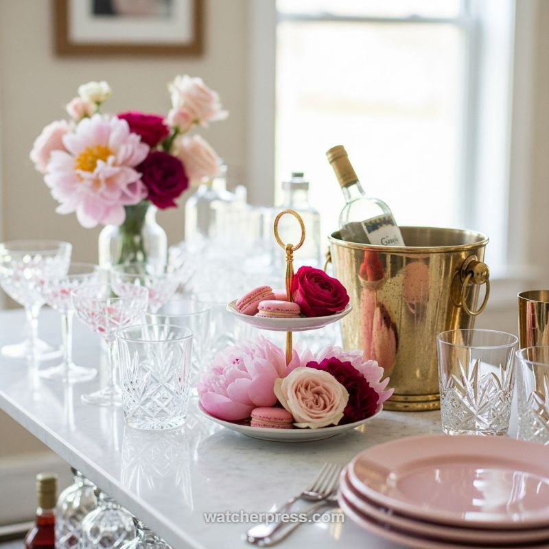
Transitioning your decor for spring and summer entertaining requires shifting from cozy textures to bright, airy elegance, and the bar cart or serving station is the perfect canvas. Begin by selecting a foundation that reflects light, such as a white marble surface or a mirrored tray, instantly setting a fresh tone. The expert advice here is to adopt a soft, yet impactful, color story: anchor your palette with blush and pale pinks (seen here in the plates and peonies) and introduce contrast using deep magenta or burgundy roses. This juxtaposition of soft pastels and rich jewel tones prevents the scheme from becoming too saccharine and adds sophisticated depth. Incorporating warm metallics, like the high-shine brass wine chiller, grounds the arrangement and provides necessary celebratory sparkle, replacing the heavy, dark metals often favored in winter schemes.
To achieve truly chic seasonal style, move beyond traditional vase arrangements and integrate florals directly into your serving elements. The key visual strategy in this setup is the transformation of the two-tiered stand, which acts as a dynamic centerpiece. Instead of dedicating it solely to desserts, treat it as a sculptural element, layering delicate pink macarons alongside lush, full-bloom flowers like peonies and roses. This not only elevates the presentation of your treats but also maximizes the fragrance and visual impact of your seasonal blooms, offering height and flow to the tablescape. Furthermore, ensure textural variety by mixing different types of glassware: pair heavy, cut crystal tumblers, which lend a vintage, substantial feel, with lighter, modern stemware and smooth porcelain plates. This deliberate layering of textures signals a high-end, curated approach to hosting.
Finally, focus on functionality to maintain that ‘effortlessly chic’ status. A beautiful bar setup is only effective if it serves your guests seamlessly. Organize your liquids logically: place spirits and decanters toward the back for background aesthetic, and keep chilled items—like the white wine in the brass bucket—easily accessible and visually prominent. Group your plates and silverware at the edge of the serving area to streamline the process for your guests. By treating your serving station as a piece of functional art, integrating the seasonal color palette through florals and utilizing tiered displays for vertical appeal, you create a celebratory atmosphere that requires minimal in-the-moment fuss, allowing the host to relax and enjoy the seasonal transition right along with their guests.
Creating an Effortlessly Chic Springtime Table Setting
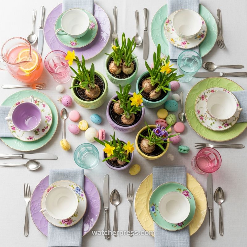
The secret to an effortlessly chic spring transition lies in a carefully curated pastel palette and thoughtful layering. Begin by selecting foundational colors like soft lavender, buttery yellow, and mint green for your dinnerware. As seen here, use solid-colored large plates or chargers (note the subtle embossed textures on the lilac and pale yellow examples) to anchor the setting, providing a calm, sophisticated base. Next, introduce smaller plates and teacups featuring delicate floral patterns, ensuring the pattern colors subtly echo your solid base plates. This mix of solid textures and intricate florals adds depth and vintage charm without feeling cluttered. For optimal contrast and polish, finish each setting with a neutral, soft linen napkin—like a light gray or muted blue—placed beneath the teacup saucer to break up the color saturation and provide an element of grounded sophistication.
For a truly seasonal transition, move beyond standard cut flowers and integrate potted bulbs that showcase the promise of spring growth. Small, potted daffodils, narcissus, and crocuses are ideal, as their exposed bulbs and vibrant green shoots provide textural interest and a rustic, natural feel. Crucially, coordinate the pots themselves with your tableware; here, the miniature planters are in matching pastel shades of mint, purple, and light yellow, integrating the living centerpiece seamlessly with the place settings. Arrange these pots informally down the center of the table rather than in a stiff line. Supplement this living centerpiece by scattering playful, high-end edible details, such as pastel macarons and candy-coated chocolate eggs, which serve as temporary, easily digestible decor elements perfect for a festive Easter or spring brunch.
The final layer of sophistication comes down to mindful accents and ambiance. Utilize classic stainless steel or antique silver flatware to maintain an element of timeless elegance, preventing the pastel setting from feeling overly juvenile. Pay attention to glassware; while some settings use clear glasses to maintain lightness and freshness, introducing a colored glass (such as the rose-tinted tumbler) or a festive beverage (like the pink lemonade shown) adds a welcome pop of celebratory contrast. Remember that true elegance allows for slight variation; observe how each place setting features a unique combination of pastel colors (e.g., a lavender charger with a mint saucer, or a yellow charger with a teal saucer). This intentional, curated asymmetry ensures the table feels assembled with care and personality, inviting guests into a fresh, warm, and memorable springtime atmosphere.
Infusing Warmth: Harnessing Natural Textures and Warm Metals for Countertop Transitions
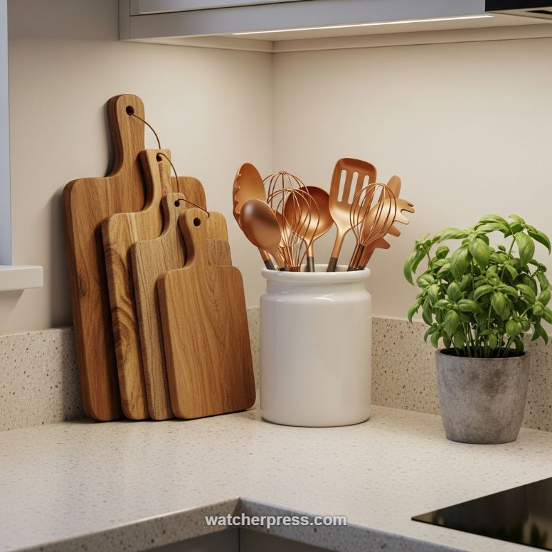
The kitchen countertop, often overlooked in seasonal decorating, is prime real estate for creating functional vignettes that signal a shift in aesthetic, moving from light summer airiness to deep, cozy warmth. The key to this effortless transition, as demonstrated in this setup, is the strategic layering of natural textures and the introduction of warm-toned metals. Start by anchoring your display with organic materials. Here, a selection of four layered wooden cutting boards in varying sizes and rich grain textures leans against the backsplash, instantly introducing warmth and depth against the cool, speckled quartz counter. The instruction here is to use functional items as decorative pieces; choose high-quality woods like teak or walnut that offer rich color and durability, and lean them at slightly offset angles to create visual interest and movement. This technique turns simple kitchen tools into art, transforming a utilitarian corner into a grounded, richly textured focal point. Always ensure the sizes vary significantly to avoid a monotonous, flat look.
Once the natural foundation is set, introduce color and sheen through carefully selected accents. The grouping of copper- or rose gold-toned utensils is a masterstroke in seasonal transition, replacing the sharp coldness of stainless steel with a metallic warmth that catches the light beautifully, echoing the glow of an autumn sunset or a flickering hearth. Housing these utensils in a simple, oversized white ceramic crock ensures that the metallic accents remain the star. The contrast between the bright, neutral ceramic and the reflective copper makes the display pop without overwhelming the workspace. Expert advice dictates balancing this warmth with a contrasting living element; the potted basil, placed in a muted grey concrete-style pot, provides a crucial splash of vibrant green. This living accent not only adds freshness and utility but also creates a beautiful visual tension against the deep wood and shining copper, keeping the overall arrangement feeling vibrant and intentional rather than heavy or overly styled. Select herbs like basil or rosemary that thrive indoors and contribute a pleasant aroma to the kitchen environment.
To ensure your seasonal display reads as effortlessly chic rather than cluttered, focus on composition and lighting integration. Notice how the entire display benefits from focused under-cabinet lighting, which highlights the grain of the wood and amplifies the rich sheen of the copper—a critical tip for maximizing the visual impact of metallic decor. When styling your own counter, apply the rule of threes or fives, ensuring your objects form distinct clusters (e.g., boards, crock, plant). Furthermore, pay attention to vertical scaling; the tallest elements (the boards and the extended utensils) create height and draw the eye upward, while the middle-height crock and lower plant ground the arrangement. This careful variation in height and texture makes the vignette feel intentional and professionally curated. By treating these functional items—cutting boards, utensils, and herbs—as essential decorative components, you can achieve a seamless and high-end seasonal shift with zero extra clutter.
The Art of the Moody Winter Tablescape: Dark Linens and Rich Textures
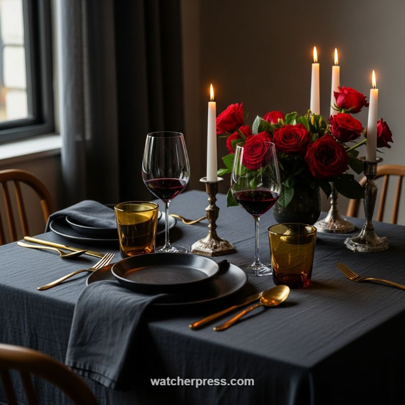
Transitioning your decor for the cooler, darker months is all about embracing saturated color palettes and tactile materials that absorb light and create intimacy. To replicate this sophisticated, romantic setting, begin by anchoring the table with deep, foundational linens. Swap out bright summer whites or light pastels for a heavy, washed linen tablecloth and coordinating napkins in shades of charcoal, deep navy, or slate gray. This dark base is essential, as it immediately grounds the setting and allows reflective elements to truly shine. The texture of the linen should be slightly raw or weighty, lending a sense of cozy permanence to the arrangement. This strategic shift in textiles is the most effortless way to signal a move from light, airy seasons to a more luxurious, contained atmosphere.
Achieving true chic effortlessness requires thoughtful layering of materials and mixing of warm and cool tones within the place setting. Opt for matte black stoneware or dark earthenware plates; their non-reflective surface beautifully contrasts the sheen of the gold or copper flatware. Avoid perfectly matched metal finishes; instead, introduce complexity by pairing antique elements, such as heavily patinated brass or silver candleholders, with modern, sleek polished gold cutlery. This juxtaposition of old and new, dull and shiny, is the hallmark of high-end design. To further enhance the warm glow of the setting, incorporate amber or smoked glassware. These pieces are crucial for catching the candlelight and distributing a soft, honey-toned reflection that prevents the overall dark palette from feeling overly somber or cold.
The final instructional element focuses on controlling the ambiance through the centerpiece and lighting. For a seasonal transition, the centerpiece should provide a dramatic focal point without overwhelming the table; deep crimson roses arranged tightly in a dark, opaque vase maintain the grounding aesthetic while offering a necessary burst of vibrant life. Most importantly, abandon overhead lighting entirely. Rely exclusively on clustered candlelight, using white taper candles in varying heights across your mixed metal holders. The soft, flickering flame not only provides the most flattering light for dining but also magnifies the rich textures and deep tones of the linens and glassware, transforming a standard meal into an intentional, intimate winter experience.
Romantic Springtime Table Scapes: Mastering the Lush Floral Runner
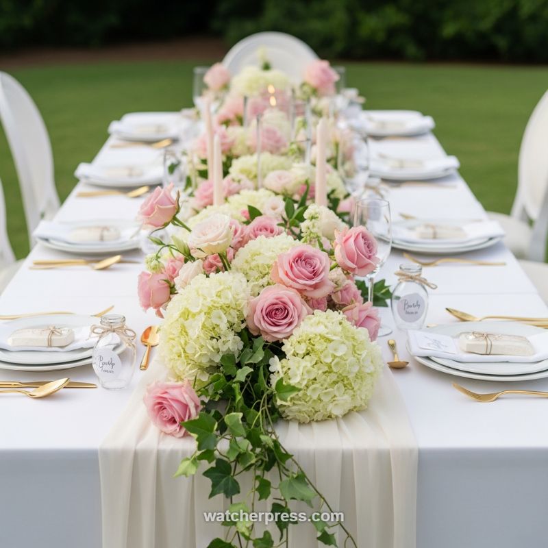
Achieving an effortlessly chic seasonal transition often centers around perfecting your tablescape, moving away from heavy winter textures to bright, airy elements, perfectly exemplified by this romantic outdoor setting. To replicate this look, start with a crisp foundation: a plain white tablecloth acts as a clean canvas, allowing the color and texture of your centerpiece to truly pop. Layer a sheer chiffon or silk runner, preferably in a neutral shade like ivory or blush, down the center of the table. The key instructional move here is allowing the runner to drape slightly over the edges, introducing softness and movement that immediately transitions the space from formal to garden-party relaxed. Complement this neutral base with subtle metallic accents—gold flatware and the rims of glassware provide a reflective shine that catches the sunlight, elevating the simplicity of the white place settings without overwhelming the eye.
The centerpiece itself is the focal point for maximizing seasonal impact. This design utilizes a lush, continuous floral runner created by massing two complementary flower types: voluminous hydrangeas (in soft white or pale green) and rich pink roses. When assembling, arrange the flowers densely to ensure coverage and volume, creating a meandering garden feel. Expert advice suggests staggering the heights slightly to prevent the arrangement from looking like a rigid block. Integrate thin taper candles in varying heights, nestled between the blooms, to provide vertical interest and a warm glow for evening ambiance. The crucial “how-to” for achieving the effortless garden aesthetic is incorporating trailing greenery, such as ivy or smilax, allowing it to spill dramatically over the table edge onto the ground. This deliberate breakage of the horizontal line adds depth and grounds the whole setup in its natural outdoor environment.
Completing this seasonal scape involves deliberate attention to the details at each place setting. Maintain the clean aesthetic by sticking to classic white dinnerware, but ensure the setting feels intentional by incorporating delicate personalized elements. Instead of traditional paper place cards, use small, customized favors—such as the labeled glass jars shown here—which double as both a keepsake for guests and a rustic, charming identifier. For a smooth decor transition, remember that springtime elegance is often about balance: pairing the high formality of stacked plates and quality flatware with the low-key charm of the natural floral elements and cascading greenery. This combination ensures the overall presentation is refined yet approachable, perfectly capturing the lighthearted spirit of the warmer months.
Injecting Springtime Cheer: The Art of Transitioning with Florals and Pastels
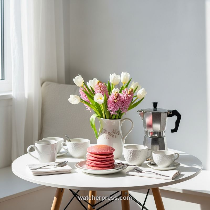
The most effective way to signal a seasonal shift from winter’s depth to spring’s renewal is through the strategic use of fresh florals and natural light. To replicate this effortlessly chic transition, begin by selecting transitional blooms that offer both crispness and softness. White tulips paired with vibrant pink hyacinths—as seen here—are ideal, providing high-impact color while maintaining a clean aesthetic. Instead of standard clear glass, use an opaque, patterned ceramic pitcher as your vessel; this adds a touch of rustic charm and grounds the arrangement, preventing it from looking too delicate. Placement is critical: position your floral centerpiece close to a window to catch and reflect the natural sunlight. Further enhance this airy quality by utilizing sheer, white window treatments. These diffuse harsh morning light, creating a soft, ethereal glow that instantly elevates the mood and highlights the freshness of the setting.
Beyond purely decorative elements, incorporate the seasonal palette into your functional servingware and even your menu. This setting achieves a perfect balance by using pure white, minimalist ceramic mugs and saucers as the base, allowing the vibrant accents to truly pop. The expert touch lies in the use of “edible decor,” exemplified by the stack of bright pink pancakes. Integrating seasonal colors directly into consumables (think berry-flavored glazes, bright fruit platters, or naturally dyed baked goods) provides a high-impact color moment that is also practical and temporary. When mixing textures, ensure there is contrast; the matte white ceramics and soft linens are counterbalanced by the sleek, polished metallic Moka pot. This industrial element prevents the overall look from becoming overly sweet and speaks to a modern, refined sensibility.
To ensure the setting feels intentional and not cluttered, maintain a strict adherence to minimalism on the table surface. The small, rounded white table—a style known for promoting intimacy and conversation—should remain largely clear, focusing only on the necessities: the coffee pot, the floral arrangement, and the place settings. Notice the careful staging of the silverware, neatly resting on simple white linen napkins. For a successful seasonal decor transition, the emphasis must shift from heavy layering and texture (winter) to lightness and airiness (spring). This means removing any heavy runners or dark wooden accessories and focusing on materials that reflect light and promote a feeling of openness. By adhering to a limited color palette—white, silver, and one primary pastel accent—you create a sophisticated, yet welcoming, ambiance suitable for any top-tier brunch.
Neutral Spring Mantel Styling: Transitioning with Texture and Tone
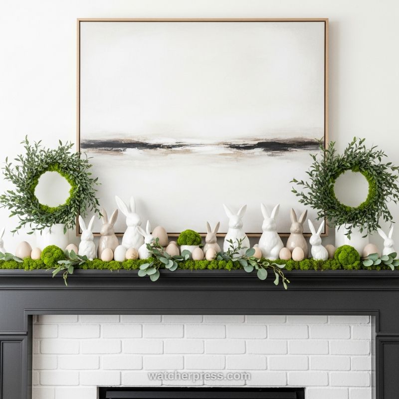
To successfully transition your living space from the quiet simplicity of late winter to the fresh energy of spring without overwhelming the room, employ a neutral palette anchored by natural textures, as demonstrated in this effortlessly chic mantel display. The foundation of this look is the commitment to a clean backdrop—here, a large, horizontal abstract painting with subtle beige, black, and white tones serves as the central anchor, ensuring the decor itself provides the main visual interest. Begin your arrangement by establishing symmetry and scale: place two identical, highly textured greenery wreaths (such as realistic faux boxwood or preserved moss) on either end of the mantel, resting them atop simple, white cylindrical vases or pedestals. This immediate introduction of vibrant green establishes the seasonal shift while the uniformity maintains a sophisticated balance. The use of high-quality faux materials is key for longevity and ensuring the rich color saturation lasts throughout the season, providing maximum impact with minimal maintenance. To achieve professional balance, ensure the outermost edge of the wreaths align with the edges of the artwork or the mantel itself to define the display’s boundaries.
Next, build the centerpiece along the length of the mantel using layered, natural elements. Start with a substantial base layer of preserved moss or a lush faux eucalyptus and boxwood garland runner that cascades slightly over the edge—this provides the tactile, organic feel essential for spring decor. The selection of seasonal figurines should adhere strictly to a neutral, earth-toned scheme to keep the look elevated. Here, various sizes of ceramic bunny statues are clustered together, featuring glossy white and matte beige/taupe finishes. By avoiding bright Easter colors, the display maintains a cohesive, adult aesthetic. Enhance this natural grouping by scattering small textural accents: introduce natural wooden eggs (varying sizes work best) and small, spherical moss truffles among the bunny groupings. Expert advice for placement involves clustering objects in odd numbers (groups of three or five) and varying their heights slightly to create visual movement and depth across the long horizontal surface. Ensure the figurines are nestled deeply into the moss base, making the entire arrangement appear as a single, abundant tableau.
The effortless aspect of this transition lies in its versatility and restraint. Since the color story is limited to white, beige, brown, and natural greens, the collection reads as sophisticated naturalism rather than themed holiday kitsch. To ensure cohesion, integrate the elements so they touch or overlap slightly; for instance, the eucalyptus leaves should mingle with the moss base, and the eggs should tuck right up against the ceramic bunnies. This method of intentional overcrowding, or ‘nesting,’ makes the mantel feel abundant and seasonally rich. For future transitions, this setup is highly adaptable: the abstract art, the greenery wreaths, and the moss base can remain in place well into summer. Simply swap out the specific seasonal icons—trade the ceramic bunnies and wooden eggs for small potted succulents or minimalist shell accents—to transition seamlessly into summer decor, demonstrating how high-quality neutral textures serve as the ultimate evergreen decor investment that minimizes the need for yearly overhaul.
Subtle Shifts: Mastering the Cozy Transition with Felt and Floral Accents
The secret to an effortlessly chic seasonal transition lies in employing low-commitment decor items that deliver high visual impact, such as a simple garland paired with a focused floral accent. This style, perfect for bridging the gap between deep winter and early spring holidays like Valentine’s Day, relies on textile warmth and a crisp, intentional color scheme. Start by analyzing your anchor surface—in this example, a beautiful distressed white mantlepiece. The texture of the wood serves as a neutral, weathered base, instantly elevating the soft materials placed upon it. Introduce a homemade or high-quality felt heart garland, intentionally alternating a deep, classic red with an off-white or cream tone. The tactile nature of the felt provides a cozy, handcrafted counterpoint to the clean lines of the furniture, ensuring the decor feels inviting rather than stark. This simple application allows you to define the celebratory mood without overwhelming the space, and the minimal surface area of the garland makes storage effortless when the season passes.
To keep the look refined and adult, choose a high-impact centerpiece that provides a visual pause. Instead of a large, complex arrangement, opt for a single, perfect bloom, such as the deep red rose pictured, housed in a miniature or bud vase. This minimalist approach draws the eye without adding clutter. Expert decorators understand that scale is crucial; the small white ceramic vase is understated, allowing the vibrant color and velvety texture of the rose to take center stage. The color palette—deep red, crisp cream, and neutral twine—is intentionally restrained, providing a classic romantic feel that avoids the juvenile pinks often associated with Valentine’s Day. Furthermore, positioning the garland to drape gently along the edge, rather than tightly pulled across the surface, adds a softness and movement that complements the overall cozy aesthetic.
Maximizing the lifespan of transitional decor is the ultimate goal of seasonal sophistication. This specific arrangement is exceptionally versatile. While the deep red hearts signal immediate romance, the cream hearts and neutral wood base allow the setup to serve beyond a single holiday. To transition this look into early spring, simply swap out the red rose for a pastel bloom—a single daffodil or a pale pink tulip—while leaving the garland intact. The change in the floral element immediately lightens the atmosphere and signals the coming of warmer weather, saving you the labor of removing and replacing the entire display. This strategic swapping focuses your effort on the most dynamic element (the flower) while maintaining the structural and textural base (the felt garland), making your decor feel updated and intentional with minimal fuss.
Elevating the Covered Patio: Maximizing Dusk-to-Dawn Entertaining
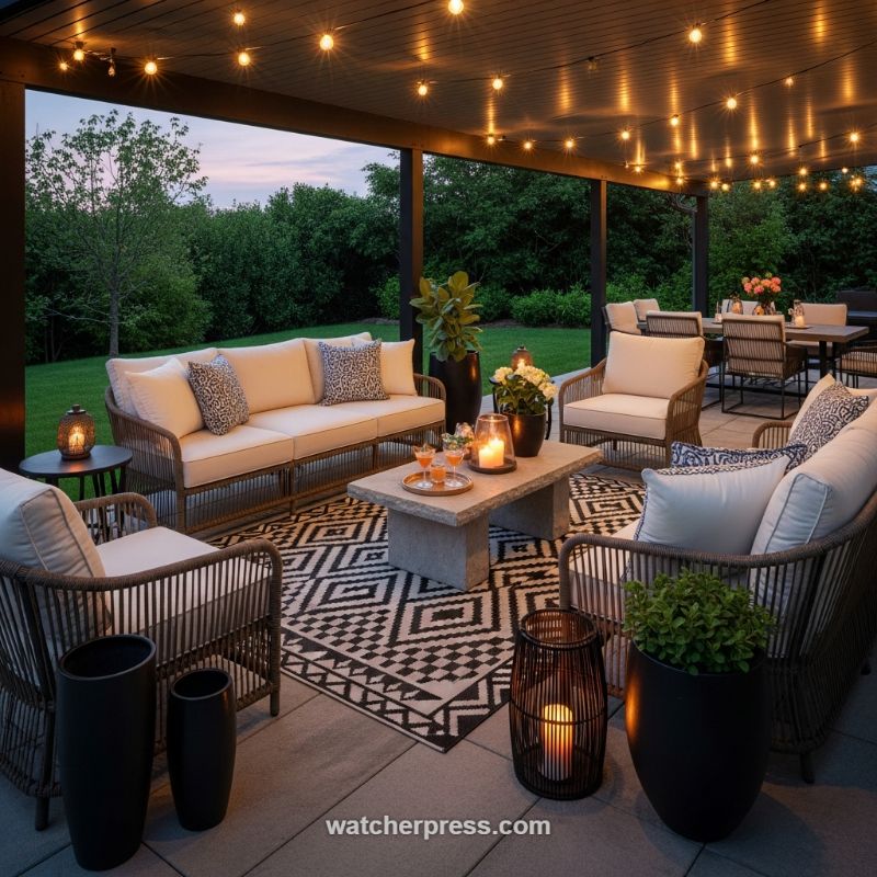
The key to an effortlessly chic outdoor transition lies in creating a durable, layered foundation that feels inviting from late spring through early autumn. Begin by establishing a defined living zone, even on a large patio or deck, using high-quality foundational furniture and a striking all-weather rug. In the scene above, the woven, resort-style seating paired with thick, cream-colored cushions provides textural depth while maintaining a neutral canvas. To ensure this base remains stylish across various weather conditions and gatherings, anchor the grouping with a high-contrast geometric area rug. A bold, repeating pattern, like the black and white design shown, grounds the space visually, absorbs light beautifully in the evenings, and helps distinguish the lounge area from the dining space in the background. This investment in durable, stylish textiles and substantial outdoor furniture ensures that the space reads as an extension of the indoor living room, rather than a temporary setup.
Effective seasonal transition relies heavily on masterful lighting, which allows the space to remain functional and atmospheric well past sunset. Follow the rule of layered lighting: utilize overhead string lights (cafe lights or Edison bulbs) strung across the pergola or ceiling beams to provide a warm, general glow (aim for bulbs around 2200K for maximum warmth and romance). This layer is essential for visibility, while the secondary, more intimate lighting creates the cozy mood crucial for evening relaxation. Incorporate ground-level elements, such as oversized, open-weave metal lanterns, and tabletop lighting like thick pillar candles encased in glass hurricanes. These lower light sources draw the eye inward, add sculptural interest during the day, and transform the patio into a sophisticated evening retreat, effortlessly extending your entertaining season as temperatures begin to cool.
Finally, transition the space using easily interchangeable accent pieces and strategic plantings. The neutral cushions provide the perfect backdrop for seasonal pillow swaps; here, high-contrast black and white geometric and animal prints add an immediate layer of sophistication without the commitment of bold color. For a look that bridges the seasons, choose patterns that incorporate grounding tones like charcoal, taupe, or deep blue. Integrate substantial, natural materials—the heavy, rectangular stone coffee table, for example, grounds the center of the seating arrangement and offers a durable surface for drinks and decor. Finish the look with large, dark, monochromatic planters. Using oversized black vessels creates visual continuity and makes the planted greenery (which can be easily swapped from bright annuals to more durable evergreens or grasses) feel like a permanent, intentional design element.
Brightening Your Space with Minimalist Floral Statements
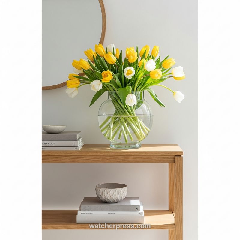
The shift into warmer seasons demands a refresh that is both impactful and restrained. As demonstrated in this vignette, embracing transparent vessels and high-impact seasonal blooms like tulips is key. The generous bouquet of sunny yellow and crisp white tulips immediately injects warmth and vibrancy, signaling spring’s arrival without overwhelming the clean, minimalist backdrop. Opting for a large, globe-shaped glass vase is crucial; it not only allows the full beauty of the stems to be appreciated—adding organic lines and texture beneath the water line—but also keeps the look feeling light and airy, avoiding the visual weight a colored or opaque vessel might introduce. When transitioning your decor, select flowers that naturally reflect the outdoor environment, using color pairings (like yellow and white) that feel fresh and uplifting, ensuring they are the undisputed focal point of the arrangement.
An ‘effortlessly chic’ transition relies heavily on a foundational, neutral palette to anchor vibrant accents. Here, the warm, light oak shelving unit provides a sturdy, natural base. To prevent the arrangement from looking isolated, incorporate curated, muted accessories styled in intentional groupings. Notice the strategic use of books—stacked horizontally in sophisticated shades of grey and off-white—which add necessary height and structure to the shelving. Paired with small, textured ceramic bowls, these elements introduce subtle tactile interest while maintaining a quiet sophistication. The key is balance: the accessories must complement the natural tones of the wood and wall, ensuring the vibrant yellow and white florals remain the highest contrast and primary attention magnet. Use groupings of three or five items, varying height and texture, to achieve visual harmony and avoid a cluttered appearance.
For a truly elevated seasonal transition, spatial awareness and light utilization are paramount. The setting—a white wall brightly lit by natural sunlight, further enhanced by the presence of a reflective circular mirror—amplifies the perceived freshness and luminosity of the flowers. When styling your own console or side table, prioritize placing the arrangement where it can catch and disperse light effectively. Furthermore, consider the scale; the vase is substantial, mirroring the density of the bouquet, which avoids the arrangement looking sparse. For the ultimate ‘how-to’ tip, always ensure your secondary accessories (like the bowls and books) are intentionally positioned to frame or subtly lead the eye towards the main event—the magnificent bouquet—creating a cohesive, high-end display that effortlessly welcomes the new season.
HELLO: The Art of Layered Entryway Styling
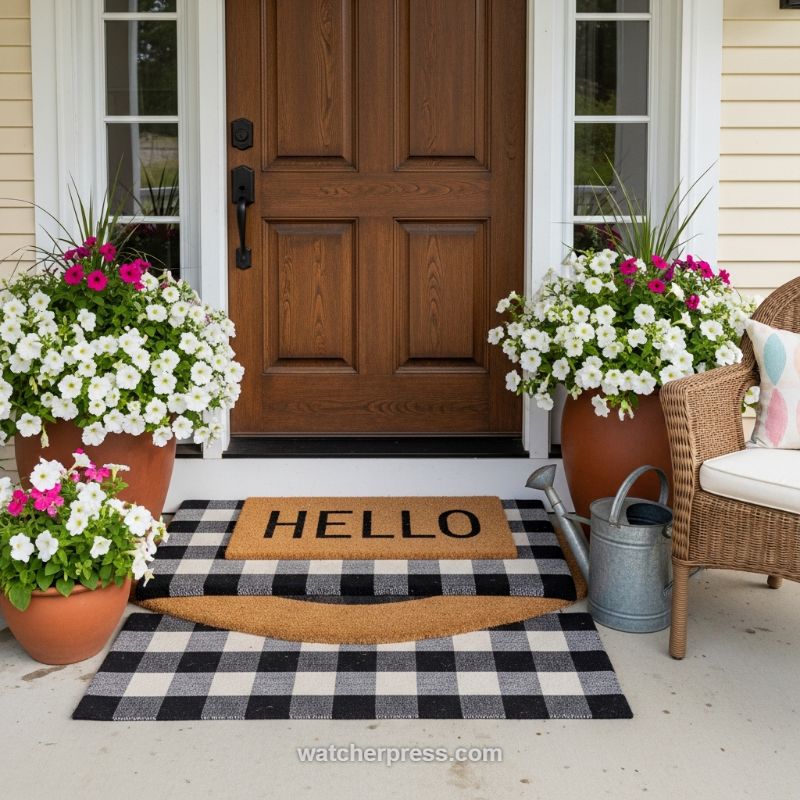
Mastering the entryway begins with the foundation: the layered doormat technique. As demonstrated here, effective layering requires significant contrast in both size and texture. Start with a foundation rug extemdash like the highly versatile black and white buffalo check seen here extemdash that is large enough to span the doorway and extend several inches beyond the primary entrance mat. This base rug should introduce pattern and soft textile texture. Layer on top one or two smaller coir mats; coir offers excellent scrubbing texture and durability. The visual success of this specific setup lies in the three-part stack: the wide plaid rug, a semi-circular coir mat providing a unique shape break, and the final rectangular mat featuring a simple, bold greeting like “HELLO.” This system not only enhances curb appeal but also makes seasonal transitions easier, as you can swap the top mat for holiday greetings or switch the base pattern entirely, while maintaining the layered structure.Once the grounding textiles are established, the next step is incorporating high-impact seasonal color through strategically placed container gardens. In this spring/summer example, the deep richness of the mahogany door is perfectly counterbalanced by the bright white and magenta petunias overflowing from large terracotta pots. Expert tip: Ensure your containers match the scale of your doorway; small pots look dwarfed next to a substantial front door. Utilize the classic “thriller, filler, spiller” gardening method within each pot to create the lush, abundant look shown. The grassy vertical element acts as the thriller, while the petunias serve as prolific fillers and spillers. For seasonal transition, these annuals are the easiest swap: trade out the petunias for bright red geraniums for summer, or replace them with structured ornamental cabbage and mums for a sophisticated autumn look, keeping the pots and layered mats consistent.Achieving a truly chic entryway means dressing the adjacent space to create a cohesive scene, not just decorating the door itself. The inclusion of the textured rattan chair and the vintage-style galvanized watering can grounds the entire composition, providing essential textural contrast. The wicker material introduces a natural, warm element that offsets the clean lines of the plaid mat and the formality of the wooden door. When selecting finishing accents, choose items that are both decorative and functional. The watering can, for example, signals care and attention to detail while adding a touch of rustic charm. Ensure all visible fabrics, from the pillow on the chair (note the soft pastels complementing the flower colors) to the mat, adhere to the established color palette (black, white, natural wood/coir, and seasonal pops), thereby completing a sophisticated, transition-ready facade.